Staring at a blank page trying to build a feedback form customer questions from scratch wastes time you don't have. Most teams end up with a form that asks too much, uses confusing wording, or gets ignored by the very customers you need input from. That's a fixable problem, and it starts with looking at forms that already work instead of guessing at your own.
This article gives you ten ready-to-use samples, so you can find the right customer feedback form example for your situation and adapt it in minutes, and if you want an even wider set, there are 13 customer feedback form examples and templates to compare too. Whether you need something for post-purchase surveys, support interactions, or ongoing product feedback, you'll find a sample customer feedback form here that fits without you having to reinvent the wording or layout.
Below, you'll see real examples covering different use cases, from a simple customer feedback form for quick reactions to a more detailed customer feedback form template for services businesses that need specific, actionable detail. Each sample includes the questions to ask and why they work, so you can copy, tweak, and start collecting better feedback today.
If you want one place where customers submit ideas, vote on what matters, and see what you're building next, Koala Feedback's feedback portal is built exactly for that. Unlike a one-off survey, this feedback form customer submissions flow into a live board where other users can upvote and comment, so you're not just collecting opinions, you're building a prioritized backlog straight from the people who use your product. It's the option to reach for when you need an ongoing feedback loop, not a single snapshot in time.
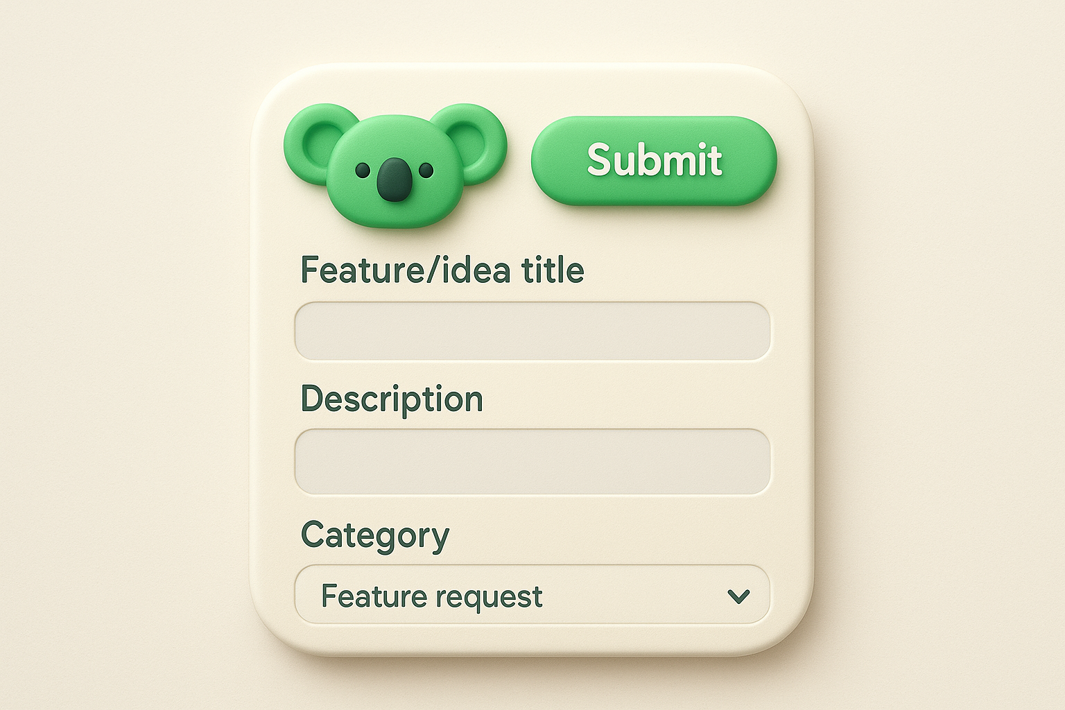
The form itself is short by design: a title field, a description box, and a category dropdown so submissions land on the right board automatically. Behind the scenes, automatic categorization groups similar requests together and flags duplicates, so you're not sorting through fifty versions of the same idea manually. You can brand the whole portal with your own logo, colors, and a custom domain, so it feels like a native part of your product instead of a bolted-on survey tool.
A feedback form that doubles as a public roadmap gets you more honest, more frequent input than any one-time survey ever will.
This format suits product managers and SaaS teams who need a constant stream of feature requests rather than a periodic check-in. Use it when you want customers to see their feedback acknowledged and tracked over weeks or months, not just submitted into a black hole. It also works well if you're trying to cut down on repetitive support tickets asking "is this feature coming?" since your public roadmap answers that question before anyone has to ask.
Keep the submission form itself minimal. The real value comes from the structure around it, categories, voting, and status updates, but here's a sample customer feedback form you can drop straight into a portal:
Feature/idea title: [short text field]
Description: What problem does this solve for you? [text area]
Category: [dropdown: Feature request / Bug / Integration / Other]
How important is this to you? [Nice to have / Important / Critical]
Once submissions come in, pair them with customizable statuses like "Under review," "Planned," "In progress," and "Completed" so customers always know where their idea stands. That transparency is what turns a basic form into a real feedback engine:
If your product has an active user base and you're tired of feedback scattered across emails, spreadsheets, and support tickets, this is the sample worth starting with, and it's worth reading what to look for when setting up a feedback portal before you launch it.
Sometimes you just need a quick read on how someone feels about a single interaction, and that's where a form built around your customer satisfaction score (CSAT) earns its place. This is the classic "how did we do?" ask, usually a row of stars, faces, or numbers, paired with one optional comment field. It's the fastest customer feedback form example you can build, and that speed is exactly why it works so well for high-volume touchpoints.
A CSAT form is almost always a single screen: a rating scale from 1 to 5 (or 1 to 10), plus an optional text box for context. You'll see this pop up right after a support chat closes, an order ships, or a user finishes onboarding. There's no navigation, no multi-page flow, just one question and a submit button. As with any well-designed satisfaction survey, keep the scale consistent across every touchpoint so you can compare scores over time instead of mixing 5-point and 10-point results.
The shorter the form, the higher the response rate, and CSAT proves that better than any other format.
Reach for CSAT right after a specific, recent interaction, while the experience is still fresh. It suits support teams closing tickets, e-commerce sites confirming deliveries, and SaaS products capping off an onboarding flow. Avoid using it for broad, big-picture questions about your brand overall; that's a job for NPS, which we'll cover next. CSAT works best as a simple customer feedback form you fire off dozens or hundreds of times a week, not as your only feedback channel.
How satisfied were you with [support interaction / order / onboarding]?
[1 - Very unsatisfied] [2] [3] [4] [5 - Very satisfied]

What's the main reason for your rating? (optional) [text area]
Add a second question only if you need a bit more diagnostic detail:
Keep it to two questions max. CSAT lives or dies on how little effort it asks of the customer.
When you need to know whether customers would actually recommend you, not just whether they're satisfied today, Net Promoter Score (NPS) is the standard to reach for. Like other surveys for customer feedback, it asks one core question about loyalty, then groups respondents into promoters, passives, and detractors based on their score. Plenty of SaaS companies track this quarterly as their main health metric, and it's one of the most recognizable customer feedback form examples out there for a reason: it's simple to send and easy to benchmark against your own past results or industry averages.
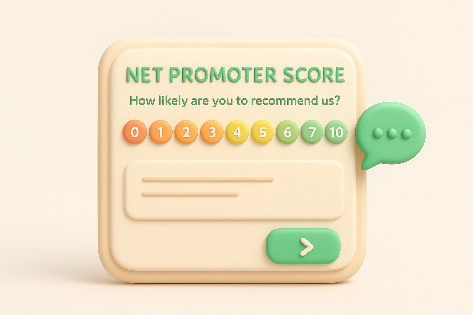
NPS forms use a 0-10 scale rather than the 1-5 scale you saw with CSAT, which gives you finer detail on where customers actually land. Respondents who score 9-10 count as promoters, 7-8 as passives, and 0-6 as detractors, and your score is the percentage of promoters minus the percentage of detractors. Most NPS forms follow the rating with a single open-ended follow-up, since the number alone doesn't tell you why someone feels that way.
A single number won't tell you why customers feel the way they do, so always pair your NPS score with an open follow-up question.
NPS works best as a periodic pulse check rather than something you trigger after every interaction. Quarterly or twice a year is typical for most SaaS products, since loyalty doesn't shift dramatically week to week. It suits product managers and leadership teams who need one comparable metric to track over time, and it's less useful if you're trying to fix a specific bug or support experience, where CSAT or a targeted survey works better, as a closer look at which CX metric to use makes clear.
On a scale of 0-10, how likely are you to recommend [product/company] to a friend or colleague?
[0] [1] [2] [3] [4] [5] [6] [7] [8] [9] [10]

What's the main reason for your score? [text area]
Segment responses by score range so you can act on each group differently:
Sometimes the question isn't whether customers are happy, it's whether you made things hard for them. Customer Effort Score (CES) measures exactly that: how much work someone had to put in to get an answer, complete a task, or resolve an issue. Research popularized by Gartner found that reducing customer effort predicts loyalty better than satisfaction alone, one reason effortless experiences are often called the most direct cause of customer loyalty, and that makes CES one of the more underused entries on this list of customer feedback form examples. If your support team keeps closing tickets but customers still churn, effort might be the real problem.
A CES form is a single statement paired with an agreement scale, usually 1 (strongly disagree) to 7 (strongly agree). Instead of asking "how satisfied were you," it asks something like "the company made it easy for me to handle my issue." That framing forces customers to think about friction, not just mood. Like CSAT, it's a one-screen form with an optional comment field, so it keeps the same fast, low-effort format that gets high response rates.
Low effort keeps customers coming back more reliably than high satisfaction ever will.
Deploy CES right after a support interaction, a self-service help center visit, or a checkout process where friction is likely to show up. It's especially useful for SaaS support teams and onboarding flows, where a confusing step can quietly drive churn even if the customer never files a complaint. Skip it for general brand sentiment, that's still NPS territory, and use CES specifically when you want to diagnose process friction.
[Company] made it easy for me to resolve my issue.
[1 - Strongly disagree] [2] [3] [4] [5] [6] [7 - Strongly agree]

What made this harder than it needed to be? (optional) [text area]
Follow up with a targeted question if you want more detail:
Once an order ships and lands on someone's doorstep, you get a narrow window to ask how the whole buying experience actually went. A post-purchase feedback form looks at the entire journey, browsing, checkout, shipping speed, and the product itself, rather than a single touchpoint. Retail and e-commerce teams rely on this feedback form customer data to catch problems before they show up as returns or bad reviews, and it gives you specifics you can't get from a star rating alone.
Most post-purchase forms arrive by email a few days after delivery, giving the customer time to actually use the product before you ask. Expect a short mix of rating scales and multiple choice questions covering shipping, packaging, and product accuracy, plus one open text field for anything else. Keep it under five questions; response rates drop fast once a post-delivery email starts feeling like homework.
Ask about the buying experience while it's still fresh, but wait long enough for the customer to actually use what they bought.
Send this sample customer feedback form three to seven days after delivery, once the product has had time to prove itself. It suits online retailers, subscription boxes, and any business shipping physical goods where damage, sizing, or accuracy issues only surface after unboxing. Skip it for digital products or services, where onboarding feedback fits better.
How would you rate your overall shopping experience?
[1] [2] [3] [4] [5]

Did your order arrive as described and on time?
[Yes] [No] [Partially]

How would you rate the packaging condition?
[1] [2] [3] [4] [5]

What could we improve about your ordering experience? [text area]
Add one optional follow-up to catch anything the scales miss:
Consultants, agencies, contractors, and anyone billing for time rather than shipping a product need a different kind of customer feedback form template for services. The interaction usually stretches across weeks or months, so you're not asking about a single click or a single delivery, you're asking about communication, expertise, and whether the outcome matched what was promised. This format works for law firms, marketing agencies, home service providers, and freelancers alike.
A services feedback form typically runs longer than a CSAT or CES form, since there's more ground to cover: responsiveness, expertise, value for money, and whether the final outcome met expectations. Expect a mix of rating scales for each dimension plus one or two open text fields for detail. Send it by email once a project wraps or a contract milestone closes, rather than mid-engagement when the answer is still incomplete.
Service businesses live or die on relationships, so ask about the whole engagement, not just the final invoice.
Use this sample customer feedback form at natural end points, project completion, contract renewal, or the close of a service ticket that took multiple sessions to resolve. It suits agencies, consultants, and B2B service providers who need to catch relationship problems before a client quietly doesn't renew. Skip it for quick transactional touchpoints, that's still CSAT territory.
How would you rate the overall quality of the service you received?
[1] [2] [3] [4] [5]

How responsive was our team to your questions or concerns?
[1] [2] [3] [4] [5]

Did the final outcome meet your expectations?
[Exceeded] [Met] [Fell short]

What could we have done differently? [text area]
Add a closing question to gauge long-term relationship health:
When you need to know whether people can actually find what they're looking for on your site or in your app, a usability feedback form gives you that answer directly instead of guessing from analytics alone. This kind of customer feedback form example targets navigation, clarity, and task completion rather than emotion, which makes it a practical starting point if you're working out how to improve user experience during a redesign or a new feature launch. Pair it with a heatmap or session recording tool and you get both the what and the why in one pass.
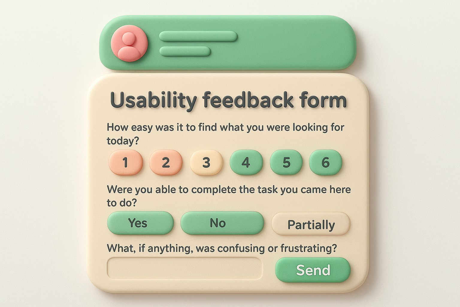
Most usability forms show up as an on-page widget or a short popup triggered after someone completes (or abandons) a specific task, like checkout or account setup. Expect a couple of rating questions about ease of navigation plus one open field asking what got in the way. Some teams build this into a dedicated feedback tab that stays visible on every page, so people can report friction the moment they hit it instead of waiting for a survey invite.
Usability feedback works best when you catch the friction while it's happening, not days later when the details have faded.
Deploy this sample customer feedback form right after a redesign, a new feature launch, or a checkout flow change, when you specifically need to know if the new version actually works better than the old one. It suits product and UX teams more than support teams, since the goal is design validation, not resolving a single ticket. Skip it for general satisfaction questions, that's CSAT's job.
How easy was it to find what you were looking for today?
[1 - Very difficult] [2] [3] [4] [5 - Very easy]

Were you able to complete the task you came here to do?
[Yes] [No] [Partially]

What, if anything, was confusing or frustrating? [text area]
Add a targeted follow-up when you're testing something specific:
Sometimes you don't need a full survey, you just need a quick way for customers to tell you what they wish your product did. A form built around what counts as a feature request captures that raw idea before it gets lost in a support ticket or a Slack message someone forgets to forward. This is one of the simplest examples of customer feedback forms you can build, but it only works if you actually do something with what comes in, otherwise customers stop bothering to submit anything at all.
Keep this to three or four fields: a short title, a description of the problem the idea solves, and a way to flag urgency. Many teams embed it as a small in-app widget or a link in a help menu rather than a separate page, since the best ideas surface while someone's actually using the product and hitting a limitation. Unlike a one-off survey, this form works best when it feeds into something ongoing, which is exactly what the tools and setup tips behind a feature request portal like Koala Feedback's prioritization boards are built for.
A feature request form only earns trust if customers can see their idea got somewhere.
Offer this customer feedback form example continuously, not as a one-time push. It suits SaaS teams, product managers, and anyone shipping software on a regular release cycle who wants a steady stream of ideas straight from active users. Skip it if you don't have a process for collecting, prioritizing, and shipping requests; an ignored request form does more harm than no form at all.
What feature or improvement would you like to see?
[short text field]

What problem would this solve for you?
[text area]

How are you handling this today without it?
[text area]

How important is this to you?
[Nice to have / Important / Critical]
The first few weeks after signup decide whether a customer sticks around or quietly cancels, so an onboarding feedback form catches problems while there's still time to fix them. This kind of sample customer feedback form asks whether setup made sense, whether the value showed up fast enough, and where someone got stuck before they gave up. SaaS teams that skip this step usually find out about onboarding friction only after churn numbers and other SaaS onboarding KPIs have already moved the wrong way.
Most onboarding forms trigger automatically, either through an in-app prompt after a few days of use or an email once a trial period starts winding down. Expect a short mix of rating scales covering setup ease and time-to-value, plus one open field asking what nearly made someone quit. Keep it to four or five questions; new users have low patience for anything that feels like extra work on top of learning your product.
If onboarding feedback only arrives after a customer cancels, you've asked the question too late to act on it.
Send this form somewhere between day three and day fourteen after signup, once someone has had a real chance to explore core features but before a trial expires. It suits SaaS product teams and customer success managers who need to catch confusion early, not after a support ticket or a cancellation email arrives. Skip it for one-time purchases or services with no ongoing setup process, where a post-purchase or services form fits better.
How easy was it to get started with [product]?
[1 - Very difficult] [2] [3] [4] [5 - Very easy]

Did you accomplish what you set out to do in your first few sessions?
[Yes] [No] [Partially]

What almost stopped you from continuing setup? [text area]

What would have made getting started easier? [text area]
Add one more question if you want to track momentum over time:
Once in a while, you need more than a quick pulse check, you need the full picture. An in-depth customer experience survey pulls together product satisfaction, support quality, pricing perception, and loyalty into one longer questionnaire, usually sent once or twice a year. Think of it as the annual physical for your customer relationship, the one where you finally ask everything the quick forms above never had room for. This is the most thorough sample customer feedback form on this list, and it's meant to be used sparingly.
Expect ten to fifteen questions mixing rating scales, multiple choice, and two or three open text fields, broken into sections like product, support, pricing, and overall relationship. Good surveys group related questions under short headers so the length feels organized rather than overwhelming. Progress bars help too, since customers are more willing to finish a long form when they can see how much is left. Plan for five to ten minutes of a customer's time, and say so upfront so nobody feels tricked partway through.
A long survey only works if you're honest about the time it takes and clear about why the answers matter.
Send this customer feedback form example annually or semi-annually to your active customer base, not after every interaction. It suits established SaaS products and B2B relationships where leadership wants a comprehensive view across product, support, and account management. Skip it for new customers still in their first few weeks, they don't have enough history yet to answer most of these questions meaningfully.
How satisfied are you with [product] overall? [1-5]
How well does [product] meet your current needs? [1-5]
How would you rate the value for the price you pay? [1-5]
How satisfied are you with our support team? [1-5]
How likely are you to renew or continue using [product]? [1-10]
What's working well for you right now? [text area]
What's the biggest gap between what you need and what we offer? [text area]
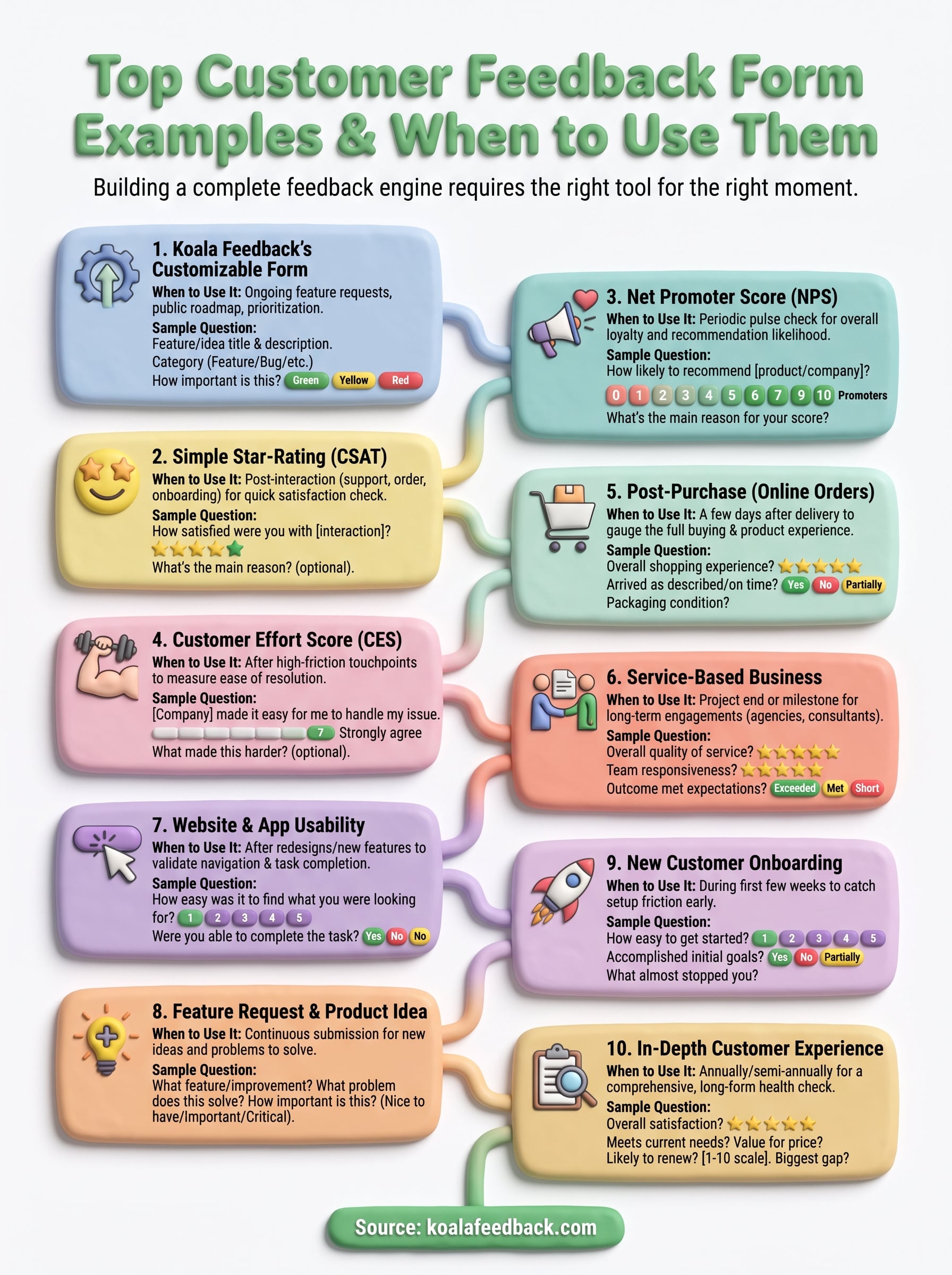
Matching the form to the moment matters more than picking the "best" template on this list. A quick CSAT after support beats a ten-question survey nobody finishes, and a detailed services form beats a star rating when you need real relationship context. Look back at what you're actually trying to learn, a single reaction, a loyalty trend, or an ongoing stream of ideas, and let that decide the format, not the other way around.
Most teams end up needing more than one feedback form customer touchpoint over time: something fast for transactions, something deeper for relationships, and something ongoing for feature requests. That last piece is where a standalone survey tool falls short, since ideas need a place to live, get votes, and show progress. If you want that ongoing loop built in from the start, capture user feedback with Koala Feedback and turn today's feedback into tomorrow's roadmap.

Start today and have your feedback portal up and running in minutes.