Building a customer feedback form from scratch is a good way to waste an afternoon and still end up with questions nobody wants to answer. Most teams either overask and get abandoned forms, or underask and get feedback too vague to act on. You need a format that gets people to actually finish the survey and gives you data you can use.
That's what this list is for. Below you'll find 13 real customer feedback form examples and templates, covering everything from quick post-purchase surveys to detailed product feedback form samples for feature requests and bug reports. Each one shows you the actual layout and question types, so you can see what works before you build your own.
We cover forms for different moments in the customer journey: onboarding, support tickets, feature requests, NPS surveys, and general satisfaction checks. Some you can copy into a Google Form or Word doc in minutes, others point to tools built specifically for collecting and organizing this kind of input. By the end, you'll have a customer feedback form format that fits your product and a clear sense of which template to grab first.
Most feedback forms just dump comments into an inbox and hope someone reads them. Koala Feedback takes a different approach: it's a dedicated feedback portal where customers submit ideas, vote on what matters to them, and watch your team's progress on a public roadmap. If you're managing a SaaS product with a steady stream of feature requests, this is less a form and more a system for turning scattered opinions into a prioritized backlog.
A feedback form only creates value once someone can act on what it collects.
You set up a branded portal (custom domain, colors, logo) where users submit feedback through a simple form: a title, a description, and a category. Koala Feedback automatically groups similar submissions together, so instead of getting fifteen separate requests for "dark mode," you get one entry with fifteen votes attached. Other customers can browse existing ideas, upvote the ones they care about, and comment with added context. Your team organizes everything into prioritization boards by product area, then updates statuses (planned, in progress, complete) so submitters see their feedback move somewhere instead of vanishing into a support queue.
This setup fits product managers and SaaS teams juggling feature requests from multiple channels, sales calls, support tickets, in-app widgets, and social media, who need one place to consolidate all of it. It's also a strong match for teams trying to build trust with users by showing visible progress, rather than collecting a customer product feedback form response and never mentioning it again. If your current process is a spreadsheet someone updates once a month, this replaces that with something customers can check themselves.
Unlike a static survey, the portal's submission form is intentionally short so people actually fill it out:
What would you like to see? (title)
Tell us more about this request (description)
Which area of the product does this affect? (category dropdown)
You can supplement this with occasional in-app prompts like "What's the one feature that would make you recommend us to a colleague?" to surface bigger themes the portal alone might miss.
Sometimes you don't need a specialized survey, you just need a straightforward customer feedback form that asks how things are going overall. This is the workhorse form: the one you link in an email footer, embed on a support page, or send quarterly to your whole customer base. It's not tied to a specific purchase or moment, which makes it flexible but also means you need tight questions to avoid vague, unusable answers.
A general feedback form usually mixes a couple of rating questions with one or two open text fields. You keep it short, five to seven questions max, because there's no specific trigger prompting someone to fill it out. Most teams distribute it through email campaigns, a website widget, or a link in the product itself. The customer feedback form format matters here more than in triggered surveys, since a wall of text scares people off before they start.
A general feedback form works only when brevity does the heavy lifting that context usually provides.
This format suits businesses running periodic check-ins rather than reacting to a single event, like a quarterly pulse survey or a permanent "Give Feedback" link in your app's footer. It's also useful for smaller teams that don't yet have the volume of requests to justify a dedicated portal but still want a consistent way to hear from customers.
Launching something new means you're flying without much data, and a new product feedback form is how you start collecting it fast. This form targets early adopters and beta testers who just tried a feature or product for the first time, while the experience is still fresh. Wait too long to ask and you get vague, generalized impressions instead of the sharp, specific reactions you actually need to fix rough edges before a wider release.
Timing drives this one. You send the form right after someone completes their first meaningful session with the new product, often triggered automatically a day or two after signup or first use. The product feedback form format should stay narrow: focus on first impressions, clarity of value, and anything confusing, rather than trying to cover every feature at once. Keep it to a handful of questions so people answer while the experience is still top of mind, not three weeks later when details have faded.
Feedback collected within 48 hours of first use beats feedback collected a month later, every time.
This format fits teams running beta programs, early access launches, or soft rollouts where the goal is catching problems before they reach your full customer base. It also works well for product managers testing a specific new feature inside an existing product, since the narrow scope keeps responses focused on that one addition instead of the product as a whole.
Right after someone buys something, you get a narrow window where their experience is fresh and their opinion is honest. A post-purchase survey catches that window. It's shorter and more transactional than a general feedback form, built to capture reaction to one specific order or checkout flow rather than the product relationship as a whole.
You trigger this survey automatically, usually by email a few hours to a few days after delivery or checkout completion, depending on whether you're selling a physical product or a digital one. The customer feedback form for products works best when it's tied to that single transaction: reference the order, ask about the buying process, and stop there. Ecommerce platforms often have this built in, but a simple embedded form or email link does the same job for smaller stores.
A post-purchase survey only works if it lands while the transaction is still fresh in the customer's mind.
This format suits ecommerce businesses, subscription services, and any company selling discrete transactions rather than ongoing usage. It's particularly useful for spotting friction in checkout, shipping, or fulfillment before it shows up as a return or a bad review. If you sell one-time products rather than software with continuous logins, this is likely your primary feedback channel.
After someone contacts support, you get a small window to find out whether the interaction actually solved their problem. A customer service feedback form measures that single interaction, not the product as a whole. It's the survey you see after a chat closes or a support ticket resolves, and it's short by design because the person just spent time getting help and doesn't want to spend more time rating it.
Most help desk and live chat tools trigger this form automatically the moment an agent marks a ticket as resolved or a chat window closes. Keep the customer feedback form format tight here, one rating question and one optional comment box is often enough. Tagging responses to the specific agent or ticket lets you spot patterns, like one team member consistently getting lower scores, without waiting for a formal review cycle.
A support survey that arrives more than an hour after resolution measures memory, not service.
This format fits support teams, customer success managers, and help desk operators who need a fast read on whether an interaction landed well. It's especially useful for companies running live chat or ticketing systems where volume is high and you need a lightweight signal, not a deep survey, to catch problems before they turn into churn or public complaints.
Website visitors rarely email you when something's broken or confusing, they just leave. A website feedback form catches that friction while someone's still on the page, instead of losing them silently to a bounce. It's typically a small widget tucked in a corner rather than a full-page survey, built to gather quick reactions to navigation, layout, or content without interrupting whatever the visitor came to do.
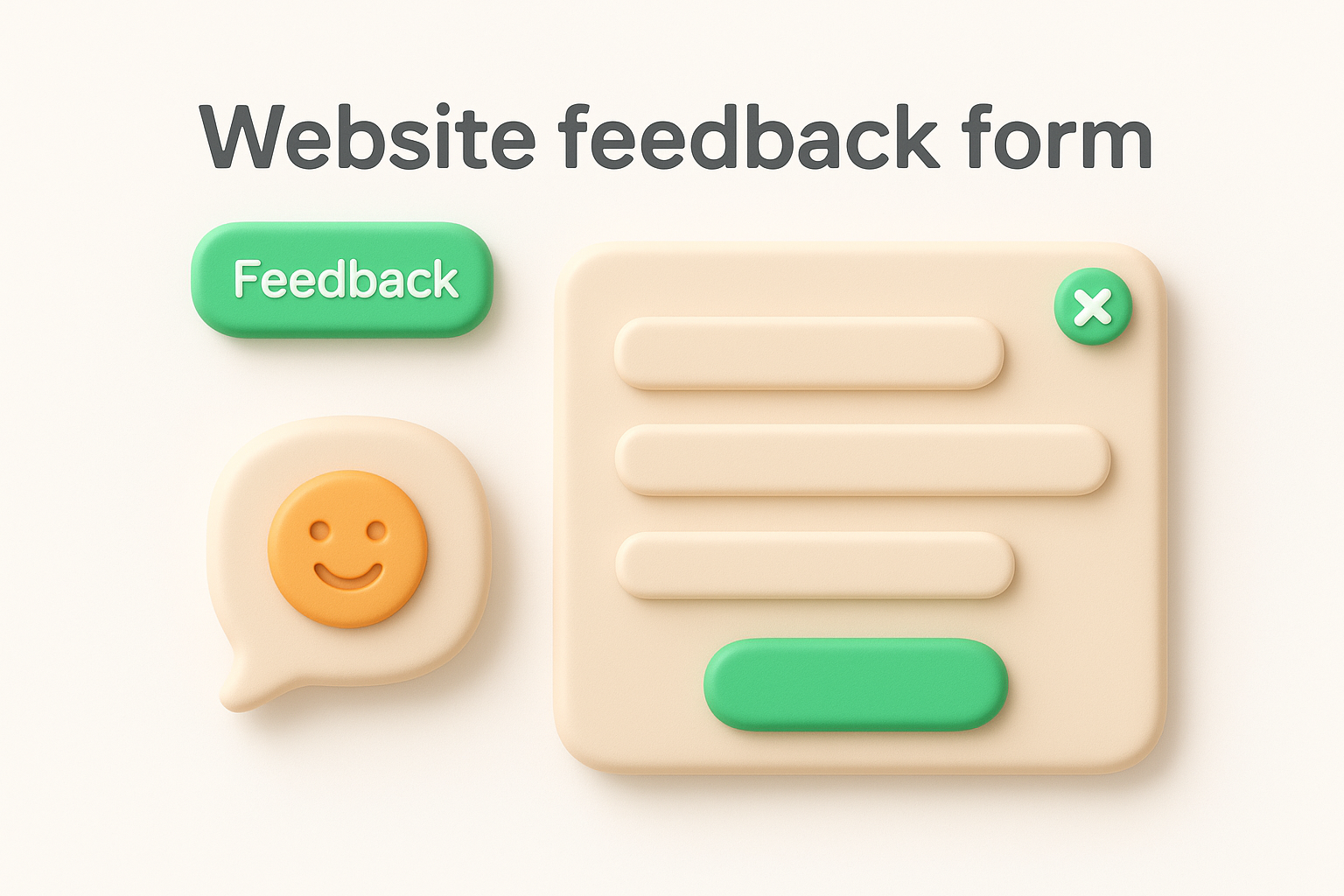
You embed a small trigger, usually a tab or button, on key pages like pricing, checkout, or your help center. Clicking it opens a short form with two or three questions, often paired with a screenshot tool so visitors can mark exactly where they got stuck. Some teams also trigger it based on behavior, like a rage click or someone lingering on a page without converting. Keep the customer feedback form format here visual and fast; nobody wants to type paragraphs about a broken button.
A website feedback widget only earns trust if it appears where confusion actually happens, not on every single page.
This format suits marketing teams, UX designers, and website owners trying to catch usability issues, broken links, or unclear copy before they show up in analytics as a drop in conversions. It's also useful for SaaS companies auditing their marketing site separately from the in-product experience, since visitor intent on a pricing page differs a lot from intent inside the app.
A net promoter score survey boils customer sentiment down to one number you can track over time. Instead of asking a dozen questions, you ask one: how likely are you to recommend us to a friend or colleague, on a scale of 0 to 10. It's the closest thing to a universal benchmark in customer feedback, which is why so many teams run it alongside more detailed forms rather than instead of them.
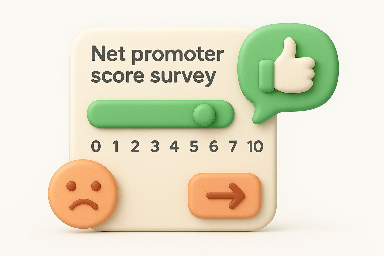
Respondents pick a number from 0 to 10, and that single answer sorts them into three groups: promoters (9-10), passives (7-8), and detractors (0-6). Subtract the percentage of detractors from the percentage of promoters and you get your NPS, a number between -100 and 100. Most teams send this customer feedback form on a set cadence, quarterly or twice a year, and follow the number with one open field asking why the person chose that score. That follow-up question is where the useful detail actually lives.
The score tells you where you stand, the follow-up question tells you why.
This format fits leadership teams and product managers who need a consistent metric to track loyalty trends over months or years, not just a one-time snapshot. It also works well for benchmarking against competitors or past performance, since NPS is standardized enough that most industries report rough averages you can compare against.
Usability problems rarely show up as support tickets, people just get frustrated and quietly stop using the feature. An app or software usability feedback form catches that friction inside the product itself, right where confusion happens, instead of waiting for someone to complain. It's built to surface the small stuff: confusing labels, buried settings, flows that take too many clicks, the kind of friction that never makes it into a formal bug report but still drives people away.
You trigger this form contextually, often tied to a specific feature or screen rather than the whole app. A common pattern is showing it after someone completes an action, or after they've used a feature a set number of times, so their opinion reflects actual use rather than a first glance. Keep the customer feedback form format narrow here, two or three questions tied directly to that screen or workflow, because a generic survey won't tell you which button confused someone. Many teams pair this with session recordings or heatmaps so the written feedback has visual context to back it up.
Usability feedback works best when it's tied to the exact screen where someone got stuck, not the app as a whole.
This format suits product managers, UX researchers, and engineering teams shipping frequent updates who need to know whether a redesign actually made things easier or just moved the confusion somewhere else. It's especially useful right after a feature launch, when early usage patterns reveal problems that internal testing missed entirely.
Conferences, webinars, and workshops generate a burst of opinion that disappears fast once attendees head home or close the browser tab. An event feedback form captures that reaction while it's still sharp, covering everything from session quality to logistics like registration and venue. Unlike an ongoing product survey, this one has a hard deadline: send it too late and you're competing with a dozen other emails in someone's inbox.
You distribute this customer feedback form immediately after the event ends, either as a pop-up before attendees leave a virtual session or an email sent within a few hours of an in-person one. Structure matters here: separate questions about content (speakers, topics, relevance) from questions about logistics (venue, scheduling, registration process), since a bad Wi-Fi connection shouldn't drag down your rating of a great keynote. Many teams also add an event-specific NPS question to compare turnout satisfaction year over year.
Send the survey while people are still in the room, not after they've forgotten which session they attended.
This format fits event organizers, marketing teams, and community managers running conferences, webinars, or in-person workshops who need a fast read on what to repeat and what to cut next time. It's also useful for SaaS companies hosting user conferences or product launch events, since attendee feedback often surfaces feature requests you wouldn't catch through a standard support channel.
The first week after signup decides whether someone sticks around or quietly cancels. An onboarding feedback form measures that critical stretch, asking new users whether setup made sense and whether they reached that first "aha" moment before frustration set in. Miss this window and you're left guessing why trial users vanished, instead of knowing exactly which step lost them.
You trigger this customer feedback form at a specific milestone, typically a few days after signup or right after someone completes a key setup task like connecting an integration or inviting a teammate. Some teams send it once, others check in at day 1, day 7, and day 30 to track whether early confusion resolves on its own or keeps causing drop-off. Keep the customer feedback form format focused on the setup experience itself: clarity of steps, time to value, and anything that made someone stop midway. Pair the responses with your product analytics, since a form telling you setup felt confusing means more when you can see exactly where users abandoned the flow.
The fastest way to fix onboarding is asking the people who almost quit during it.
This format suits SaaS companies and product-led businesses where a rocky first session directly predicts churn. It's especially valuable for teams running free trials, since every day of confusion during onboarding is a day closer to a lapsed trial instead of a paid conversion.
A meal is a short, specific experience, and a restaurant feedback form works because it asks about that one visit while the taste is still fresh. Diners will tell you far more right after they've eaten than they will days later in a generic email survey, and the format needs to match that immediacy: quick, visual, and tied to specifics like the dish they ordered or the server who helped them.
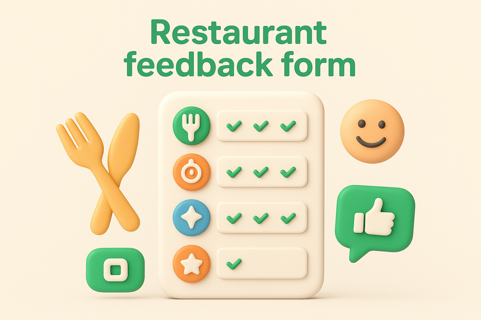
Restaurants typically hand this customer feedback form to diners with the check, print a QR code on the receipt, or send a text link a few hours after a reservation closes out in the POS system. Keep it to three or four questions covering food quality, service speed, and cleanliness, since a diner filling this out on their phone in the parking lot won't sit through ten questions. Some chains route low scores directly to a manager's inbox so a bad visit gets addressed before the customer posts a public review.
A restaurant survey that takes longer to fill out than the wait for the check will get ignored.
This format suits restaurant owners, hospitality groups, and franchise operators who need a fast pulse on food and service quality across multiple locations. It's also useful for catching problems location by location, since one underperforming branch can drag down a brand's reputation while headquarters has no idea anything's wrong.
Some of the most useful feedback only shows up when nobody's name is attached to it. An anonymous feedback form strips out identifying fields on purpose, which matters most for employee surveys, sensitive product complaints, or any situation where honesty and fear of repercussion pull in opposite directions. If people worry their comments will get traced back to them, they soften their answers or skip the form entirely, and you lose the exact signal you were trying to collect.
You remove name and email fields entirely, or route responses through a tool that strips IP addresses and metadata before anyone on your team sees them. Group questions by theme rather than by respondent, since anonymity means you can't follow up individually, so each question needs to stand on its own. Many teams pair this customer feedback form with a note explaining exactly what's collected and what isn't, since trust in the anonymity claim determines whether people actually open up.
Anonymous feedback only works if people believe the anonymity is real, not just labeled.
This format fits HR teams running employee pulse surveys, companies handling sensitive complaints, and any team suspecting their regular feedback channel is getting filtered or softened. It's also useful after a layoff, restructuring, or policy change, when people have opinions they'd never attach their name to but still want heard.
Sometimes you just need a product feedback form template word processors can open, something you can print, email as a PDF, or drop into a Google Doc without setting up any software. This is the fallback option for teams without a survey tool budget, or for anyone who wants a starting customer feedback form format to edit rather than build from a blank page. It's less polished than a dedicated portal, but it gets a usable form in front of customers in minutes.
You copy the structure below into a Word document, Google Doc, or even a PDF form, then swap in your product name and adjust the questions to match what you're actually trying to learn. Because there's no logic or automation, keep the layout linear: identifying info first, ratings in the middle, open comments last. Many teams use this exact product feedback form doc as a print handout at trade shows or as an email attachment for customers without reliable form-tool access.
A template you can edit in five minutes beats a survey tool you never get around to setting up.
Product Feedback Form

Name (optional): __________
Email (optional): __________
Product used: __________

1. Overall, how satisfied are you with this product? (1-5)
2. What do you like most about it?
3. What's one thing that frustrates you or could improve?
4. How often do you use this product?
5. Any other comments?
This format suits small businesses, freelancers, and teams without a survey tool subscription who need something functional today. It also works as a quick print handout for in-person events, retail counters, or trade shows where a screen or QR code isn't practical.
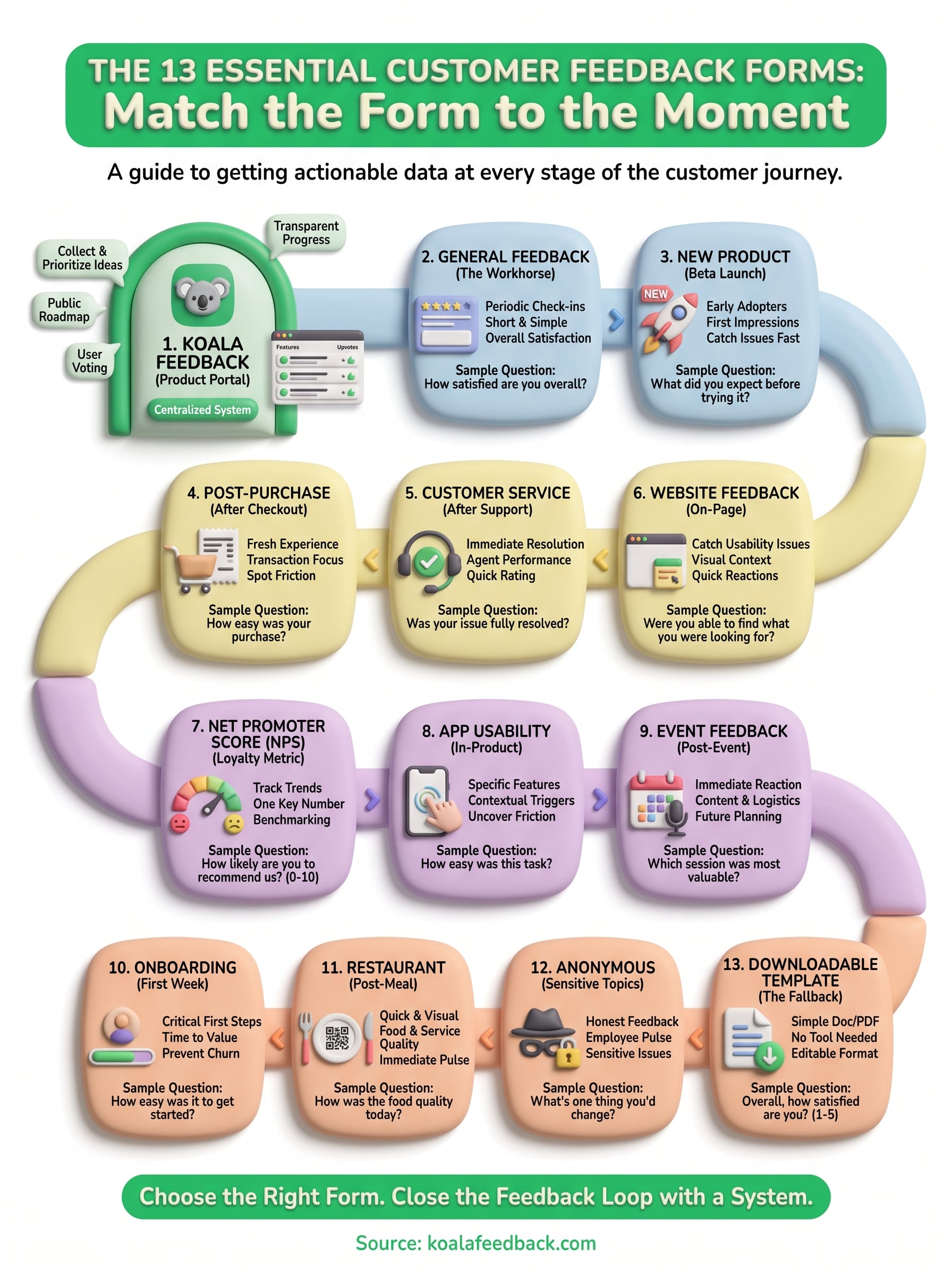
Thirteen formats, one decision: match the form to the moment, not the other way around. A post-purchase survey sent a month late gets ignored the same way a ten-question onboarding form gets abandoned halfway through. Pick the template that fits where your customer actually is, keep the question count tight, and you'll get answers people actually finish typing.
Generic forms and static templates work fine for one-off checks, but they all share the same weakness: feedback lands in an inbox and stops moving. If you're gathering feature requests, bug reports, or ongoing product input rather than a single snapshot, you need somewhere for that input to live, get voted on, and turn into visible progress. That's the gap a customer feedback form alone can't close on its own.
If you're ready to stop losing feedback in spreadsheets and email threads, try Koala Feedback and give your customers a portal built to collect, prioritize, and act on what they tell you.

Start today and have your feedback portal up and running in minutes.