If you can't say which onboarding step causes users to quit, you're flying blind. Most teams launch an onboarding flow, watch signups trickle in, then guess why activation stalls. The fix starts with picking the right saas onboarding kpis and watching them weekly, not just glancing at a dashboard once a quarter.
This article gives you a direct answer: the 12 metrics that actually tell you whether new users are reaching value or bouncing before day seven. You'll see time to first value, activation rate, and feature adoption alongside less obvious ones like onboarding checklist completion and support ticket volume during the first week. Each one points to a different failure point in your funnel.
We built Koala Feedback because product teams need real signal from real users, and that same principle applies here. Once you know which onboarding KPI is slipping, user feedback data and feature request patterns help you figure out why, and what to fix first. Track these numbers, and you'll stop guessing about churn and start making onboarding decisions backed by evidence.
Time to value (TTV) tracks how long a new user takes to reach their first meaningful outcome inside your product, the moment they realize "this actually solves my problem." It's not about logging in or clicking through a tour. It's about the specific action that proves your product's worth, like sending a first campaign, publishing a first feedback board, or generating a first report. Every SaaS product has a different trigger, and finding yours matters more than copying someone else's definition of activation moment.

If a user hasn't hit their first value moment within a week, you're losing them to a competitor who gets them there faster.
You calculate TTV by measuring the time elapsed between signup and the completion of that defined value action, then averaging it across a cohort of users. Most teams pull this from product analytics events, not surveys, because self-reported timing is unreliable.
Time to Value = Timestamp(First Value Action) - Timestamp(Signup)
Average TTV = Sum of all user TTVs / Number of users in cohort
Run this monthly per signup cohort so you can spot whether a recent onboarding change sped things up or slowed them down. Segment by plan tier and acquisition channel too, since a self-serve trial user and an enterprise buyer will hit value at very different speeds.
Benchmarks vary by product complexity, but the pattern holds across categories: simpler tools should get users to value in minutes, while complex platforms may reasonably take days.
| Product type | Reasonable TTV target |
|---|---|
| Simple tool (feedback widget, form builder) | Under 10 minutes |
| Mid-complexity SaaS (project management, CRM) | Under 24 hours |
| Enterprise platform (ERP, data warehouse) | 3 to 7 days |
If your product falls into the mid-complexity bucket and users are averaging four days to reach value, you've found your leak before it shows up as churn.
Shortening TTV usually comes down to removing friction between signup and that first payoff, not adding more explanation.
Each of these tactics shaves minutes or hours off the clock, and those minutes compound. A five-minute improvement across a thousand new signups a month is a thousand extra chances to keep someone past their trial period.
Activation rate tells you what percentage of new signups actually reach the value moment you defined for time to value. Where TTV measures speed, activation rate measures volume, how many people out of your entire signup pool cross that finish line at all. A product can have a fast average TTV and still have a weak activation rate if only a small slice of users ever get there. This is the metric that separates "our onboarding is quick" from "our onboarding actually works" for most of the people who try it.
Getting this number requires dividing activated users by total signups over the same time window, then multiplying by 100.
Activation Rate = (Number of Activated Users / Total Signups) x 100
Instant tracking depends on having a firm definition of "activated" baked into your analytics before you pull the report, otherwise every team argues about what counts. Pick one clear event, tag it in your product analytics tool, and run this weekly by signup cohort so you catch drops fast.
Solid self-serve SaaS products typically activate 20% to 40% of free signups, according to patterns widely cited by product-led growth practitioners. Enterprise products with sales-assisted onboarding often see higher activation, sometimes above 60%, because a human is actively pushing users toward that first outcome.
An onboarding flow that nobody finishes isn't an onboarding flow, it's a wall.
Anything under 15% for a self-serve product usually signals a mismatch between what you're marketing and what new users actually need to do first.
Raising activation rate means removing the excuses users have for stopping halfway through.
Small nudges like these often move activation rate faster than a full onboarding redesign.
Onboarding completion rate tracks the percentage of new users who finish every step of your defined onboarding flow, not just the first one. Unlike activation rate, which cares about a single value moment, this metric looks at the full checklist, every setup task, tutorial, or configuration step you've decided matters. Gaps between activation rate and completion rate reveal something useful: users who hit value early but abandon the rest of setup, leaving your product half-configured and fragile long term.
Dividing the number of users who finish all onboarding steps by total signups gives you this rate.
Onboarding Completion Rate = (Users Who Completed All Steps / Total Signups) x 100
Pull this from whatever checklist or progress-tracking system sits inside your onboarding flow. If you don't have one yet, build a simple event for each step and tag completion when all events fire for a given user. Segment by cohort weekly so a broken step shows up fast instead of hiding in a monthly average.
Completion rates above 70% signal a tight, well-scoped onboarding flow. Below 50%, you likely have too many steps or steps that don't feel necessary to the user.
A checklist nobody finishes is just a list of things you decided mattered more to you than to your users.
Watch which specific step causes the steepest drop, that single point usually explains most of your loss.
Shortening your checklist and reordering steps by impact fixes most completion problems.
Treat this rate as a diagnostic, not a vanity number, and it'll tell you exactly where to trim.
Customer engagement rate tracks how actively new users interact with your product after onboarding technically ends, not just whether they finished a checklist. This metric looks at login frequency, session length, and how many core features a user touches in a given week. It matters because a user can complete every onboarding step and still drift away within a month if the product never becomes part of their routine. Engagement rate is your early warning system for silent churn, the kind that doesn't show up until the cancellation email arrives.
Most teams calculate engagement rate by counting active users against total users over a set window, usually weekly or monthly.
Engagement Rate = (Active Users in Period / Total Users in Period) x 100
Define "active" clearly before you run this, whether that means a login, a specific feature touch, or a minimum session length. Pull the data from your analytics platform and segment by signup cohort so you can compare week-one engagement against week-four engagement for the same group of users.
Weekly engagement above 60% for products meant for daily use signals a healthy habit forming. For tools used less frequently, like monthly reporting software, a strong benchmark looks more like 40% to 50% monthly active usage against total accounts.
A user who logs in once and never returns didn't onboard successfully, they just signed up.
If engagement drops sharply after week two, that's usually when the novelty of onboarding wears off and real habits either form or don't.
Building sustained engagement means giving users reasons to come back beyond the initial setup.
Engagement rate rewards patience more than any other KPI on this list, so track it over months, not days.
Feature adoption rate tracks what percentage of your users actually use a specific feature, especially the ones you built to drive retention. This differs from engagement rate because it zooms into individual features rather than overall product activity. A user might log in daily and still ignore the feature that would make them stick around for years. Tracking this during onboarding tells you whether new users are discovering your product's real differentiators or just poking at the basics before drifting off.
You get this number by dividing users who engaged with a given feature by total active users, then multiplying by 100.
Feature Adoption Rate = (Users Who Used Feature / Total Active Users) x 100
Run this calculation per feature, not as one blended number, since bundling every feature together hides which ones actually matter. Pull the data from event tracking tied to specific feature actions, and compare adoption rates across cohorts to see whether onboarding changes moved the needle on a particular feature.
Core features tied directly to your product's main value proposition should see adoption above 50% among active users within the first month. Secondary features, the nice-to-haves, often land between 10% and 20%, and that's fine as long as your core feature numbers stay strong.
A feature nobody adopts isn't a feature, it's a line item on your changelog.
If a feature you consider central sits under 20% adoption, something in your onboarding flow is failing to introduce it properly.
Raising adoption usually means surfacing the feature earlier and more directly, not building more of it.
Once you see which features go ignored, that data becomes your roadmap for what to fix next.
Onboarding funnel drop-off rate identifies exactly which step in your sequence loses the most users, rather than giving you one blended completion number. This is the metric that turns a vague "our onboarding isn't working" into a specific, fixable problem, like "68% of users quit at the integration setup step." Funnel drop-off treats onboarding as a series of gates, not a single event, and shows you which gate is too narrow. Without this view, you're stuck guessing whether users leave because of pricing confusion, a confusing form, or a step that simply doesn't matter to them.
You calculate drop-off rate at each individual step by comparing how many users entered that step against how many moved to the next one.
Step Drop-off Rate = (Users Who Started Step - Users Who Completed Step) / Users Who Started Step x 100
Map every step in your onboarding flow as a distinct event in your analytics funnel tool, then run this calculation for each transition, not just the overall start-to-finish number. Weekly tracking by cohort catches a broken step within days instead of a full billing cycle.
Healthy funnels lose 10% to 20% of users between adjacent steps. Anything above 30% at a single step points to a specific problem, not general onboarding fatigue.
One ugly step can undo five good ones, so find it before you redesign everything else.
Compare drop-off across steps rather than against industry averages, since your worst step matters more than any external benchmark.
Fixing funnel drop-off means treating each weak step as its own project, not part of a broad overhaul.
Once you patch the biggest leak, rerun the funnel. A new bottleneck usually surfaces, and that's normal.
These three numbers track whether a new user comes back after signing up, at three checkpoints that matter most for onboarding. Day 1 retention tells you if the first session actually stuck. Day 7 retention tells you if a habit is forming. Day 30 retention tells you if the product survived the initial excitement and became something the user actually relies on. Together they paint a curve, and that curve tells you more than any single retention rate snapshot ever could.
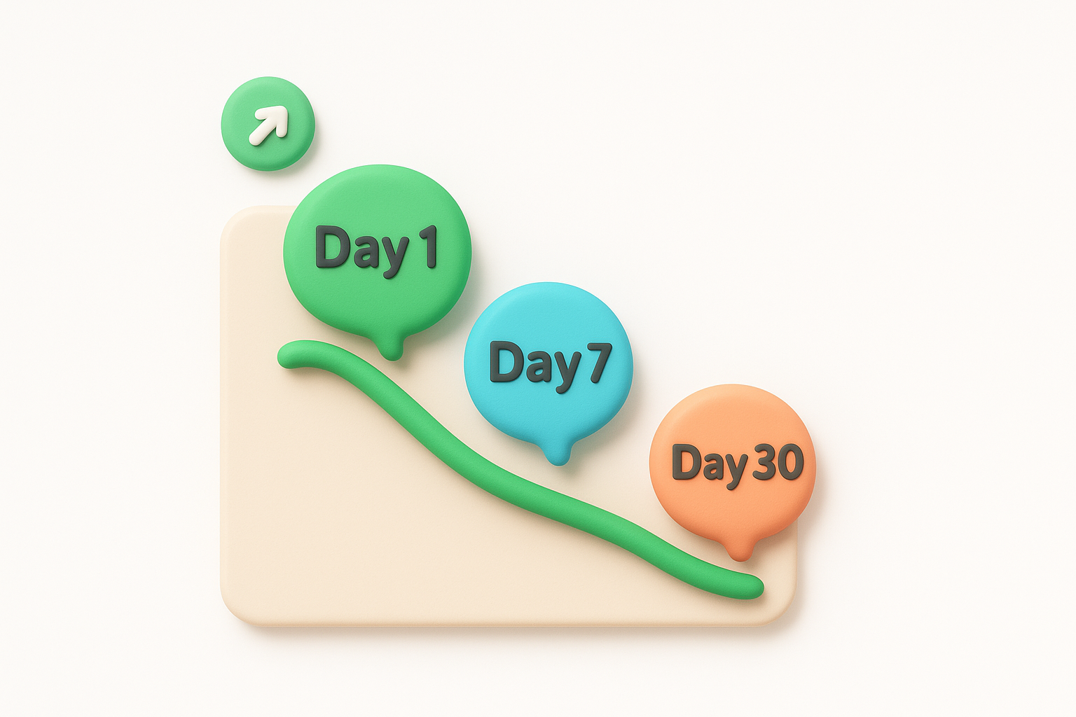
Each checkpoint uses the same formula, just applied to a different day.
Day N Retention = (Users Active on Day N / Users Who Signed Up) x 100
Run this per signup cohort, not as a rolling blend across all users, since mixing cohorts hides whether a recent onboarding change helped or hurt. Most product analytics tools build this into a retention curve automatically once you tag signup and activity events correctly.
Benchmarks vary by product category, but a rough shape holds across most self-serve SaaS tools.
| Checkpoint | Reasonable target |
|---|---|
| Day 1 | 60% to 70% |
| Day 7 | 30% to 40% |
| Day 30 | 15% to 25% |
A sharp drop between day 1 and day 7 usually means onboarding got someone in the door but never gave them a reason to come back.
If your day 30 number sits well below 15%, the product isn't sticking regardless of how strong your onboarding flow looks on paper.
Improving these numbers means giving users a reason to return on each specific day, not just a stronger first session.
Track the gap between checkpoints as closely as the checkpoints themselves. That gap is where onboarding either holds or breaks.
Customer churn rate tracks the percentage of customers who cancel or stop paying within a given period, and it's the metric that turns weak onboarding into a revenue problem. Churn rate doesn't tell you why someone left, but it confirms whether all your earlier onboarding fixes actually held up past the first month. Onboarding-driven churn usually shows up early, often within the first two billing cycles, which makes this a lagging indicator of everything you tracked in the KPIs above it.
Dividing customers lost during a period by customers you started with gives you churn rate for that window.
Churn Rate = (Customers Lost in Period / Customers at Start of Period) x 100
Run this monthly, and segment by signup cohort so you can isolate whether customers who struggled through onboarding churn faster than those who breezed through it. Comparing cohort churn against your onboarding completion rate from earlier often exposes a direct link between the two.
Healthy SaaS companies typically keep monthly churn under 5%, with best-in-class products landing closer to 2%, according to benchmarks widely referenced across the SaaS industry, including analysis from the U.S. Small Business Administration on subscription business sustainability. Annual churn above 20% usually signals a structural problem, not just a rough onboarding month.
Churn is onboarding's report card, delivered a few months late.
Compare your number against your own historical baseline first, since industry averages vary wildly by pricing tier and customer size.
Reducing churn tied to onboarding means catching the warning signs before cancellation, not reacting after.
Churn rate closes the loop on every earlier metric, so treat a spike here as a signal to revisit onboarding, not just customer success.
Free-to-paid conversion rate tracks the percentage of trial or freemium users who become paying customers, and it's the metric where onboarding meets revenue directly. Conversion rate answers a blunt question: did the value you delivered during onboarding feel worth paying for? Unlike churn, which measures whether people stay, this metric measures whether people ever decided to commit in the first place. A weak number here almost always traces back to a user who never reached their activation moment before the trial clock ran out.

Divide paying customers by total trial or free signups from the same cohort, then multiply by 100.
Free-to-Paid Conversion Rate = (Paying Customers / Total Trial Signups) x 100
Track this per signup cohort and per plan tier, since a 14-day trial converts differently than a 30-day one. Segment by whether the user hit your activation event before converting, that single filter usually explains most of the variance you'll see.
Self-serve SaaS products with a free trial typically convert 15% to 25% of trial users to paid plans, according to patterns commonly cited across product-led growth benchmarks. Freemium products, where users can stay free indefinitely, usually see lower rates, often in the 2% to 5% range, since there's less urgency to upgrade.
A trial that ends before a user finds value never had a real chance to convert.
If your rate sits well below these ranges, check whether your trial length actually matches your average time to value.
Boosting conversion means making the paid tier feel like the obvious next step, not a separate decision.
Conversion rate rewards a trial built around your activation event, not a generic countdown.
Support ticket volume during onboarding counts how many help requests new users file in their first days or weeks, and it's one of the more overlooked saas onboarding kpis on this list. Ticket volume flags confusion before it becomes churn, since a user who emails support three times in week one is telling you something your product should have explained itself. This metric also reveals product gaps you can't see from usage data alone, because a ticket often explains the "why" behind a drop-off you spotted in an earlier funnel step.
Ticket volume gets tracked as a simple ratio, but the real value comes from categorizing each ticket by topic and onboarding stage.
Support Tickets per New User = Total Onboarding Tickets / Total New Signups in Period
Pull raw counts from your helpdesk tool, then tag tickets by which onboarding step the user was on when they reached out. Group tickets weekly by cohort so a spike tied to a recent product change shows up fast instead of blending into a monthly average.
Healthy self-serve products see fewer than 0.1 tickets per new user during the first week. Anything above 0.3 tickets per user usually signals a confusing setup step rather than a genuinely complex product.
Every onboarding ticket is a support agent doing a job your product should have done itself.
Watch the topic breakdown too. Ten tickets about one screen matters more than fifty scattered across your entire flow.
Cutting ticket volume means fixing the root confusion, not just answering faster.
Fewer tickets during onboarding usually means users are finding answers themselves, which is exactly the outcome you want.
Net promoter score (NPS) during onboarding asks new users a single question early in their journey: how likely are they to recommend your product to a colleague. Running this survey right after onboarding rather than months later captures a first impression while it's still fresh, before habit or apathy sets in. This isn't the same NPS you send to your whole customer base annually. It's a targeted pulse check that tells you whether the experience you just built actually delighted someone or merely got them through the door. A low score here often predicts churn long before your churn rate metric would ever catch it.
You calculate NPS by subtracting the percentage of detractors from the percentage of promoters, based on responses to a 0-10 recommendation question.
NPS = % Promoters (9-10) - % Detractors (0-6)
Trigger the survey immediately after a user completes onboarding or hits their activation event, not on a fixed calendar date. Segment responses by cohort and by which onboarding path a user took, since a shorter flow and a longer one often produce different scores even among otherwise similar users.
Onboarding-specific NPS above 40 signals a strong first impression. Scores between 0 and 30 suggest the experience is tolerable but unremarkable, and anything negative means detractors outnumber promoters entirely.
A negative onboarding NPS means you've already lost the argument before the user ever opens an invoice.
Compare this score against your company-wide NPS too. A gap between the two often means onboarding sets expectations the rest of the product doesn't meet.
Raising onboarding NPS means acting on what respondents actually say, not just tracking the number.
Treat every detractor response as free research, not just a number to average.
Customer lifetime value (LTV) tracks the total revenue you can expect from a customer over the entire time they stay subscribed, and it's the metric that proves whether your onboarding investment actually paid off. Every other KPI on this list feeds into LTV eventually. A faster time to value, a higher activation rate, and lower churn all show up here as bigger numbers. This is the metric you bring to a budget meeting when someone asks why onboarding deserves more engineering time.
The simplest version multiplies average revenue per account by average customer lifespan, though many teams fold in gross margin for a more accurate figure.
LTV = Average Revenue Per Account x Average Customer Lifespan
Pull average revenue from your billing system and average lifespan from churn data, ideally split by which onboarding cohort a customer came through. Comparing LTV across cohorts tells you whether a specific onboarding change increased not just retention, but the total dollar value of the customers you kept.
A widely cited rule of thumb calls for an LTV to customer acquisition cost ratio of at least 3 to 1, a benchmark referenced across SaaS finance guidance, including material from the U.S. Small Business Administration on subscription business planning. Ratios below 1 to 1 mean you're losing money on every customer you onboard, regardless of how polished the flow looks.
LTV is the final scoreboard for everything you fixed earlier in the funnel.
Track the ratio quarterly, since acquisition costs shift faster than lifetime value does.
Raising LTV almost always means revisiting the earlier KPIs on this list rather than chasing the number directly.
Every earlier fix compounds into this one number over time.
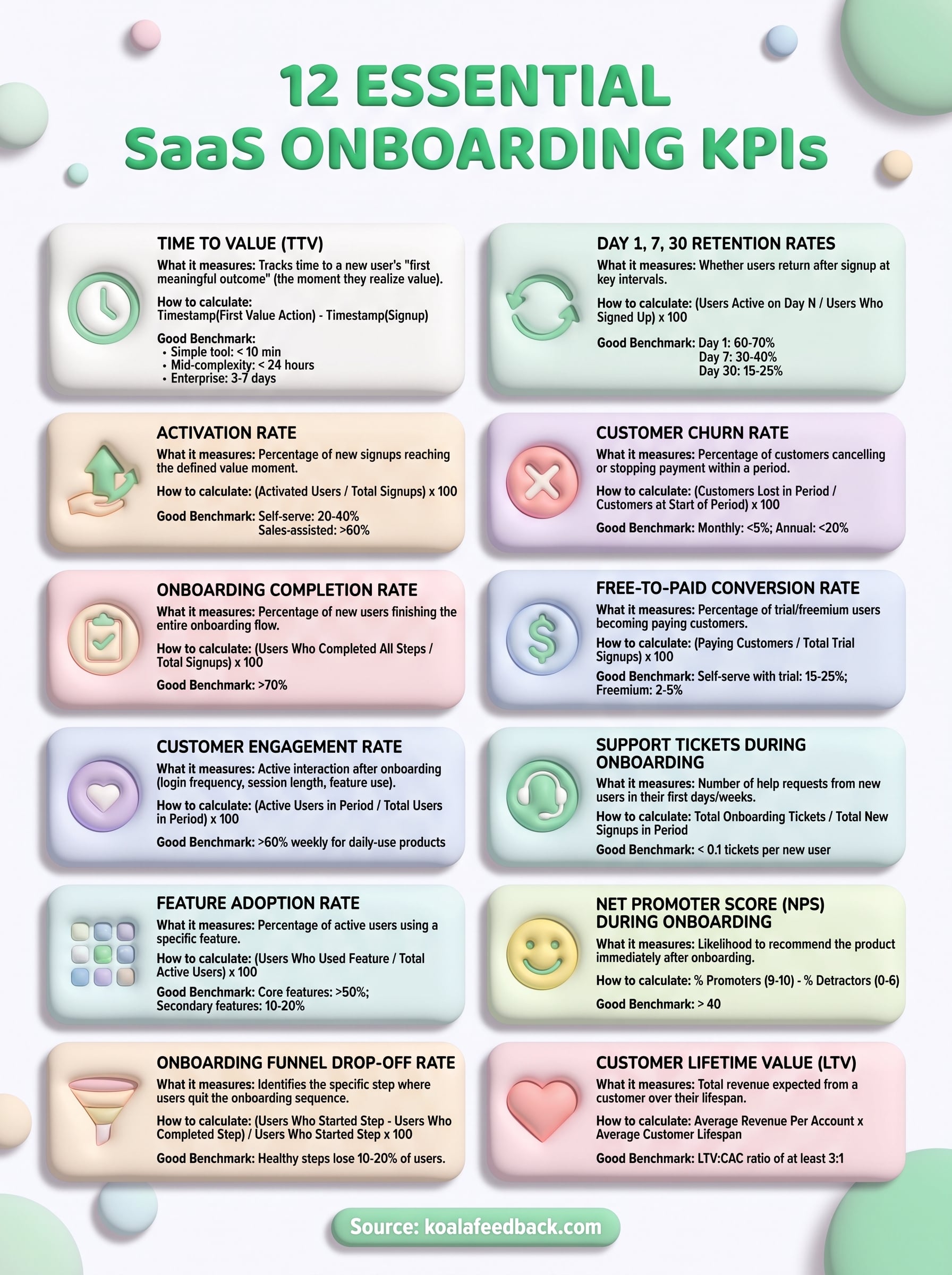
You don't need to track all 12 metrics on day one. Start with time to value and activation rate, since those two expose the biggest leaks fastest. Once you've fixed the obvious breaks, layer in funnel drop-off, retention checkpoints, and NPS to catch the subtler problems hiding underneath. Each number tells you something specific about where new users stall, and stacking them together turns onboarding from a guessing game into a system you can actually manage.
The hardest part isn't calculating these numbers, it's knowing what to do once a metric slips. That's where direct user feedback closes the gap between a dropping KPI and the fix that actually works. If you want a straightforward way to collect that feedback, prioritize it, and share progress with the users asking for it, try Koala Feedback and turn your onboarding data into a real roadmap.

Start today and have your feedback portal up and running in minutes.