You shipped the feature. The release notes went out, the changelog got updated, and then... silence. Nobody on your team actually knows if users are touching it. That's the gap feature adoption metrics close: they tell you whether the thing you built is getting used, ignored, or abandoned after one try.
If you're here, you probably want a concrete list of numbers to track, not another explainer on why adoption matters. So that's what this article gives you: nine specific metrics, from adoption rate and time to first use to retention curves and stickiness ratios, along with the formulas to calculate each one and practical ways to move them in the right direction.
We'll also connect these metrics back to something most teams overlook: the feedback loop. Knowing a feature has low adoption is only half the job. You still need to find out why, and that's where user feedback and voting on feature requests, the kind you can collect through a tool like Koala Feedback, turns raw numbers into a clear next step for your roadmap.
Feature adoption rate is the single number most product teams reach for first, and for good reason. It answers the most basic question you have after a launch: what percentage of eligible users actually turned this feature on or tried it at least once. Everything else on this list adds nuance, but this metric is your baseline health check.
At its core, feature adoption rate measures uptake against opportunity. It's not asking whether every user in your database touched the feature. It's asking, of the users who could reasonably use it (meaning they're on the right plan, have the right permissions, and have logged in since the release), how many actually did. This distinction matters because comparing raw adoption numbers against your total user base inflates the sense of a problem when the real issue is exposure, not interest. Feature adoption rate should always be measured against a defined eligible population, not your whole customer list.
The formula is simple, which is exactly why teams get sloppy with it. Get the eligible population wrong and the percentage means nothing.
Feature Adoption Rate = (Users who used the feature at least once / Total eligible users) x 100
Say you rolled out a new bulk-export tool to 1,200 customers on your Pro and Enterprise plans. Ninety days later, 340 of them have used it at least once. That's a 28% adoption rate. Whether that's good depends entirely on your benchmark. A utility feature buried three menus deep might see 15% and be considered a success. A feature you promoted in-app, by email, and in your changelog should be doing much better than that.
If you're not defining your eligible user base before you calculate adoption rate, the number you get is closer to guesswork than data.
A few practical notes on measurement:
Low adoption rate almost always traces back to one of three causes: users don't know the feature exists, they don't understand why it matters to them, or they hit friction trying to use it. Diagnosing which one you're dealing with changes what you should do next.
First, check visibility. If your feature announcement was a single line in a changelog nobody reads, that's your answer. In-app prompts, tooltips, and a short walkthrough at first login after release tend to move the needle faster than email alone. Second, look at relevance. A feature can be perfectly discoverable and still get ignored if users don't see how it solves their problem, which is often a messaging issue rather than a product one. Third, watch for drop-off inside the feature itself. If people start the flow and abandon it, that's friction, not disinterest.
This is also where direct feedback earns its keep. Instead of guessing why adoption is stuck at 28%, ask the users who haven't touched the feature. A quick in-app survey, or a request thread on your feedback portal where users can comment on what's blocking them, often surfaces the real barrier faster than any analytics dashboard will.
Breadth of adoption zooms out from a single feature and asks a bigger question: how many different features are your users actually touching, not just one you're watching. If adoption rate tells you how one feature performs, breadth tells you whether your product as a whole is being explored or whether users are stuck in a narrow groove of two or three actions they learned on day one and never left.
This metric measures the spread of feature usage across your product, not the depth of usage on any one feature. A user with high breadth might dabble in ten different tools without mastering any of them. That's fine, because breadth isn't about mastery. It's an early signal of whether your onboarding and in-app guidance are actually exposing people to the full value of what you built, or whether most of your feature set is invisible to most of your users after the first week.
The formula compares what a user actually touches against what's available to them:
Breadth of Adoption = (Number of distinct features used by a user / Total number of features available to that user) x 100
Run this per user, then average it across a segment or your whole customer base. If your product has 20 features and the average customer touches 4, you've got an average breadth of 20%. That's a useful number to track over time and to compare across plans, since a low breadth score among your highest-paying customers is a bigger red flag than the same score among free-tier users who have less reason to explore.
A product with dozens of features and an average breadth score in the single digits isn't a feature-rich product. It's a product where most of the roadmap is invisible.
Breadth problems are usually discovery problems, and they respond well to structural fixes rather than one-off nudges:
Depth of adoption flips the lens from breadth. Instead of asking how many features a user touches, it asks how thoroughly they use the one feature you care about. A user can click into a feature once and never engage with its advanced options, or they can work through every step of a workflow the way it was designed to be used. Depth catches the difference, and it's one of the more revealing feature adoption metrics because it separates curiosity from real reliance.
Essentially, depth of adoption measures how much of a feature's full capability gets used, not whether it gets opened. Think of a reporting feature with five filter options and three export formats. A shallow user applies one filter and exports to CSV. A deep user chains filters, saves a custom view, and schedules recurring exports. Both count toward adoption rate, but only one of them is getting real value, and only one of them is likely to renew because of that feature.
Depth doesn't have one universal formula the way adoption rate does, since it depends on what "full use" means for your specific feature. A common approach is to define a set of sub-actions inside the feature and score users on how many they complete:
Depth of Adoption = (Sub-actions completed by a user / Total sub-actions available in the feature) x 100
For the reporting example above, if there are six possible sub-actions (apply filter, save view, schedule export, and so on) and a user has completed two, their depth score is 33%. Average this across your user base to see whether people are engaging shallowly or working through the feature the way you intended.
A high adoption rate paired with a low depth score usually means users tried your feature once and found no reason to go further.
Shallow usage is often a design or education problem, not a motivation one. Try these fixes:
Time to adopt measures the gap between the moment a feature becomes available to a user and the moment they actually use it. This metric matters because a slow adopter and a non-adopter look identical on day one, but they're completely different problems. Someone who takes 45 days to try a feature might just be waiting for the right task to come up. Someone who never tries it at all needs a different kind of intervention entirely.
This metric measures speed of uptake, not whether uptake happens at all. It captures how long a feature sits unused after release before someone finally clicks into it. A short time to adopt usually signals strong visibility and clear relevance, the user saw it and immediately understood why it mattered to their workflow. A long time to adopt, even among users who eventually do try the feature, often points to weak discoverability or a feature that only becomes relevant in specific, infrequent situations.
You calculate this at the individual user level, then average across your eligible population:
Time to Adopt = Date of first feature use - Date feature became available to that user
If a feature launches on March 1 and a user first clicks into it on March 20, their time to adopt is 19 days. Run this across every user who eventually adopted the feature and take the median rather than the mean, since a handful of very slow adopters can skew an average and make the number look worse than typical behavior actually is.
A feature that takes 60 days on average to get a first click is a feature your users forgot existed, not one they're carefully evaluating.
Long adoption windows almost always come down to timing and placement. Fixes worth testing:
Duration of adoption tracks how long users keep engaging with a feature after they first try it, rather than whether they tried it at all. This is the metric that catches the feature everyone opens once out of curiosity and then quietly stops using a week later. Time to adopt tells you how fast someone got started. Duration tells you whether that start turned into a habit or a dead end.
Duration of adoption measures the length of a user's active engagement window with a specific feature, from first use to their last recorded interaction (or the present day, if they're still using it). It's less about a single usage event and more about a pattern over time. A user who opens a feature five times over three weeks and then never returns has a short duration, even though their raw adoption rate counted them as a success. Tracking duration alongside adoption rate exposes features that look healthy in aggregate but are actually leaking users fast.
At the individual level, duration is straightforward to define:
Duration of Adoption = Date of last feature use - Date of first feature use
Average or take the median across everyone who adopted the feature, and segment by cohort so you can see whether duration is shrinking for newer users compared to earlier ones. A feature with a median duration of 90 days among your first cohort but only 20 days among last month's signups is telling you something changed, whether that's the feature itself, onboarding, or a shift in who's signing up.
A feature people try and quietly abandon within a month isn't adopted. It's just sampled.
Short duration usually means the feature solved a one-time problem, or it stopped delivering value after the novelty wore off. Diagnose before you fix:
Feature stickiness measures something adoption rate and depth can't: whether a feature has become part of a user's regular routine or just a thing they tried a few times. It's one of the most useful feature adoption metrics for spotting features that generate excitement at launch but fail to earn a permanent spot in someone's workflow. A sticky feature gets used again and again without a prompt. An unsticky one needs constant reminders to get any attention at all.

Stickiness measures the ratio of habitual users to casual users for a given feature, usually expressed as daily or weekly active users divided by monthly active users. It's borrowed from the broader product analytics world, where it's applied to whole products, but it works just as well scoped down to a single feature. A high ratio means the people who use the feature at all tend to use it often. A low ratio means most of your "active" users are only touching it once a month, which barely qualifies as adoption at all.
The standard formula compares a short usage window against a longer one:
Feature Stickiness = (Daily Active Users of the feature / Monthly Active Users of the feature) x 100
Swap in weekly active users instead of daily if your feature isn't the kind of thing anyone would reasonably open every day, like a quarterly reporting tool. If 50 users touch the feature monthly but only 8 touch it weekly, your stickiness ratio is 16%, a sign that most adoption is sporadic rather than habitual.
A feature with strong monthly adoption but weak weekly stickiness is being sampled, not relied on.
Stickiness responds well to changes that build the feature into a routine rather than treating it as a standalone tool:
Active users per feature gives you a raw headcount instead of a ratio, and sometimes that's exactly what you need. Percentages are great for comparing features against each other, but they can hide scale. A feature at 60% adoption among 50 eligible users looks impressive next to a feature at 20% adoption among 10,000 users, until you realize the second one is generating twelve times the actual usage. This metric keeps you honest about volume.
This metric measures the absolute number of users engaging with a feature within a set time window, typically daily, weekly, or monthly. It strips out the denominator entirely and just counts heads. That makes it useful for prioritization conversations, where a feature with modest adoption percentage but a large active user count might deserve more engineering attention than a feature with a flashy percentage but a tiny audience. It's also the number that tends to matter most to leadership, since it maps directly to how many real customers would notice if the feature broke or disappeared tomorrow.
The calculation itself is simple counting, but consistency in your time window matters more than the formula:
Active Users per Feature = Count of unique users who engaged with the feature during the chosen period
Pick daily, weekly, or monthly based on how often you'd expect someone to reasonably use the feature, then track the trend line over several periods rather than a single snapshot. A single month's count tells you almost nothing on its own. Six months of counts moving up or down tells you whether the feature is gaining or losing ground.
A feature with a shrinking active user count is losing relevance even if its all-time adoption percentage still looks fine on a dashboard.
Growing this number usually means expanding either your eligible base or your engagement within the base you already have:
Feature retention rate answers a question none of the previous metrics fully cover: of the users who adopted a feature, how many are still using it weeks or months later. Adoption rate tells you who tried something. Retention tells you who stayed. This distinction matters because a feature can post a strong initial adoption number and still be quietly bleeding users every month, which only shows up if you're tracking retention as its own line item rather than assuming a good launch means lasting success.

Specifically, this metric measures the percentage of adopters who remain active users over a defined period, rather than a one-time head count. It's the difference between a feature people keep coming back to and one they tried, shrugged at, and abandoned. A feature can have a healthy adoption rate and a terrible retention rate at the same time, and that combination is one of the clearest signs you have a value problem rather than a discovery problem. Users found it. They just didn't find a reason to stay.
Calculate retention by anchoring it to a cohort of adopters and checking how many are still active at a later date:
Feature Retention Rate = (Adopters still active at end of period / Adopters at start of period) x 100
If 500 users adopted a feature in January and 310 of them are still using it 60 days later, your retention rate is 62%. Track this by monthly cohort so you can spot whether retention is improving or getting worse as you iterate on the feature, rather than relying on a single snapshot that flattens out real trends.
Retention, not adoption, tells you whether a feature actually earned a permanent place in your product.
Weak retention almost always traces back to the feature not delivering enough recurring value to justify a return visit:
Feature exposure rate closes out this list because it answers a question that should technically come before all the others: did users even have the chance to see the feature in the first place. You can calculate adoption rate, depth, breadth, and stickiness all day, but if half your eligible users never had the feature surface in their UI or never saw an announcement about it, those numbers are measuring interest against a population that was never properly exposed to begin with.
Exposure rate measures how many eligible users were actually shown the feature, through a UI element, an announcement, an email, or an in-app prompt, regardless of whether they clicked into it. This is the metric that separates a discovery problem from a genuine disinterest problem. A low adoption rate paired with a low exposure rate means your rollout didn't reach people. A low adoption rate paired with a high exposure rate means people saw it and decided to ignore it, which is a completely different fix.
You need event tracking on the announcement or UI element itself, not just on the feature's usage:
Feature Exposure Rate = (Users who saw the feature announcement/UI element / Total eligible users) x 100
If 1,200 users were eligible for a new feature but your in-app banner only rendered for 700 of them due to a targeting bug, your exposure rate is 58%, and any adoption number you calculate on top of that is working from an incomplete base.
You can't judge whether a feature failed to land until you know whether it was ever actually shown to the people who could have used it.
Low exposure is almost always a technical or sequencing issue rather than a product one, and it's usually cheap to fix once you spot it:
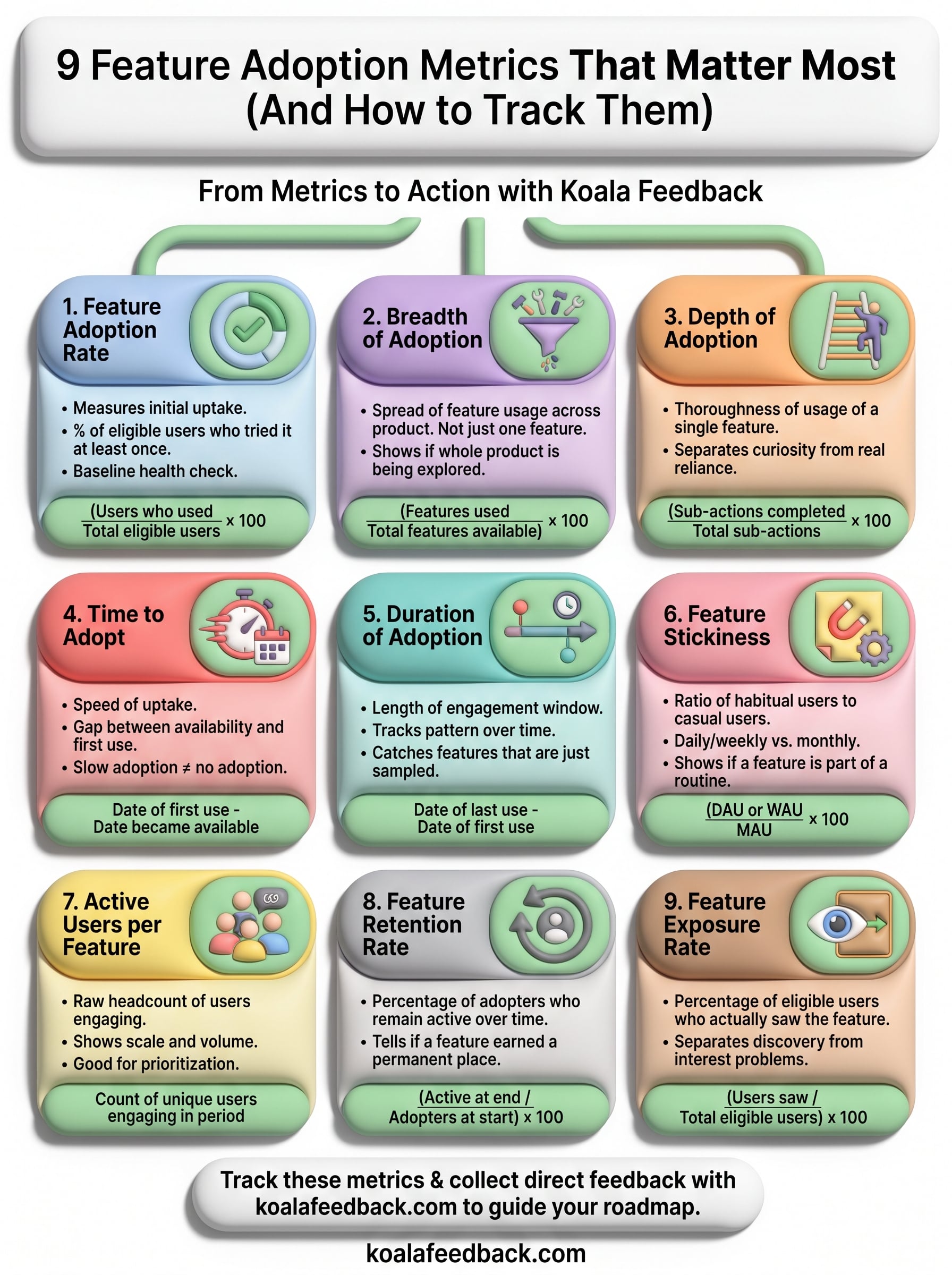
Nine metrics is a lot to track at once, so don't try to boil the ocean. Pick two or three that map to the question you're actually asking right now. If you just launched something, watch exposure rate and time to adopt. If you're worried about a feature quietly dying six months in, retention rate and duration of adoption will tell you faster than any launch dashboard.
But none of these numbers explain themselves. A low depth score tells you people aren't going deep, not why. That gap is where direct user feedback does the work analytics can't, and it's exactly why pairing your metrics with a real feedback channel matters more than adding a tenth KPI to the list.
If you want that channel already built, with voting, comments, and a roadmap your users can actually see, try Koala Feedback and start turning your adoption data into decisions.

Start today and have your feedback portal up and running in minutes.