You're shipping features, collecting user feedback, and making product decisions daily. But how do you know if any of it is actually working? A product metrics dashboard gives you that clarity, a single view into what's driving growth and what's falling flat.
Without the right KPIs in front of you, you're essentially guessing. You might prioritize the wrong features, miss churn signals, or overlook what your most engaged users actually want. That's where dashboards become essential: they turn scattered data into actionable insights that shape every product decision you make.
At Koala Feedback, we help product teams collect and prioritize user feedback, but feedback alone doesn't tell the whole story. Pairing qualitative feedback with quantitative metrics gives you a complete picture of product health. This guide walks you through which KPIs matter most, how to build a dashboard that surfaces them effectively, and practical examples to help you get started.
A product metrics dashboard is a centralized view of your most important product performance indicators. Think of it as your mission control center: it surfaces real-time data on user behavior, feature adoption, retention, and revenue in one place. Instead of digging through multiple analytics tools or spreadsheets, you get instant visibility into what's working and what needs attention. The best dashboards update automatically, track trends over time, and make it easy to spot patterns that influence your roadmap.
Without a dashboard, your data lives in silos. Marketing tracks acquisition in one tool, your dev team monitors technical performance in another, and customer success pulls reports from a CRM. Product decisions suffer when you can't see how these pieces connect. A product metrics dashboard brings everything together so you can identify which features drive retention, which onboarding flows lose users, and where your growth is actually coming from.
A consolidated dashboard turns fragmented data into decisions you can act on immediately.
Consider a SaaS product experiencing churn. Your dashboard shows that users who activate three specific features within 14 days have 80% higher retention. That insight directs your onboarding flow, your in-app messaging, and even which feature requests to prioritize. Without the dashboard, you might never connect those dots. You'd be reacting to symptoms instead of addressing the root cause.
Clarity beats comprehensiveness every time. An effective dashboard focuses on 5 to 10 core metrics that directly tie to business outcomes. Each metric answers a specific question: Are users adopting your latest feature? Is trial-to-paid conversion improving? Are power users staying engaged? You should be able to glance at your dashboard and understand product health within 30 seconds.
The structure matters just as much as the metrics themselves. Your dashboard should:
Effective dashboards also include context. A metric showing 15% monthly active user growth means nothing if you don't know whether that's accelerating, slowing, or consistent with your target. Show historical comparisons and goals alongside raw numbers so your team knows whether to celebrate or course-correct.
Your product metrics dashboard should reflect what success actually looks like for your business, not just track numbers that feel important. Start by identifying 2-3 core business objectives for the next quarter. If your goal is reducing churn, metrics like retention rate and feature adoption matter more than total signups. If you're focused on growth, activation rate and referral loops take priority. The metrics you track should directly inform decisions that move you closer to those objectives.
Early-stage products need different metrics than mature ones. If you're still finding product-market fit, track activation rate (users completing key actions) and time-to-value (how quickly users experience the core benefit). These tell you whether your product delivers on its promise fast enough to retain new users.
Once you've validated fit, shift focus to growth and retention. Measure monthly recurring revenue (MRR), net revenue retention (NRR), and daily or monthly active users (DAU/MAU). These metrics reveal whether your product sustains momentum beyond initial interest. Mature products should add efficiency metrics like customer acquisition cost (CAC) and lifetime value (LTV) to optimize unit economics.
Match your KPIs to where your product stands today, not where you hope it will be in two years.
Tracking too many metrics dilutes focus. Your dashboard should surface 5-7 KPIs that directly tie to revenue, retention, or user satisfaction. For a SaaS product, that might include:
Each metric should answer a specific question about product health. If a metric doesn't influence a decision you'll make this quarter, remove it.
Once you've selected your core KPIs, define exactly what each metric measures and how you'll calculate it. Vague definitions lead to misaligned teams and conflicting reports. If your dashboard shows "activation rate," does that mean users who logged in twice, completed onboarding, or used a core feature? Document the specific events, time windows, and conditions that constitute each metric so everyone interprets the data the same way.
Create a single source of truth for every metric on your product metrics dashboard. Each definition should include the calculation formula, the data source, and any filters or segments you apply. For example:

| Metric | Definition | Calculation | Data Source |
|---|---|---|---|
| Activation Rate | Percentage of new signups who complete 3 core actions within 7 days | (Activated users / Total signups) × 100 | Product analytics tool |
| Day 30 Retention | Percentage of users active 30 days after signup | (Users active on Day 30 / Total signups) × 100 | User database |
| Feature Adoption | Percentage of MAU using a specific feature at least once per month | (Users engaging feature / MAU) × 100 | Event tracking system |
Document these definitions in a shared space where your team can reference them. Consistent definitions prevent arguments about whether metrics are improving or declining based on different interpretations.
Clear metric definitions eliminate confusion and ensure your entire team measures success the same way.
Identify where each metric lives and how you'll pull it into your dashboard. Most product metrics come from analytics platforms, databases, payment processors, or customer support tools. Your activation rate might pull from an analytics tool, while revenue metrics come from your billing system. Map each metric to its source, then verify you have API access or database permissions to extract the data automatically. Manual exports introduce delays and errors that undermine your dashboard's value.
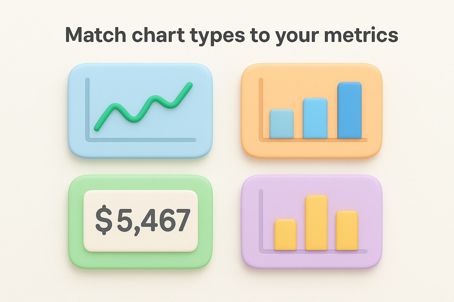
Visual design determines whether your product metrics dashboard gets used or ignored. The right chart type makes patterns obvious, while poor layout forces users to hunt for insights. Start by matching each metric to the chart that best reveals its story. Line charts work for trends over time, bar charts compare categories or segments, and single-value cards highlight key numbers that need immediate attention. Avoid pie charts for anything beyond two or three categories since they make comparisons difficult.
Use line charts for metrics that change over time like daily active users, monthly revenue, or retention curves. These show momentum and help you spot inflection points. Choose bar charts when comparing segments like feature adoption across user tiers or activation rates by signup source. Single-value cards work best for metrics that need constant visibility, such as current MRR or this month's churn rate.
| Metric Type | Best Chart | Why It Works |
|---|---|---|
| Trend over time | Line chart | Shows direction and momentum |
| Category comparison | Bar chart | Easy to compare values |
| Single key number | Value card | Immediate visibility |
| Distribution | Histogram | Reveals concentration patterns |
Break your metrics into meaningful user groups so patterns emerge. Segment by plan tier (free vs. paid), user cohort (signup month), or behavior (power users vs. casual). Your product metrics dashboard should let you filter activation rate by acquisition channel or compare retention between users who adopted your core feature versus those who didn't. These segments reveal which user groups drive success and which need intervention.
Segments transform averages into actionable insights by showing you who succeeds and who struggles.
Place your most critical metrics in the top-left corner where eyes naturally land first. Group related metrics together and maintain consistent time ranges across charts so comparisons make sense.
Publishing your dashboard is just the beginning. The real work starts when your team uses it to make decisions. Schedule a launch meeting where you walk stakeholders through each metric, explain what changes should trigger action, and establish who owns which KPIs. Share access with everyone who needs visibility into product performance, but assign specific team members to monitor critical metrics daily. Your product metrics dashboard only creates value when it informs actual decisions, not when it sits unused in a browser tab.
Configure threshold alerts for metrics that require immediate response. If your Day 7 retention drops below 40% or your activation rate falls 10% week-over-week, you need to know immediately. Most dashboard tools let you set up Slack notifications or email alerts when metrics cross predetermined boundaries. Pair automated alerts with weekly 15-minute review sessions where your team examines trends, discusses anomalies, and decides whether patterns warrant action. These regular check-ins prevent you from reacting to noise while ensuring you catch meaningful shifts early.
Automated alerts catch problems fast, but scheduled reviews help you understand why metrics move and what to do about it.
Audit your dashboard quarterly to verify you're tracking what actually matters. Your product evolves, your market changes, and the KPIs that mattered three months ago might not reflect current priorities. Ask whether each metric still ties to business goals and whether the definitions you documented remain accurate. Drop metrics that no longer drive decisions and add new ones that surface emerging patterns. Test your data accuracy by comparing dashboard figures to source systems and investigating discrepancies immediately. A dashboard that shows incorrect data is worse than no dashboard at all since it leads to confident but wrong decisions.
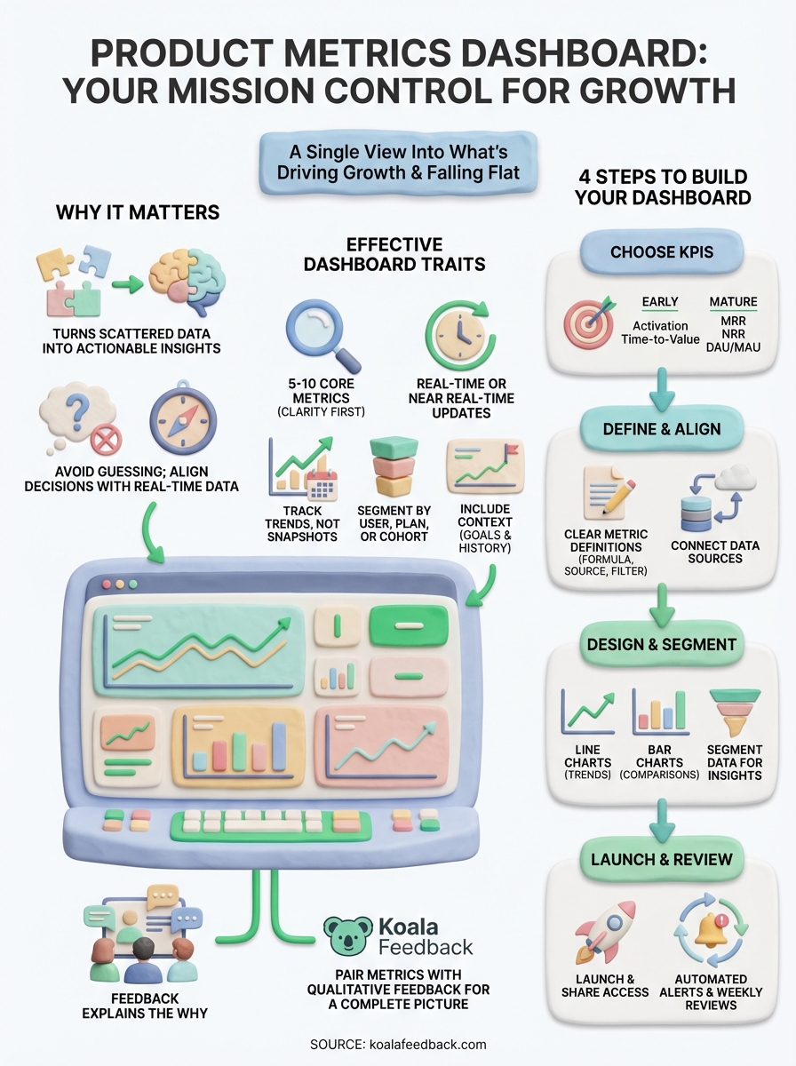
Your product metrics dashboard tracks the what, but user feedback explains the why. You now know which KPIs matter, how to define them clearly, and how to design a dashboard that surfaces insights instantly. Start by selecting your 5-7 core metrics, documenting their definitions, and choosing a tool that connects to your data sources. Launch with a simple version and refine based on what your team actually uses during those weekly review sessions.
Quantitative data from your dashboard reveals patterns, but qualitative feedback from users reveals the reasoning behind those patterns. When your activation rate drops or feature adoption plateaus, user feedback tells you what's broken, confusing, or missing. Koala Feedback helps you collect, organize, and prioritize that feedback alongside your metrics so you're building what users actually need. Pair your product metrics dashboard with direct user input and you get the complete picture: what's happening and why it matters.

Start today and have your feedback portal up and running in minutes.
