Your product is live, users are signing up, and features are shipping. But without tracking product health metrics, you're essentially flying blind, making decisions based on gut feeling rather than what's actually happening inside your product. These metrics tell you whether users are sticking around, finding value, or quietly walking away.
The tricky part isn't knowing that metrics matter. It's knowing which ones deserve your attention. Tracking everything leads to noise. Tracking too little leaves blind spots that cost you users and revenue.
This article breaks down six specific metrics that give you a clear read on adoption and retention, the two forces that determine whether your product grows or stalls. For each one, we'll cover what it measures, why it matters, and how tools like Koala Feedback can feed real user signals into your tracking so you're not just counting clicks, but understanding the people behind them.
Most product teams track usage data but ignore what users are actually saying. Feedback demand and sentiment are two of the most underused product health metrics, giving you a direct read on what users want and how they feel about what already exists.
Feedback demand tells you which parts of your product users care about most, while sentiment reveals whether their experience is working for them or frustrating them. Together, they give you a qualitative layer that pure usage data misses. Koala Feedback centralizes this by aggregating requests, votes, and comments into a single view, so you stop piecing together signals from scattered support tickets and emails.
Tracking feedback volume alone is not enough. Sentiment tells you whether high demand is coming from excited users or frustrated ones.
You calculate feedback demand by counting unique requests or votes for a specific feature or issue within a defined time period. For sentiment scoring, you can tag feedback manually as positive, negative, or neutral, or use Koala Feedback's categorization to group similar requests and surface patterns across your entire user base.
At early stage, high feedback volume on core workflows is a healthy sign that users are engaged enough to tell you what is broken or missing. At growth stage, you want to see sentiment shifting positive as you ship improvements, with demand concentrating around expansion features rather than basic bug fixes.
The goal is more honest feedback, not just more feedback. You can improve this metric by reducing friction in your submission process and prompting users at meaningful moments, like right after they complete a key task. Avoid incentivizing volume directly, since that inflates numbers without improving signal quality. Koala Feedback's voting system lets users validate existing requests rather than submitting duplicates, which keeps your demand data clean and actionable.
Activation rate is one of the most direct product health metrics you can track. It measures what percentage of new users reach the moment where your product delivers its first real value.
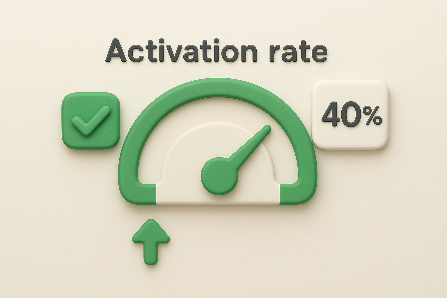
Activation rate tracks how many new users complete a specific action that signals they've experienced your product's core value. Users who never activate almost never convert to paying customers or long-term retained users. A low activation rate means your onboarding is losing people before they ever see why they should stay.
Divide the number of users who completed your activation event by total new users in a given period, then multiply by 100. If 200 out of 500 new users activate, your activation rate is 40%.
Activation rate is a leading indicator of retention. If users never activate, improving later-stage metrics becomes nearly impossible.
Your activation event should be the single action most closely tied to long-term retention in your data. Good examples include:
Avoid vague milestones like "logged in twice," which tell you nothing about value actually delivered to the user.
Get users to the activation event faster by removing unnecessary setup steps and adding contextual in-app prompts at the right moment. Surface your product's core value before asking users to configure advanced settings or explore on their own.
Feature adoption rate sits at the intersection of product development and user behavior. It tells you whether the features you're building are actually getting used, which is one of the most telling product health metrics in your entire tracking stack.
Feature adoption rate measures the percentage of your active users who use a specific feature within a defined time window. A feature nobody uses is a feature that delivered no value, regardless of how long it took to build. Tracking this metric helps you cut what is not working and double down on what is.
A low feature adoption rate often signals a discovery or onboarding problem, not necessarily a bad feature.
Divide the number of users who used the feature by your total active users in the same period, then multiply by 100. If 150 out of 600 active users engage with a feature, your adoption rate is 25%.
Aggregate adoption numbers hide what is actually happening. Break the metric down by user segment, such as plan tier, company size, or sign-up cohort. Adoption among power users tells a very different story than adoption among users in their first week.
Surface new features at the right moment in the user journey using contextual tooltips or in-app prompts tied to relevant actions. Pushing announcements to users who have no reason to care about a feature generates noise and lowers your signal quality.
Engagement and stickiness sit at the core of any honest set of product health metrics. They tell you whether users are returning to your product by habit or just showing up once and drifting away.
Engagement measures how actively users interact with your product over time, while stickiness measures how often they return relative to how many are active at all. A product with high stickiness has become part of a user's regular workflow, which is one of the clearest signals that you're delivering consistent value.
High stickiness means users choose to return on their own, not because you nudged them.
Calculate stickiness by dividing your Daily Active Users (DAU) by your Monthly Active Users (MAU), then multiplying by 100. A ratio of 20% or higher is considered strong for most SaaS products, though the right benchmark depends on your product's natural usage frequency.
Your use case determines what healthy engagement looks like. A daily task management tool should see stickiness above 30%, while a quarterly reporting tool might show strong retention at 5% DAU/MAU. Comparing your numbers against the wrong benchmark leads to bad decisions, so anchor your engagement targets to your product's intended usage pattern.
Build engagement by tightening the loop between a user's trigger, their action, and the reward they get from your product. Reduce the steps between login and value delivery, and use in-app prompts tied to real workflow moments rather than generic re-engagement messages that users learn to ignore.
Retention rate by cohort is one of the most diagnostic product health metrics you can run. Instead of showing you a single blended number, it breaks retention down by when users signed up, so you can see exactly where each group drops off and why.
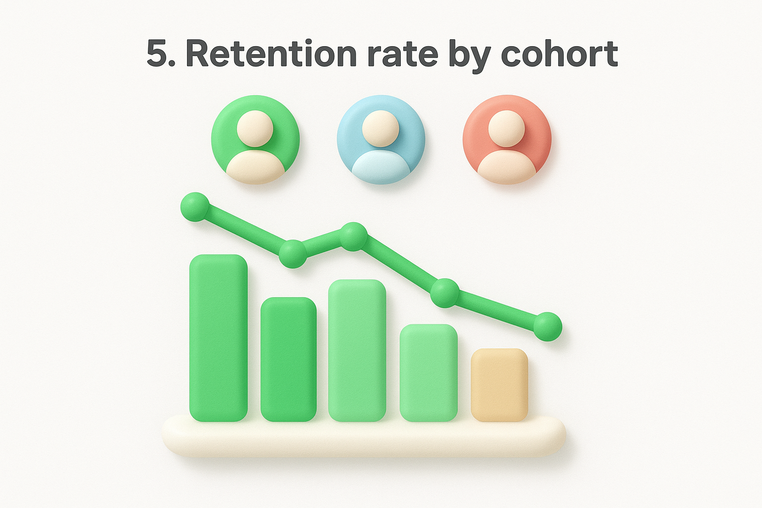
Cohort retention measures the percentage of users from a specific signup period who remain active over subsequent weeks or months. This matters because a rising overall retention rate can hide the fact that recent cohorts are churning faster than older ones.
Cohort retention exposes trends that aggregate numbers bury, giving you a timeline of exactly when users lose interest.
Divide the number of users from a cohort who are still active in a given period by the total users in that cohort at signup, then multiply by 100. If 80 users from your January cohort are still active in month three out of 200 who signed up, your month-three retention is 40%.
Group users by signup date, acquisition channel, or plan type so your cohorts reflect real distinctions in user behavior. Avoid cohorts so small that a handful of churned users skews the entire percentage.
Identify the exact week or month where each cohort shows its steepest drop, then investigate what users were doing, or not doing, right before that point. Targeted lifecycle messages tied to those specific friction moments outperform generic re-engagement campaigns every time.
Churn and expansion are the two opposing forces that determine your net revenue growth. Tracking both together gives you a complete picture of whether your product is winning more value from users than it is losing, which makes this pairing one of the most financially critical product health metrics in your stack.
Churn rate measures the percentage of customers or revenue you lose in a given period, while expansion revenue measures the additional revenue you earn from existing customers through upgrades or add-ons. Monitoring both tells you whether your growth is real or just new customers masking a leaky bucket underneath.
Net negative churn, where expansion revenue exceeds lost revenue, is the clearest sign your product delivers compounding value.
Divide churned customers or revenue by total customers or revenue at the start of the period, then multiply by 100. For expansion, divide new revenue from existing accounts by total revenue at the start of the period and multiply by 100. Subtract churn rate from expansion rate to find your net revenue churn.
Voluntary churn happens when users actively choose to leave, while forced churn results from failed payments or account issues. Treat these separately because they require entirely different responses.
Address voluntary churn by identifying users showing disengagement signals early and reaching out before they cancel. Drive expansion by surfacing upgrade triggers tied to genuine usage limits, not artificial paywalls that frustrate users.
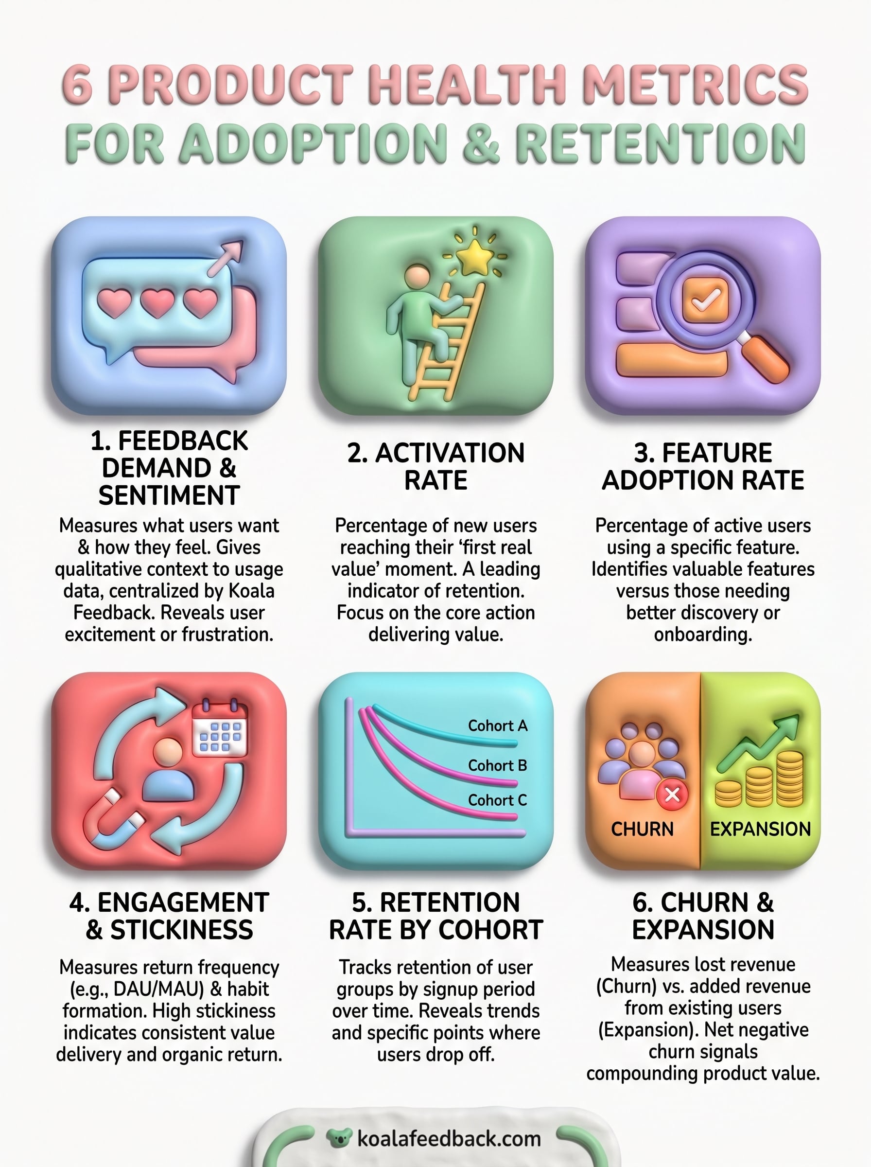
Tracking these six product health metrics gives you a complete picture of where users find value, where they drop off, and what drives them to stay or leave. Each metric builds on the others: activation feeds retention, retention shapes churn, and feedback demand tells you which direction to move next. Used together, they replace guesswork with a clear signal you can act on.
Start by picking the two or three metrics that reflect your biggest current uncertainty. If you are unsure why users leave, focus on cohort retention and churn. If growth feels slow despite steady signups, look at activation rate and feature adoption first. Fixing the right problem early compounds over time in ways that broad, unfocused measurement never does.
If you want real user signals feeding directly into your prioritization, try Koala Feedback to centralize feedback, track demand, and keep your users informed as you build.

Start today and have your feedback portal up and running in minutes.