If you've searched chartmogul saas metrics, you're probably staring at a dashboard full of numbers and wondering which ones actually matter. ChartMogul built its reputation on tracking subscription revenue, and its metrics definitions and benchmark reports have become a reference point for SaaS teams trying to make sense of MRR, churn, and LTV without guessing at formulas.
This article breaks down exactly what ChartMogul's SaaS metrics are, how each one is calculated, and where they fit into a broader picture of business health. You'll get clear definitions for the metrics that show up most often in board meetings and investor updates, plus practical context on benchmark data so you know whether your numbers are competitive or a warning sign.
We'll also connect the dots between tracking revenue metrics and tracking the feedback that drives them. Numbers tell you what's happening to your business, but user feedback tells you why. Understanding both gives you a sharper view of what to build next and how to prioritize it, which is exactly where a feedback and roadmap tool like Koala Feedback fits into the picture.
By the end, you'll know which metrics deserve your attention and how to use them alongside real user input to make better product decisions.
Subscription businesses live and die by a handful of numbers, and ChartMogul's SaaS metrics became the standard reference because they gave founders and investors a shared language for talking about revenue health. Before ChartMogul popularized clean definitions of MRR, churn, and LTV, teams routinely calculated the same metric five different ways and argued about whose spreadsheet was right. That inconsistency made it nearly impossible to compare performance across companies or even across quarters within the same company.
Consistency matters more than most teams realize. When your board asks about net revenue retention, you need a definition that matches what investors see across their entire portfolio, not a custom formula your finance team invented last year. ChartMogul's definitions solved that problem by becoming a de facto industry standard, which is why so many SaaS operators still reference their glossary and benchmark reports today.
Clear metric definitions turn subjective opinions about growth into objective, comparable facts.
Raw numbers without context tell you almost nothing. A 3% monthly churn rate sounds fine until you learn that top-quartile SaaS companies in your segment sit closer to 1%. ChartMogul's benchmark reports, drawn from anonymized data across thousands of subscription businesses, give you that comparison point. According to the U.S. Small Business Administration, understanding your financial position relative to industry norms is a core part of sound business planning, and SaaS metrics are no exception. Without benchmarks, you're flying blind, celebrating numbers that might actually signal trouble.
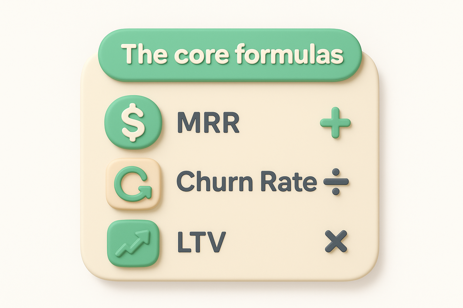
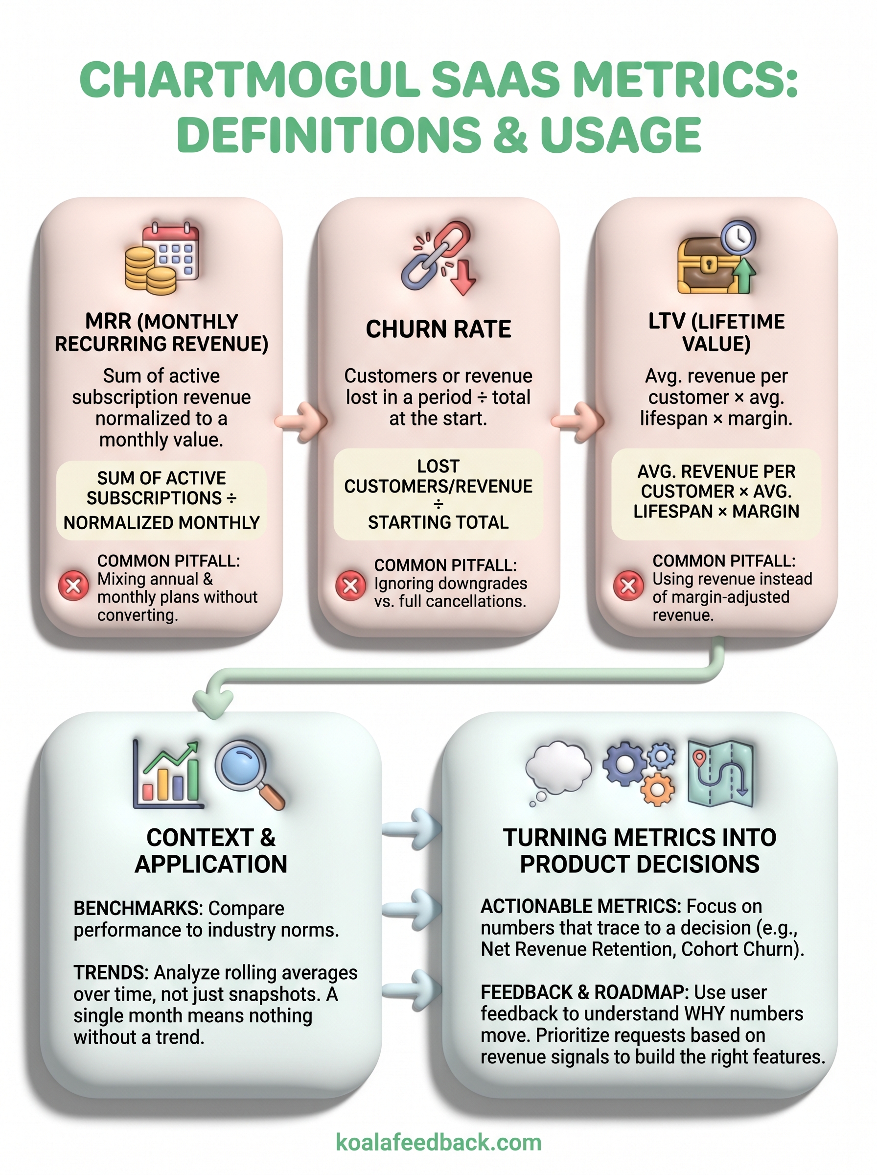
Getting the formulas right matters less than getting them consistent. MRR (Monthly Recurring Revenue) is the sum of all active subscription revenue normalized to a monthly value. Churn rate divides customers or revenue lost in a period by the total at the start of that period. LTV multiplies average revenue per customer by average customer lifespan, adjusted for gross margin. None of these are complicated on their own, but small inconsistencies compound fast across a growing customer base.
| Metric | Formula | Common pitfall |
|---|---|---|
| MRR | Sum of active subscriptions, normalized monthly | Mixing annual and monthly plans without converting |
| Churn Rate | Lost customers or revenue ÷ starting total | Ignoring downgrades vs full cancellations |
| LTV | Avg. revenue per customer × avg. lifespan × margin | Using revenue instead of margin-adjusted revenue |
Spreadsheets work early on, but they break down once you have multiple pricing tiers, discounts, and mid-cycle upgrades. Billing-integrated tools pull data directly from Stripe or your payment processor, which removes the manual entry errors that quietly skew reports. Tracking consistently, month over month, matters more than picking the perfect tool.
Numbers only matter if they change what you do next. Growth-stage decisions like where to invest in marketing, when to raise prices, or whether to expand into a new segment should all trace back to trends in your MRR, churn, and LTV rather than gut feeling. If your LTV to CAC ratio drops below 3:1, that's a signal to slow acquisition spend and fix retention before pouring more money into growth.
Single data points mislead you. A month of high churn could be a fluke, a failed billing run, or an actual product problem, and you won't know which until you look at the trend line across several months. Rolling averages smooth out noise and reveal whether a metric is genuinely improving or just having a good week.
A single month of good numbers means nothing without a trend to back it up.
Each metric should point to an owner and an action, not just a chart nobody revisits.
Even teams that know the formulas cold still trip over the same errors. Inconsistent definitions across departments cause the most damage: finance counts a downgrade as partial churn while product counts it as none, and suddenly two teams present different numbers in the same meeting.
Comparing this month's new customer LTV against last year's blended average feels like progress until you realize you're comparing apples to a fruit basket. Cohort consistency matters just as much as formula consistency, so always specify the time window and customer segment behind any number you report.
If two people can calculate the same metric two different ways, the metric isn't actually being tracked.
Total signups and pageviews feel good to report, but they rarely predict revenue health. Focus on actionable metrics that trace directly to a decision:
Skipping this discipline leads to dashboards that look impressive but never actually change what your team builds next.
Metrics tell you something is wrong, but they rarely tell you what to build to fix it. Rising churn in a specific plan tier points to a problem, yet revenue data alone can't tell you whether customers are leaving because of missing features, confusing pricing, or a competitor's better onboarding. That's the gap user feedback fills, and it's why teams pairing ChartMogul-style metrics with a structured feedback process make faster, more confident calls.
Start by matching the metric trend to a feedback question. If LTV is flat in one segment, ask those customers directly what's missing. A feedback portal where users submit and vote on ideas turns vague churn signals into a ranked list of specific requests:

Metrics show you the symptom; user feedback shows you the cause.
Once you've prioritized requests tied to real revenue signals, publish the plan. A public roadmap shows customers you're acting on their input, which itself protects retention and, eventually, the metrics you started with.
ChartMogul's definitions gave the SaaS world a common language for MRR, churn, and LTV, but a shared vocabulary only helps if you actually act on what the numbers show you. Tracking metrics consistently, comparing them against real benchmarks, and reading trends instead of snapshots gets you halfway there. The other half comes from asking your customers why the numbers moved, then turning those answers into a prioritized plan.
That's where structured feedback closes the loop that revenue data alone can't close. Rising churn or flat MRR points to a problem, but your users can tell you exactly what's driving it if you give them a clear way to speak up and a roadmap that shows you're listening.
If you're ready to pair your metrics with the feedback that explains them, start collecting and prioritizing feedback with Koala Feedback and turn those numbers into decisions your users actually notice.

Start today and have your feedback portal up and running in minutes.