Your users are leaving. They click away within seconds, frustrated by confusing navigation or slow loading times. Your bounce rates climb while conversions drop. You know something needs to change, but figuring out how to improve user experience feels overwhelming. The problem is not your product. It is how people interact with it.
This guide walks you through seven proven strategies that make your site easier to use and more enjoyable. You will learn how to collect feedback that matters, optimize for mobile users, speed up your pages, and create accessible designs. Each strategy includes practical steps you can implement immediately. By the end, you will have a clear roadmap to transform frustrated visitors into engaged users who stick around.
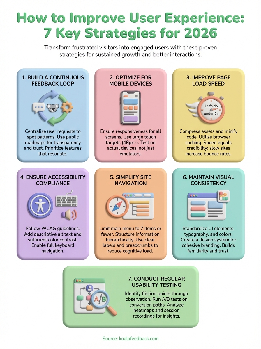
You cannot improve what you do not measure, and assumptions about user needs often miss the mark. Building a continuous feedback loop gives you direct insight into what frustrates users and what features they actually want. This approach transforms your product development from guesswork into a data-driven process that consistently delivers value.
Your users experience problems that never appear in your analytics dashboard. They encounter friction points you never anticipated and desire features that seem obvious only after someone mentions them. Direct feedback captures these insights before users abandon your product for a competitor. Internal teams often develop tunnel vision, but users provide the outside perspective that reveals blind spots in your design and functionality.
"The best way to know what users want is to ask them directly and track what they request most often."
Scattered feedback across email, support tickets, and social media creates chaos. Centralizing all requests in one platform lets you spot patterns and identify which improvements matter most. Koala Feedback automatically deduplicates similar requests and allows users to vote on features they want, giving you clear prioritization metrics. This voting system reveals which changes will satisfy the largest segment of your user base, helping you allocate development resources efficiently. You see what resonates with your audience instead of building features that sound good in planning meetings but fail to address real user needs.
Collecting feedback means nothing if users never see results. A public roadmap shows users that you heard them and took action. When people see their requested features moving from "planned" to "in progress" to "completed," they feel invested in your product's success. This transparency builds trust and reduces support inquiries about feature availability. Users who understand your development timeline become more patient and less likely to churn. Roadmaps also set clear expectations, preventing frustration when features take time to build. Learning how to improve user experience requires this full-circle approach where feedback leads to visible action.
Mobile users now represent the majority of web traffic, yet many sites still treat mobile optimization as an afterthought. Your desktop design might look perfect on a large monitor, but those same elements become unusable on smaller screens. Users who struggle with tiny buttons or horizontal scrolling abandon sites within seconds. Mobile optimization is not about shrinking your desktop site. It is about creating an experience tailored to how people actually use their phones.
Google ranks mobile-friendly sites higher in search results because over 60% of searches now happen on mobile devices. Your site must adapt to different screen sizes automatically or you lose both visibility and conversions. Users expect pages to load quickly and display correctly without zooming or panning. Responsive design affects your bottom line directly because frustrated mobile users rarely return.
"A poor mobile experience costs you traffic, rankings, and revenue simultaneously."
Fingers are less precise than mouse cursors. Your clickable elements need minimum dimensions of 48 pixels to prevent accidental taps. Space buttons apart so users can tap the right target on their first attempt. Text must scale appropriately without requiring pinch-to-zoom. Forms become especially problematic on mobile when input fields are too small or positioned awkwardly. Understanding how to improve user experience means designing for thumbs instead of cursors.
Your site looks different on an iPhone, Android tablet, and foldable device. Test on actual devices rather than relying solely on browser emulators. Screen dimensions vary dramatically, and real hardware reveals performance issues that simulators miss. Pay attention to how images scale, where content breaks appear, and whether navigation remains accessible across all sizes.
Speed determines whether users stay or leave. Pages that load in under two seconds keep visitors engaged, while slower sites watch potential customers disappear. Every additional second of loading time increases your bounce rate by 7% and directly impacts your revenue. Users expect instant access to information, and technical delays feel like broken promises. Your server response time, image sizes, and code efficiency all contribute to the overall experience.
Visitors make snap judgments about your site's quality based on load speed. When pages take more than three seconds to appear, over half of mobile users abandon them entirely. This impatience is not unreasonable. Slow sites signal poor quality, outdated technology, or lack of professionalism. Search engines recognize this behavior pattern and rank faster sites higher because they provide better experiences. Understanding how to improve user experience starts with acknowledging that speed equals credibility in users' minds.
"Every second of delay costs you both visitors and conversions simultaneously."
Large image files are the primary culprit behind slow pages. Compress images to reduce file sizes by 60% or more without visible quality loss. Remove unnecessary spaces, line breaks, and comments from your CSS and JavaScript files through minification. This process shrinks code files significantly while preserving functionality. Modern image formats like WebP offer better compression than older JPEG and PNG standards.
Browser caching stores previously downloaded assets on users' devices. Returning visitors load pages instantly because their browser pulls resources from local storage instead of requesting everything again. Configure your server to tell browsers which files to cache and for how long. Content delivery networks distribute your assets across multiple servers globally, reducing the physical distance data travels to reach users.
Millions of potential users struggle with websites that ignore accessibility standards. People who rely on screen readers, keyboard navigation, or alternative input devices encounter barriers on sites that were never designed with them in mind. Accessibility is not just about legal compliance. It expands your audience significantly while creating a better experience for everyone. Features that help users with disabilities often improve usability for all visitors.
Approximately 15% of the global population lives with some form of disability. Excluding this audience means losing customers and facing potential legal action. Many countries enforce accessibility requirements through regulations like the Americans with Disabilities Act. Beyond compliance, accessible sites rank higher in search results because search engines favor well-structured, semantic HTML. Understanding how to improve user experience requires recognizing that accessibility benefits everyone, from temporary injuries to situational limitations like bright sunlight on screens.
The Web Content Accessibility Guidelines provide clear benchmarks for accessible design. Start by ensuring all images include descriptive alt text that screen readers can interpret. Add sufficient color contrast between text and backgrounds so users with visual impairments can read your content. Make all functionality available through keyboard navigation alone. Label form fields explicitly so assistive technology conveys their purpose to users.
"Accessible design removes barriers for some users while improving experience for all."
Install popular screen readers like NVDA or JAWS and navigate your site without looking at the screen. Listen to how the software interprets your content structure. Verify that headings follow logical hierarchy and that interactive elements announce their purpose clearly. Test whether users can complete critical tasks using only keyboard commands.
Users abandon websites when they cannot find what they need quickly. Navigation should feel invisible and intuitive, guiding visitors to their destination without conscious effort. Complex menu structures, inconsistent labels, and hidden navigation elements create frustration and confusion. Every additional click or decision point increases the likelihood that users give up entirely. Mastering how to improve user experience means removing obstacles between your visitors and their goals.
Your navigation should require minimal mental effort to understand. Limit your main menu to seven items or fewer because human working memory handles that many choices comfortably. Group related pages under clear parent categories so users can predict where information lives. Avoid creative menu labels that prioritize cleverness over clarity. Users scan rather than read, so familiar terms like "Services" or "Contact" work better than vague alternatives.
"The best navigation is the one users never need to think about."
Organize your content in logical layers that move from general to specific. Your homepage should present broad categories while deeper pages contain detailed information. This pyramid structure matches how people naturally search for information. Users who land on your site should understand the scope of available content within seconds.
Breadcrumb trails show users their current location within your site hierarchy. These navigational aids reduce confusion and make backtracking effortless. Label every link and button with descriptive text that explains exactly where it leads. Generic phrases like "Click Here" waste opportunities to inform users about their destination.
Visual inconsistencies signal unprofessionalism and confuse users. When buttons change colors across pages, fonts vary randomly, or layouts shift unexpectedly, visitors question your credibility and attention to detail. Consistent design creates a predictable environment where users focus on completing tasks instead of relearning your interface on every page. A unified visual language builds familiarity and trust that keeps people engaged with your product.
Users subconsciously evaluate your reliability based on visual coherence. Sites with matching color schemes, consistent spacing, and uniform styling across all pages appear more trustworthy than those with haphazard designs. Your brand colors, logo placement, and imagery style should remain identical everywhere visitors encounter them. This consistency extends beyond your website to email templates, social media profiles, and marketing materials.
"Visual consistency transforms random elements into a unified brand experience that users recognize instantly."
Buttons should look and behave the same way throughout your entire site. Choose specific button styles for primary actions, secondary options, and destructive commands, then apply these standards universally. Limit your typography to two or three font families maximum and establish clear hierarchy rules for headings, body text, and captions. Define exact pixel values for margins, padding, and border radius.
A documented design system prevents visual drift as your team grows. Record your color palette with hex codes, button specifications, spacing units, and component behaviors in a shared reference guide. This documentation ensures that developers and designers implement features identically without constant clarification. Knowing how to improve user experience includes creating reusable components that maintain consistency automatically across your product.
Assumptions about user behavior often prove wrong when real people interact with your product. Regular usability testing reveals friction points that analytics alone cannot detect. Watching users struggle with tasks that seem obvious to you provides invaluable insights into where your interface fails. Testing transforms abstract data into concrete examples of confusion, frustration, and delight that guide meaningful improvements.
Observe users attempting to complete specific tasks without your assistance. Record where they hesitate, backtrack, or abandon their goals entirely. Common friction points include confusing form fields, unclear button labels, or navigation that leads users in circles. Recruit testers who match your target audience demographics and give them realistic scenarios to complete. Understanding how to improve user experience requires identifying these exact moments where users hit barriers.
"Real users reveal problems that teams immersed in the product cannot see."
Test variations of critical pages where users make purchase decisions or sign up for your service. Change one element at a time, whether that is headline copy, button color, or form length. Measure which version drives higher conversion rates and implement the winner. Statistical significance matters, so run tests until you collect enough data to make confident decisions.
Heatmaps show where users click, scroll, and spend time on your pages. These visual representations reveal which elements attract attention and which get ignored completely. Session recordings capture actual user journeys through your site, exposing navigation patterns you never anticipated.
Learning how to improve user experience requires consistent action across multiple fronts. You cannot fix everything overnight, but implementing these seven strategies systematically transforms how users interact with your product. Start with the areas causing the most friction for your current users, whether that means speeding up your slowest pages, collecting feedback on features people actually want, or simplifying navigation paths that confuse visitors.
Sustainable improvement depends on continuous monitoring and iteration rather than one-time fixes. Build processes that keep you connected to user needs through regular testing, feedback collection, and performance analysis. Track metrics that matter, respond to user input promptly, and maintain the visual consistency that builds trust over time. Small improvements compound significantly when you apply them consistently across your entire product.
Koala Feedback centralizes user feedback and helps you prioritize improvements based on what your audience values most. Your users know exactly what frustrates them and which features would make their experience better. Give them a voice in your product development and watch engagement grow as you build what matters.

Start today and have your feedback portal up and running in minutes.
