You built a product users signed up for, but now they're not coming back. Activation rates stall, feature adoption flatlines, and the metrics you check each morning refuse to budge. You know engagement drives retention and growth, but knowing what levers to pull and when feels like guesswork. The question of how to increase user engagement keeps surfacing in every product meeting, yet most advice you find offers surface level tactics without the underlying principles that make them work.
This guide walks through 16 science backed tactics that product teams use to boost engagement across the user lifecycle. You'll learn how to centralize feedback, design onboarding that delivers fast wins, guide users without annoying them, and build habits that stick. Each tactic includes the psychological principle behind it, practical implementation steps, and metrics to track success. Whether you're fighting churn in a mature product or trying to activate trial users, these strategies give you a clear path from strategy to measurable results.
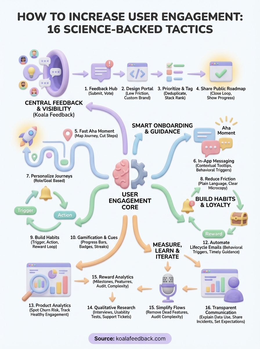
Users disengage when they feel unheard. Scattered feedback across email threads, support tickets, and social channels creates a black hole where requests disappear and users assume you ignore them. A centralized feedback system transforms this dynamic by giving every user a visible platform to submit ideas, vote on requests from others, and track what you build. When users see their input shape your roadmap, engagement climbs because they now have skin in the game.
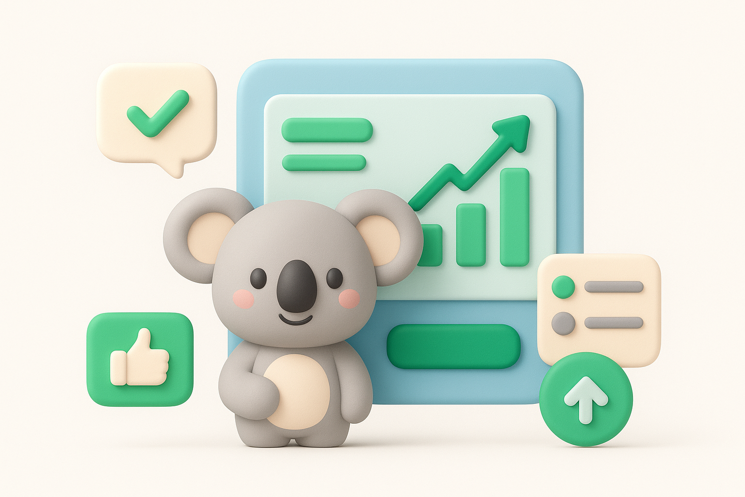
A dedicated feedback portal turns passive users into active participants in your product direction. Voting mechanisms let users signal which features matter most without sending another email, while comment threads create mini communities around specific requests. This visibility proves you listen and gives users confidence that their time investment pays off. The psychological principle is simple: people engage more with products they feel ownership over, and watching their feedback move from idea to shipped feature builds that sense of ownership.
Your feedback portal needs low friction submission and clear organization to work. Users should land on a page that explains how to increase user engagement through their input in seconds, not minutes. Custom branding with your domain, colors, and logo makes the portal feel native to your product rather than a tacked on third party tool. Organize feedback into boards that mirror how users think about your product, not how your internal teams are structured.
Raw feedback volume overwhelms without structure. Automatic deduplication catches similar requests and merges them so you see true signal, while tagging by category lets you filter by product area or customer segment. You can spot patterns faster when feedback groups itself logically instead of appearing as an endless chronological stream. Prioritization boards help you stack rank requests based on votes, strategic fit, and effort required.
When users see their feedback organized and acted upon, they shift from passive consumers to engaged contributors.
Collecting feedback means nothing if users never see what you do with it. Public roadmaps that display planned, in progress, and completed features close this loop by showing users their input influenced real decisions. You can customize status labels to match your development process and set realistic expectations about timing. Users who watch items move from requested to shipped return more often because they trust you deliver on what matters to them.
New users abandon products before experiencing core value because onboarding drags them through unnecessary steps or dumps too much information at once. Your goal is to compress the time between signup and the moment users realize your product solves their problem. This aha moment varies by product, but finding it and designing a straight path to reach it separates products that retain from those that churn. Understanding how to increase user engagement starts with nailing this critical first experience.
You need to identify the specific action that triggers value recognition in your product. Track activation metrics by analyzing cohorts who became engaged users and reverse engineer what they did differently in their first session. Document every step between signup and that defining action, then ruthlessly cut steps that don't directly support reaching it. Your map should highlight exactly where users get stuck so you know which friction points to smooth first.
Interactive walkthroughs overwhelm users when they explain everything upfront. Contextual guidance that appears only when users need it beats forced tours that interrupt natural exploration. Checklists work when they focus on three to five critical actions that unlock value, not exhaustive feature lists. Let users skip or dismiss guides without feeling lost, because forcing engagement through annoying prompts backfires into immediate abandonment.
The best onboarding feels invisible because it anticipates user intent rather than demanding attention.
Different user segments need different paths to value. Role based questions during signup let you tailor the first experience to match how a marketer versus a developer will use your product. Show features relevant to their stated goal instead of a generic tour that wastes their time. Personalization increases perceived relevance and speeds up the journey to their specific aha moment.
Define what activated user means for your product, then track what percentage of signups reach that state within key time windows. Monitor how long users take to complete their first valuable action and look for patterns in users who activate quickly versus those who never return. These metrics tell you whether your onboarding improvements actually work or just shuffle friction to different points in the journey.
Users abandon flows when they hit confusion and no help appears at the moment they need it. In app messaging meets users where they struggle by surfacing contextual guidance without forcing them to leave your product or search documentation. These messages range from subtle tooltips near unfamiliar buttons to modal announcements that introduce new features. When you time and target messages correctly, you remove friction that causes users to quit, which directly addresses how to increase user engagement by keeping people moving forward instead of bouncing.
Tooltips work best when they appear exactly where users pause or hover over an element. Position tooltips near the action they explain rather than floating them in generic screen locations. Write clear, concise explanations that answer the immediate question without requiring users to read paragraphs. Your tooltip should disappear after users interact with the element so it doesn't clutter their workspace on subsequent visits.
Behavioral triggers beat time based messages because they respond to what users actually do instead of guessing when they need help. Fire a message when someone hovers over a button for three seconds without clicking, or when they revisit the same page multiple times without completing an action. You can trigger re engagement messages when users go dormant for seven days to remind them of unfinished tasks or new features that match their past activity.
Messages that respond to real behavior feel helpful rather than intrusive because they arrive when users signal they need assistance.
Users hate being interrupted by messages they can't dismiss or skip. Always include a clear close button and let users permanently dismiss recurring tips after they've seen them once. Limit how many messages you show in a single session to avoid overwhelming new users with constant popups. Track dismissal rates to identify annoying messages that users close without reading.
Measure whether your messages actually help by tracking click through rates on links or calls to action within them. Compare task completion rates for users who saw a message versus those who didn't to validate the guidance worked. High dismissal rates combined with low click through signal that your message timing, placement, or content misses the mark and needs revision.
Users complete more tasks when they see visible progress toward a goal. Gamification mechanics like progress bars, badges, and streaks tap into psychological principles that make finishing feel rewarding. You don't need complex point systems or leaderboards to benefit from these tactics. Simple visual indicators that show users how far they've come and what remains unlock completion bias, the human tendency to finish what we start. When you apply gamification thoughtfully, you answer how to increase user engagement by making routine actions feel like meaningful achievements.
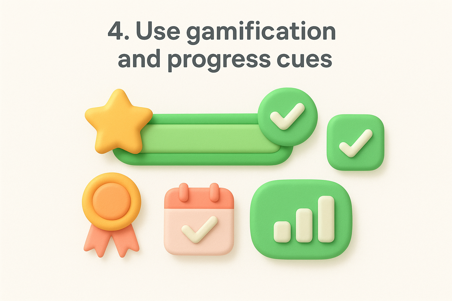
Progress bars transform abstract goals into concrete visual feedback. Display percentage completion for profile setup, feature adoption checklists, or any multi step process users should finish. You can break large goals into smaller milestones so users experience wins earlier and build momentum. Showing progress creates a psychological pull to reach 100% that keeps users returning until they complete the sequence.
Visible progress transforms passive users into motivated completers by showing them exactly how close they are to finishing.
Badges work when they recognize real accomplishments tied to product value. Celebrate milestones like completing a first project, inviting team members, or using your product for 30 consecutive days. Streak counters leverage loss aversion by making users reluctant to break a chain of daily activity. You should limit badge types to avoid diluting their meaning and reserve them for behaviors that correlate with long term retention.
Design rewards around actions that drive actual value rather than surface metrics. Prioritize behaviors like completing workflows, adopting advanced features, or achieving outcomes over simply logging in or clicking around. Users who chase meaningless points disengage once the novelty fades, while those rewarded for valuable actions build habits that stick.
Too many game mechanics annoy users and feel manipulative. Respect user autonomy by making progress visible without forcing engagement through guilt or pressure. Skip fake urgency tactics or rewards that trick users into unwanted actions. Your gamification should enhance the experience rather than create artificial reasons to return.
Generic experiences drive users away because they ignore individual needs and goals. Segmentation lets you divide your user base into groups that share similar behaviors, characteristics, or desired outcomes, then craft experiences tailored to each group. When you show users relevant features and content based on their segment, you reduce noise and accelerate their path to value. This targeted approach transforms how to increase user engagement by making every interaction feel purposeful rather than scattershot.
Traditional segmentation by company size or industry tells you little about how users actually interact with your product. Behavioral data like feature usage patterns, login frequency, and workflow completion rates reveals which users need help versus which ones are ready for advanced capabilities. Create segments around actions that predict long term engagement, such as users who completed onboarding but never invited teammates, or power users who adopted three core features in their first week. You can combine behavioral signals with firmographic data to refine targeting, but behavior should drive your primary groupings.
Different personas need different journeys through your product. Build customized flows that match how a solo founder explores your platform versus how an enterprise administrator rolls it out to their team. Show beginner tutorials to new segments while surfacing advanced shortcuts to experienced users. Your navigation, feature recommendations, and empty states should adapt based on segment membership so users only see what matters to their role and maturity level.
Personalized paths reduce cognitive load by filtering out irrelevant options and highlighting exactly what each user needs next.
Segmentation should extend beyond your product into email, support responses, and marketing messages. Target lifecycle emails with content specific to each segment's stage and needs rather than blasting everyone with identical newsletters. Offer upgrade prompts that emphasize features your segment actually uses instead of generic benefit lists. Your support team can prioritize tickets and tailor responses when they see which segment a user belongs to.
Too many segments dilute your efforts and create maintenance nightmares. Start with three to five core segments that cover most users and expand only when clear patterns emerge that existing segments miss. Avoid creating segments around single edge cases or temporary behaviors. Review segment definitions quarterly to ensure they still align with how users actually engage and retire segments that no longer add value.
Confusing labels and vague instructions kill engagement faster than bugs. Words guide users through your interface, and when copy fails, users hesitate, misclick, or abandon tasks they can't understand. Your buttons, error messages, and empty states either clarify next steps or add cognitive load that drives people away. Smart UX writing treats every word as a design element that shapes how to increase user engagement by removing confusion at critical decision points.
Technical jargon alienates users who don't share your internal vocabulary. Replace industry terms with everyday language that users actually speak when describing their goals. Your signup flow, checkout process, and first run experience need words that explain exactly what happens when users click each button. Audit these paths for phrases that require users to pause and decode meaning, then rewrite them using simpler alternatives that communicate instantly.
Microcopy appears in form labels, helper text, and tooltips to guide users through complex actions. Tell users what to expect after they submit a form or enable a setting instead of leaving outcomes ambiguous. You should explain why you need specific information and how you'll use it to reduce hesitation around sensitive inputs. Short clarifying phrases prevent errors and build confidence that users understand consequences before they commit.
Generic labels like "Submit" or "Next" force users to remember context from elsewhere on the page. Action oriented button text that describes the specific result works better, such as "Create Project" or "Invite Team Members." Empty states need clear guidance about what users should do first rather than displaying blank screens that suggest something broke. Run quick preference tests on alternative phrasings to see which versions reduce confusion.
Clear microcopy transforms uncertainty into confident action by removing guesswork from every interaction.
Track completion rates for forms and workflows before you change copy so you have a baseline. Monitor where users abandon tasks and correlate those points with copy that might confuse or overwhelm them. After rewriting, compare new completion rates to validate that clearer language actually improved outcomes rather than just sounding better to your team.
Users who form habits around your product stick longer than those who rely on willpower to remember to log in. Habit formation follows a predictable loop where a trigger prompts an action that delivers a reward, and this cycle repeats until the behavior becomes automatic. Your job is to identify which actions create lasting value and design your product to reinforce that loop consistently. When you understand how to increase user engagement through habitual use, you shift from pushing users to return toward building systems that pull them back naturally.
Your product has one or two actions that, when repeated, deliver compounding value over time. Map the trigger that starts the loop, such as a notification, a scheduled event, or an internal motivation like checking progress. Document the core action users take in response, whether that's reviewing feedback, updating a project, or analyzing new data. Finally, define the reward that makes the action worth repeating, which could be discovering insights, completing a task, or seeing measurable progress toward a goal.
Effective triggers feel helpful rather than intrusive because they align with user intent and timing. Send notifications when new information arrives that users specifically asked to track, not random alerts that train them to ignore you. You can surface contextual reminders inside your product when users open it rather than relying solely on external interruptions. The best cues tie directly to outcomes users care about and arrive when they're most likely to act.
Habits stick when cues connect to existing routines rather than demanding users create entirely new behaviors.
Users abandon habit loops when rewards feel distant or inconsistent. Instant feedback that shows the impact of each action keeps the loop tight and satisfying, such as displaying updated metrics immediately after users input data. Design rewards that accumulate over time so repeated actions build visible progress rather than delivering the same static outcome. You want users to feel momentum from consistent engagement, not just one time wins.
Track what percentage of users who complete your core action in week one return to repeat it in weeks two, four, and eight. Cohort retention curves reveal whether your habit loop actually works by showing if engagement stabilizes or continues declining over time. Compare cohorts who experienced different onboarding flows or feature sets to identify which variables strengthen habit formation and which leave users falling off after initial activity.
Users hesitate to engage when they feel alone or uncertain about taking action. Social proof removes this hesitation by showing that others already use, trust, and succeed with your product. When you surface real user activity like recent sign ups, feature usage, or community contributions, you create a psychological pull that encourages new users to participate. This visibility transforms passive observers into active contributors because people naturally follow behaviors they see others performing successfully, which directly impacts how to increase user engagement across your entire user base.
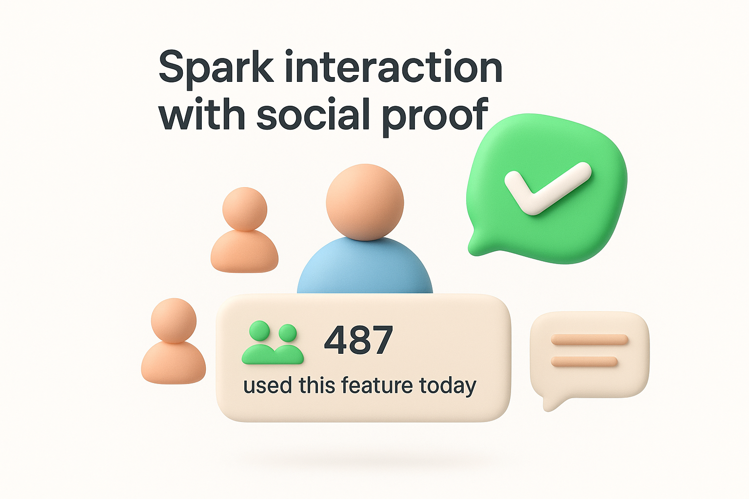
Display recent actions from real users to prove your product has an active community behind it. You can show counters like "487 teams used this feature today" or activity feeds that list anonymized recent achievements. Live indicators such as number of users currently online or projects created this week signal that others find ongoing value. This transparency reduces the psychological risk of being an early adopter or outlier.
Place customer quotes and success metrics at points where users need confidence to proceed, such as upgrade pages or complex feature introductions. Show aggregate statistics like total users, projects completed, or time saved that demonstrate scale and impact. You should feature testimonials from users similar to your current viewer rather than only showcasing enterprise clients when your audience consists of small teams.
Build spaces where users can share tips, templates, or solutions that help others succeed. Enable comments and replies on feedback requests or community posts to create visible conversations. Users engage more when they see active discussions rather than static content because interaction invites participation.
Social proof works because seeing others succeed reduces the perceived risk of trying something new yourself.
Never fabricate testimonials, inflate numbers, or display fake activity counters. Authentic signals build lasting trust while manufactured ones destroy credibility the moment users detect them. You should remove outdated social proof that no longer reflects current reality rather than leaving stale indicators that suggest your product lost momentum.
Static content invites passive consumption while interactive elements demand participation. Quick polls and surveys embedded directly in your product transform readers into responders by asking them to click, select, or share opinions. These lightweight interactions keep users engaged longer because each question creates a micro commitment that builds momentum toward deeper involvement. When you understand how to increase user engagement through interactivity, you stop treating users as passive observers and start creating two way conversations that reveal preferences while keeping attention locked on your product.
Single question polls work because they require minimal effort to complete. Place polls strategically where users naturally pause, such as after completing a task or viewing new content. Your questions should offer clear multiple choice options that users can answer in seconds without typing lengthy responses. Keep polls relevant to the current context rather than asking random questions that feel disconnected from what users are doing.
Multi question surveys inside your product overwhelm users and kill completion rates. Break complex surveys into individual questions that appear across multiple sessions rather than dumping everything into one long form. You can trigger each question based on specific user actions to maintain relevance and timing. This approach respects user attention while still gathering comprehensive feedback over time.
Connect survey answers directly to Koala Feedback so insights don't disappear into separate databases. Tag responses by user segment and question type to enable filtering when you analyze patterns. This integration ensures survey data influences product decisions alongside traditional feedback channels.
Micro interactions compound into meaningful engagement because each small action builds familiarity and investment in your product.
Look for consistent patterns across dozens or hundreds of responses before making product changes based on survey data. You should compare survey sentiment against actual usage behavior to validate whether stated preferences match real actions. Individual outlier responses deserve acknowledgment but not immediate roadmap changes.
Email remains powerful when you send the right message at the right moment based on what users actually do. Behavioral triggers beat calendar based email campaigns because they respond to real product activity rather than arbitrary time intervals. Your emails should guide users through their journey by addressing specific actions or inactions that signal where they are and what they need next. When you automate emails around behavior, you create a support system that scales personal guidance to thousands of users, which directly affects how to increase user engagement by keeping users moving forward even when they're outside your product.
Your email strategy needs different tracks for new trials, activated users, power users, and dormant accounts. Map the typical journey through your product and identify decision points where users either progress or stall. Build automated sequences that address the questions and obstacles unique to each stage rather than sending everyone identical messages. You can branch sequences based on engagement signals to ensure users receive increasingly relevant content as they mature.
Send emails when users complete meaningful actions like finishing onboarding, creating their first project, or inviting teammates. Milestone emails celebrate progress while suggesting logical next steps that build on what users just accomplished. You should also trigger re engagement messages when users go seven days without activity or abandon a started workflow. These behavioral triggers feel timely because they connect directly to user actions.
Behavioral triggers transform generic blasts into personalized guidance that arrives exactly when users need it most.
Educational content works when paired with specific calls to action that users can complete immediately. Your emails should teach concepts through brief examples then direct users back to your product to apply what they learned. Skip lengthy tutorials in favor of focused tips that solve a single problem and link to the relevant feature.
Monitor email open rates and click through rates to gauge which messages resonate with different segments. Measure return visits to your product after email sends to validate that messages actually drive engagement rather than just getting opened. You should A/B test subject lines and send times to optimize performance across your sequences.
Recognition transforms casual users into committed advocates when you celebrate behaviors that drive lasting value. Loyalty programs that acknowledge milestones like usage streaks, feature mastery, or anniversary dates make users feel valued beyond their subscription payment. Your rewards should reinforce actions that correlate with long term retention rather than one time spikes in activity. When you design recognition systems thoughtfully, you create emotional connections that keep users coming back because they feel invested in maintaining their status and unlocking new achievements.
Track milestones that reflect genuine product value like completing 100 tasks, managing 10 projects, or maintaining a 30 day login streak. Send personalized messages when users hit these thresholds that acknowledge their accomplishment and suggest what comes next. You can display achievement badges in user profiles or dashboards to make progress visible to the user and their team members. Recognition works best when it arrives immediately after users cross the milestone rather than days later when the moment loses impact.
Reward loyal users with benefits that enhance their existing workflows rather than generic discounts. Unlock premium features for power users who demonstrate consistent engagement or give early access to new capabilities before wider release. You might offer dedicated support channels, custom integrations, or increased usage limits as rewards that make your product more valuable to champions. These perks strengthen retention because they deepen dependence on your platform.
Rewards that enhance product value create stronger loyalty than those that simply reduce costs.
Your most engaged users want to share products they love when you make it easy and worthwhile. Build referral programs that reward both the referring user and their invitee with perks that benefit from network effects like additional seats or collaborative features. Display referral options prominently after users hit major milestones when satisfaction peaks. You should track which user segments generate the highest quality referrals and focus incentives on activating those groups.
Points systems that reward any activity regardless of value attract users who game mechanics without deriving real benefit. Focus incentives on behaviors that predict long term retention like completing core workflows or inviting teammates rather than superficial actions like daily logins. You need to ensure rewards appeal to your ideal customer profile rather than bargain hunters who churn immediately after collecting bonuses.
Users rarely churn without warning signs appearing in their usage data first. Product analytics reveal patterns that predict disengagement weeks before users cancel, giving you time to intervene with targeted outreach or product improvements. You need to establish what healthy engagement looks like for your product so you can spot deviations that signal trouble. When you instrument your product correctly and monitor the right metrics, you transform reactive churn management into proactive retention work that addresses how to increase user engagement before users decide to leave.
Your baseline for normal activity should reflect actions that correlate with long term retention rather than arbitrary usage thresholds. Track how often retained users log in, which features they adopt, and what workflows they complete regularly. You should define engagement tiers that segment users into groups like highly engaged, moderately engaged, and at risk based on behavioral patterns from your most successful cohorts. This framework gives you clear reference points when individual users drift from expected activity levels.
Monitor signals like login frequency declining, feature usage narrowing to fewer tools, or time between sessions expanding beyond normal ranges. Set up automated alerts when users drop below your engagement thresholds or stop using features they previously relied on. You can track metrics like days since last login, incomplete workflows, or ignored notifications to identify disengagement early. These indicators often appear two to four weeks before users actively consider churning.
Early warning systems catch churn risk while you still have time to re-engage users through product improvements or personalized outreach.
Create standard response protocols for different churn risk scenarios based on user segment and behavior. Your playbook might trigger personalized emails, in app messages, or account manager outreach depending on the user's value and engagement history. Document which interventions work for which situations so your team responds consistently and quickly when alerts fire. You should test multiple approaches to learn what brings different user types back.
Run controlled tests to validate whether suspected friction points actually cause disengagement. Compare cohorts who experience different onboarding flows, pricing structures, or feature sets to isolate which variables drive churn versus retention. Your experiments should measure both immediate changes in engagement metrics and downstream effects on renewal rates weeks later. This evidence based approach prevents you from fixing symptoms while missing underlying problems.
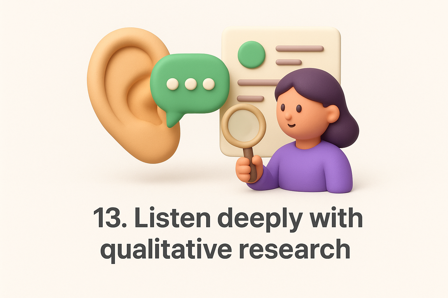
Numbers reveal patterns but miss the reasons behind them. Qualitative research fills gaps that analytics leave by capturing the thoughts, frustrations, and motivations users experience while interacting with your product. You need to talk directly with users, watch them struggle through workflows, and read what they tell support teams to understand why metrics move the way they do. When you combine quantitative data with rich qualitative insights, you discover how to increase user engagement by addressing real problems rather than guessing based on surface metrics alone.
Schedule conversations with both your most engaged users and those who recently canceled to understand contrasting perspectives. Your champions reveal which features deliver transformational value and what kept them coming back during rough patches. Churned users explain specific moments when your product failed to meet their needs or when a competitor won their attention. You should ask open ended questions about their goals, workflows, and decision process rather than leading them toward answers you want to hear.
Watch real users attempt critical tasks like onboarding, completing their first project, or adopting advanced features without your guidance. Record sessions where participants think aloud while navigating your product so you capture confusion points and unexpected behaviors. Tests reveal where your mental model of the product diverges from how users actually think about solving problems. You can identify friction points that analytics flag but only usability tests explain with concrete examples of what confuses or blocks people.
Your support queue contains direct feedback about features that frustrate users enough to seek help. Tag tickets by theme to identify patterns in questions about specific workflows or capabilities. Recurring confusion around certain features signals poor discoverability or inadequate guidance that drives users away. You should analyze tickets from highly engaged versus at risk users to spot different pain points across engagement levels.
Transform interview notes, usability findings, and support patterns into actionable recommendations backed by specific user quotes and observed behaviors. Create themes that connect individual data points into broader problems worth solving on your roadmap. You need to share findings with your entire product team through regular research reviews that keep qualitative insights visible alongside quantitative metrics when making prioritization decisions.
Qualitative research transforms abstract metrics into human stories that reveal exactly why users engage or abandon your product.
Feature bloat kills engagement by overwhelming users with options they never use. Your product accumulates complexity over time as you add capabilities to satisfy different segments, but unused features create cognitive overhead that confuses new users and slows down existing ones. You need to regularly audit your product and ruthlessly cut elements that don't serve current user needs. When you understand how to increase user engagement through simplification, you realize that removing features often improves retention more than adding new ones because users can finally focus on what matters.
Your analytics should reveal which features users ignore and which workflows rarely complete. Track adoption rates for every major capability and identify features below 10% usage across your active user base. You can segment by user cohort to spot features that only early adopters use versus capabilities that never gained traction with any group. Look for navigation elements, settings panels, or entire sections that collect dust while adding maintenance burden and confusion.
Once you identify underused features, determine whether poor discovery or actual lack of value caused the problem. Run quick tests that improve visibility or onboarding for the feature to see if usage climbs. Features that remain ignored after improved promotion signal misalignment with user needs and should be removed. You should consider the maintenance cost and strategic fit when deciding between improvement and removal.
Removing features without warning erodes trust even when nobody used them. Announce deprecations several weeks in advance and explain why you're removing the capability. You can offer alternatives or migration paths for the few users who relied on the feature. Transparent communication turns potentially negative changes into demonstrations that you actively maintain and improve your product.
Simplification extends beyond removing features to reorganizing how users access what remains. Prioritize navigation around the three to five workflows that drive the most value rather than exposing every capability equally. You should bury advanced settings and rarely used options in secondary menus while surfacing core actions prominently.
Users disengage when they feel kept in the dark about how your product works, what you're building, or why changes happen. Transparency about data collection, feature development, and operational challenges builds trust that keeps users invested even when problems arise. You should communicate openly about what happens behind the scenes instead of pretending everything runs perfectly. This honest approach demonstrates respect for user intelligence and transforms how to increase user engagement by creating psychological safety where users feel confident committing to your platform long term.
Tell users exactly what data you collect and how you use it to improve their experience. Privacy policies written in plain language rather than legal jargon show you have nothing to hide. You can explain tracking decisions directly in your interface when you ask for permissions or introduce analytics features. Users accept necessary data collection when you justify the value exchange clearly.
When your product breaks, acknowledge the issue publicly and explain what you're doing to fix it. Status pages that display real time system health and incident histories prove you don't hide problems. You should share post mortems after major outages that detail root causes and prevention measures. This vulnerability paradoxically strengthens trust because users see you take accountability seriously.
Transparent incident communication transforms frustrated users into patient supporters who appreciate your honesty.
Announce price increases or plan modifications weeks before they take effect so users can adjust budgets or evaluate alternatives. Explain the reasoning behind changes rather than dropping surprises that feel like betrayals. You need to grandfather existing customers into old pricing when possible to reward loyalty.
Your public roadmap should display what you're actually building with honest timelines instead of vague promises. Update statuses regularly to show progress on committed features and explain delays when they happen. This consistency helps users plan around your releases and trust that you deliver.
Tracking everything measures nothing. You need a focused set of metrics that reveal whether users extract real value from your product rather than vanity numbers that look impressive but predict nothing about retention or growth. The right metrics connect directly to user outcomes and guide product decisions toward improvements that matter. When you understand how to increase user engagement through measurement, you stop chasing arbitrary goals and start optimizing for behaviors that drive sustainable business results.
Your north star metric should capture the core action that delivers value to users and predicts long term retention. Revenue or user count alone miss the nuance of engagement because they lag behind the behaviors that drive them. You want metrics like weekly active projects created, tasks completed per user, or team collaboration events that reflect actual product usage tied to outcomes users care about. This singular focus prevents your team from optimizing for conflicting goals that pull product direction in opposing ways.
Supporting metrics break down your north star into components that reveal engagement quality. Track both breadth metrics like feature adoption rate and depth metrics like actions per session to understand whether users engage superficially or deeply. Frequency indicators such as days active per week or session count per month show habitual use patterns. These supporting metrics help you diagnose problems when your north star drops by pinpointing which engagement dimension weakened.
Supporting metrics transform a single number into a diagnostic framework that reveals exactly where engagement breaks down.
Aggregate metrics hide differences between user groups that need distinct strategies. Break engagement down by acquisition channel, user role, company size, and signup date to spot patterns that overall averages obscure. You might discover that users from organic search engage twice as deeply as paid social traffic, or that enterprise cohorts take longer to activate but retain better long term.
Schedule weekly or biweekly sessions where your team reviews engagement metrics together and discusses emerging patterns. These meetings should surface questions about metric movements and generate hypotheses to test rather than just reporting numbers. You need consistent review rhythms to catch engagement drops early before they compound into retention crises.
You now have 16 proven tactics that answer how to increase user engagement across every stage of the user lifecycle. Start by implementing two or three strategies that address your biggest friction points rather than trying to execute everything at once. Your product analytics will reveal which tactics move your north star metric most effectively, while qualitative research explains why certain changes work better than others for your specific audience.
Building sustained engagement requires consistent iteration based on real user feedback and behavior patterns. Centralize that feedback with Koala Feedback to create a single source of truth where users vote on priorities, track your progress, and see their input shape your roadmap directly. When users watch you build what matters to them, engagement stops being something you push and becomes something they choose to maintain because they feel ownership over your product direction.

Start today and have your feedback portal up and running in minutes.
