Most teams build a feedback form for customer input, get a handful of vague responses, and then wonder why nobody uses it. The problem usually isn't the customers, it's the form. Too many questions, no clear purpose, or a design that feels like an afterthought bolted onto a support page.
If you're searching for a customer feedback form that actually gets filled out, you need real examples, not just theory about "good survey design." This article gives you 13 templates covering different use cases: post-purchase surveys, feature requests, NPS scores, churn interviews, and more. Each one includes the specific questions to ask and why they work.
You'll also see how a well-structured portal feedback form fits into a bigger system, one where feedback doesn't just get collected but gets organized, voted on, and turned into actual product decisions. Whether you're building your first form from scratch or fixing one that's been ignored for months, you'll walk away with templates you can copy today and a clearer sense of what separates a form that works from one that just sits there.
A portal feedback form works differently than a typical contact form. Instead of collecting feedback that disappears into an inbox, it feeds directly into a public or private board where ideas get organized, voted on, and tracked through to a decision. Koala Feedback's portal is built around this exact idea: one submission form connected to a system that automatically deduplicates similar requests, groups them by product area, and lets other customers upvote what matters to them, which is what a feedback portal should include at minimum. If you're tired of digging through spreadsheets to figure out what your users actually want, this is the format to start with.
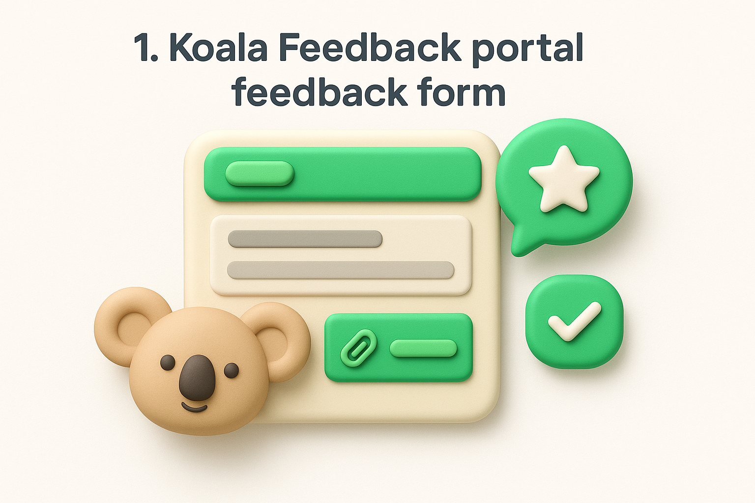
This form suits any SaaS company or product team that gets a steady stream of feature requests and complaints but has no central place to put them. It's especially useful when you want customers to see that their input matters, since submitted ideas show up publicly (or privately, if you prefer) with a status like "Under Review," "Planned," or "Complete." That visibility alone cuts down on repeat requests, because customers can search existing ideas and vote instead of submitting duplicates.
A feedback form only works long-term if customers can see what happens to what they submit.
Keep the submission form short. The goal is to lower the barrier to entry so people actually finish it, not to run a full survey. A good feedback customer form on a portal typically asks:
Notice there's no rating scale or multiple-choice grid here. The portal format works because it's conversational, not a survey.
Setting up a portal feedback form in Koala Feedback takes less time than writing the questions for a traditional survey. Here's the general flow:
Once it's live, embed a link to the portal in your app's navigation, your help center, and your onboarding emails. The easier it is to find, the more consistent your feedback stream becomes.
A general feedback form for customer input works as a catch-all. It doesn't ask about one feature or one interaction, it just gives people an open channel to tell you what's on their mind. Think of it as the digital version of a suggestion box, placed somewhere visible like your website footer, help center, or account settings page. It won't replace targeted surveys, but every product needs one place where feedback can land even when you haven't thought to ask a specific question yet, which is a big part of why customer feedback matters in the first place.
Use this form when you want a low-effort way to catch feedback you didn't know to look for. Small businesses just starting to collect input, or teams that haven't built out a full feedback system yet, benefit most here. It also works well as a safety net alongside more specific forms, since not every comment fits neatly into "feature request" or "bug report."
A general feedback form catches the input you didn't know to ask for.
Keep this form short and open-ended. Overloading a general form with dropdowns defeats its purpose.
Building this form doesn't require much technical lift. A simple embedded form on your site, connected to an email inbox or a lightweight tool, gets the job done. If you're already using a portal feedback form like Koala Feedback, route general submissions into a "General Feedback" board so they don't get lost. That way, even loosely worded comments end up categorized alongside more structured requests, and you can revisit them later when patterns start to emerge.
A product feedback form digs deeper than a general one. Instead of asking "what's on your mind," it targets specific parts of your product: a new feature, a redesigned dashboard, a pricing page, whatever you shipped recently and want reactions to. This makes it less of a suggestion box and more of a diagnostic tool, one you send out deliberately after a release rather than leaving it sitting quietly in a footer.
Product teams that just shipped something and want structured reactions should reach for this format. It suits companies past the early stage, ones with an actual roadmap and release cycle, because the questions only make sense if there's a specific feature or update to react to. It's also useful before a big investment decision. If you're weighing whether to expand a feature or scrap it, this form gives you direct input instead of guesswork.
Product feedback works best when it's tied to something specific, not a vague request for opinions.
Frame every question around the specific feature or update you're asking about, not the product as a whole, and borrow from these survey questions that drive action if you get stuck.
Trigger this form right after someone uses the feature, either through an in-app prompt or a follow-up email a few days later, while the experience is still fresh. Keep it under five questions so completion rates stay high. If you're running this through Koala Feedback, tag responses to the relevant board so the feedback sits next to related feature requests and votes, giving your team one place to see both the original ask and the reaction once it shipped.
A feature request form does one job: it captures what customers want you to build next, in their own words, before you decide what to prioritize, so it helps to know the different types of feature requests you'll receive. Unlike a product feedback form that reacts to something you already shipped, this one looks forward. It's the intake point for new ideas, and it works best when it's connected to a system that can track, vote on, and eventually close the loop on every submission instead of letting requests pile up in a shared inbox.
This form suits any team that wants to build a roadmap based on actual demand rather than internal guesswork. It's especially valuable for SaaS companies with an active user base, since repeat customers usually have specific, well-formed opinions about what's missing. Pair it with a portal feedback form so submissions aren't just collected, they're organized into boards, deduplicated automatically, and opened up for other users to vote on. That turns a one-way request into a public signal of demand.
A feature request form is only useful if someone can see how many other customers asked for the same thing.
Keep the form focused on the problem, not just the solution the customer thinks they want.
Build this form directly into your feedback portal rather than as a standalone survey. In Koala Feedback, requests submitted through this form land on a dedicated board, get merged with similar existing ideas, and collect votes from other users automatically. Set a custom status workflow (Under Review, Planned, In Progress, Complete) so requesters know their idea didn't disappear into a queue, and follow a repeatable playbook for how to prioritize incoming requests. Link to the form from your app's settings menu and support docs, since that's where users go when they're already thinking about what's missing.
The net promoter score form measures one thing: how likely someone is to recommend your product to a friend or colleague. It's the most standardized feedback form for customer loyalty tracking, built around a single 0-10 question and a short follow-up. Because the scoring method is universal, you can benchmark your results against industry averages instead of guessing whether your number is good or bad.
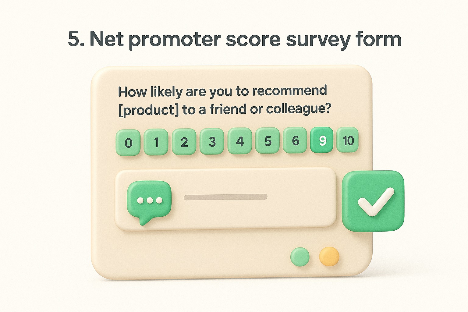
Companies that want a repeatable, trackable loyalty metric over time should run NPS on a quarterly or biannual basis, alongside the other loyalty KPIs, formulas, and benchmarks worth watching. It suits mature products with an established user base more than brand-new tools, since you need enough respondents for the score to mean anything. NPS also works well as an early warning system. A dropping score often signals churn risk before cancellations actually happen.
A single NPS score means little on its own, but the trend line over time tells you whether customers are drifting away.
Stick to the standard format so your results stay comparable across survey rounds.
| Score range | Category | What it signals |
|---|---|---|
| 0-6 | Detractor | At risk of churning, needs follow-up |
| 7-8 | Passive | Satisfied but not vocal, could switch |
| 9-10 | Promoter | Loyal, likely to refer others |
Send NPS surveys by email or as an in-app prompt to a random sample of active users, not your entire list at once, so you're not fatiguing the same people every quarter. Automate the calculation (percentage of promoters minus percentage of detractors) rather than doing it by hand in a spreadsheet. Route the open-text responses into your portal feedback form system so low scores with specific complaints turn into trackable items instead of getting buried in a survey export nobody revisits.
A customer satisfaction score form, often called CSAT, measures happiness with a single interaction rather than the whole relationship. Where NPS asks about loyalty over time, CSAT asks a narrower question right after a support ticket, a purchase, or a specific touchpoint: how satisfied were you with this? If you're unsure which CX metric fits your situation, the distinction matters more than the score. It's the simplest feedback form for customer experience tracking you can build, and that simplicity is exactly why it gets high response rates.
CSAT works best immediately after a defined moment, a support chat closing, an order shipping, a demo call ending. Support teams rely on it constantly because it gives a quick pulse check per agent or per ticket, which makes it easy to spot who needs coaching and which issue types generate the most frustration. It's less useful for tracking long-term loyalty since it only reflects one moment, not the overall relationship.
CSAT tells you how one interaction went, not how a customer feels about your company overall.
Keep the core question tied to the specific interaction, not the product in general.
Trigger the CSAT form immediately after the interaction closes, either through an automated email or an in-app popup, since satisfaction scores drop in accuracy the longer you wait. Keep the scale consistent across every touchpoint so you can compare support CSAT against onboarding CSAT without translating between different rating systems, and use the same CSAT formula and industry benchmarks each round. For low scores, route the open-text answer into your feedback portal as a flagged item so someone follows up instead of letting a bad experience go unanswered.
A customer effort score form, or CES, measures how much work a customer had to put in to get something done, whether that's resolving a support issue, completing a signup, or finding an answer in your help docs. Unlike CSAT, which asks about satisfaction, CES asks about friction directly, and it helps to understand the CES formula and when to send it before you roll one out. The logic behind it is simple: customers who have to struggle are more likely to churn, even if they eventually got what they needed.
Use this feedback form for customer effort tracking right after a task-based interaction, like closing a support ticket, finishing onboarding, or completing a self-service action like resetting a password. It's especially useful for teams trying to reduce support volume, since a high effort score on a specific task usually points to a broken process or confusing documentation rather than a one-off complaint. CES pairs well with CSAT because one tells you how the customer felt, and the other tells you how hard it was to get there.
Customers rarely complain about effort directly, they just quietly stop trying.
Stick to a single scaled question tied to a specific task, plus one open-text follow-up.
Trigger the CES form immediately after the task completes, not days later, since effort is hard to recall accurately once the frustration fades. Attach it to specific workflows rather than your whole product so you know exactly which process needs fixing. Feed low scores into your feedback portal as flagged items, tagged by the task involved, so recurring friction points show up as patterns your team can actually prioritize instead of scattered one-off complaints.
A website feedback form lives directly on your site, usually as a small tab or embedded widget, and asks visitors about their browsing experience rather than your product itself. It catches the person who can't find your pricing page, hits a broken link, or gets confused by your navigation right when it happens, instead of relying on them to email support later. This kind of feedback form for customer experience on-site fills a gap that product surveys and support tickets miss entirely, since most visitors who struggle just leave without saying anything.
Marketing teams and UX designers get the most value here, especially during a redesign or right after launching a new page. It works well for catching usability issues on high-traffic pages like checkout flows or signup forms, where a small amount of friction costs you real conversions. Use it continuously rather than as a one-time survey, since website behavior changes with every update you ship.
A website feedback form catches the frustration that never makes it to your support inbox.
Keep the form tied to the page the visitor is currently on, not your product as a whole.
Embed a small floating tab or button on key pages rather than your entire site, since asking on every page dilutes the responses; comparing the best website feedback tools first will save you a rebuild later. Trigger it based on behavior when possible, like a long pause on a page or an attempted exit, so you catch people at the moment of friction. Route submissions into your portal feedback form system tagged by URL, so recurring complaints about the same page surface as a pattern instead of getting lost as isolated comments.
An in-app feedback widget sits inside your product itself, usually a small tab in the corner of the screen or a button in a menu, so users can flag something without leaving what they're doing. This is different from a website feedback form because it captures the experience of people who already pay you and are actively using the product, not visitors browsing your marketing pages. Because it's always available, this feedback form for customer input works as an ongoing pressure valve rather than something you only send out during a campaign.
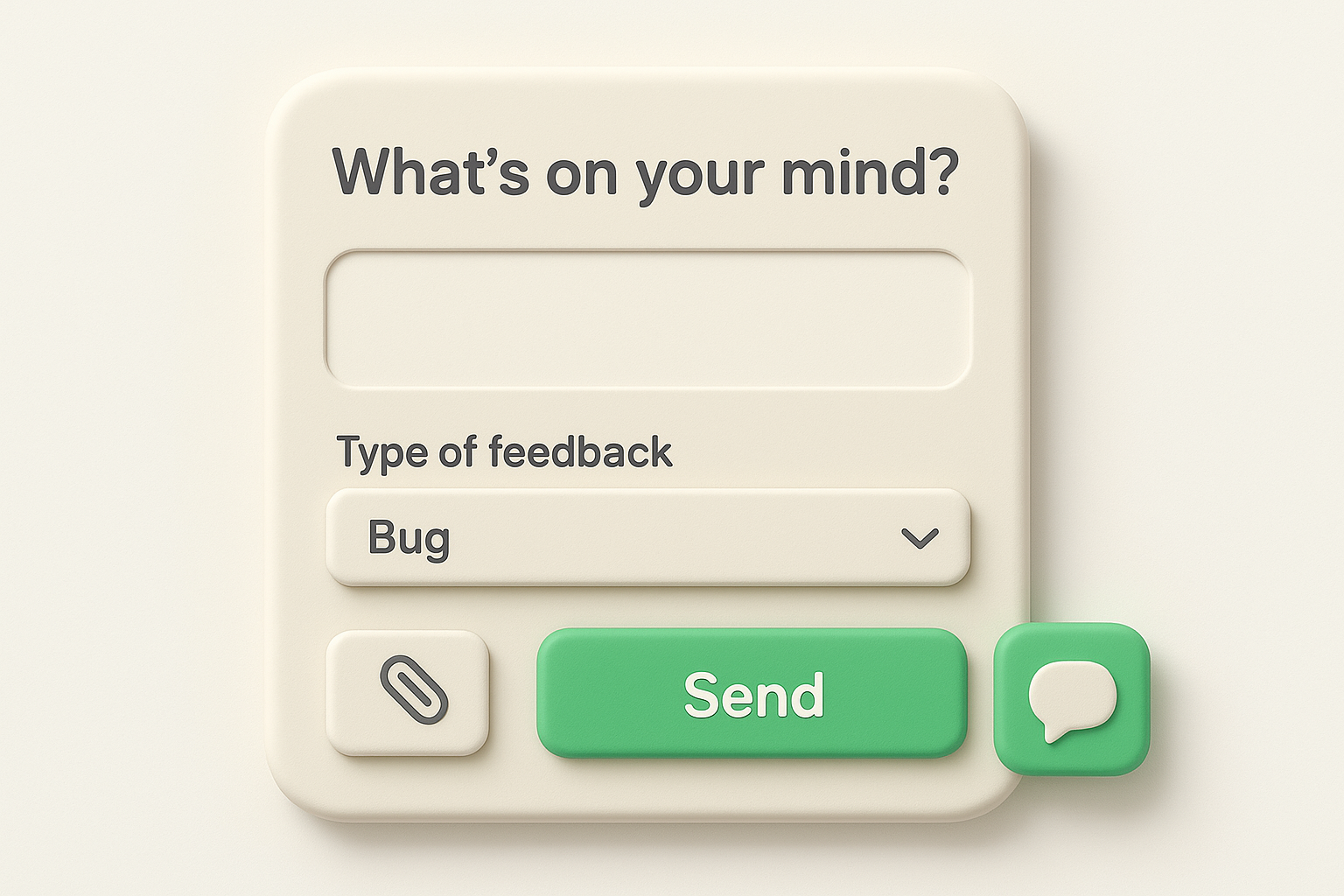
This format suits SaaS products with logged-in users who hit friction mid-task, like a confusing setting or a feature that doesn't behave as expected. Support teams like it because it gives context automatically. Many widgets can capture the current page, browser, or account details along with the message, so nobody has to ask "what were you doing when this happened?" It also works well for catching bugs early, since frustrated users often report a problem the moment it occurs rather than waiting to file a formal ticket.
The best time to catch feedback is the moment a user feels friction, not three days later in a survey email.
Keep the widget itself minimal. A long form defeats the purpose of something meant for a quick, in-the-moment report.
Install a lightweight widget script in your product rather than building a custom modal from scratch, since maintaining your own version adds unnecessary engineering work, and there are plenty of widget tools built for SaaS teams to pick from. Connect the widget to your portal feedback form system so submissions land on the right board automatically, tagged by feedback type. Position the tab somewhere consistent, like the bottom-right corner, so returning users know exactly where to find it without hunting through menus.
A customer service feedback form checks in right after a support interaction ends, whether that's a live chat, a phone call, or an email thread. It overlaps with CSAT in some ways, but this feedback form for customer service goes a bit further, asking about the agent, the tone of the response, and whether the resolution actually stuck. It's less about the product and more about the human (or bot) who handled the request.
Support managers running a team of agents get the most out of this format, since it isolates performance at the individual level rather than just measuring overall satisfaction. It works well for companies with a ticketing system already in place, because the form can trigger automatically once a ticket closes. Use it continuously rather than as a periodic survey, since support quality can shift week to week depending on volume and staffing.
A customer service feedback form tells you which agents need coaching, not just whether customers were happy in general.
Focus each question on the agent and the resolution, not the broader product experience, and adapt one of these ready-to-use feedback form templates if you'd rather start from a sample.
Trigger this form automatically when a ticket status changes to closed, either through your help desk software or an email follow-up sent within a few hours. Attach the agent's name to each response so you can track patterns per person rather than just averaging scores across the whole team. Route low scores and negative comments into your portal feedback form as flagged items, tagged by agent or ticket type, so recurring service gaps show up clearly instead of getting lost in a monthly report.
A post-purchase survey form lands in a customer's inbox right after an order ships or arrives, asking about the buying experience itself rather than the product's long-term performance. It covers everything from checkout friction to shipping speed to whether the item matched expectations. This feedback form for customer purchases works best as a short, quick pulse check, not a deep product review, since most people won't have used what they bought long enough to judge it yet.
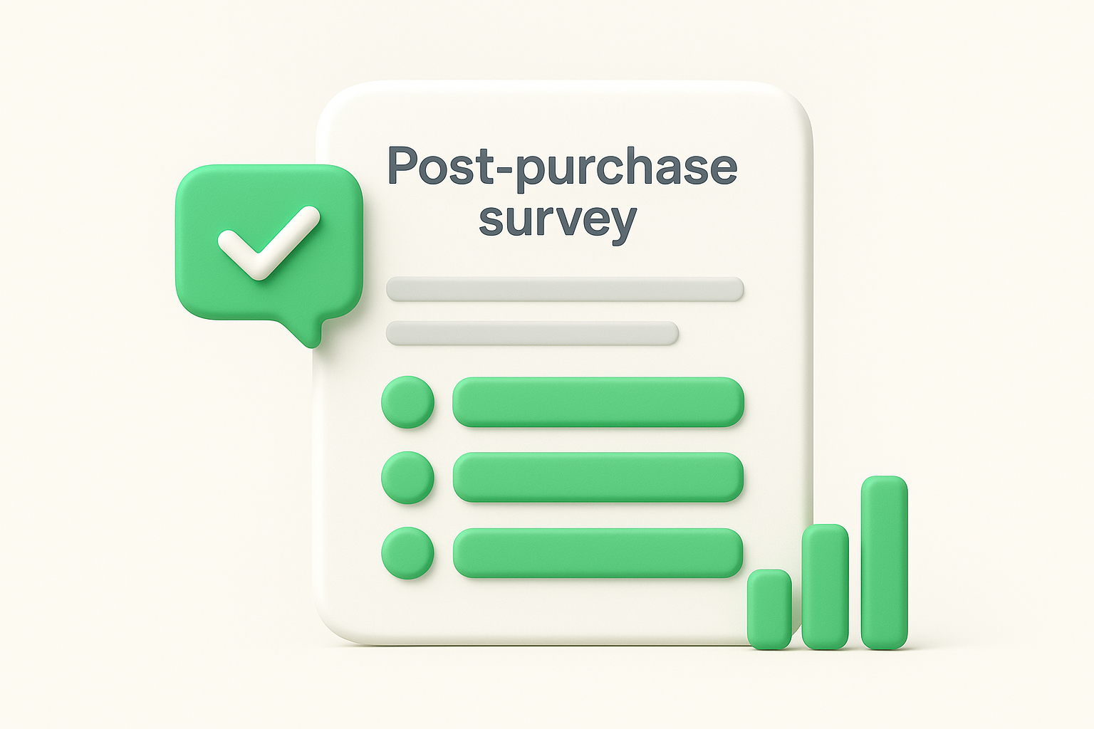
Ecommerce businesses and any SaaS company with a paid signup flow benefit most from this format. It catches friction in the buying process itself, a confusing checkout step, an unexpected fee, a shipping delay, while the memory is still fresh. It's also useful for spotting patterns across a specific product line or plan tier, since you can segment responses by what was purchased.
A post-purchase survey catches buying friction while it's still fresh, not months later when the details are forgotten.
Keep the questions tied to the transaction itself, not the product's ongoing performance, and lean on questions that pinpoint friction rather than generic praise prompts.
Trigger this survey automatically 24 to 48 hours after the purchase confirms, giving customers enough time to receive or use the item without losing the immediate context. Keep it under five questions since post-purchase attention spans are short and people are eager to move on. Feed the open-text responses into your portal feedback form system, tagged by product or plan, so recurring objections or friction points surface as patterns your team can prioritize instead of scattered one-off complaints buried in a survey export.
An onboarding feedback form checks in during a customer's first days or weeks with your product, when first impressions are still forming and small confusions can turn into churn if nobody catches them. This feedback form for customer onboarding differs from a post-purchase survey because it focuses on setup and early usage, not the buying decision. It's one of the few feedback moments that directly predicts retention, since customers who struggle to get value in the first week rarely stick around long enough to give you a second chance.
SaaS companies with a defined onboarding flow, whether that's a setup wizard, a first-login checklist, or a guided demo, get the most value here. It suits teams trying to reduce early churn specifically, since the responses point directly at which onboarding step is causing drop-off. It also works well paired with usage data. If a customer skips a step and reports confusion in the same window, you've found a real problem worth fixing.
Customers who struggle in their first week rarely stick around long enough to complain about it later.
Keep every question tied to the setup experience, not the product's full feature set.
Schedule this form to trigger 3 to 7 days after signup, giving customers enough time to actually use the product without waiting so long that early friction fades from memory. Segment responses by signup date or plan tier so you can spot whether a recent onboarding change helped or hurt completion rates, and read them next to the onboarding metrics worth tracking. Send low scores into your portal feedback form as flagged items tagged "onboarding," so a pattern of confusion around one specific step becomes visible instead of sitting scattered across individual survey responses.
An anonymous feedback form strips away the name and email fields so customers can say what they actually think without worrying about how it lands. This matters most when the topic is sensitive: pricing complaints, criticism of a specific team, or honest opinions about a product direction someone might hesitate to attach their name to. A feedback form for customer honesty works best when people trust that their words won't come back to them, and removing identifying fields is the only way to earn that trust.
Use this format when you suspect people are holding back in your named surveys, particularly around layoffs, price increases, or a feature nobody wants to admit they hate. It also suits internal-facing versions, like gathering feedback from users in a beta program who might fear losing access if they're too critical. Companies going through a rocky stretch, a bad release, a support backlog, a confusing repricing, get more honest signal here than from any survey with a name field attached.
People tell you the truth more often when they know their name isn't attached to it.
Keep the form open-ended and skip anything that could indirectly identify the respondent, like account IDs or specific plan names if you have very few customers on that plan.
Strip out every optional identifying field, not just the obvious ones like name and email, since IP logging or session tracking can undo the anonymity you're promising. State clearly at the top of the form that responses are anonymous and explain how you're ensuring that. Route submissions into a separate portal feedback form board so anonymous input doesn't get mixed with named requests, since the two need different follow-up approaches entirely.
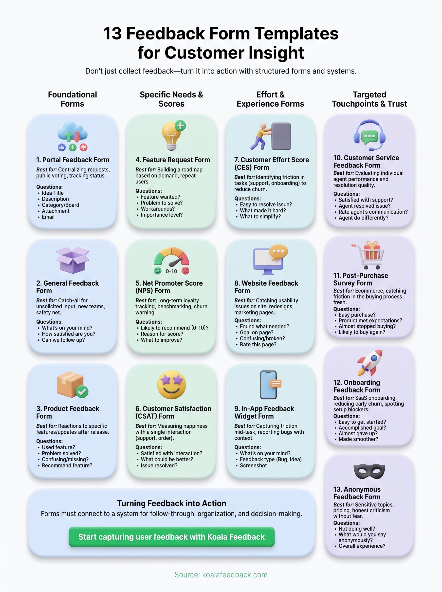
Thirteen templates won't fix anything if the responses sit in a spreadsheet nobody opens. The real value of any feedback form for customer input comes from what happens after someone hits submit: does it get read, tagged, prioritized, and eventually acted on, or does it disappear? Pick two or three forms from this list that match where your product actually is right now. A brand-new tool needs a general form and a feature request form. A mature product with support volume needs CSAT and CES running constantly.
Whatever you choose, connect it to a system built for follow-through rather than collection alone. A portal feedback form that automatically organizes, deduplicates, and lets customers vote turns scattered input into a visible roadmap. If you're ready to stop losing feedback in inboxes, start capturing user feedback with Koala Feedback and turn submissions into decisions your customers can actually see.

Start today and have your feedback portal up and running in minutes.