Most product feedback survey questions get ignored, or worse, they generate responses so vague they're impossible to act on. The difference between a survey that collects dust and one that actually shapes your roadmap comes down to asking the right things, the right way. Generic questions produce generic answers, and generic answers don't help you decide what to build next.
The fix isn't sending more surveys. It's asking fewer, sharper questions that give your team clear signals about what users need, what frustrates them, and what would make them stick around. That's exactly the kind of actionable feedback we help teams collect and prioritize at Koala Feedback, turning raw user input into a structured backlog your product team can actually use.
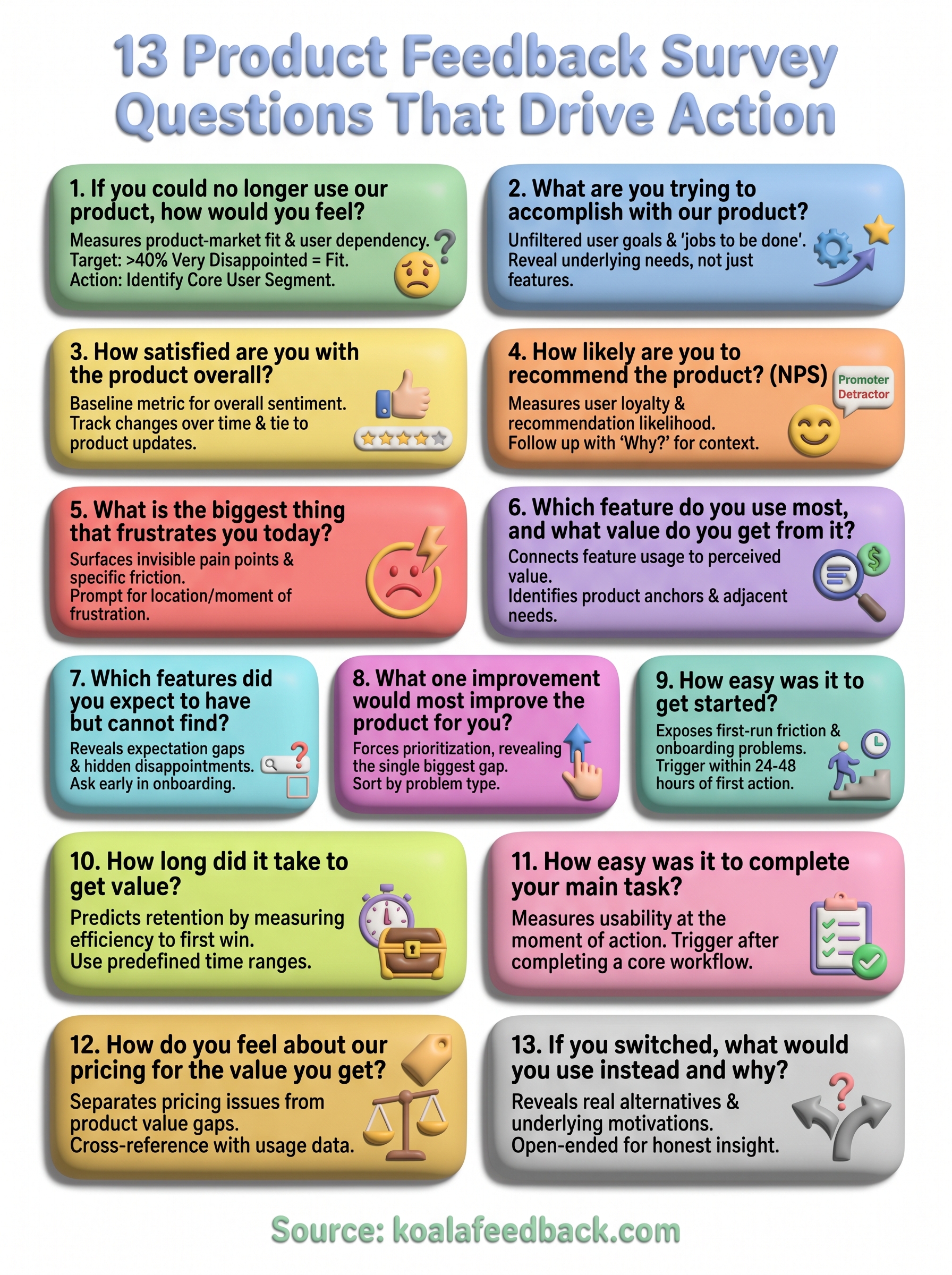
Below, you'll find 13 specific survey questions designed to surface insights you can act on, not just report on. Each one targets a different aspect of the user experience, from initial impressions to feature requests to churn risk. We'll break down why each question works, when to use it, and how to interpret the responses so they translate into better product decisions.
This question is the foundation of the Sean Ellis test, a method designed to measure product-market fit by revealing how much users would genuinely miss your product. It sounds almost casual, but the response cuts straight to how embedded your product is in someone's actual workflow. If most users shrug at the idea of losing access, you have a retention problem hiding behind healthy-looking usage numbers.
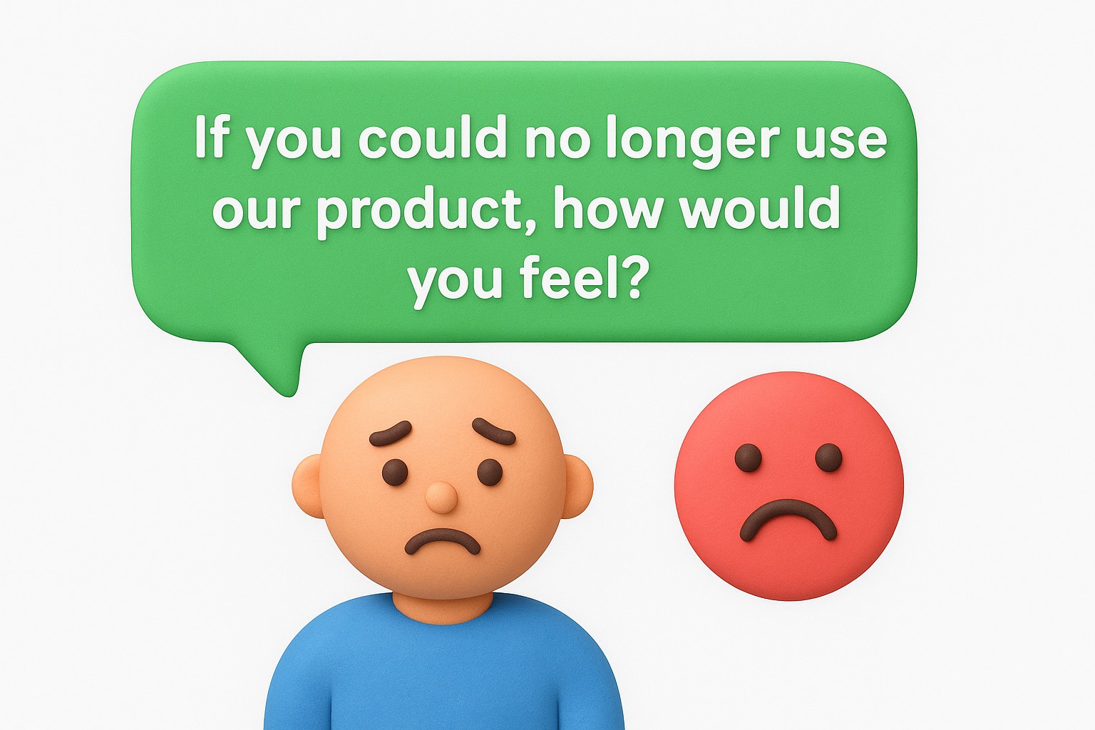
The standard response options are: "Very disappointed," "Somewhat disappointed," or "Not disappointed." When 40% or more of respondents say they would be "very disappointed," that signals you've reached a meaningful level of product-market fit. Below that threshold, you need to understand which specific users would miss you most, because those users hold the blueprint for what your product actually does well.
Your "very disappointed" respondents are your core user segment. Their answers tell you which use cases your product solves well enough to create real dependency. Dig into their roles, goals, and how they describe the product's value in their own words. That language often becomes the most effective positioning copy your marketing team will ever find.
Framing matters more than most teams realize. If you add any positive context before the question, like mentioning a new feature or upcoming release, you prime users toward a more favorable response. Keep the question standalone and neutral in presentation so the answers reflect genuine attachment, not optimism from the moment.
Send this as a single-question survey outside the product experience, like a plain-text email, so users aren't responding in an environment that nudges them toward positive feelings.
When fewer than 40% say "very disappointed," resist the urge to chase the number as a target. Instead, pair this question with an open-ended follow-up: "What type of person do you think would benefit most from this product?" That response often points you toward a better-fit audience you haven't fully reached yet.
For users who answer "not disappointed," ask a direct follow-up about what they expected the product to do that it didn't deliver. Their unmet expectations reveal where your onboarding or messaging created the wrong impression, which is a problem your team can actually fix.
This open-ended question cuts past feature usage and gets to the underlying job your user hired your product to do. Unlike satisfaction scores or rating scales, it gives you unfiltered context about the real goals driving someone's behavior inside the product, which is often very different from what your team assumed during design.
Users don't buy software features. They buy outcomes they care about, whether that's saving time, reducing errors, or replacing a messy manual process. This question exposes what those outcomes actually are, in the user's own language. When you read enough responses, you'll notice that clusters of jobs emerge that your product solves, and some of those clusters may be ones your team never explicitly built for.
Keep this question completely open-ended with no predefined answer choices. Any list you provide anchors the respondent to your assumptions about what the product is for. Place it early in the survey, before you ask about specific features, so the user's goal is still top of mind rather than shaped by your question flow.
Avoid phrases like "How do you use our product to achieve X?" because the moment you name a goal, you've already guided the answer.
Tag responses by the job the user describes, then look for frequency. The goals that appear most often across your product feedback survey questions represent the use cases your roadmap should protect and invest in first.
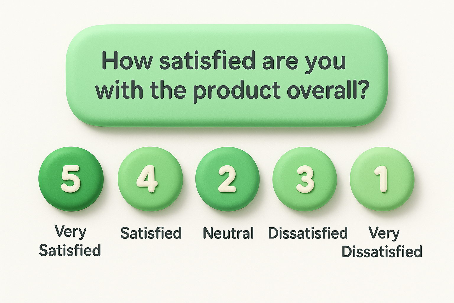
Overall satisfaction is your baseline metric, and tracking it over time gives you a clear signal of whether product changes are moving the needle in the right direction. This question sits at the center of most product feedback survey questions because it captures how users feel about the product as a whole, not just a single interaction or feature. It's simple to run, easy to benchmark, and genuinely hard to misinterpret.
This question measures overall sentiment rather than any specific feature or workflow. That broad scope is its strength. When satisfaction drops, you know something shifted in the user experience. When it climbs, you can tie the movement to recent product changes and confirm the work your team shipped actually landed well with users.
A five-point scale is the clearest option for this question. It gives respondents enough range to express real differences without making the choice feel like a chore.
Avoid 10-point scales here because the extra options create noise without adding precision, which makes trend analysis harder over time.
| Option | Label |
|---|---|
| 5 | Very Satisfied |
| 4 | Satisfied |
| 3 | Neutral |
| 2 | Dissatisfied |
| 1 | Very Dissatisfied |
Run this question on a regular cadence, either monthly or quarterly, and segment responses by user plan, role, or account tenure. Users on different plans often report different satisfaction levels for legitimate reasons, and combining those responses into a single average can mask what's actually driving the score up or down.
This question is the foundation of the Net Promoter Score (NPS), one of the most widely used loyalty metrics in SaaS. It asks users to rate their likelihood of recommending your product on a scale from 0 to 10, splitting responses into promoters (9-10), passives (7-8), and detractors (0-6). Including it among your product feedback survey questions gives you a trackable number you can benchmark against industry standards over time.
NPS measures user loyalty, not just satisfaction. A user can feel fine about a recent interaction but still not feel confident enough to stake their reputation on a recommendation. When your score sits low, it usually signals an unresolved gap between what your product promises and what it consistently delivers. High scores, on the other hand, tend to correlate with strong retention and organic growth through referrals.
The score alone tells you where you stand, but not why. Always follow the NPS question with an open-ended prompt: "What's the main reason for your score?" That follow-up is where the real signal lives, because it converts a number into a specific, actionable concern your team can address.
Route follow-up responses into your feedback system immediately so your team can act on them before user sentiment shifts further.
Promoters are strong candidates for case studies, referral programs, or early access to new features. Detractors need direct outreach from your support or success team to understand what went wrong and whether the issue is something you can realistically fix.
Frustration questions are often avoided because teams worry about inviting complaints. But negative feedback is some of the most valuable signal you can collect, because users only report frustration about things they actually care about. If something didn't matter to them, they'd simply stop using the feature rather than feel annoyed by it.
This open-ended question surfaces pain points your analytics cannot detect. Usage data can tell you that users drop off at a certain step, but it can't tell you whether the cause is confusion, a missing capability, or a workflow that doesn't match how they actually work. Responses to this question give you the context behind the drop-off, which is what your team needs to fix the real problem.
Vague frustration responses like "it's slow" or "it's confusing" are hard to act on. Follow the main question with a targeted prompt: "Where exactly does this happen in the product?" That second layer pushes the user to describe a specific moment rather than a general feeling, giving your team a concrete place to investigate.
Ask this question in-product, triggered shortly after a user completes a core workflow, so the frustration is fresh and tied to a real interaction.
Once you collect responses, sort them into two buckets: issues caused by broken or unclear existing functionality, and gaps where the product simply doesn't do something users need. Fixes to broken experiences should take priority over new feature work, because unresolved friction quietly drives churn long before users ever complain directly.
This two-part question connects feature usage to perceived value, which is something your analytics dashboard cannot surface on its own. A user might click a feature regularly and still not find it particularly meaningful, and including it in your product feedback survey questions exposes that gap directly.
Behavioral data shows what users do, but this question reveals what users actually find meaningful. A feature could rank high in usage simply because it sits on the main navigation, not because it delivers real value. Pairing frequency with perceived value gives you a clearer picture of which parts of your product genuinely earn their place.
You'll often find that the feature users name most frequently is not what your team invested the most in building, which is a direct signal about where to focus roadmap attention.
Provide a predefined list of your core features as answer options for the first part, then follow with an open-ended field asking users to describe the value they get. This structure keeps responses comparable across respondents while still capturing qualitative context that a multiple-choice format alone would miss.
Limit your list to the five to eight features that represent the core of what your product does, so users don't feel overwhelmed by options.
When one feature consistently dominates responses, treat it as your product's anchor. Any roadmap decision that risks degrading that experience deserves extra scrutiny before moving forward.
Use the value descriptions to identify adjacent needs users mention alongside their most-used feature. Those patterns often point toward the highest-confidence areas for future investment.
Expectation gaps are invisible until users tell you about them. When someone comes to your product expecting a specific capability and walks away without finding it, they often leave quietly rather than complain. This question drags those silent disappointments into the open and turns them into structured insight your team can actually evaluate.
This question surfaces the gap between your product's perceived scope and its actual functionality. Users form expectations before they ever log in, based on your marketing copy, competitor experiences, or industry assumptions. When those expectations go unmet, users either work around the problem or churn, and you often never learn which one happened. This question forces that information out early.
Timing this question right matters. Ask it during the first two weeks of a user's experience, when their expectations are still fresh and unfiltered by habit. Users who have been in the product for months have already adjusted their mental model, so their answers reflect current frustrations rather than initial expectation gaps, which are two different problems.
Trigger this as part of your onboarding feedback sequence, not a general satisfaction survey, so the timing stays accurate.
Once responses come in, split them into two categories: features your product genuinely lacks, and features that exist but are hard to find. Including this among your product feedback survey questions helps you separate a UX problem from a real product gap, and those two issues require completely different responses from your team.
Asking users to name one improvement does something powerful: it forces them to prioritize. Instead of receiving a wishlist, you get a ranked signal about what matters most. This constraint makes the question one of the most efficient in your set of product feedback survey questions because it mimics the same tradeoff your team faces every sprint.
This question surfaces the single biggest gap between what your product currently does and what users need it to do. Because the constraint requires users to choose, their answer reflects genuine priority rather than a brainstorm. You learn what problem is urgent enough to push everything else aside, which is exactly the kind of signal your roadmap process needs.
When users all point toward the same improvement, that alignment is a strong mandate to act. When answers are scattered, it usually means different user segments have very different core needs, and you may need to think about whether one product can serve them all well.
Keep the question open-ended with no predefined options. The moment you list possible improvements, you anchor users to your assumptions and lose the raw priority signal.
Follow up with "Why is this the most important to you?" to add context that makes each response easier to evaluate.
Once responses come in, tag each one by the problem type it describes, such as performance, missing functionality, or workflow friction. Then count the tags. The themes that appear most often across responses represent the highest-confidence areas for your next planning cycle.
Onboarding is where most SaaS products lose users before they ever get a chance to see real value. Getting started friction is often invisible in your analytics because users who struggle simply stop logging in rather than complain. This question surfaces that hidden friction directly, giving you something to fix rather than just a retention rate to worry about.
Responses expose whether your first-run experience matches what users expected when they signed up. A low ease rating points to specific problems: unclear setup steps, too many decisions too early, or missing in-context guidance.
Including this in your product feedback survey questions helps you separate onboarding gaps from deeper product problems, which saves your team from solving the wrong issue.
Send this question within 24 to 48 hours of a user completing their first core action. Waiting longer lets users normalize the experience, which makes their ratings more favorable but less accurate.
Trigger this as a single in-app prompt tied to the completion of a specific setup step, not as part of a longer general survey.
When users rate setup as difficult, map their responses directly to onboarding steps rather than treating the result as a vague UX problem. Pull your product analytics alongside the feedback to pinpoint exactly where users stalled.
Users who describe the same confusing step often do so in nearly identical language. That pattern is your clearest signal of where to focus, so your team fixes the highest-impact friction point before moving to anything else.
Time-to-value is one of the strongest predictors of long-term retention in SaaS. Users who reach a meaningful outcome quickly are far more likely to stay than users who spend days wondering whether the product is worth their time. This question adds a critical time dimension to your product feedback survey questions, helping you understand whether your product delivers results fast enough to hold users through the period when churn risk is highest.
This question shows how efficiently your product moves users from signup to their first real win. A long time-to-value often points to gaps in your onboarding flow, unclear next steps, or a setup process that demands too much effort before giving anything meaningful back.
Patterns in the responses let you benchmark your onboarding against real user expectations rather than guessing. Users who report getting value in their first session represent the experience you want everyone to have, and their paths through the product are worth studying closely.
Open-ended time estimates are hard to compare, so use predefined time ranges that keep responses consistent and easy to analyze across your entire user base.
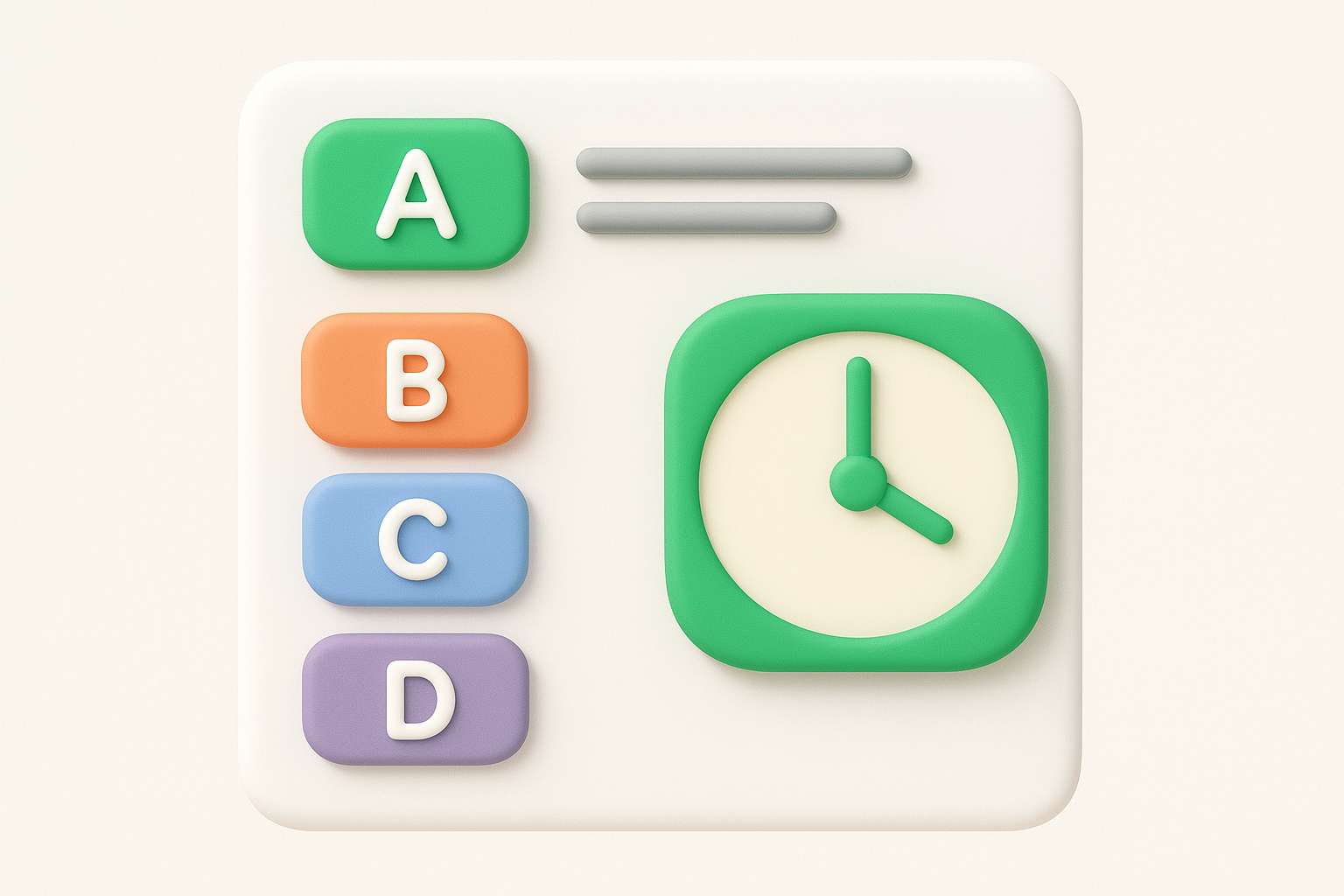
| Option | Label |
|---|---|
| A | Within the first session |
| B | Within the first day |
| C | Within the first week |
| D | More than a week |
| E | I haven't gotten value yet |
Option E is the most important response to monitor because those users are at the highest risk of churning before your team even knows they are struggling.
When responses cluster in the later time buckets, map those answers against the specific onboarding steps users completed before dropping off. Your goal is to find the earliest stall point and remove that friction before addressing anything else on your roadmap.
Task-based ease questions measure usability at the moment it matters most, when users are actively trying to accomplish something specific in your product. Unlike broad satisfaction scores, this question ties feedback to a concrete user action, which makes the responses far easier to convert into targeted product changes.
This question surfaces friction inside your core workflows, the places where users slow down, get confused, or abandon a task before finishing. When you include it in your set of product feedback survey questions, you get direct evidence of whether your product's design actually supports the jobs it was built to do. A low ease score on a critical workflow is a serious signal that deserves immediate investigation.
Trigger this question immediately after a user completes or exits a specific core task, not at the end of a general session where the memory of difficulty has already faded. If your product supports multiple primary workflows, build separate versions of the question for each one. This keeps responses tied to a specific context rather than blending feedback from different experiences into one unhelpful average.
When responses reveal difficulty, map the low scores directly to the specific workflow steps rather than treating them as general design feedback. Pull your session analytics alongside the responses to pinpoint exactly where users hesitated or dropped off. Users who describe the same friction point in similar language are showing you precisely where your flow breaks down first.
Cross-reference low ease scores with your retention data to confirm whether that workflow friction is actively driving churn.
Pricing feedback makes many teams nervous, but avoiding it leaves you with a dangerous blind spot. When users feel the price doesn't match the value they receive, they don't argue about it. They simply cancel, and you lose the insight that could have told you whether the problem was your price point or your product's ability to deliver results.
This question separates two very different problems: users who find your product too expensive outright, and users who would pay more if the product delivered more value. Those are completely different problems that require completely different responses from your team. Including it in your product feedback survey questions helps you avoid the mistake of cutting prices when the real fix is improving the product experience.
Keep the question open-ended or use a simple sentiment scale rather than asking users to name a specific dollar amount they'd pay. Price anchoring from a number you suggest skews responses heavily, so avoid it.
Pair this question with your satisfaction score to see whether low-value perception tracks with low satisfaction, or whether it exists independently among otherwise happy users.
When users say pricing feels high, cross-reference those responses with their usage data. Users who rarely log in and feel the price is steep are telling you something different from users who use the product daily and still feel underserved. Heavy users citing poor value signal a product gap, while low-usage users citing poor value signal an onboarding or engagement problem your team needs to address first.
Most competitive research happens at the marketing level, based on traffic data and feature comparisons. This question goes deeper by asking users who already know your product to name what they would move to instead and explain the reason. That combination of context and motivation is something no competitive intelligence tool can replicate.
Responses expose the real alternatives in your users' minds, not just the names that appear in your category on a review site. Users sometimes name direct competitors, but they also name spreadsheets, internal tools, or entirely different categories of software. Each of those alternatives tells you something different about the gap your product is failing to close for that segment.
Keep this question fully open-ended so users name their own answers rather than choosing from a list you provide. A predefined list narrows responses to alternatives you already know about, which defeats the purpose. Follow up with "Why would you switch to that option?" to capture the specific reason behind the choice, whether it's pricing, a missing feature, or a workflow that fits better elsewhere.
Treat this as one of the most honest questions in your set of product feedback survey questions, because users answer it with real intent rather than politeness.
When the same alternative appears repeatedly, that pattern signals a genuine product gap worth investigating. Resist the urge to immediately copy what that competitor does. Instead, focus on the underlying need users describe and find a solution that fits your product's existing strengths rather than forcing a feature that doesn't belong.
The 13 product feedback survey questions in this article each target a specific gap in your understanding of what users need, what frustrates them, and what keeps them around. Picking the right questions for your situation matters more than running every one at once. Start with two or three that match your current product stage, collect enough responses to see patterns, and then build your roadmap decisions around what users actually tell you.
The harder challenge is what happens after the survey closes. Raw responses sitting in a spreadsheet don't drive decisions; organized, prioritized feedback does. You need a system that takes what users say and turns it into something your team can act on without losing the original context. That's exactly what Koala Feedback is built to do: collect feedback, deduplicate it, and surface the themes that matter most so your product moves in the right direction.

Start today and have your feedback portal up and running in minutes.