Most teams collect feedback. Few actually turn it into something useful. The gap between raw customer data and a product decision that moves the needle is where most companies stall out. They have spreadsheets full of survey responses, support tickets piling up, and feature requests scattered across Slack channels, but no structured customer insights process to make sense of it all. Without one, you're essentially guessing what to build next.
A solid process does more than organize data. It helps you spot patterns, prioritize what matters, and make decisions backed by real user input rather than gut feelings. That's exactly the problem we built Koala Feedback to solve, giving product teams a centralized place to collect, categorize, and act on what users are actually telling them.
This guide breaks down the customer insights process into 8 clear steps, from gathering raw data to turning it into decisions that improve your product and customer experience. Whether you're a product manager at a startup or leading development at a scaling SaaS company, you'll walk away with a repeatable framework you can put to work immediately.
A customer insights process is a structured, repeatable workflow that takes you from raw customer signals to clear, prioritized actions. Unlike one-off surveys or gut-check decisions, a real process connects every step: setting a goal, collecting data from the right sources, cleaning and analyzing it, and feeding conclusions directly into your product decisions. Most teams skip two or three of these steps, which is why their research often sits in a folder and never influences anything.
A process without a feedback loop is just a research project. The goal is to turn what you learn into something your team actually acts on.
Every effective process shares the same building blocks, regardless of your company size or tool stack. Understanding what those components are before you start helps you design a workflow that fits your team and avoids the common gaps that cause insights to disappear before they reach a decision-maker.
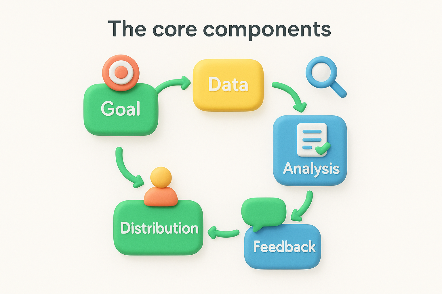
Here are the six core components every process needs:
Each component feeds the next. Skip data preparation, and your analysis will be noisy. Skip prioritization, and your team will treat all findings as equally urgent, which means nothing gets done.
Most product teams do some version of customer research already. They send a survey before a launch, read through support tickets after a bad NPS score, or talk to a few power users when they're stuck on a decision. That kind of ad hoc research has value, but it is reactive and inconsistent by nature.
A structured process is proactive and systematic. You define in advance what you want to learn, from whom, and how often. You build habits around collecting and reviewing data on a set cadence rather than scrambling when something breaks. The result is that your product decisions are grounded in a continuous stream of user input rather than whatever feedback happened to surface last week.
Consider the difference in practice. A team doing ad hoc research might notice a spike in churn and then interview five customers to find out why. A team with a proper process already has longitudinal data on the friction points those churned customers experienced weeks before they left, plus a backlog of feature requests that would have addressed those points earlier. The structured team is always a step ahead.
The output of a customer insights process is not a report. Reports sit in shared drives and get forgotten. Good output is a prioritized list of decisions, each tied to the evidence that supports it, the customer segment it affects, and the metric you expect to move. A simple insight card format helps your team capture and act on findings consistently.
| Field | Example |
|---|---|
| Insight | Users abandon the setup flow at step 3 |
| Evidence | 47% drop-off in analytics + 12 support tickets |
| Affected segment | New users on free plan |
| Recommended action | Simplify step 3 or add inline guidance |
| Success metric | Setup completion rate |
Using a consistent format like this means anyone on the team can pick up an insight, understand the context immediately, and know exactly what action to take next.
Before you collect a single data point, you need to know what decision you're trying to make. Most teams skip this step and jump straight into surveys or interviews, which produces a pile of interesting-but-unactionable data. The first two steps of any customer insights process are about setting a precise research goal and identifying who needs to act on what you find. Without both in place, your findings will either be too vague to drive action or will land on the wrong person's desk.
The clearest way to write a research goal is to frame it as a decision you need to make or a question you need to answer. "We want to understand our users" is not a goal. "We want to understand why users who complete onboarding still churn within the first 30 days" is one. The more specific your goal, the easier it becomes to choose the right data sources, ask the right questions, and know when you've gathered enough evidence to act.
If you can't name the decision your research will inform, you're not ready to start collecting data.
Use this template before you kick off any research sprint. Fill in every field, and if you can't, your goal needs more work before you move forward.
| Field | Example |
|---|---|
| Decision to inform | Should we redesign the onboarding flow? |
| Target segment | New users on the free plan |
| Time frame | Answer needed within two weeks |
| Success criteria | Three distinct friction points identified with supporting evidence |
Once your goal is set, you need to figure out who needs to be involved and who needs to see the results. Skipping this step is what causes insights to die in a Slack thread instead of turning into a product change. Not every stakeholder needs to participate in research, but every decision-maker tied to your goal should know the findings exist and understand what action they're expected to take.
Build a simple stakeholder map before you begin collecting data. It keeps accountability visible and prevents the common scenario where research gets completed but no one owns the next step.
| Stakeholder | Role | Involvement | Output they need |
|---|---|---|---|
| Product manager | Decision-maker | Reviews findings | Prioritized insight cards |
| Engineering lead | Implementer | Consulted on feasibility | Scoped action items |
| Customer success | Data contributor | Shares support patterns | Summary of top themes |
| CEO / founder | Strategic approver | Informed only | One-page summary |
With your goal and stakeholders in place, you're ready to decide where your data will come from. This step matters more than most teams realize. Choosing the wrong sources means you'll collect plenty of data that doesn't actually answer the question you set in Step 1. Your research goal should drive every source decision in your customer insights process, not habit or convenience.
You need both types of data, but they answer different questions. Quantitative sources tell you what is happening at scale: how many users drop off at a specific step, which features get used most, or what percentage of respondents rated something poorly. Qualitative sources tell you why: what frustrated a user enough to abandon a flow, what language they use to describe a problem, or what outcome they were hoping for. Relying on only one type leaves you with an incomplete picture.
Quantitative data shows you where to look. Qualitative data tells you what you're actually looking at.
Here are the most common sources across both categories:
| Source | Type | Best used for |
|---|---|---|
| In-app surveys | Quantitative + qualitative | Capturing context at the moment of friction |
| Feature request boards | Qualitative | Understanding unmet needs at scale |
| Support tickets | Qualitative | Identifying recurring pain points |
| Usage analytics | Quantitative | Spotting drop-off and behavioral patterns |
| User interviews | Qualitative | Deep-diving into motivations and context |
| NPS / CSAT scores | Quantitative | Tracking sentiment over time |
Not every source belongs in every project. Pulling from too many channels at once creates noise and slows down your analysis. Instead, map your top two or three sources directly back to the decision you defined in Step 1. If your goal is to understand early churn, usage analytics and user interviews are your strongest starting points. Support tickets and feature request boards add supporting context once you have a working hypothesis.
Use this template to lock in your source selection before you begin collecting:
| Goal | Primary sources | Supporting sources | What to look for |
|---|---|---|---|
| Reduce early churn | Usage analytics, user interviews | Support tickets | Drop-off points, friction language |
| Prioritize next feature | Feature request board, NPS follow-ups | User interviews | Frequency, affected segments |
| Improve onboarding | In-app surveys, usage analytics | User interviews | Exit points, confusion signals |
Filling out this table forces you to stay intentional about your data collection and avoids the trap of collecting data that never connects back to your original goal.
Raw data is rarely ready to analyze. Before you can spot meaningful patterns, you need to clean what you've collected and tag it consistently. Steps 4 and 5 are where your customer insights process moves from gathering inputs to producing something your team can actually use. Most teams rush through this stage and end up with noisy, inconsistent data that makes every insight feel unreliable.
Your first job is to remove duplicates and add consistent labels to everything you've collected. A single user problem often appears across multiple channels. The same onboarding friction shows up in a support ticket, a feature request, and an in-app survey response. If you count each instance as a separate finding, your analysis will be skewed. Deduplicate before you tag, and your pattern detection will be far more accurate.
Tagging without a shared taxonomy creates chaos. Agree on your tag set before anyone touches the data.
Build a simple tagging system before you start. Each entry should get three labels: a problem category (what area of the product it relates to), a severity (how much friction or impact the user described), and a segment (which type of user it came from). Use this template to process each data point consistently:
| Field | Example entry |
|---|---|
| Source | Support ticket #482 |
| Raw input | "I can't figure out how to invite my team" |
| Problem category | Onboarding / collaboration |
| Severity | High (blocking task) |
| User segment | New user, team plan |
| Duplicate of | Feature request #19 |
Work through every data point with the same template. It takes time upfront, but it dramatically reduces the noise you're fighting in the next step.
Once your data is tagged, look for clusters of entries that share the same problem category and severity. Start by sorting your entries by problem category and counting how many unique users reported each one. High frequency alone is not enough. A problem that blocks a high-value segment once is often more important than a low-severity complaint from dozens of casual users.
Group your findings into a pattern summary that ties frequency to segment impact. For each cluster, note how many data points it contains, which segments it affects, and whether it appeared across more than one source. When a problem shows up in both your support tickets and your feature request board, that cross-channel signal is your strongest evidence that the issue is worth prioritizing.
| Pattern | Data points | Segments affected | Sources |
|---|---|---|---|
| Team invite confusion | 18 | New users, team plan | Support, in-app survey |
| Report export errors | 7 | Power users, paid plan | Support, interviews |
| Slow dashboard load | 11 | All segments | NPS follow-ups, interviews |
Patterns are not decisions. Once you've clustered your data in Step 5, you need a way to rank everything against each other so your team knows what to tackle first and what to deprioritize without debate. This is where the customer insights process shifts from analysis into strategy, and where the work you put into tagging and pattern-finding pays off directly.
A scoring matrix gives every insight the same evaluation criteria, which removes the internal politics from prioritization conversations. Score each pattern on three dimensions: impact (how significantly fixing this problem would improve the user experience or move a key metric), frequency (how many users reported it), and strategic fit (how closely it aligns with your current product direction). Assign each dimension a score from 1 to 3, then multiply all three together to get a single priority score.
The insight with the highest priority score is your first bet, not the one your loudest customer mentioned last week.
Use this template to evaluate every pattern from your Step 5 analysis:
| Insight | Impact (1-3) | Frequency (1-3) | Strategic fit (1-3) | Priority score |
|---|---|---|---|---|
| Team invite confusion | 3 | 3 | 3 | 27 |
| Slow dashboard load | 2 | 3 | 2 | 12 |
| Report export errors | 3 | 2 | 1 | 6 |
Fill in this table for every pattern in your backlog. The scores force an honest comparison and make it straightforward to defend your choices to stakeholders because the evidence is right there beside each decision.
Your highest-scoring insights become your prioritized bets: the specific changes you commit to shipping in the next development cycle. Keep the list tight. Three to five bets per cycle gives your team enough to work on without losing focus across too many fronts simultaneously.
For each bet, write a one-sentence action statement that connects the insight directly to the change you plan to make. This format keeps everyone aligned on the problem being solved and the user segment that benefits, so nothing gets lost in translation when you hand off to engineering.
| Bet | Action | Segment | Expected metric |
|---|---|---|---|
| Fix team invite flow | Redesign the invite step with inline guidance | New users, team plan | Onboarding completion rate |
| Improve dashboard speed | Optimize query load for the main dashboard view | All segments | Time to first meaningful interaction |
Apply this format to every bet before you move it into your development backlog. Two fields that teams often skip are segment and expected metric, but those two columns are what let you measure whether the bet actually worked once it ships.
Deciding what to build is only half the work. The other half is making sure your prioritized bets from Step 6 actually move the metrics you expected them to move. This step in your customer insights process is where research stops being theoretical and starts being accountable. For each bet you ship, you need a pre-defined measurement plan that tells you exactly what success looks like before anyone writes a line of code, so your team can evaluate results without any ambiguity about what they were aiming for.
You cannot measure improvement without knowing where you started. Before your team begins work on any bet, record the current value of your success metric. If you're fixing the team invite flow, capture your current onboarding completion rate today. If you're improving dashboard load speed, note the current average load time. These baseline numbers become your reference point once the change ships, and they protect you from the common trap of declaring a win based on gut feel rather than evidence.
Measuring without a baseline is like running a race without a starting line. You'll finish, but you'll have no idea how fast you actually ran.
Use this template to document the baseline for each bet before development starts:
| Bet | Metric | Baseline value | Target value | Measurement date |
|---|---|---|---|---|
| Fix team invite flow | Onboarding completion rate | 54% | 70% | 30 days post-ship |
| Improve dashboard speed | Avg. load time | 4.2 seconds | Under 2 seconds | 14 days post-ship |
| Redesign export feature | Export error rate | 11% | Under 3% | 30 days post-ship |
Once a change ships, assign one person to own the measurement for that bet. Without a clear owner, no one checks the numbers, and three months later your team has no idea whether the change worked. Set a fixed review date for each bet when you add it to the development backlog, not after it ships. Scheduling it in advance removes the temptation to delay the review when things get busy.
Reviewing on a cadence also helps you catch underperforming bets early so you can iterate before too much time passes. If your onboarding completion rate is flat two weeks after the invite flow redesign, that is a signal to dig back into your qualitative data and look for something you missed. At the review date, record the actual outcome alongside the baseline in the same table. That single habit is what transforms a one-time research project into a continuous measurement system your team can trust and build on.
Measuring impact in Step 7 only benefits your team if what you learn gets shared and applied to the next round of decisions. Step 8 is where your customer insights process becomes self-sustaining. The goal here is to create two feedback loops: one internal, so your team accumulates knowledge over time, and one external, so your users see that their input actually shapes the product they use.
A process that hoards its findings is just an expensive research habit. Sharing what you learn is what makes the whole system compound.
Your insights should not live only in the product manager's notes. After each measurement review, write a brief learning summary and share it in the same place your team already communicates, whether that is a project management tool, a shared doc, or a dedicated Slack channel. The summary does not need to be long. Three sections are enough: what you set out to learn, what you found, and what you changed or plan to change as a result.
Use this template for every completed research cycle:
| Field | Example |
|---|---|
| Research goal | Understand why new users abandon onboarding at step 3 |
| Key finding | 62% of exits happened when users hit the team invite step |
| Action taken | Redesigned invite flow with inline guidance |
| Outcome | Onboarding completion rate increased from 54% to 71% |
| Next question | Do invited team members complete setup at the same rate? |
That last row is the most important one. Every completed cycle should surface a follow-up question that seeds your next research goal, which is exactly how the loop keeps running without requiring a top-down push each time.
Your users submitted feedback because they wanted something to change. If you never tell them what happened, they stop submitting. Closing the loop with users is not just good manners; it directly affects how much signal you receive in future cycles. Use your public roadmap to move completed features into a "shipped" status with a short note explaining what changed and why. Connect it explicitly to the user feedback that informed the decision.
Segment your update notifications so users only hear about changes relevant to the requests they submitted or voted on. A targeted update, such as "We redesigned the team invite flow based on your feedback," lands far better than a generic changelog. That specificity shows users their input has real weight, which drives stronger engagement in every subsequent round of your customer insights process.
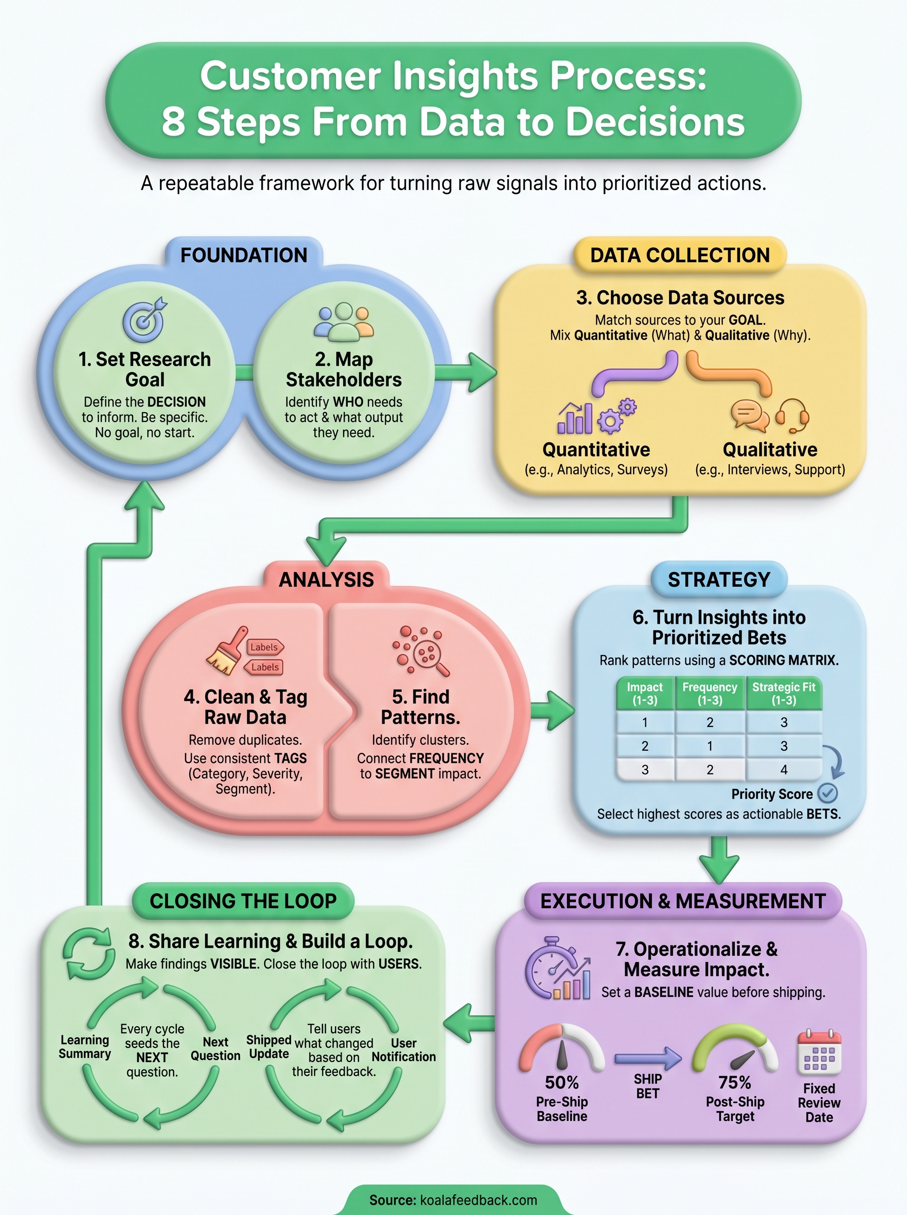
You now have a complete eight-step customer insights process that takes you from scattered data to decisions your team can defend and measure. The steps build on each other deliberately: sharp goals feed better data collection, clean data produces clearer patterns, and clear patterns lead to prioritized bets you can track against real metrics. Each completed cycle generates a follow-up question that automatically seeds the next one, so the process keeps running without starting from scratch every time.
Start small. Pick one active decision your team is wrestling with right now, apply Steps 1 through 3 this week, and run a single cycle end to end before you try to scale the process across every product area. Nothing teaches the workflow faster than completing it once with a real question on the line.
If you want a centralized place to collect, organize, and act on user feedback as part of this process, explore what Koala Feedback can do for your team.

Start today and have your feedback portal up and running in minutes.