You know good UX when you feel it, but explaining it to your team or stakeholders is another matter. Reading a definition of what user experience actually is doesn't help nearly as much as seeing it in action, which is why looking at a real example of user experience design does more to sharpen your instincts than another abstract framework ever will.
This article gives you exactly that. Below you'll find 12 user experience design examples pulled from products people actually use every day, along with what makes each one work (or, in a few cases, what falls flat). You'll see how small decisions, like button placement, onboarding flow, or error messaging, add up to an experience that either keeps users around or sends them looking for a competitor.
We picked these examples because they connect directly to decisions product teams face constantly: how to prioritize a redesign, what to test next, or how to justify a UX investment to leadership. If you're building or refining a product, treat this list as a practical reference you can point to when your team needs a shared understanding of what great design actually looks like.
Opening this list with our own product might seem self-serving, but it's the clearest example of user experience design we can walk you through firsthand, because we built it and watch people use it daily. The feedback portal works like a feature request portal: users get a single, simple form to submit ideas, and it automatically groups similar submissions so nobody has to scroll through duplicate requests. Next to it sits a public roadmap, the same transparent, user-driven roadmap pattern other teams use, with customizable statuses like Planned, In Progress, and Complete, so anyone can see exactly where their suggestion stands without emailing support. The whole thing sits on a portal you brand with your own domain, logo, and colors, so it feels like part of your product instead of a bolted-on survey tool.
Because the interface separates "submit an idea" from "see what's happening," users never feel like they're shouting into a void. Voting and commenting sit right on each request, which means people can back an idea instead of submitting a near-duplicate, and that alone cuts down the noise product teams normally wade through. Customers who check the roadmap and see their request moved to "In Progress" tend to stay more patient and more engaged, simply because the status transparency replaces guesswork with a visible answer.
When users can see exactly where their feedback stands, they stop asking and start waiting patiently.
Support teams notice the difference too: fewer "any update on this?" tickets, because the answer already lives on the roadmap page instead of buried in an inbox.
Good feedback UX isn't about collecting more input, it's about closing the loop visibly. If your product currently routes feature requests through email threads or a shared spreadsheet, you're asking users to trust a black box. A structured feedback loop, where submission, prioritization, and status all live in one place users can revisit, does more for retention than most redesigns ever will. Start small: even a basic public roadmap with three or four statuses gives users something concrete to check back on, and that single change often does more to build trust than a polished new feature ever could.
Duolingo turns language learning into something closer to a game than a textbook, and that's deliberate. Every lesson is broken into short bursts you can finish in two or three minutes, with a progress bar that fills as you go and a burst of animation when you finish. Streaks count consecutive days of practice, leaderboards pit you against other learners, and a cast of cartoon characters react to your answers with encouragement or mock disappointment. None of this teaches grammar faster on its own, but it's a textbook user experience design example of using game mechanics to solve a motivation problem, not just an information problem.
Language apps live or die on daily habit, and Duolingo's design attacks that head-on. Streaks create a small sense of loss if you skip a day, which nudges people back into the app even when they're not feeling particularly motivated to study. Points and levels give short-term wins long before someone reaches actual fluency, and that steady drip of small rewards keeps beginners from quitting in the first frustrating week.
Gamification works when it rewards the habit, not just the content.
Gamification gets a bad reputation when it's slapped onto a product as a shallow badge system, but Duolingo shows what it looks like when it's built around a real behavioral problem: habit formation. Before you add points or streaks to your own product, or any other tactics to increase user engagement, ask what specific drop-off you're trying to fix. If users abandon your product before reaching their first real win, a small, well-placed reward system can bridge that gap far better than another onboarding tooltip ever will.
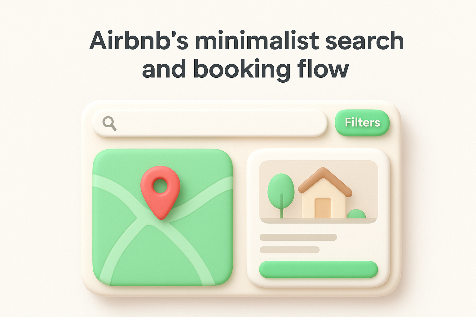
Airbnb strips its search experience down to a handful of decisions: where, when, and how many guests. The results page uses a split-screen map and listing view, so you can scan photos on one side and see exactly where each property sits on the other without switching tabs. Filters stay tucked behind a single button instead of cluttering the top bar, and the booking flow itself walks you through dates, guests, and payment in a handful of screens with almost no visual noise. It's a user experience design example that shows restraint as a design choice, not a limitation.
Because the interface removes almost every non-essential element, users spend their mental energy comparing listings instead of figuring out how the site works. The map-and-list combination in particular cuts down the back-and-forth people usually do between a booking site and a separate maps app. Guests can filter by price, property type, or amenities without ever feeling buried in options, which shortens the path from browsing to booking.
The best search interfaces get out of the way so users can focus on the decision, not the tool.
That simplicity also builds trust during a purchase that involves handing over a credit card to a stranger's spare room, since a cluttered flow at that moment would only add hesitation.
If your product has a search or checkout flow, audit it for anything that doesn't directly help someone decide or complete a purchase. Airbnb, one of several product design innovation case studies worth studying, proves that cutting filters and steps, rather than adding them, often shortens the path to conversion. Before adding another field or option to your flow, ask whether it earns its place next to the ones that matter most.
Slack solved a problem that plagues every group chat tool: a fast-moving channel where five conversations happen at once and nobody can follow any of them. Threaded replies let anyone respond directly to a specific message, and that reply collapses into a small counter under the original post instead of flooding the main channel. You can still broadcast a thread reply to the channel if it matters to everyone, but that's opt-in rather than the default. It's a quiet user experience design example of solving a structural problem with a UI pattern instead of a feature announcement.
Teams using Slack heavily can keep a dozen side conversations running without losing the main thread of a channel's purpose. New members joining a channel can scroll through the top-level messages and get the gist of what's happening, without wading through every tangent and reply. That separation between the main conversation and its branches cuts down the mental load of tracking who replied to what.
Good chat design isn't about showing every message, it's about showing the right message at the right level.
People also mention threads by name now, a sign the pattern became part of how teams actually talk about communication.
Slack's threading shows that information hierarchy matters even in something as simple as a chat log. If your product has any kind of comment section, activity feed, or notification stream, look at whether related items get grouped or whether they just pile up chronologically. Grouping related activity, the way Slack groups replies, keeps your interface readable as usage grows instead of becoming noisier the more successful your product gets.
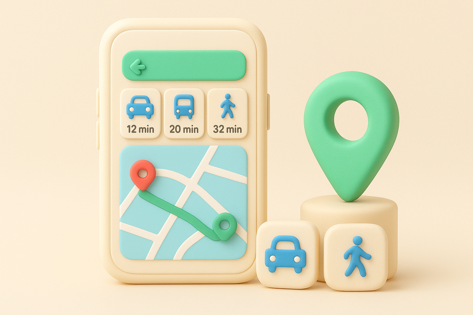
Google Maps handles a genuinely hard problem: getting you from point A to point B using whatever mix of walking, driving, biking, or transit actually gets you there fastest. Switching between modes takes a single tap at the top of the screen, and each option shows its own time estimate side by side so you can compare a 12-minute drive against a 20-minute bus ride before committing to either. Live transit data layers on top, showing when the next train leaves and whether your bus is running late. It's a user experience design example of managing enormous complexity, traffic, transit schedules, walking paths, without ever making the user feel it.
Because the comparison happens automatically, users don't need to open separate apps for transit versus driving directions. Someone unfamiliar with a city's bus system can trust the app to surface a route they'd never have pieced together on their own. Real-time updates also mean fewer people standing at a stop wondering if they missed their ride, since the app already told them the delay before they left home.
Complexity handled well feels like simplicity, not like a feature list.
When your product needs to help users choose between several valid paths, the goal isn't listing every option, it's ranking them by what matters to that user in that moment. Google Maps succeeds because it translates raw data (schedules, traffic, distance) into a simple time comparison instead of forcing users to interpret the data themselves. If your interface asks users to weigh multiple choices, do that math for them and show the result plainly.
Mailchimp turns a normally tedious moment, creating an account, into a small interaction that actually talks back to you. As you type a password, a strength indicator updates instantly and a short line of text below the field shifts from playful commentary to genuine encouragement once you hit a secure combination. There's no waiting for a form submission to find out you messed up; the real-time password feedback appears character by character, right as you type. It's a small user experience design example, but it shows how a single form field can carry personality without sacrificing clarity.
Users get immediate confirmation instead of the frustrating cycle of submitting a form, hitting an error, and retyping a password from scratch. That instant signal removes the guesswork of "is this good enough," which matters most for people who aren't sure what counts as a strong password in the first place. Mailchimp's playful copy also softens what's normally a purely functional, even annoying, step in signing up.
Feedback that arrives the moment you act builds more trust than feedback that arrives after you fail.
Fewer abandoned signups follow naturally, since nobody's stuck guessing why a form rejected their input after the fact.
Apply this same principle, one of many practical UX best practices, anywhere your product asks users to fill in something with rules attached, usernames, passwords, coupon codes, file uploads. Validating input the moment someone types, rather than after they submit, turns a guessing game into a guided conversation. Even a short line of inline copy explaining why something works or doesn't can turn a frustrating form into one that feels like it's actually on the user's side.
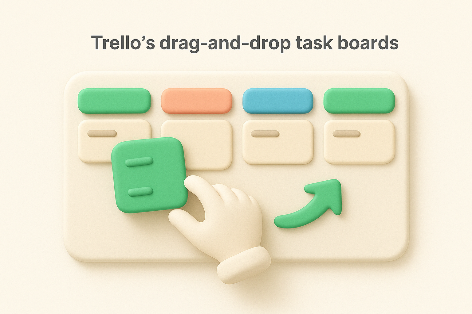
Trello built its entire interface around a single, familiar metaphor: sticky notes on a wall, rearranged with a flick of the mouse. Cards represent tasks, columns represent stages like "To Do," "Doing," and "Done," and moving a task forward just means dragging its card one column to the right. There's no dropdown menu to update status, no save button to click, no form to fill out. This is one of those examples of user experience design where the interaction itself communicates the entire concept, so nobody needs a tutorial to understand what a board does.
Speed is the biggest win here. Updating a task's status takes under a second, compared to the several clicks a traditional project management form usually demands. Teams adopt Trello quickly, some even running a Trello feature request board for user ideas, because the mental model, a physical board with movable cards, already exists in most people's heads from whiteboards and corkboards long before software entered the picture. Visual scanning also gets easier: glancing at a board tells you instantly where bottlenecks sit, since a column stacked with cards is its own warning sign.
When an interaction mirrors something physical people already understand, you skip the learning curve entirely.
Before building a settings panel or status dropdown, ask whether a direct-manipulation interface, dragging, dropping, reordering, could replace it. Familiar real-world metaphors cut onboarding time dramatically, because users bring existing mental models with them instead of learning your system from scratch. Look for the step in your product where users update a status or reorder priorities, and consider whether that action could become a gesture instead of a form.
Headspace opens with a soft-spoken narrator, muted blues and oranges, and animations that move slowly enough to feel deliberate rather than sluggish. Before you meditate for the first time, the app asks a handful of gentle questions about why you're there and how much time you have, and the onboarding never rushes you toward a paywall or a feature tour. Once you start a practice, a streak counter tracks consecutive days quietly in the corner, never flashing or demanding attention the way a game score might. It's a rare example of user experience design where every visual and audio choice reinforces the product's core promise: slowing down.
Because the pacing matches the goal, users arrive at their first session already primed to relax instead of fighting an interface that feels rushed or salesy. Streaks give people a reason to return daily, but Headspace frames a broken streak as no big deal rather than a failure, which keeps the habit-building mechanic from working against the calm it's meant to deliver. New meditators, often skeptical or self-conscious about the practice, stay longer because nothing in the app rushes or judges them.
Design tone matters as much as design function when the product's whole purpose is emotional.
Match your interface's pace and tone to what you're actually asking users to do, the way the strongest onboarding flows from other SaaS products do. A habit-tracking mechanic like a streak works in almost any product, but only if its presentation fits the emotional register of the task itself. If your product asks users to slow down, breathe, or reflect, don't undercut that with jarring colors, urgent notifications, or aggressive gamification borrowed from unrelated categories.
Amazon built accessibility into the Kindle experience rather than bolting it on as an afterthought. Readers can adjust font size, line spacing, and typeface independently, swap to a high-contrast color scheme for low vision, or let VoiceView read text aloud for anyone who can't or doesn't want to read a screen. Page margins, orientation, and even the boldness of text respond to a few taps in the settings menu. This is one of the clearer examples of user experience design built around a spectrum of ability rather than a single default user.
Readers with low vision, dyslexia, or aging eyesight get a genuinely usable product instead of a workaround. Someone commuting on a bumpy train can switch to audio without buying a separate app, and a parent reading in a dark room can drop brightness without straining. Because these settings live in the same menu everyone uses, nobody has to hunt through a separate "accessibility mode" to find them.
Accessible design isn't a separate feature, it's the same feature built to work for more people.
Treat text and contrast controls as core settings, not extras reserved for a niche audience, since vision changes with age, lighting, and device, not just disability status. Audit your product for the one or two adjustments, font size, contrast, audio alternatives, that would remove the most friction for the widest range of readers. Building accessibility in from the start almost always costs less than retrofitting it after complaints pile up, and Amazon's own accessibility guidance makes clear this thinking runs through the whole product line, not just Kindle.
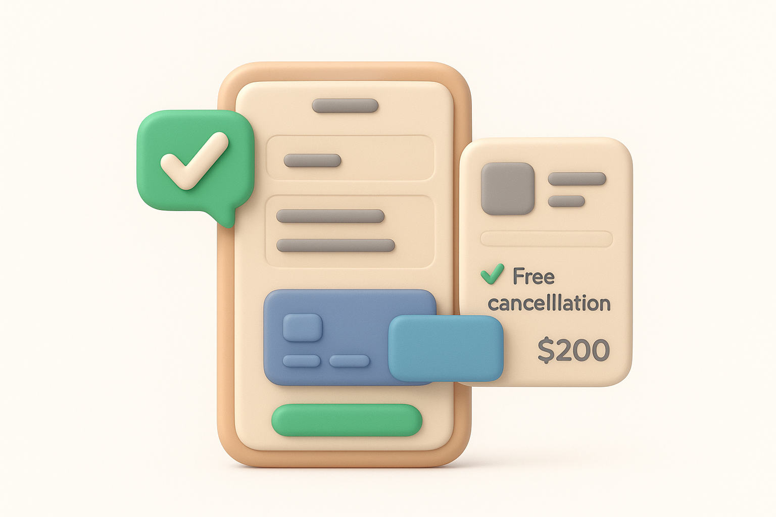
Booking.com strips its checkout down to a single scrolling page instead of the usual multi-step wizard other travel sites still use. Guests enter payment details, confirm dates, and review cancellation terms without ever clicking "next" and losing sight of what they already filled in. A persistent summary panel stays visible the whole time, showing the room, price, and dates so nobody has to scroll back up to double-check what they're actually buying. Small trust signals, like "free cancellation until" dates and a note on how many other people are viewing the same room, sit right next to the payment fields rather than in a separate banner. It's a practical user experience design example of reducing steps without hiding the information that actually matters.
Fewer screens mean fewer chances for someone to second-guess a booking or get distracted mid-flow. Travelers booking on a phone during a commute can finish in under a minute, since nothing forces them to reload a new page for each field. That single-page structure also cuts down on the abandoned-cart problem that plagues longer checkout flows, because the whole commitment feels smaller when it fits on one screen.
A checkout that fits on one screen feels like a smaller commitment than one that spans five.
Count the screens in your own checkout or signup flow, then challenge yourself to cut that number in half. Keeping a visible order summary on screen the entire time, the way Booking.com does, reassures users they haven't lost track of what they agreed to. Fewer steps, paired with clear reminders of what's already been confirmed, beats a longer flow dressed up with progress bars.
Spotify reuses the same visual language everywhere you look: the same play button shape, the same swipe gesture to queue a song, the same three-dot menu for options on an album, a playlist, or a podcast episode. Whether you're browsing a curated mix or your own liked songs, the controls sit in the same place and behave the same way. This consistent interaction pattern means you learn the interface exactly once, then apply that knowledge everywhere else in the app without a second thought. It's a subtle user experience design example, easy to overlook precisely because it never surprises you.
Because every screen behaves the way the last one did, users stop thinking about the interface and focus on the music. Someone who figures out how to queue a song on desktop already knows how to do it on mobile, since Spotify keeps the same gesture and icon across platforms. That predictability matters most for a product people use daily, often while driving, exercising, or multitasking, when fumbling through an unfamiliar menu just isn't an option.
Consistency is invisible when it works and glaring the moment it breaks.
New features also feel less jarring when they're introduced, since they slot into patterns users already trust rather than demanding they relearn the basics.
Audit your own product for icons, gestures, or button placements that mean one thing on one screen and something different on another. A design system with reusable components, built on principles of intuitive UX design, pays for itself the moment your product grows past a handful of screens, because it keeps new features from feeling bolted onto an inconsistent foundation. Consistency won't win you praise the way a flashy feature might, but it quietly removes friction from every single session someone spends in your app.
WhatsApp lets you delete a sent message for everyone, but only within a set time window, and the interface never tells you upfront how much time you have left. Tap and hold a message, choose "Delete," then pick between "Delete for me" and "Delete for everyone," two options with nearly identical labels and drastically different outcomes. If you're a few minutes past the cutoff, the "Delete for everyone" option simply vanishes with no explanation, leaving you to guess whether you missed the window or tapped the wrong thing. This confusing message deletion flow stands out as one of the rare examples of user experience design worth studying for what not to do, alongside other bad UX examples from real products.
People send an embarrassing text, panic, and open the delete menu expecting a clean fix, only to find the option they need already gone. Because the app gives no countdown or warning before the window closes, users learn the time limit exists only after they've already been burned by it once. That gap between expectation and reality erodes trust in a small but real way, since a messaging app people rely on for private conversations should make an action this sensitive predictable, not a gamble.
An option that disappears without warning teaches users to distrust the whole interface, not just that one button.
Support forums fill with the same question every week, a sure sign the interface itself isn't answering it.
Any time-sensitive action in your product, canceling an order, editing a comment, undoing a payment, needs a visible countdown or clear messaging about the deadline, not silence until it's too late. Visible time limits turn a frustrating dead end into an understandable constraint. If a feature can vanish based on a condition the user can't see, show that condition before they need it, not after they've already failed to meet it.
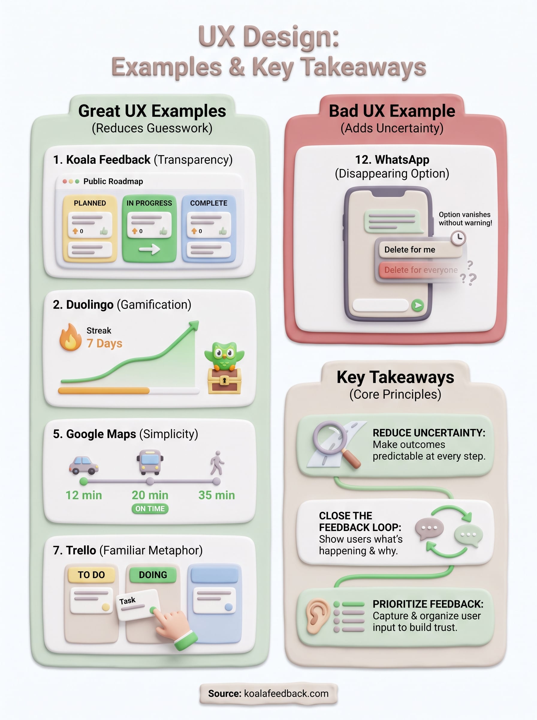
Each example of user experience design in this list, good or bad, comes back to the same idea: users shouldn't have to guess. Duolingo removes the guesswork around motivation, Booking.com removes it from checkout, and WhatsApp shows what happens when a product leaves that guesswork in place. The pattern holds across every industry, whether you're building a meditation app or a project management tool. Reducing uncertainty at every step, not adding more features, is what separates products people trust from ones they tolerate.
If there's one thread worth pulling from all twelve, it's this: closing the feedback loop with users, showing them what's happening and why, builds more loyalty than almost any single feature you could ship. That's exactly the gap Koala Feedback was built to close. If you want your own users to feel heard instead of ignored, start capturing and prioritizing user feedback in one place and see the difference visible progress makes.

Start today and have your feedback portal up and running in minutes.