Most SaaS products lose the majority of their signups before users ever experience the core value. The onboarding flow is where that drop-off happens, and where the biggest conversion gains hide. If you're researching SaaS onboarding examples, you're likely looking for concrete patterns you can steal, adapt, and test in your own product. Good instinct, design decisions here directly impact activation rates, trial conversions, and long-term retention.
We built Koala Feedback to help product teams collect and prioritize user feedback so they can build what actually matters. And one thing we see repeatedly is this: the companies that nail onboarding are the ones that deeply understand their users' goals. That understanding doesn't come from guessing, it comes from structured feedback loops that start from day one.
In this article, we break down nine real onboarding flows from SaaS companies that are getting it right. For each example, you'll see what specific UX patterns they use, why those patterns work, and how you can apply similar thinking to your own product. No generic advice, just actionable teardowns with screenshots and context you can reference during your next design sprint.
Koala Feedback is a feedback management platform built for product managers and SaaS teams who need to collect, organize, and act on user input without drowning in spreadsheets or support threads. The onboarding experience reflects the product's core promise: get to value fast, with minimal friction between signup and first meaningful action.
When you sign up for Koala Feedback, you enter a guided setup flow that walks you through creating your first feedback board. The product asks a few targeted questions about your use case, then pre-populates your workspace with a sample board and example feedback posts so the interface never feels empty on day one. You immediately see what a populated portal looks like, which removes the blank-canvas anxiety that kills activation in most tools.
Getting users to a pre-filled, realistic view of your product is one of the fastest ways to reduce first-session drop-off.
The setup flow uses contextual tooltips tied to specific UI elements rather than a generic walkthrough modal. Each tooltip explains not just what a feature does, but why it matters in the context of your specific workflow. Koala Feedback also relies on progressive disclosure, meaning it surfaces advanced settings like custom domains and status management only after you complete the core setup steps. This keeps the initial experience simple without permanently hiding power features from users who want them.
Koala Feedback's approach works best for tools with a multi-step setup requirement, where users need to configure something before the core functionality makes sense. If your product requires users to create a project, invite a team, or set up a workflow before experiencing real value, a guided linear flow with pre-populated sample data is the right model to follow. This pattern shows up repeatedly across the strongest saas onboarding examples because it closes the gap between signup and that first moment of clarity.
Notion is a flexible workspace tool used for note-taking, project management, and documentation. Because it can do almost anything, its biggest onboarding challenge is helping new users understand what to do first without overwhelming them with options.
When you sign up, Notion asks a few questions about your role and primary use case. Based on your answers, it loads a pre-built workspace with relevant templates already in place. You land in a live, populated environment rather than a blank editor, which immediately shows you what the product can do without requiring you to build anything from scratch.
Starting users in a pre-configured workspace removes decision paralysis and gets them to value within the first session.
That pre-populated approach also means your first interaction is tactile. You click, edit, and explore a real working page rather than sitting through a feature tutorial.
The product leads with template-driven onboarding as its core activation strategy. Rather than walking you through features abstractly, it puts you inside a working environment and lets you interact directly. Setup guidance comes through inline checklists embedded in the workspace itself, not through a separate overlay or modal that pulls you out of context.
This pattern fits highly flexible or multi-use tools where blank-canvas paralysis is a real risk. If your product serves many different use cases, using targeted intake questions to personalize the starting environment is one of the most transferable ideas in this entire list of saas onboarding examples.
HubSpot CRM is a free-to-start sales and marketing platform used by small businesses and enterprise teams alike. Its onboarding challenge is significant: the product covers contacts, deals, pipelines, email, and more, so guiding new users toward a single clear first action is critical to keeping them engaged past day one.
After signup, HubSpot presents a role-based setup checklist that adapts to whether you identify as a salesperson, marketer, or business owner. The checklist lives in the sidebar throughout your first sessions, giving you a persistent reference point without forcing you through a locked linear flow. Each task in the list connects directly to a live feature, so completing a step means you've actually used something rather than just clicked through a tutorial.
Embedding your onboarding checklist inside the product UI, rather than in a separate modal, keeps users in context and builds real confidence through action.
HubSpot uses goal-based task lists that let users self-select their starting point. Combined with in-app tooltips and short explainer videos tied to each feature, the flow respects different learning styles without requiring a one-size-fits-all path. Key patterns include:
This approach suits feature-rich platforms where users arrive with different goals and varying levels of technical confidence. If your product serves multiple buyer personas, this is one of the most relevant saas onboarding examples to study before you design your own flow.
Asana is a project management platform used by teams to track work and coordinate across departments. Its onboarding challenge is helping new users grasp the relationship between projects, tasks, and assignees quickly, since that structure is the foundation everything else builds on.
When you first sign up, Asana walks you through a short setup wizard that asks about your team size and primary use case. It then creates a sample project pre-loaded with example tasks assigned directly to you, which puts you inside an interactive workspace in under two minutes.
Showing users a realistic project with tasks already assigned to them makes the product feel personal from the first session, not abstract.
The setup also triggers a welcome email sequence that reinforces the key actions from your first session, helping users who drop off before finishing return with full context intact.
Asana uses a persistent bottom-corner checklist that stays visible across sessions without blocking the main interface. Each item connects to a specific action inside your actual workspace, and task completion animations reward users for moving through the flow rather than abandoning it.
This is one of the most transferable patterns across saas onboarding examples. It works best for collaborative tools where users need to create, assign, and interact with structured content before the product's full value becomes clear.
Webflow is a visual web design and development platform that lets you build production-ready websites without writing code. Its onboarding challenge is steep: the product has a learning curve closer to a professional design tool than a typical SaaS, so the first-run experience has to manage expectations while still moving you toward a quick win.
When you sign up for Webflow, the product offers a choice between starting with a template or jumping into the Designer directly. First-time users get nudged toward a short interactive tutorial called Webflow University 101, which runs inside the actual product interface. Rather than watching a video externally, you manipulate real elements in a sandboxed environment, which builds hands-on confidence before you ever touch your own project.
Putting your tutorial inside the product itself, using real interactions on real UI, builds muscle memory faster than any external video walkthrough.
Webflow separates learning mode from building mode cleanly, so you never feel like the tutorial is blocking your path to actual work. The in-product lessons tie directly to visual feedback in the canvas, making abstract concepts like layout and positioning immediately tangible rather than theoretical.
This is one of the more specialized saas onboarding examples on this list. It works best for technically complex tools where users need to build foundational skills before they can accomplish anything meaningful on their own.
Slack is a team communication platform that replaced email for millions of companies by organizing conversations into channels. Its onboarding challenge is getting users to see Slack as a live, active workspace rather than just another messaging app, which means the first-run experience has to simulate real team activity even before a single teammate joins.
When you sign up, Slack drops you into a pre-configured workspace with a Slackbot tutorial already running in your direct messages. Slackbot sends you conversational prompts that walk you through core actions like setting your status, creating a channel, and sending your first message. You complete your onboarding inside the actual product interface, not through a separate modal or slideshow.
Teaching users through a simulated conversation inside the product makes the tutorial feel like normal product usage, which accelerates habit formation faster than passive walkthroughs.
Slack uses a conversational onboarding agent to simulate real usage before your team is present. The flow also surfaces channel creation and teammate invitations early, because Slack's core value only becomes obvious once other people are in the workspace with you.
Among practical saas onboarding examples, Slack's approach fits any product where value depends on multiple users being present. If your product's core loop requires collaboration, getting users to invite teammates during onboarding is the most important activation step you can optimize.
Canva is a visual design platform that lets anyone create graphics, presentations, and marketing materials without a design background. Its onboarding challenge is unique: the product needs to convince non-designers that they can produce something polished within their first session, or they leave and never come back.
When you sign up, Canva asks you a single question: what are you primarily here to create? Based on your answer, it loads a filtered template library tailored to your use case, so you're never staring at thousands of irrelevant options. Within ninety seconds of signing up, you can have a real design open and editable in the canvas.
Getting users to a tangible output in the first session is the single most effective activation strategy for tools where the end product is visible and shareable.
Canva uses outcome-based personalization at the entry point rather than feature-based onboarding. The platform surfaces a short in-editor tooltip sequence only when you interact with a tool for the first time, keeping guidance contextual without interrupting your flow. This pattern keeps the experience feeling like design work, not a product tutorial.
Among the saas onboarding examples in this list, Canva's model fits output-driven tools best. If your product's value shows up in something a user creates or publishes, get them to that output as fast as possible and let the result do the convincing.
Trello is a visual project management tool built around boards, lists, and cards. Its onboarding challenge is deceptively simple: the card-based structure is intuitive on the surface but requires users to grasp the underlying workflow logic before the tool clicks as a daily habit.
When you sign up, Trello drops you into a sample board pre-loaded with cards arranged across multiple lists. The board comes with a short welcome card at the top of the first list that explains the basics, giving you a self-guided entry point without forcing a scripted walkthrough. You can immediately start dragging cards, adding details, and exploring the interface on your own terms.
Giving users a pre-built, interactive board to explore removes the setup burden and lets the product's visual metaphor explain itself.
Trello relies on embedded instructional cards within the sample board rather than tooltip overlays or separate onboarding modals. This keeps all guidance inside your actual workspace, so learning happens through interaction with a real, functional environment rather than through passive observation.
This approach works well for visually intuitive tools where the interface is largely self-explanatory with minimal framing. Among the saas onboarding examples covered here, Trello's model suits products where low-friction entry matters more than guided configuration.
Calendly is a scheduling automation tool that removes the back-and-forth of booking meetings. Its onboarding challenge is getting users to connect their calendar and share their first booking link before they leave, since Calendly's value is entirely invisible until someone actually books time on your calendar.
When you sign up, Calendly immediately prompts you to connect your calendar and walks you through setting your availability in a few steps. Within minutes, you have a live, shareable booking link ready to send. The flow is intentionally short and linear because the single activation moment is getting that link into someone else's hands.
The fastest path to activation in single-purpose tools is a shareable output the user can act on before the session ends.
Calendly uses a single-path linear flow that strips away all optional setup until you finish the core action. The product surfaces a copy-ready link at the end of setup with explicit prompts to share it, which closes the loop between configuration and real use. This focus on one outcome over many features is a lesson several saas onboarding examples on this list reinforce from different angles.
This model fits single-purpose tools where one specific action defines whether a user has activated. If your product's core value unlocks through a single task, like connecting an account or publishing an output, a locked linear flow with a clear endpoint is often the most effective structure you can build.
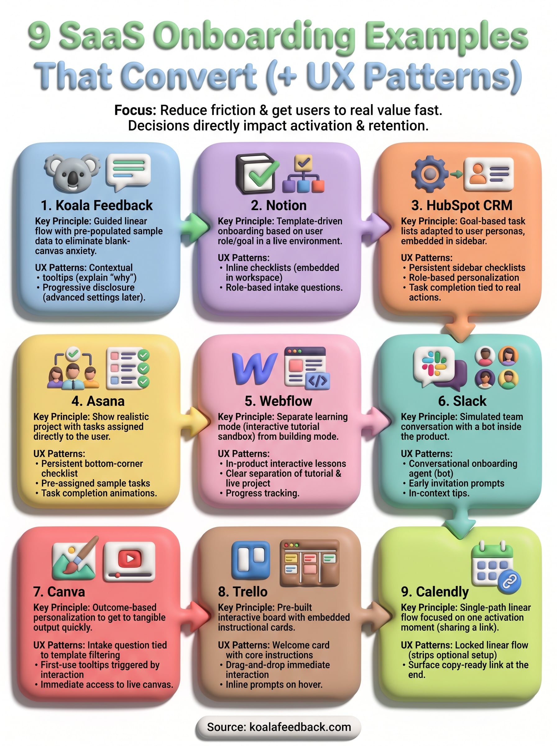
The nine saas onboarding examples above share a common thread: they all reduce friction between signup and the moment a user experiences real value. Whether you borrow Canva's outcome-based personalization, Calendly's single-path linear flow, or Trello's embedded instructional cards, the pattern that matters most is getting users to a meaningful action before they have a reason to leave.
Your next move is to map your own onboarding against the patterns here. Identify where users drop off, what action would confirm activation for your product, and which examples most closely match your use case. Building that clarity starts with listening to your users directly and systematically.
Koala Feedback gives you a structured way to collect, organize, and act on user input so your onboarding decisions are grounded in what users actually need, not what you assume they want.

Start today and have your feedback portal up and running in minutes.