Every product has at least one feature users quietly hate. Maybe it's a confusing checkout flow, a settings menu buried five clicks deep, or a form that wipes out everything you typed after one wrong field. A bad user experience doesn't just annoy people, it drives them straight to a competitor, and most teams don't notice until churn shows up in the numbers.
This article walks through eleven real cases of bad user experience design, pulled from products you've probably used yourself. Each example breaks down exactly where the design failed, why users bounced, and what the team could have done differently. You'll see patterns repeat across industries: unclear navigation, ignored feedback, features shipped without testing against real user needs.
More importantly, each example comes with a lesson you can apply directly to your own product. We'll cover how to spot these mistakes before launch, how to build a feedback loop that catches problems early, and how tools like structured feedback portals and public roadmaps help teams avoid repeating history. By the end, you'll have a checklist of warning signs to watch for in your own design decisions.
Most companies treat UX problems as a design team issue, not a revenue issue. That's the first mistake. A confusing signup flow or a buried cancel button doesn't just cause a bad afternoon for one user, it shows up months later as churn, support tickets, and refund requests that nobody connects back to the original design decision. Bad user experience rarely announces itself with an angry email. It shows up as silence: users who simply stop coming back.
Forrester research has long shown that even small improvements in usability drive measurable gains in conversion, and the inverse holds true too. Friction compounds. A user who struggles through one clunky form starts expecting the rest of the product to be just as painful, and that expectation colors every future interaction, even the ones you got right. This is why bad UX examples are worth studying in detail instead of dismissing as one-off complaints. The damage is rarely contained to the single screen where it happened.
A bad user experience doesn't lose you one click, it loses you the customer's trust in every click after it.
Support costs are the most visible symptom. Every confusing menu or unclear error message turns into a ticket, a chat session, or a phone call that a clearer design would have prevented entirely. Teams that track this closely often find that a small number of UX issues generate a disproportionate share of their support volume. Fixing the design is cheaper than staffing up support to explain around it.
Retention tells the quieter, more expensive story. Users who hit friction early, during onboarding, during their first attempt to complete a core task, rarely file a complaint. They just leave, and they leave without telling you why. That's the real cost of bad user experience design: it hides inside your churn numbers, dressed up as a normal drop-off, when it's actually a fixable design flaw nobody flagged in time.
Here's what usually separates products that catch these problems early from products that don't:
Every example in this article traces back to one of these missing habits. Workday's job application flow, Facebook's privacy maze, Zara's homepage, they all shipped without a tight enough feedback loop catching the problem before real users hit it. The rest of this article breaks down exactly where each one went wrong, but the underlying lesson is consistent: teams that build a structured way to hear from users, and act on what they hear, avoid most of these mistakes before they ever reach production.
Job seekers dread the words "apply via Workday" for good reason. This applicant tracking system powers hiring for thousands of large employers, but its application flow turns a five-minute task into a 45-minute ordeal of account creation, résumé re-entry, and forms that don't save progress. It's one of the most-cited bad UX examples in hiring, and it's not because the underlying technology is broken. It's because the flow was built around internal HR requirements, not around the person trying to submit an application.
Applicants often have to create a new account for every single company that happens to run on Workday, then manually retype work history the uploaded résumé already contains. Session timeouts wipe out unsaved fields, and required fields with vague validation errors force users to hunt for the one dropdown they missed.
When applying for a job takes longer than the job interview itself, you've already lost the best candidates.
Candidates are evaluating your company the entire time they're filling out that form. A frustrating application process signals disorganization before day one, and the most qualified people, the ones with other offers on the table, simply close the tab and apply somewhere else. The friction doesn't just cost applicants time, it costs employers their strongest candidates.
Teams building any multi-step form, hiring-related or not, should treat progress preservation as non-negotiable. A few concrete fixes:
Test your own forms the way a stressed, distracted user would, on a phone, with a spotty connection, at 11pm.
Booking a Ryanair flight often feels like a test of willpower. The advertised fare looks like a bargain, but by checkout you've been walked through a gauntlet of add-ons: seat selection, priority boarding, checked bags, even travel insurance that gets pre-selected by default. This is a textbook case of dark patterns, interface tricks designed to nudge users toward choices that benefit the business more than the customer, and it's one of the most notorious bad user experience examples in travel booking.
Ryanair's booking flow buries the true price behind a sequence of upsells, some framed as mandatory until you look closely enough to decline them. Insurance opt-outs hide behind vague country names instead of a clear "no thanks" button, and the seat map defaults to paid seats before showing any free option. Each screen is engineered to slow down the user just enough that clicking "continue" feels easier than hunting for the real price.
Nobody likes feeling tricked, and that's exactly what happens here. Travelers arrive expecting one price and leave having paid another, which breeds resentment that outlasts the transaction itself. The European Consumer Organisation has flagged airline booking flows for exactly this kind of pricing opacity, and regulators across the EU have pushed for clearer upfront disclosure of mandatory fees.
Tricking a user into a purchase might close the sale, but it guarantees they'll never trust your prices again.
Short-term revenue from a dark pattern almost always costs more in long-term trust. Build pricing flows that hold up to scrutiny:
If your pricing page needs a lawyer to explain it, your design already failed the user.
Open LinkedIn's notification preferences and you'll find a maze of toggles spread across categories like "Messaging," "News and reports," "Job postings," and "Groups," each with its own sub-settings for email, push, and on-site alerts. Users who just want fewer emails end up hunting through nested menus, flipping switches that don't seem to match what actually lands in their inbox. It's a bad user experience that punishes anyone trying to regain control of their own attention.
LinkedIn scattered notification controls across multiple settings pages instead of centralizing them in one view. Toggling off a category on the website doesn't always sync with the mobile app, so users end up managing two separate settings panels for the same outcome. Default settings favor maximum engagement, meaning most notification types ship turned on, and finding the master switch to quiet things down takes more clicks than most users are willing to spend.
People don't open a settings menu for fun, they open it because something is already annoying them. When the fix takes longer than the problem itself, frustration compounds fast. Users start associating the entire platform with noise and clutter, even if the core product, the feed, the messaging, the job search, works fine. That resentment shows up as disabled email opens, ignored push notifications, and eventually, reduced time in the app.
If turning off notifications takes more effort than the notifications themselves, you've built the wrong settings page.
Settings should mirror how users actually think about the problem, not how your internal teams organize their features. Some fixes worth applying to any notification system:
A settings page that respects a user's time builds more loyalty than another feature they never asked for.
HuffPost's homepage has earned a reputation among designers for burying its most important stories under a wall of unrelated links, trending tags, and sponsored content. A reader landing on the site after clicking a shared link often can't tell what's actually breaking news versus what's just filler competing for the same visual weight. It's a recurring entry in bad UX examples lists because the layout actively works against the one thing a news site should do well: help you find the story you came for.
HuffPost's homepage structure changes shape depending on the day, the section, and sometimes the device, so returning visitors can't build a mental map of where anything lives. Headlines of wildly different importance sit in identical type sizes, and sponsored posts blend into editorial content without clear labeling. Scroll depth becomes a guessing game, since the most relevant story might sit above the fold one day and three scrolls down the next.
Readers expect a news site to signal importance visually, bigger headline, bolder placement, means bigger story. When that signal breaks down, people lose trust in the source itself, not just the layout. A bad user experience design like this trains readers to distrust the hierarchy on the page, so they either bounce to a competitor or start scanning headlines elsewhere first and only click through when they already know what they want.
If your layout changes every visit, readers stop trusting it to show them what matters.
Consistency beats novelty on any content-heavy site. A few practical guardrails:
A homepage should orient readers, not force them to relearn it every time they show up.
Zara's website looks like a fashion editorial, and that's precisely the problem. Full-bleed photography, minimal text, and generous white space work great in a magazine spread, but on an ecommerce homepage they push actual shopping tools out of view. Shoppers land on the site wanting to browse categories or find a sale, and instead scroll past model shots with no clear next step. It's a bad user experience that prioritizes brand aesthetic over the basic job a homepage exists to do: help people find products.
Zara buries category navigation behind a hidden hamburger menu, hides the search bar until you hover in the right spot, and stretches hero images across the full viewport with zero supporting links. New arrivals and sale sections sit several scrolls down, disguised as more lookbook photography rather than clickable entry points. Nothing on the first screen signals "click here" the way a typical retail site does.
Shoppers move fast, and every extra second spent hunting for navigation is a second closer to abandoning the site entirely. Mobile users feel this worse, since the same oversized imagery that looks striking on a desktop monitor forces excessive scrolling and hides menus behind ambiguous icons. A bad user experience design built for visual impact rather than usability trades short-term brand polish for long-term shopper frustration, and frustrated shoppers close the tab and search a competitor instead.
A beautiful homepage that hides the buy button isn't design, it's decoration.
Aesthetic and usability aren't opposites, but they need to be balanced deliberately rather than left to whichever wins internal design reviews.
If a first-time visitor can't find the product they came for within seconds, the design has already failed them.
Scroll through Netflix's home screen for more than a second and a trailer starts blaring, complete with sound, spoilers, and movement that yanks your eyes away from whatever you were actually trying to browse. What started as a feature meant to help people decide what to watch has turned into one of the most complained-about bad UX examples in streaming. Users didn't ask for a preview reel, they asked for a way to find something to watch without noise.
Netflix set autoplay previews on by default, with sound enabled, triggered by a hover or even a brief pause while scrolling. The setting to disable it sits buried inside account profile settings rather than on the browsing screen where the annoyance actually happens. Previews also reveal plot points or tone shifts that spoil a show before a viewer has decided whether they even want to watch it.
Browsing should feel calm, not like dodging pop-up ads. A bad user experience here comes from mismatched intent: the user wants to scan titles quietly, but the interface assumes they want a sales pitch. Sound autoplaying in a quiet room, or during a late-night session with sleeping kids nearby, turns a simple browsing session into an unwanted disruption that users can't easily escape mid-scroll.
When the interface assumes what users want instead of asking, it usually assumes wrong.
Autoplay features can work, but only when users control them, not the other way around.
Asking users before deciding for them costs a few extra design cycles, but it beats losing their trust one blaring trailer at a time.
Open Microsoft Teams for the first time and you're greeted with a left rail stacked full of icons: Activity, Chat, Teams, Calendar, Calls, Files, and whatever third-party apps your IT department bolted on. New users spend their first week clicking around trying to figure out where a message actually lives, since the same conversation can surface in Chat, inside a Team channel, or as a notification in Activity. It's a frequently cited bad user experience in enterprise software, where feature count gets mistaken for feature value.
Teams tries to be a chat app, a video platform, a file repository, and a project hub all at once, and the navigation shows every seam. Menus nest three or four levels deep, channel names get truncated without warning, and the search bar returns messages, files, and people in a single unsorted list that forces users to guess which result they actually need. Microsoft kept adding modules without ever pulling any older ones out.
Adding a feature without removing anything eventually turns your navigation into the product's biggest liability.
Workplace tools carry an extra burden: employees don't choose them, IT does, so patience for a learning curve runs thin fast. A bad user experience design in a mandatory work tool means every confused click becomes a small tax on someone's actual job, repeated dozens of times a day across thousands of employees. That adds up to real productivity loss that never shows up on a balance sheet tied back to the software itself.
Growing a product doesn't require growing its navigation at the same rate. Some fixes any team building a multi-feature platform should apply:
A navigation menu should shrink complexity for the user, not just organize your org chart.
Amazon markets Prime Video as a benefit already baked into your Prime membership, but scroll through the catalog and you'll hit a wall of titles labeled "rent" or "buy" mixed in with the ones actually included. Subscribers click into a movie expecting it's covered, only to land on a paywall asking for another $3.99. It's a classic bad user experience because the confusion is baked into the business model, not a one-time bug someone forgot to fix.
Prime Video blends included content, rental content, and third-party channel add-ons into a single scrolling interface with almost no visual distinction between them. A thumbnail for a free show sits right next to a thumbnail for a paid rental, both styled identically until you tap through. Search results don't filter by what's actually included in your membership, so users have to open each title just to find out if it costs extra.
If a subscriber has to click through to a paywall just to find out something isn't included, the interface already misled them.
People pay for Prime expecting a clear boundary between what they own and what they don't. When that boundary disappears into the browsing experience itself, every click carries a small risk of an unexpected charge. That uncertainty erodes trust in the platform overall, and it's a large part of why Prime Video shows up so often in bad UX examples roundups: the frustration hits during a moment meant to feel like a reward, not a transaction.
Any product mixing free and paid tiers within the same interface needs unmistakable visual separation. A few fixes:
Clarity about what's actually free costs nothing and saves you the resentment of a surprise charge.
Facebook's privacy controls are scattered across so many menus that even people who work in tech struggle to find the setting they need. Ask someone to limit who sees their old posts, and you'll watch them click through Settings, then Privacy, then Audience and Visibility, then a separate tool called Activity Log, none of which are labeled the way a normal person would search for them. It's one of the most enduring bad user experience examples in social media, and Facebook has redesigned this menu repeatedly without actually simplifying it.
Privacy options live in at least three different sections, each with overlapping but not identical controls, so changing one setting doesn't guarantee the related setting updates too. Some controls apply retroactively to old posts, others only apply going forward, and the interface never explains which is which. Terminology shifts between "audience," "visibility," and "who can see this," describing the same underlying control with three different names depending on which screen you're on.
Privacy settings deal with something people care about deeply, and uncertainty here feels different from uncertainty over a font choice. Users who can't confirm their settings actually worked start assuming the worst, that their data is exposed no matter what they click. This kind of bad user experience design damages trust at a level far beyond typical usability complaints, since the stakes involve personal safety, employment risk, and relationships.
When users can't verify a privacy setting actually took effect, they'll assume it didn't.
Any product handling sensitive settings needs to prioritize clarity over comprehensiveness.
If users can't confirm a privacy setting worked, you haven't built privacy, you've built the appearance of it.
Renew a passport, file for unemployment, or pay a property tax bill online in most states, and you'll land on a site that looks frozen in 2004: tiny text, unlabeled buttons, and a session that times out before you finish reading the instructions. Government portals show up constantly in bad UX examples roundups, not because the agencies don't care, but because decades-old procurement cycles and legacy systems make basic updates painfully slow.
Many of these portals were built on top of mainframe systems from decades ago, with a web layer bolted on rather than a true redesign. Forms ask for information already stored elsewhere in the same government database, session timeouts hit without warning and wipe out completed steps, and error messages reference internal field codes instead of plain language. Mobile users often can't complete a task at all, since the layout assumes a desktop screen and a mouse.
People turn to these sites when they have no alternative. You can't switch to a competitor's DMV. That captive audience means agencies rarely face the market pressure that pushes private companies to fix friction, so problems persist for years past the point any startup would have patched them. The bad user experience compounds because the tasks involved, taxes, benefits, licenses, already carry stress before the interface adds more.
When users have no alternative, bad design doesn't get fixed by competition, it gets fixed by public pressure, or it doesn't get fixed at all.
Any team building tools people are required to use, not choosing to use, needs to work harder to earn trust:
A captive audience is exactly why the design bar should be higher, not lower.
Every iPhone owner has seen it: a gray popup reading "iPhone Storage Almost Full" with a single vague suggestion to "manage storage," no breakdown of what's actually taking up space, and no clear next step. It's a small, recurring bad user experience that millions of people hit monthly, and Apple has had over a decade to fix it.
Apple's warning tells you there's a problem without telling you what's causing it. Tapping "manage storage" dumps you into a settings screen listing apps by size, but not by what's actually bloating them, cached photos, old messages with attachments, or duplicate files buried in app containers. Users end up deleting entire apps just to reclaim a few gigabytes, since the interface never isolates the actual offender.
A warning that tells you something's wrong without telling you what to do next isn't help, it's just anxiety.
People interpret vague warnings as urgent, since Apple frames it with red icons and blocking popups, but the fix requires digging through menus with no guidance. This mismatch between urgency and clarity is exactly what makes a bad user experience design so aggravating: the system demands immediate action while withholding the information needed to act correctly. Users end up guessing, deleting things they might actually want, just to make the warning disappear.
Any warning that interrupts a user's flow needs to pair the alert with an actionable, specific fix. Apply these principles to your own error and warning messages:
A warning without a clear path forward just shifts the burden of troubleshooting onto the user.
Line up all eleven examples and the differences start to disappear. Workday's forms, Ryanair's dark patterns, Facebook's privacy maze, they all trace back to the same handful of root causes. Bad user experience almost never comes from a lack of talent on the design team. It comes from priorities getting out of order: internal convenience over user convenience, short-term revenue over long-term trust, feature count over feature clarity.
Spotting the pattern matters more than memorizing the examples. Once you know what to look for, you can catch the same mistake in your own product before a user ever complains about it. Here's how the failures break down:
| Root cause | Example | What it looks like |
|---|---|---|
| Built for the business, not the user | Workday | Forms designed around HR data needs, not applicant speed |
| Revenue prioritized over trust | Ryanair, Prime Video | Hidden fees, unclear paid vs. included content |
| Settings scattered across the product | LinkedIn, Facebook | No single place to manage a related set of controls |
| Growth without pruning | Microsoft Teams | Features added, nothing retired, navigation bloats |
| Assumed intent instead of asking | Netflix, Apple | Interface guesses what users want and guesses wrong |
| Captive audience, no pressure to fix | Government portals | Legacy systems persist because users have no alternative |
Every bad UX example on this list started with a decision made for the business, not the person using the product.
Notice what's missing from that table: malice. Nobody at these companies set out to frustrate users on purpose. Poor decisions accumulated one shortcut at a time, each one reasonable in isolation, until the interface stopped serving the person on the other end of the screen. That's exactly why bad user experience design is so easy to walk into and so hard to walk back out of once it ships. Reversing it later costs far more than catching it early would have, in engineering time, in support tickets, and in the users who already left without saying why.
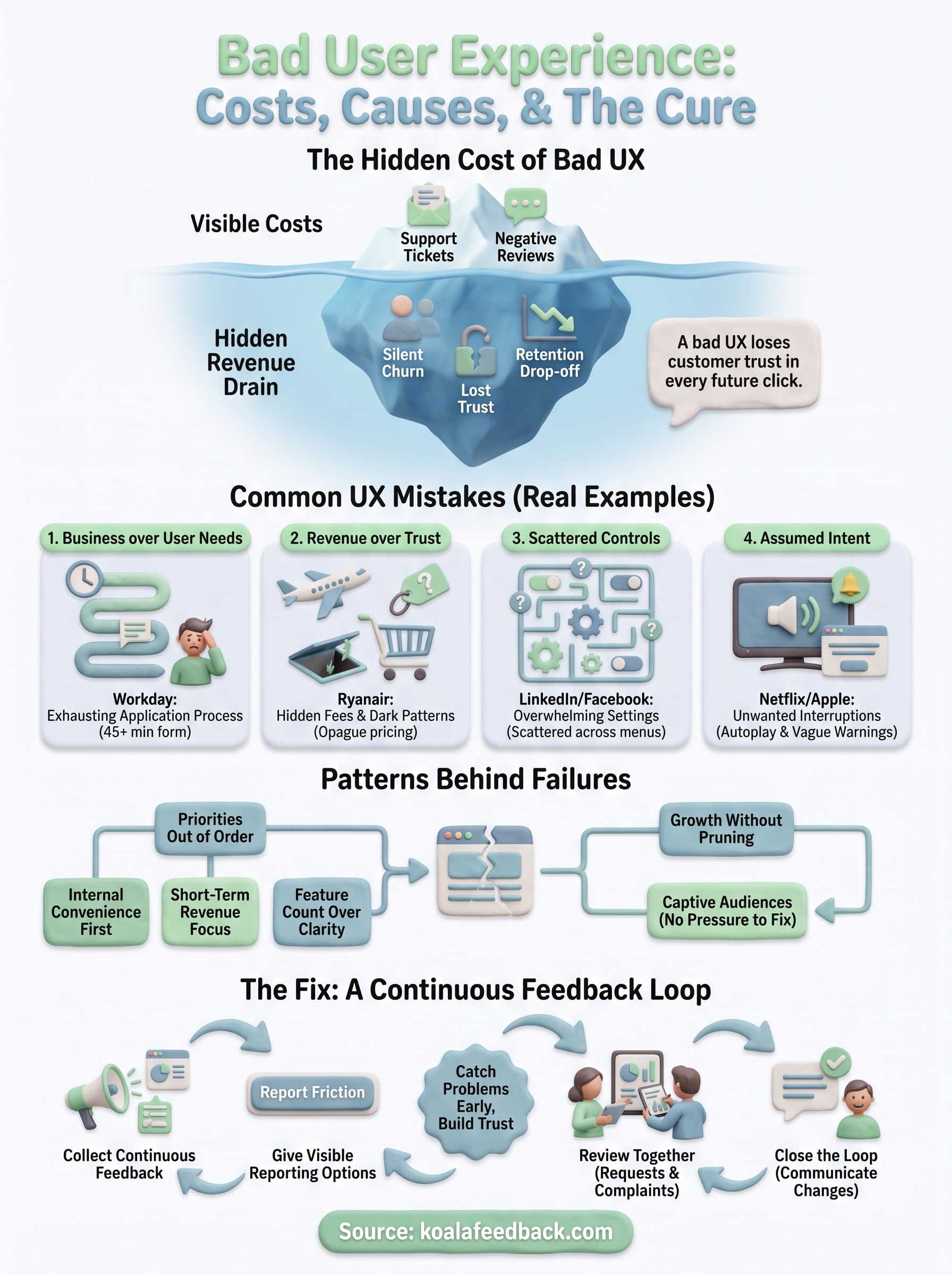
Every example in this article started the same way: a team shipped a decision without checking it against real user needs, and nobody caught it until the damage was already done. Bad user experience isn't a talent problem, it's a listening problem. The companies above had skilled designers on staff. What they lacked was a tight enough loop between what users experienced and what the product team actually saw.
You don't need eleven case studies to know if your own product has a version of this waiting to surface. You need a way for users to tell you before it becomes a churn statistic. Give people a visible place to flag friction, vote on what matters most, and see that you're actually acting on it. That's the entire fix, applied early instead of after launch.
If you want that feedback loop built into your product from day one, see how Koala Feedback works.

Start today and have your feedback portal up and running in minutes.