Every product team eventually runs into the same debate: is this a UI problem or a UX problem? The truth is, user interface and user experience design work so closely together that many teams use the terms interchangeably, and that confusion leads to wasted design cycles and features that look polished but still frustrate users. Getting the distinction right matters more than most teams realize, because misaligned priorities between the two can quietly sink an otherwise solid product.
UI design covers what users see and touch: buttons, layouts, colors, typography. UX design covers what users feel: whether a flow makes sense, whether a task takes three steps or ten, whether the product actually solves their problem. One is visual craft, the other is structural thinking, and neither works well alone.
In this article, we'll break down what separates UI from UX, show how they overlap in practice, and walk through how strong teams get both disciplines pulling in the same direction. We'll also touch on where user feedback fits into this process, since listening to real users is what keeps UI and UX decisions grounded instead of guesswork.
Users decide whether they trust your product within seconds, and that snap judgment usually comes down to user interface and user experience design working in tandem. A messy layout signals sloppiness even if the underlying logic is sound, and a confusing flow makes even the most beautiful screen feel broken. Product teams that treat UI and UX as an afterthought, something to "clean up" after the features ship, consistently see it show up in the numbers: higher churn, lower activation rates, and support tickets asking how to do things that should be obvious.
Getting someone to sign up is only half the battle. Keeping them past week one depends on whether the product feels intuitive from the first click. Poor onboarding flows, buried settings, and inconsistent navigation patterns push new users to quietly disappear rather than complain. Strong interface and experience design removes friction at exactly the moments where users are most likely to give up, like account setup, first-time configuration, or the initial
Great products don't separate these disciplines into isolated phases of product development where one team finishes and hands off to the other. Instead, UI and UX design run as overlapping, iterative work throughout a product's lifecycle, from the first sketch to the fiftieth version shipped after launch. A UX designer might map out a checkout flow, a UI designer builds the screens for it, and then user testing sends both back to the drawing board when real people get confused at step three. This back-and-forth isn't a sign of a broken process, it's what a healthy design workflow actually looks like.
Most teams move through a recognizable sequence of user experience steps, even if the loops repeat many times before anything ships:
Teams that treat UX as a one-time research phase and UI as a separate visual pass tend to ship inconsistent products. A beautiful screen built on a flawed flow just makes the flaw harder to notice until users hit it. The reverse happens too: a well-structured flow with sloppy visual execution feels untrustworthy even when the logic is sound.
When UI and UX design inform each other continuously instead of sequentially, the product feels effortless instead of assembled.
Collecting input at every stage, not just at the end, keeps this loop working. Platforms like Koala Feedback let teams gather feature requests and usability complaints in one place, so UX researchers and UI designers are reacting to the same signal instead of working from separate assumptions about what users actually want. Small teams especially benefit from this shared source of truth, since there's rarely a dedicated researcher and a dedicated visual designer working full time on the same feature. Often, one or two people wear both hats, which makes tight feedback loops between research and execution even more important to get right.
Splitting user interface and user experience design into two job descriptions helps clarify who owns what, even when one person handles both roles. UI designers are responsible for the tangible surface of a product: color palettes, iconography, spacing, and how buttons respond when clicked. UX designers own the invisible scaffolding underneath, the information architecture and decision logic that determines whether a task takes two clicks or twelve. Confusing these roles is where most disagreements over “the design” start, because a critique of layout and a critique of flow require completely different fixes.
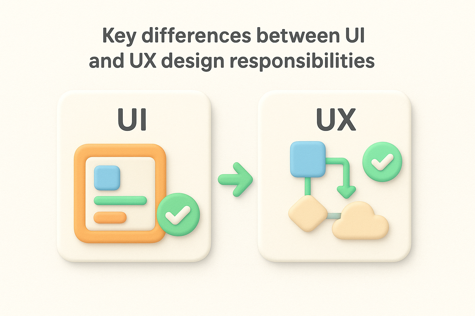
If a fix changes how something looks, it's UI. If it changes how something works, it's UX.
Deliverables make the split concrete. A UI designer hands off polished mockups, a component library, and style guides that keep every button and label consistent across the product. A UX designer hands off user flows, wireframes, journey maps, and research findings that justify why the product is structured the way it is. Neither deliverable replaces the other, and shipping one without the other creates the mismatched products described earlier, gorgeous screens with confusing flows, or logical flows dressed in inconsistent visuals.
| Aspect | UI Design | UX Design |
|---|---|---|
| Focus | Visual presentation | Structure and flow |
| Key deliverables | Mockups, style guides, component libraries | Wireframes, journey maps, research reports |
| Core question | Does this look right? | Does this work right? |
| Tools commonly used | Figma, Sketch, Adobe XD | Miro, user interviews, analytics tools |
| Success metric | Visual consistency, brand alignment | Task completion rate, drop-off points |
Overlap is common, and it's not a problem to fix. Many product teams, especially at startups, have one designer covering both roles, or a product manager stepping into UX work while an outsourced contractor handles UI polish. Practically, this means the same person might spend Monday morning sketching a checkout flow and Monday afternoon picking the exact shade of blue for a call-to-action button. Trouble starts only when neither responsibility gets dedicated attention because everything feels urgent at once, and visual polish quietly becomes the default priority since it's more visible in a demo than a well-reasoned flow that nobody notices precisely because it works.
Regardless of team size, tracking which complaints are visual and which are structural keeps priorities honest. A support ticket saying "I can't find the settings page" points to UX. One saying "the settings page looks broken on mobile" points to UI. Tagging feedback this way, even informally, prevents teams from burning a sprint on button colors when the real issue is a buried navigation menu.
Nothing clarifies the difference between UI and UX design like walking through real products people use every day, including the ones that get it wrong. Every app you open blends both disciplines, and spotting where one succeeds while the other stumbles teaches you more than any dictionary definition could. Think about your banking app, your favorite food delivery service, or the last time you tried to cancel a subscription and couldn't find the button.
Picture a beautifully designed onboarding screen: custom illustrations, a tasteful color palette, smooth animations. Now picture that same screen asking for twelve fields of information before letting you see the app's actual value. This is polished UI wrapped around broken UX, the visuals are flawless, but the structure ignores what users actually need in that moment. Streaming services sometimes fall into the same trap, showing off gorgeous browse screens that hide a maze of clicks before a video actually starts playing.
A gorgeous screen that takes ten steps to finish a task isn't good design, it's a good-looking obstacle.
The reverse happens constantly, too. Craigslist is the textbook example: the visual design hasn't meaningfully changed in decades, yet millions of people still use it because posting an item or finding an apartment takes almost no effort. Older internal enterprise tools follow this same pattern often, ugly interfaces sitting on top of genuinely efficient workflows that longtime employees defend fiercely because they know exactly where everything lives, even if a new hire finds the screen baffling.
Some products get real credit for getting user interface and user experience design right at the same time:
These examples share a pattern worth noticing: the visual layer never distracts from the task, and the underlying flow never leaves users guessing what a button or icon does. That alignment doesn't happen by accident. It comes from teams treating UI and UX as one continuous conversation instead of two separate checklists, testing real screens against real tasks rather than assuming a clean mockup will automatically translate into an easy experience once it ships.
Guessing what users want is how most bad redesigns happen. Teams sit in a room, argue about button placement or navigation labels, and ship changes based on opinion rather than evidence. What user feedback actually is closes that gap by replacing assumptions with actual signals: what people struggle with, what they ask for repeatedly, and what they never notice because it already works. Without that input, UI and UX design decisions become a matter of taste, and taste doesn't scale across a growing user base with different habits and expectations.
Sorting feedback into UI issues and UX issues is where the real value starts. A flood of comments saying "I didn't know this feature existed" points to a UX problem: the flow buried something important. A wave of complaints about a button being hard to tap on mobile points to UI: a sizing or spacing fix. Left unsorted, feedback turns into a noisy backlog that nobody prioritizes correctly, which is why sorting requests into themes and tags matters. Tools built for this, like Koala Feedback, let teams collect requests through a public portal, then categorize and deduplicate them automatically, so patterns surface instead of getting lost across scattered emails, support tickets, and Slack threads.
Feedback that never gets sorted into UI and UX categories is feedback that never gets acted on.
Not every complaint deserves the same urgency, and vocal users don't always represent the majority. Voting systems solve this by surfacing which requests actually matter to the broader user base rather than whoever complained loudest that week. When fifty users upvote a request to simplify a five-step signup flow, that's a stronger UX signal than one detailed email from a single frustrated customer. Koala Feedback's prioritization boards let product teams weigh vote counts alongside effort estimates, so a design fix gets scheduled based on real demand instead of who spoke up most recently or most persuasively in a meeting.
Closing the customer feedback loop matters because collecting feedback means little if users never see it acted on. Publishing a roadmap that shows which UI polish items and UX overhauls are planned, in progress, or shipped tells users their input actually shaped something. This visibility does double duty: it reduces repeat requests for the same fix, and it gives design teams a running record of which changes came from evidence rather than internal debate. Products that close this loop consistently earn more detailed, more useful feedback over time, because users learn that reporting an issue leads somewhere instead of disappearing into a support inbox.
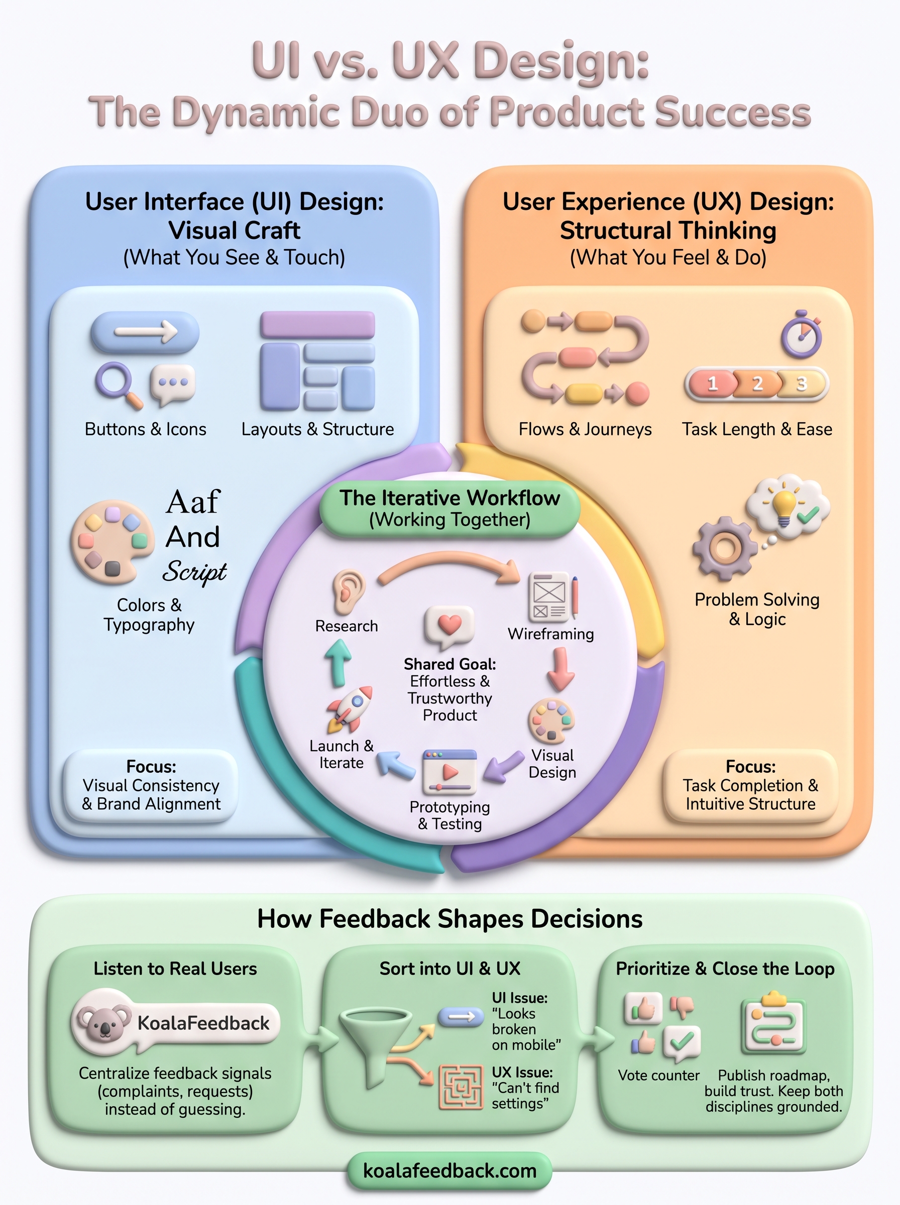
Great products never treat user interface and user experience design as separate lanes. UI gives users something clear to look at, UX gives them a path that makes sense, and the products people actually love get both right at the same time. Splitting responsibilities helps you diagnose problems faster, but the real work happens when those two disciplines keep talking to each other through every sprint, not just at launch.
Staying aligned long-term means building a habit of listening, not a one-time research phase. Continuous feedback is what tells you whether a redesign actually improved the user experience or just made it prettier, and whether users are struggling with a button or a broken process underneath it. Instead of guessing which fixes matter most, centralize user feedback with Koala Feedback to collect, sort, and prioritize real user input, so your UI and UX decisions stay grounded in what people actually need, not what looks good in a meeting.

Start today and have your feedback portal up and running in minutes.