Most UX projects fall apart not because the design is bad, but because the process was never defined in the first place. Teams jump straight to wireframes, skip research, or launch features nobody asked for, then wonder why adoption stalls. If you're trying to figure out the right user experience steps to follow from idea to launch, you're in the right place.
This guide breaks down a full user experience design process you can actually use, not a theoretical framework pulled from a textbook. You'll get a clear sequence: research, defining problems, ideation, prototyping, testing, and iterating after launch, with practical notes on what each stage requires and how long it typically takes.
We'll also cover where user feedback fits into this process, since most user experience design processes break down after launch when teams stop listening to what users actually want next. That's the stage where a lot of product teams lose momentum, and where tools like Koala Feedback help you keep collecting input, prioritizing requests, and showing users what's coming next. By the end, you'll have a repeatable structure you can apply to your next project.
A UX design process is the repeatable sequence of steps a team follows to turn a user problem into a working, tested solution. It's not a single deliverable or a Figma file full of screens, and it's worth being clear on the difference between user experience and user interface before you start. It's the discipline of moving from user research to a validated product decision without skipping the parts that feel slow but actually save time later. Companies that treat UX as a structured process, rather than a design pass at the end of development, ship features that people actually use.
Most solid user experience design processes collapse down to four phases, no matter how big or small the project is: research and problem definition, analysis and planning, design and prototyping, and testing with iteration. Each phase feeds the next. Skip research and you design for assumptions instead of real behavior. Skip testing and you launch guesses instead of solutions. The order matters as much as the steps themselves.
A UX process only works if every step feeds the next one with real evidence, not assumptions.
Teams under deadline pressure often compress or drop steps, usually research or post-launch testing, because they feel like they slow down delivery. The opposite is true. A missing research phase means your team builds based on internal opinions, and a missing feedback loop after launch means you have no idea if the feature solved anything. Here's what typically happens when a step gets skipped versus when it's followed:
| Step Skipped | Common Outcome |
|---|---|
| User research | Features built on assumptions, low adoption |
| Planning/prioritization | Scope creep, unclear success metrics |
| Prototyping | Expensive late-stage design changes |
| Post-launch testing | Repeated mistakes, no feedback loop |
Understanding this table is often the fastest way to convince a stakeholder why a rushed timeline is risky.
SaaS teams especially feel the cost of a broken process, because every unused feature is engineering time you can't get back. A defined process gives product managers a shared vocabulary with designers and developers, so "we need more research" isn't a vague request but a specific, expected phase everyone budgets time for. Google's own guidance on human-centered design backs this up: understanding context of use and user requirements before designing is a formal part of the ISO human-centered design standard, not an optional nicety.
Research is the foundation of every solid user experience design process, and skipping the user research process is the single biggest reason features flop after launch. You're not trying to confirm what your team already believes. You're trying to find out what users actually do, where they get stuck, and what they're trying to accomplish when they open your product. This step usually takes one to three weeks depending on the size of the project, and it should never be shorter than a few days even on a tight deadline.
Grab a mix of UX research methods rather than relying on one. Combining qualitative and quantitative data gives you a fuller picture than surveys or interviews alone:
Research isn't a formality before design starts, it's the evidence that keeps design honest.
Once you've gathered input, write a single problem statement your whole team agrees on, something like: "New users abandon setup because they can't find where to invite teammates." Vague problem statements produce vague solutions, so push for specificity here. This is also the moment to check an existing feedback portal for recurring requests tied to the same pain point, since patterns that show up in both interviews and submitted feedback are rarely coincidence.
Once research is done, resist the urge to jump straight into wireframes. This step is where you turn raw notes into a prioritized plan, and it's the phase most teams rush through, which is exactly why scope creep happens later. Set aside two to four days to sit with your findings before committing to a direction.
Group your interview notes, session recordings, and support tickets into themes. You're looking for the two or three problems that show up repeatedly across different sources, not the loudest single complaint. A simple affinity map on a whiteboard or Figjam works fine here. Once themes emerge, use value vs effort prioritization to score them so your team isn't arguing from gut feeling:
| Theme | User Impact | Engineering Effort | Priority |
|---|---|---|---|
| Can't find invite option | High | Low | Now |
| Confusing pricing page | Medium | Medium | Next |
| Missing dark mode | Low | Low | Later |
A plan built on scored themes beats one built on whoever spoke loudest in the meeting.
Write a one-page brief covering the problem statement, the top priority theme, success metrics, and rough scope. Don't over-engineer this document, it should fit on one screen. This is also a good point to check a public roadmap tool like Koala Feedback against your priority list, since votes and comments from real users often confirm or challenge what your internal research suggested. If a theme from your research matches a heavily upvoted request, you've got strong evidence to move forward with confidence.
Now you can finally sketch solutions against your core UX design guidelines, but resist jumping straight to high-fidelity screens. Start rough. Low-fidelity wireframes let you test structure and flow before you waste time on colors and copy. This step usually runs one to two weeks, depending on how many screens or flows the problem touches. The goal isn't a polished mockup, it's a testable representation of the solution that matches the problem statement you wrote in step one.
Once the rough flow makes sense to your team, build a clickable prototype in Figma or a similar tool. This is where the user experience design process starts producing something stakeholders can actually react to instead of imagining. Keep the fidelity low enough that feedback focuses on flow and logic, not button colors:
A prototype exists to answer a question, not to look finished.
Share the prototype with engineering before you consider it final. A quick fifteen-minute walkthrough catches technical constraints you can't see from a design tool, like a third-party integration that limits what the invite flow can actually do. Skipping this conversation is how teams end up redesigning a feature mid-sprint because nobody flagged a limitation until development started.
Testing confirms whether your prototype actually solves the problem you defined in step one, so don't skip straight from design to production. Run five to eight usability sessions with real users or close proxies, watching where they hesitate or misclick rather than asking them to rate the design. This step typically takes three to five days, and it's cheaper to fix now than after a full engineering build.
Use a mix of methods depending on what's at stake:
A feature that passes testing with real users beats one that only passed a design review.
Release to a small segment first, ten to twenty percent of users, before pushing to everyone. Watching adoption and support tickets during a limited rollout catches problems your usability tests missed, since real usage under real conditions always surfaces something a test session doesn't.
Once the feature is live, the user experience steps don't stop. Keep collecting user feedback by routing ongoing comments, votes, and bug reports into a feedback portal, so the next round of research starts with evidence instead of guesswork. Teams that treat launch as the finish line repeat the same research gaps on their next project.
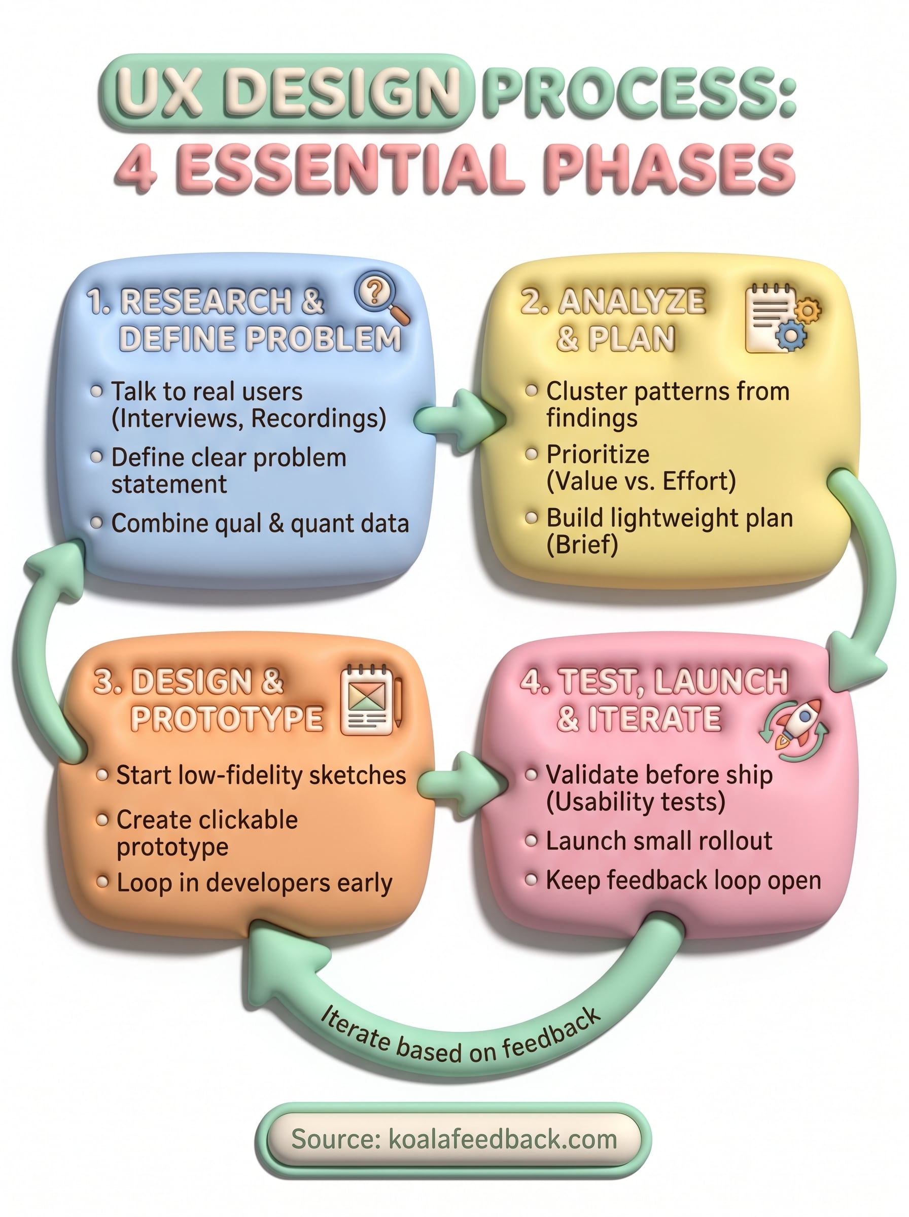
None of these four phases work in isolation. Research feeds planning, planning feeds prototypes, and testing feeds the next round of research. Skipping any single step doesn't save time, it just moves the cost downstream to a more expensive stage. The teams that ship features people actually use are the ones that treat this sequence as non-negotiable, even when a deadline tempts them to cut corners.
Getting the user experience design process right isn't about following every step perfectly on the first try. It's about building a habit your team repeats project after project, so research stops feeling optional and feedback stops getting ignored after launch. Start small: pick your next feature and run it through all four steps before writing a line of code.
If you want the post-launch loop to actually work, give users a place to keep talking to you. See how to build a product feedback loop with Koala Feedback, collecting votes, comments, and requests in one place so your next round of research starts with evidence instead of guesswork.

Start today and have your feedback portal up and running in minutes.