Picking the wrong research approach wastes weeks, and sometimes entire sprints. With over a dozen established user research methods available, knowing which one fits your current question is half the battle. The other half is actually running the study and turning findings into product decisions that move the needle.
The challenge most product teams face isn't a lack of methods. It's choosing between them. Should you run a usability test or send a survey? Do you need diary studies, or would card sorting answer your question faster? Each method has a specific purpose, and matching the method to your goal is what separates useful research from busywork. Get it right, and you'll build features users genuinely want. Get it wrong, and you'll spend resources validating assumptions nobody questioned.
This guide breaks down 13 proven user research methods, organized so you can quickly identify which one fits your project stage and research question. For each method, you'll get a clear definition, when to use it, and practical tips to run it well. And once your research points you toward what to build next, tools like Koala Feedback help you close the loop, collecting ongoing user feedback, prioritizing feature requests through voting, and sharing your roadmap so users see their input actually shaping the product. Let's get into it.
A feedback portal gives your users a dedicated space to submit ideas, report issues, and vote on what matters most to them. Unlike one-off studies, a portal runs continuously, capturing input at every stage of the product lifecycle without requiring you to set up a new study each time. Tools like Koala Feedback let you centralize all incoming requests, automatically deduplicate similar submissions, and surface patterns you would otherwise miss.
Feedback portals answer the foundational question: what do your users actually want built next? They reveal which pain points are widespread versus individual, helping you separate the loud minority from the broader user base. Feature voting adds a quantitative layer, showing you which requests carry the most weight across your entire user pool.
A feedback portal is one of the few user research methods that works passively, meaning your product tells you what to build while you sleep.
Start by embedding a feedback link or widget directly inside your product, whether in the navigation, the help menu, or on key pages. The shorter the path from "I have an idea" to "I submitted it," the higher your response rate. Once submissions come in, organize them using these quick steps:
Feedback portals produce a mix of qualitative data (written descriptions of problems and ideas) and quantitative signals (vote counts, comment volume, and submission frequency). Because the portal stays open indefinitely, your sample size grows over time and becomes more representative than a snapshot study.
A request with 50 votes from paying users carries more weight than one with 200 votes from free-tier users, so segment your data by user type before drawing conclusions.
The biggest risk with a feedback portal is survivorship bias: the users who engage tend to be your most vocal advocates or your most frustrated churners, not the silent majority. Balance portal data with other research, such as usability testing or analytics, to get a complete picture.
Also watch for over-indexing on vote counts alone. High votes show demand, but they do not tell you whether a feature is technically feasible or strategically aligned with where your product needs to go.
User interviews are one-on-one conversations between a researcher and a participant. They sit among the most flexible user research methods available because you can run them at any project stage, from early discovery through post-launch evaluation. The goal is to understand motivations, mental models, and decision-making processes that numbers alone cannot reveal.
Interviews answer the "why" behind user behavior. When your analytics show users abandoning a flow, interviews tell you what's stopping them and what they expected instead. Use them when you need rich context, not just confirmation of a hypothesis.
Interviews are most powerful when you listen more than you talk. Resist the urge to lead witnesses.
Recruit five to eight participants from your existing user base using a short screener survey. Prepare a discussion guide with open-ended questions, but treat it as a reference, not a script. Schedule sessions for 45 minutes and record them with participant consent so you can focus on the conversation rather than note-taking.
Interviews produce qualitative data in the form of direct quotes, stories, and behavioral patterns. Five sessions will surface most major themes. Eight sessions give you enough coverage to identify recurring patterns across different user types without spending weeks on recruitment.
Confirmation bias is the main threat here. If you already believe users want a specific feature, you will unconsciously ask questions that confirm it. Use a neutral question structure, and have a second team member review your guide before you start recruiting.
Contextual inquiry places you inside a user's real environment while they work. Instead of asking users to recall behavior in a lab or survey, you observe them directly as they complete actual tasks in their natural setting. This makes it one of the most grounded user research methods available, surfacing problems that users rarely articulate but consistently run into.

Contextual inquiry answers the question: how do people actually use your product in the context of their daily work? You discover workarounds, environmental constraints, and workflow interruptions that never show up in interviews or surveys because users have normalized them.
What users tell you they do and what they actually do are often two completely different things.
Schedule 60 to 90-minute sessions at a user's workplace, whether in person or via screen share if they work primarily in software. Open with a few brief questions about their role, then ask them to walk through a real task while narrating their thought process. Take notes and photographs where permitted, and avoid jumping in to help when they struggle. The struggle is the data.
Contextual inquiry produces qualitative data rich with behavioral observations, environmental details, and direct workflow patterns. Three to five participants from the same role will surface most critical issues. You may need additional sessions if you serve users across very different work environments or job functions.
Your presence changes behavior. Users tend to perform tasks more carefully when observed, which can mask the shortcuts and workarounds that define their normal workflow. Keep sessions low-key, remind participants there are no right or wrong answers, and ask follow-up questions whenever their behavior looks cleaner or more deliberate than you expected.
Field studies share DNA with contextual inquiry but operate at a broader scale. Where contextual inquiry focuses on a single user completing a specific task, field studies observe multiple users across real environments over an extended period. You step into the places where your users actually live and work, collecting naturalistic observations that no other user research methods approach can fully replicate.
Field studies answer questions about how users behave across different environments and over time, rather than in one controlled session. They reveal patterns around tool adoption, switching behavior, and the organizational dynamics that quietly shape how people interact with your product.
Field studies capture how context itself drives behavior, not just how individuals respond to your product in isolation.
Start by identifying two or three representative user environments rather than attempting to cover every possible context. Coordinate with a point of contact at each site to schedule access and introduce you to participants. Use a structured observation checklist to keep each session consistent, and leave 15 minutes at the end of each visit for a short debrief to clarify anything you observed.
Field studies produce qualitative observational data supplemented by photographs, workflow diagrams, and field notes. Plan for at least four to six site visits to surface patterns that hold across different locations and user roles rather than individual quirks.
Field studies take significantly more time to coordinate than most other research approaches, so scope them tightly before committing. If access to user environments is restricted, a remote screen-sharing session with a structured observation protocol can approximate field study conditions without the logistical overhead.
Diary studies ask participants to log their own experiences with a product over a set period, typically one to four weeks. Unlike most other user research methods that capture a single moment, diary studies reveal how behavior and sentiment shift over time, making them particularly useful for understanding onboarding, habit formation, and infrequent tasks.
Diary studies answer the question: how does the user experience change as someone spends more time with your product? They expose the gap between first impressions and long-term usage, revealing friction that only appears after novelty wears off.
Diary studies are the only method that captures the full arc of a user's experience, not just a single snapshot.
Send participants a structured daily or weekly prompt via email, a form, or a messaging app rather than asking for free-form journals, which quickly become inconsistent. Keep each entry short by asking three focused questions: what task they attempted, what happened, and how they felt about it. A two-week study with eight participants gives you enough longitudinal data without running indefinitely.
Diary studies produce qualitative self-reported data that you can scan for recurring themes across entries. Aim for eight to twelve participants to account for dropout, since some participants lose momentum before the study ends.
Self-reporting introduces recall bias and inconsistent logging. Participants often skip entries during busy periods, which skews your data toward calmer days. Send a brief reminder at the same time each day to keep completion rates high without becoming intrusive.
Surveys collect structured responses from a large number of users at once, making them one of the most scalable user research methods in your toolkit. You can deploy them in minutes, reach hundreds of respondents across different segments, and start identifying patterns without scheduling a single session.
Surveys answer what users think, prefer, or experience at a given point in time. They work best when you already have a hypothesis and need to validate it across a broad audience, or when you want to measure satisfaction, usage frequency, or feature demand at scale.
Surveys confirm or challenge what qualitative research surfaces, but they rarely replace it.
Keep your survey under 10 questions and lead with the most critical ones. Use a mix of multiple-choice, rating scales, and one or two open-text fields to balance speed with depth. Distribute through these three channels for the fastest reach:
Surveys produce quantitative data from closed questions and qualitative data from open-text responses. Aim for at least 50 to 100 responses for meaningful patterns on closed questions. For open-text analysis, 30 thoughtful responses often tell you more than 300 rushed ones.
Poorly worded questions introduce bias before a single person responds. Avoid leading language, double-barreled questions, and response scales that push users toward the middle. Test your survey with two or three colleagues before sending it to your full list.
Moderated usability testing puts a real user in front of your product while a researcher guides them through specific tasks in real time. This is one of the most direct user research methods for uncovering usability problems because you can ask follow-up questions the moment something goes wrong, rather than guessing what a recording reveals later.
Moderated usability testing answers the question: can users actually complete key tasks, and where do they get stuck? It works best when you need to understand the reasoning behind observed behavior, not just the behavior itself.
Watching a user struggle in silence teaches you more than a dozen survey responses ever will.
Prepare a task script with four to six realistic scenarios drawn from your most common user flows. Recruit participants who match your target persona using a short screener, and run sessions over video call if in-person access is limited. Ask participants to think aloud throughout each task so you capture their reasoning alongside their actions.
Moderated sessions produce qualitative behavioral data combined with direct verbal feedback. Five participants is the standard starting point because that number reliably surfaces the most significant usability problems without requiring weeks of scheduling.
Facilitator influence is the biggest risk. If you nod, offer hints, or react visibly when users struggle, you contaminate the session data and end up testing your facilitation style rather than your product. Practice neutral responses before you run your first session.
Unmoderated usability testing sends participants a set of tasks to complete on their own schedule, without a researcher present. Platforms record their screen, clicks, and spoken thoughts so you can review sessions asynchronously and identify usability problems at scale. It's one of the faster user research methods to deploy because scheduling disappears entirely as a bottleneck.
This method answers the same core question as moderated testing: can users complete key tasks without friction? It works best when you want to validate specific flows across a larger sample, or when your research question does not require real-time follow-up from a facilitator to make sense of what you observe.
Speed is the defining advantage here, but only if your tasks are clear enough to stand alone without someone available to clarify them.
Write three to five focused task prompts that mirror what real users actually do inside your product. Avoid open-ended instructions that leave room for interpretation. Distribute the study through a recruitment panel and set a two to three day collection window to keep momentum and deliver results before team priorities shift.
Unmoderated sessions produce behavioral recordings and quantitative completion metrics such as success rates and time-on-task. Aim for 10 to 15 participants to surface consistent patterns across different user approaches without spending weeks on recruitment.
Without a facilitator, you lose the ability to probe unexpected behavior in the moment. If a participant takes a strange path through your product, you can watch it but not ask why. Reserve unmoderated testing for confirming known hypotheses, not exploring unfamiliar territory.
Card sorting asks participants to group labeled cards into categories that make sense to them, revealing how your users mentally organize information. It sits among the most practical user research methods for shaping navigation structures, menu labels, and content architecture before you build anything users will need to find.
Card sorting answers the question: how do your users expect information to be organized inside your product? It tells you whether your current navigation matches the mental model your audience brings to the interface, or whether your team has been organizing things in a way that only makes sense internally.
Mismatched information architecture is one of the most common usability problems, and card sorting catches it before you build the wrong structure.
Run an open card sort first, where participants create their own category names, to surface natural groupings without priming them with your existing labels. Then follow up with a closed card sort using your proposed category names to validate or refine them. Use a dedicated card sorting tool to collect responses asynchronously and remove the scheduling bottleneck entirely.
Card sorting produces quantitative grouping data that you can analyze using a similarity matrix showing how often participants placed cards together. Aim for 15 to 20 participants to generate statistically meaningful patterns across varied responses without running an extended recruitment cycle.
Card labels that are too technical or ambiguous will produce noise rather than insight, because participants sort based on how they interpret the label, not the concept you intended. Keep labels short, plain, and consistent before your study begins.
Tree testing checks whether users can find specific content or features within your navigation structure using a stripped-down, text-only version of your information architecture. Unlike card sorting, which builds the structure from scratch, tree testing validates a structure you already have by asking participants to locate items without any visual design cues to guide them.
This method answers the question: can users find what they need inside your current navigation, and where do they take a wrong turn? It isolates navigation problems from visual design noise, making it one of the cleaner user research methods for confirming whether your structure works before you commit to building it out fully.
A navigation structure that feels logical to your team will often feel completely foreign to users who have no memory of the meetings where you named it.
Write five to eight task prompts that reflect common things users need to locate inside your product, then run the test asynchronously through a tree testing tool. Participants click through your text-only structure to reach their answer, and the tool records every path they take so you can pinpoint exactly where they branch off in the wrong direction.
Tree testing produces quantitative success metrics including task completion rates, time-on-task, and the percentage of participants who took a direct versus indirect path. Aim for 20 to 30 participants to generate reliable completion rates across each task.
One important limitation is that tree testing only evaluates your navigation structure, not labels, visual hierarchy, or page-level usability. High failure rates confirm the structure is broken, but you will need follow-up qualitative research to understand the underlying reason.
Heuristic evaluation is an expert-driven inspection where trained reviewers assess your interface against a set of established usability principles, most commonly Jakob Nielsen's ten heuristics. Unlike participant-based user research methods, heuristic evaluation requires no recruitment, no scheduling, and no sessions to facilitate, making it one of the fastest ways to identify usability problems before any user sees your product.
Heuristic evaluation answers the question: does your interface violate recognized usability principles that are known to cause friction? It surfaces issues like unclear error messages, missing feedback after user actions, and inconsistent navigation patterns that slow users down before you spend time on formal testing.
Heuristic evaluation works best as a first pass, catching obvious problems so your usability tests can focus on subtler, more nuanced issues.
Assign three to five evaluators to review your product independently using Nielsen's heuristics as a reference checklist. Ask each person to note violations and rate their severity on a scale from cosmetic to critical. Reconvene afterward to consolidate findings and prioritize fixes based on frequency and impact across reviewers.
Heuristic evaluation produces qualitative expert judgment organized by heuristic category and severity rating. Three evaluators typically uncover around 75 percent of major issues, and adding a fourth or fifth evaluator captures most remaining problems without diminishing returns.
Evaluators bring their own assumptions and blind spots to the review, so their findings reflect expert opinion, not actual user behavior. Follow up any heuristic evaluation with at least one round of participant-based testing to confirm which flagged issues genuinely block real users.
Product analytics and clickstream analysis track how users actually navigate your product, capturing every click, scroll, page view, and drop-off point across your entire user base. Unlike most other user research methods that require recruiting participants, analytics tools run passively in the background and deliver behavioral data at a scale no study can match.

This approach answers the question: where do users go, where do they stop, and which paths lead to your most important outcomes? Clickstream data shows you which features get heavy use, which ones get ignored, and where users abandon a flow before completing it. That combination of signals tells you where to focus research and design effort next.
Analytics tells you precisely what is happening inside your product, but it cannot tell you why without additional qualitative research alongside it.
Instrument your product with an analytics platform and define a core set of events around your most critical user actions, such as sign-ups, feature activations, and checkout completions. Start by reviewing your top drop-off points and least-used features before looking at anything else, since those two categories surface the highest-priority problems with the least digging.
Product analytics produces quantitative behavioral data across your full user population, which means sample size is rarely a concern once your tracking is properly set up. You gain statistical reliability automatically as your user base grows, making this one of the most scalable inputs to your research process.
Analytics shows you patterns across many users but strips away individual context entirely. A drop-off at step three of your onboarding flow could mean a dozen different things, and only qualitative follow-up research like interviews or usability testing can tell you which explanation is correct.
A/B testing splits your user base into two groups and shows each group a different version of a feature, page, or UI element to determine which one performs better. Unlike most other user research methods, A/B testing measures real behavior under real conditions, with no participant recruitment required and no risk of observer effects influencing the outcome.
A/B testing answers the question: which version of a design, copy, or feature drives better outcomes for your target metric? Use it when you have a specific hypothesis about an improvement and a large enough user base to generate statistically significant results within a reasonable timeframe.
A/B testing is only as useful as the metric you choose to optimize, so pick one that directly connects to a meaningful user outcome.
Define your success metric and minimum detectable effect before you launch the test. Split traffic evenly between your control and variant, and resist the temptation to call a winner before your predetermined sample size is reached. Most analytics platforms include built-in experimentation tools that handle traffic splitting and significance calculations without requiring custom engineering work from your team.
A/B testing produces quantitative behavioral data tied directly to your chosen metric. You need enough traffic to reach statistical significance, typically a minimum of several hundred conversions per variant, so this method works best for teams with established user volume rather than early-stage products still finding their footing.
Running too many tests simultaneously introduces interaction effects that corrupt your results. Isolate your experiments, and avoid changing other variables while an active test is still collecting data.
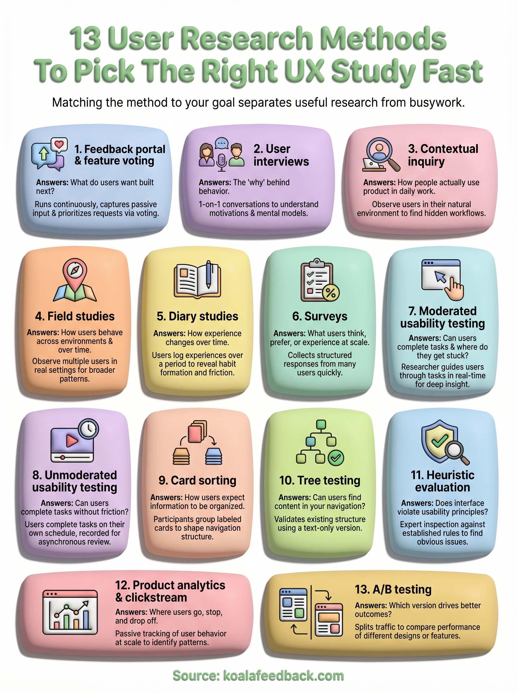
The best way to choose among these user research methods is to start with your question, not your preferred method. If you need to understand why users behave a certain way, go qualitative. If you need to confirm a hypothesis at scale, go quantitative. Most strong research programs combine both, cycling between exploration and validation as your product matures.
Once your research surfaces what users actually need, the next challenge is capturing that input continuously and acting on it in a way users can see. That is exactly what Koala Feedback is built for. It gives your users a dedicated place to submit ideas and vote on features, while your team gets a prioritized view of what matters most. Your roadmap stays visible, your users stay engaged, and your product decisions stay grounded in real demand rather than internal guesswork.

Start today and have your feedback portal up and running in minutes.