Ask five people on your product team to define UX and UI, and you'll likely get five different answers. Some use the terms interchangeably. Others argue for hours about where one ends and the other begins. This mix-up isn't just a semantics problem, it leads to misdirected budgets, unclear job descriptions, and design decisions that solve the wrong issue. The debate around user experience vs user interface shows up constantly in product meetings, hiring discussions, and roadmap planning.
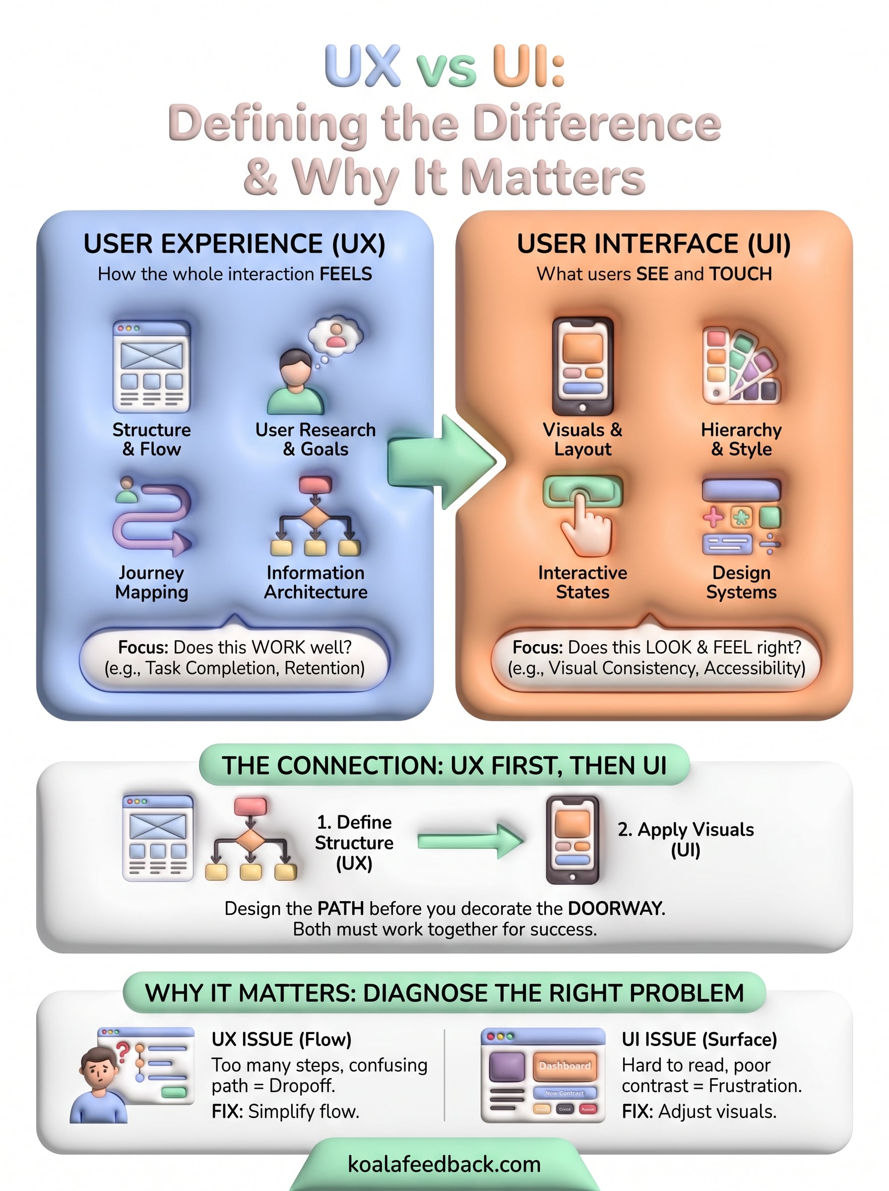
Here's the short version: UI is what users see and touch, the buttons, screens, and visual layout. UX is how the whole interaction feels, from finding value in your product to completing a task without frustration, which is what user experience really means in practice. UI lives inside UX, but a product needs both working together to succeed.
In this article, we'll break down what separates user interface and user experience, walk through concrete examples of each, and show how they depend on each other in real products. You'll also see why understanding this distinction matters when you're collecting feedback and deciding what to build next, since the requests users send often blur these two categories without realizing it.
Mixing up UX and UI doesn't just cause awkward debates in Slack channels, it changes what your team actually builds. If a customer says "this app is confusing," a team that only thinks in UI terms might redesign buttons and tweak colors. But if the real problem is a checkout flow that requires seven steps instead of three, no amount of visual polish fixes it. Understanding user interface and user experience as separate but connected disciplines helps you diagnose the right problem before you spend a sprint solving the wrong one.
A beautiful screen that solves nothing is a UI win and a UX failure.
Companies routinely pour money into visual redesigns when the actual complaint is structural. A SaaS dashboard might get a fresh coat of paint, new icons, a modern font, and users still can't find the report they need. That's because the issue was never how it looked. It was how the information was organized and how many clicks it took to get there. Misreading a UX problem as a UI problem leads to redesign cycles that look great in a demo and change nothing in retention numbers. Teams that separate the two concepts ask better diagnostic questions before assigning work: is this a usability issue or a visual one?
Job postings often ask for a "UX/UI designer" as if it's one skill set, and that's part of the confusion. In reality, these are different disciplines that sometimes live in the same person and sometimes don't. A UX designer focuses on user research, information architecture, and flow logic. A UI designer focuses on visual hierarchy, typography, spacing, and interactive states. Smaller teams often combine both roles out of necessity, but as a company scales, treating them as one job title makes it harder to evaluate candidates or measure whether a hire is actually improving the product experience.
| Aspect | UX Focus | UI Focus |
|---|---|---|
| Core question | Does this work well? | Does this look and feel right? |
| Typical deliverables | User flows, wireframes, personas | Mockups, style guides, icon sets |
| Success measure | Task completion, retention, satisfaction | Visual consistency, accessibility, polish |
| Common tools | Research surveys, journey maps | Figma, design systems |
Product teams collecting feedback run into this distinction daily, even if they don't name it. A user who says "I can't find where to export my data" is describing a UX problem: the path to a goal is broken. A user who says "the export button is too small and hard to tap on mobile" is describing a UI problem: the element itself needs adjustment. If your team logs every complaint into one undifferentiated backlog, you'll struggle to prioritize correctly. Tagging incoming requests by whether they point to flow issues or interface issues gives your roadmap real direction instead of a pile of vague complaints. This is exactly the kind of categorization Koala Feedback's feedback portal helps teams do, since it groups and deduplicates requests so patterns in flow problems versus visual problems become visible instead of buried in a spreadsheet.
Getting this distinction right also changes how you talk to stakeholders and investors about the business value of user experience design. Saying "we improved the UI" tells leadership almost nothing about business outcomes. Saying "we cut onboarding time from twelve minutes to four by simplifying the signup flow" ties design work directly to conversion and retention metrics that matter to the business. Companies that treat UX and UI as one blurry category tend to measure success by how a product looks in a screenshot. Companies that separate them measure success by whether users actually accomplish what they came to do, which is a far more reliable predictor of churn and long-term growth.
Knowing the difference between UX and UI only helps if it changes your actual workflow. The most effective product teams don't treat these as sequential handoffs where research finishes and visuals begin. They treat UX and UI as parallel disciplines that inform each other constantly, with checkpoints where one validates the other before work moves forward. Getting this sequencing right prevents the common trap of designing a beautiful screen for a flow nobody has tested yet.
Before anyone opens Figma to design a screen, apply the core UX design principles and map out what the user needs to accomplish and how many steps it takes to get there. Wireframes, user flows, and even rough paper sketches answer the structural questions: what order do steps happen in, what information is required at each stage, where do users get stuck. Skipping this step and jumping straight to polished visuals means you might spend a week perfecting a form that shouldn't exist in the first place.
Design the path before you decorate the doorway.
Once a flow is tested with real users or at least reviewed against support tickets and feedback data, UI work can begin without the risk of polishing something structurally broken. A practical sequence looks like this:
This order keeps teams from arguing over button color while the underlying flow still confuses half the people who try it.
Applying user interface user experience thinking together also means treating feedback as an ongoing input, not a one-time research phase before launch. A public roadmap tied to a feedback portal lets users flag both kinds of problems as they use the product, and lets your team route each report to the right discipline. Koala Feedback's prioritization boards make this concrete by helping you organize user feedback with themes and tags: requests about confusing flows get grouped separately from requests about visual polish, so a product manager can see at a glance whether the next sprint needs a UX fix, a UI fix, or both.
Finally, build review habits that check both dimensions before shipping. A design review that only asks "does this look good" misses usability regressions. One that only asks "does this work" misses inconsistent spacing or broken visual hierarchy. Pairing a UX-focused checklist (task completion, error recovery, clarity) with a UI-focused checklist (contrast, alignment, responsive behavior) catches problems from both angles before they reach production.
Abstract definitions only go so far. Seeing how user experience vs user interface plays out in real products makes the split obvious once you know where to look. Below are three common scenarios that product teams run into, broken down by which layer is actually broken and what fixing it looks like in practice, and you can find plenty more in these real bad user experience examples.
Imagine an ecommerce app where users add items to a cart, then abandon the purchase at a high rate. If the buttons are stylish, the color scheme is on brand, and the typography is clean, the team might assume the UI is fine and look elsewhere. But if checkout requires creating an account, entering shipping info twice, and clicking through five separate screens, that's a UX problem: too much friction between intent and completion. The fix isn't a new button style, it's cutting steps, adding guest checkout, and pre-filling fields from previous orders.
A slow, confusing path costs more sales than a plain-looking page ever will.
Now picture a SaaS analytics dashboard where the underlying flow works fine. Users can find the report, filter by date, and export data without confusion. But the charts use low-contrast colors, the font size is too small on mobile, and important numbers blend into the background. Here the flow is solid, so this is a UI problem: the visual execution isn't communicating the information clearly. Fixing it means adjusting contrast ratios, increasing font weight on key metrics, and following accessibility guidelines like those outlined in the Web Content Accessibility Guidelines rather than rethinking the flow itself.
Often a single feature needs work on both layers at once. Take a signup flow where new users must complete eight fields before seeing any value in the product, and the form itself uses tiny inputs that are hard to tap on a phone, a pattern that stands out against these SaaS onboarding examples that convert. The excessive steps are a UX issue: the path to value is too long. The cramped inputs are a UI issue: the interface itself is hard to use. Solving only one half leaves users frustrated either way.
| Scenario | Layer at fault | Typical fix |
|---|---|---|
| Multi-step checkout abandonment | UX | Reduce steps, add guest checkout |
| Hard-to-read dashboard charts | UI | Improve contrast, resize text |
| Long, cramped signup form | Both | Shorten flow and enlarge inputs |
| Unclear button labels | UI | Rewrite copy, adjust hierarchy |
| Users can't find a key feature | UX | Reorganize navigation, add search |
Grouping real complaints into buckets like these, rather than treating every ticket as one undifferentiated "bug," is what turns scattered feedback into a roadmap that actually fixes the right problem first.
Hiring for user interface user experience work gets easier once you know which skills belong to which discipline. Job titles blur these lines constantly, but the day-to-day work looks nothing alike. A UX practitioner spends their week interviewing users, mapping flows, and running usability tests. A UI practitioner spends their week in a design tool, refining spacing, choosing type scales, and building component libraries. Knowing this split helps you write job descriptions that attract the right candidate instead of someone who's strong in one area and weak in the other.
Breaking down the actual skill sets makes the hiring decision concrete instead of guesswork:
Candidates who overlap heavily in the shared category often make strong hires for small teams, since they can flex between both without a hard handoff.
Great UX without great UI feels clunky. Great UI without great UX feels hollow.
The software each role reaches for reflects the different questions they're answering. The best user research tools for UX center on research and structure, while UI-focused tools center on visual production and handoff.
| Discipline | Common tools | Primary purpose |
|---|---|---|
| UX | Maze, Optimal Workshop, Hotjar | User testing and behavior analysis |
| UX | Miro, FigJam | Journey mapping and flow diagrams |
| UI | Figma, Sketch | Visual design and prototyping |
| UI | Storybook | Component and design system management |
| Shared | Figma, Adobe XD | Interactive prototyping |
Teams collecting ongoing input from users benefit from adding a feedback layer on top of these tools. Koala Feedback's feedback categorization sits alongside research and design tools by tagging incoming requests as flow-related or visual-related, so whoever picks up the ticket, researcher or visual designer, knows exactly which skill set the fix requires.
Startups rarely have the budget for separate UX and UI hires, so one person often wears both hats. This works fine early on, but it puts pressure on that person to context-switch constantly between research mode and visual mode. As the product grows and the backlog of both flow issues and visual issues grows with it, splitting the roles usually pays for itself in faster iteration and fewer half-solved problems slipping through review.
Questions about user experience vs user interface tend to repeat across teams, whether you're writing a job posting or explaining a redesign to a stakeholder. Here are the ones that come up most often, answered directly.
Neither wins outright, because they solve different failures. A product with strong UX and weak UI still gets users to their goal, but it feels rough and unpolished along the way. A product with strong UI and weak UX looks sharp but leaves users stuck or confused about what to do next. Prioritizing one over the other almost always backfires once the product scales past its first few users, since both gaps eventually show up in churn.
Ask which one is broken before you decide which one matters more.
Yes, especially on small teams where budget doesn't allow for separate hires. Someone with a research background who also has a solid eye for visual design can move between flow mapping and interface polish without a handoff delay. Problems show up when a company expects this dual skill set from every hire regardless of team size, since strong UX instincts and strong UI instincts are genuinely different muscles that take separate practice to build.
UX comes first in almost every healthy workflow. Deciding what the flow should accomplish, mapping the steps, and testing whether the logic holds up needs to happen before anyone chooses colors or spacing. Reversing this order, starting with visuals and retrofitting the flow around them, is a common trap that produces polished screens attached to a confusing path. Working through user interface and user experience in this sequence, structure first and surface second, saves rework down the line.
Feedback is where the theoretical split becomes practical. A support ticket that says "I don't understand how to invite my team" points to UX. One that says "the invite button is hard to see" points to UI. Sorting incoming requests this way, instead of dumping everything into a single backlog, tells you whether next sprint needs research and flow work or visual polish. Tools built specifically for this, like Koala Feedback's voting and internal comments for team discussion, also surface which problems affect the most users, so you're not guessing which layer to fix first based on whoever complained loudest.
Generally yes. UX success shows up in task completion rates, time on task, and retention, the kinds of signals the Google HEART framework was built to measure. UI success shows up in accessibility scores, visual consistency audits, and reduced error rates from misclicks or unclear labels. Tracking both separately keeps either discipline from hiding behind the other's numbers.
UX and UI aren't rivals competing for credit on your product. They're two layers of the same job, one making sure the path works, the other making sure it feels right. The user experience vs user interface debate stops being a semantics argument once you start tagging real feedback by which layer it points to. A confusing flow needs different work than a cramped button, and treating them the same wastes sprints on the wrong fix.
Once your team can tell the difference, the next challenge is scale: sorting hundreds of requests into flow problems and visual problems without losing the signal in the noise. That's where a dedicated system beats a shared spreadsheet. If you want feedback sorted this clearly by default, see how Koala Feedback organizes feedback into dedicated boards and turn scattered complaints into a roadmap that fixes the right layer first.

Start today and have your feedback portal up and running in minutes.