You just spent three weeks running interviews, surveys, and usability tests, and now you have twenty minutes on a Tuesday to convince a VP who skims slides that your findings matter. This is where most researchers lose the room. Learning how to present user research findings isn't about dumping every quote and chart you collected. It's about picking the three things that change a decision and making the case fast, because stakeholders remember conclusions, not methodology sections.
If you're staring at a messy pile of notes and a meeting on the calendar, you need a structure that works under pressure. The short answer: lead with the business impact, back it up with a handful of concrete examples, and end with a clear recommendation stakeholders can act on that same day. Skip the chronological walkthrough of your research process. Nobody in that room cares that you ran five rounds of testing before you cared about the outcome.
This guide walks through a repeatable presentation format, what to cut from your slides, how to handle pushback from stakeholders who disagree with your data, and a few templates you can adapt for your next readout. We'll also touch on how tools like a feedback portal can keep the conversation going after the meeting ends, so your findings don't just get a nod and then disappear into a backlog nobody revisits.
Before you open a slide deck, sit down with your raw notes and group them into three to five recurring themes. Don't present forty individual quotes; distill them into patterns a busy executive can hold in their head. Affinity mapping works well here: cluster sticky notes or spreadsheet rows by the problem they describe, not by which participant said it. This step alone usually reveals which findings are noise and which ones actually move the business.
Every research readout should exist to push a specific decision forward, whether that's greenlighting a redesign, killing a feature, or reprioritizing next quarter's roadmap. Write that decision statement down in one sentence before you draft a single slide. If you can't name the decision, your stakeholders won't be able to either, and the meeting turns into a status update instead of a call to action.
If your presentation doesn't point at a specific decision, it's a report, not a research readout.
Draft a single page that captures your headline finding, the evidence behind it, and your recommendation. This forces early clarity and gives you something to sanity-check with a colleague before you build twenty slides around a weak argument. A good one-pager includes:
Keep this page around after the meeting too. It becomes the artifact people forward to colleagues who missed the call, and it saves you from re-explaining your findings from scratch every time someone asks.
Stakeholders will question your sample size, your methodology, or a finding that contradicts their own assumptions. Anticipate the three hardest questions you're likely to face and write out honest answers before the meeting, not during it. Sample was small? Say so upfront and explain why the pattern still matters. Dodging a weak spot in your methodology only makes people trust the strong parts of your research less, and it hands skeptics an easy way to dismiss everything you found.
Gathering supporting evidence gets easier when feedback lives in one place instead of scattered across spreadsheets and old email threads. A centralized feedback portal lets you pull up direct quotes, vote counts, or comment threads mid-meeting when someone challenges a finding, which turns a shaky moment into proof that your conclusions are grounded in real user input rather than a hunch.
A VP of Sales and a lead engineer need completely different things from the same research readout. Before you build a single slide, map out who's actually in the room and what decision they can influence. Stakeholder mapping sounds like a formality, but skipping it is why so many research presentations get polite nods and zero follow-through. An engineer wants to know what to build differently. A VP wants to know what it costs to ignore the problem. Speak to both, but lead with whichever one holds the budget for the decision you're pushing.
Once you know who's attending, sketch out what each group cares about and adjust your emphasis accordingly. This doesn't mean building three separate decks; it means knowing which slide to linger on depending on who's asking questions.

| Stakeholder | What they care about | What to emphasize |
|---|---|---|
| Executives | Revenue, retention, competitive risk | Business impact, cost of inaction |
| Product managers | Roadmap fit, scope, tradeoffs | Prioritized recommendations, effort estimates |
| Designers | Usability details, interaction patterns | Specific pain points, screen recordings |
| Engineers | Technical feasibility, edge cases | Concrete examples, reproduction steps |
Present to the room you have, not the room you wish you had.
If you're unsure who's showing up or what they're hoping to get out of the meeting, ask the meeting organizer directly. A quick message like "What decision are you hoping this data helps you make?" saves you from building slides nobody needed. Direct questions like this also signal that you're treating the readout as a working session, not a performance, which tends to make stakeholders more willing to engage honestly with findings that challenge their assumptions.
Knowing your audience also tells you how much context to include. A stakeholder who sat in on your usability sessions doesn't need the same background as someone hearing about the project for the first time. Tailoring the depth of your methodology explanation to the room keeps you from either boring experts or losing newcomers, and it's the difference between a presentation that lands and one that gets talked over.
A live walkthrough, a written report, and an async video each serve different purposes, and picking the wrong one wastes the work you just did. Ask yourself how much time stakeholders actually have and whether they need to discuss the findings in real time or just absorb a decision and move on. Meeting format should follow the stakes of the decision, not your personal preference for building slides.
High-stakes decisions, like killing a feature or shifting a roadmap, usually deserve a live session where people can push back and you can respond on the spot. Lower-stakes updates, like confirming a design direction stakeholders already agreed with, often work better as a short written summary or recorded walkthrough people can review on their own time.
| Format | Best for | Watch out for |
|---|---|---|
| Live slide deck | High-stakes decisions, cross-functional buy-in | Running long, losing the room to tangents |
| One-page written report | Quick updates, async approval | Losing nuance without a discussion |
| Recorded video walkthrough | Distributed teams, repeat viewing | No real-time pushback or clarification |
| Interactive dashboard or portal | Ongoing tracking, ad hoc lookups | Requires upkeep or it goes stale |
Match the format to the decision, not to the template you already have saved.
Whatever format you choose, cap yourself at ten to twelve slides for a live session. Each slide count limit forces you to cut anything that doesn't directly support your recommendation. If you find yourself needing fifteen slides to explain one finding, that's usually a sign you haven't distilled it enough yet.
Regardless of format, build in a way for stakeholders to revisit the raw evidence later without booking another meeting with you. A shared link to a feedback portal or a recorded clip does more for your credibility than a static PDF, because it lets skeptics check your work on their own time instead of just taking your word for it in the room.
Structure decides whether your findings land or get lost. Open with the headline conclusion, not a slide about your research goals or participant demographics. Stakeholders should know your main point within the first sixty seconds, because attention drops fast once people sense a slow build toward a punchline. This is the inverted pyramid approach journalists use: lead with what matters most, then layer in supporting detail for whoever wants to dig deeper.
Skip the slide that lists how many interviews you ran before you say what you found. Save methodology for an appendix slide you only click into if someone asks. A findings-first structure looks something like this for each theme you present:
If your first slide isn't your strongest finding, you've buried the lede and lost half the room already.
A short video clip of a user struggling through a checkout flow makes a stronger case than three bullet points describing the same struggle. Pick visual evidence that shows the problem instead of summarizing it, whether that's a screen recording, a heatmap, or a direct quote pulled verbatim. Charts should compare something, like before-and-after task completion rates, rather than just decorate a slide with a number that has no context.
Order your themes so each one builds toward your recommendation instead of jumping between unrelated topics. If three findings all point to the same root cause, say that explicitly rather than letting stakeholders draw their own connections. This narrative sequencing turns a list of observations into an argument, which is exactly what you need when you're asking a room full of busy people to approve a change to their roadmap.
Findings without a recommendation just create more debate. Once you've shown the pattern, tell stakeholders exactly what you think should happen next, framed in terms they can approve in the room. This is the step that separates how to present user research findings as a report from presenting them as a proposal, and it's the difference between polite nods and someone actually assigning a ticket.
Each recommendation needs an owner, a rough effort estimate, and a next step small enough to start this week. Vague suggestions like "improve onboarding" get filed away and forgotten. Specific ones get scheduled. A specific ask might read: "Add a progress indicator to step two of checkout; design can mock this up by Friday; engineering estimates two days of work." That level of detail tells the room you've already thought through feasibility, not just identified a problem and walked away.
Not every finding deserves equal weight, so rank your recommendations by impact and effort before you present them. A simple table does this better than a paragraph of caveats:
| Recommendation | Impact | Effort | Priority |
|---|---|---|---|
| Add progress indicator to checkout | High | Low | Do now |
| Simplify account creation form | High | Medium | Next sprint |
| Redesign settings navigation | Medium | High | Backlog |
A ranked list of recommendations gets funded. An unranked list of problems gets discussed.
End your presentation by asking directly for what you need, whether that's sign-off on a design change, budget for further testing, or a slot on next quarter's roadmap. Closing with an open-ended "thoughts?" invites a meandering conversation instead of a commitment. Naming the exact decision you want, out loud, in the last sixty seconds of your presentation, is what turns a well-received readout into a shipped feature.
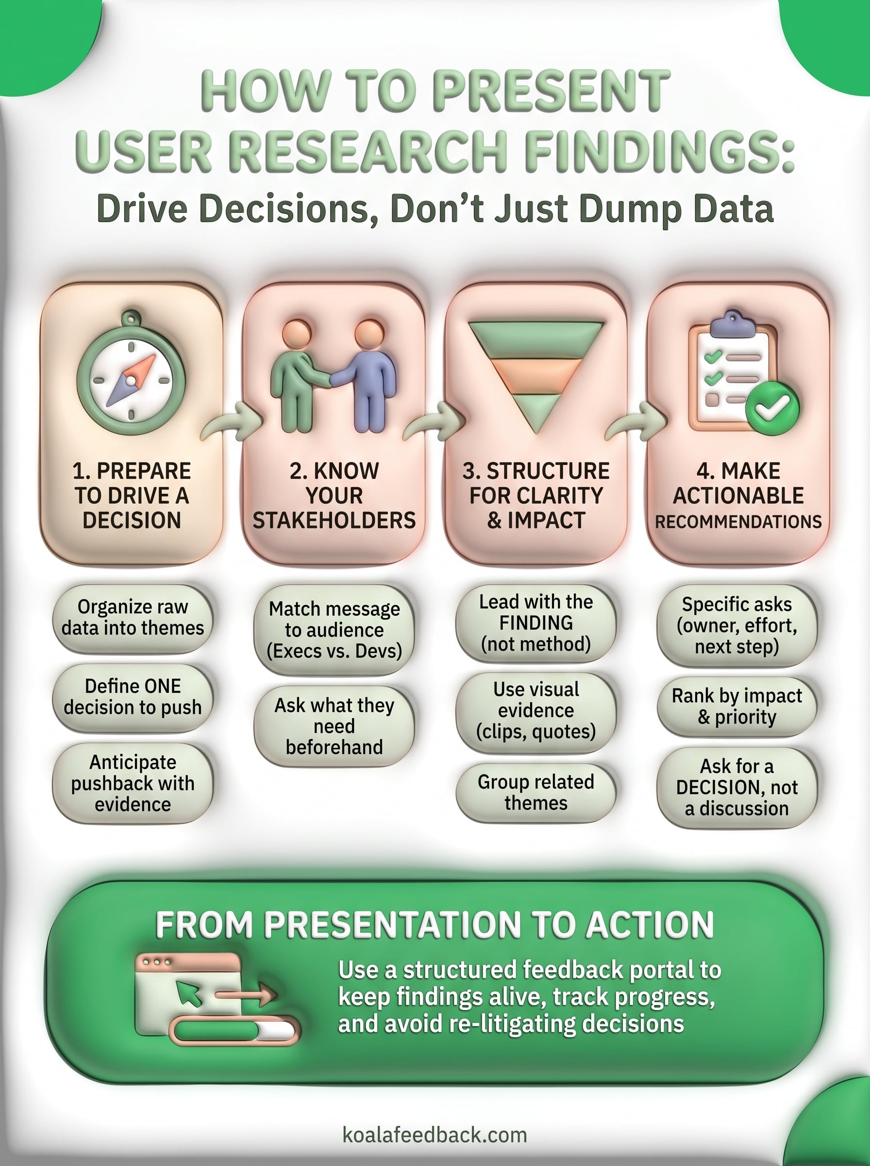
Great research readouts don't end when the meeting does. The themes, quotes, and recommendations you just presented need a home where stakeholders can revisit them without pinging you for the deck again. Otherwise, that hard-won clarity fades within a week and you're back to re-litigating findings you already proved.
This is where a structured feedback system earns its keep. Instead of burying decisions in slide archives, you can log the recommendation, tag it to the theme it came from, and let stakeholders track progress as it moves from idea to shipped feature. That visibility keeps the pressure on and gives you a paper trail the next time someone questions a finding.
If you're tired of watching solid research disappear after one good meeting, give your team a place to keep the conversation alive. Try Koala Feedback and turn your next presentation into a roadmap people actually follow.

Start today and have your feedback portal up and running in minutes.