You just wrapped a round of user interviews or usability tests, and now you're staring at a pile of notes, quotes, and recordings. Stakeholders want answers, not raw data. That's where a user research report template earns its keep: it turns messy findings into a document people actually read and act on.
This guide gives you a structure you can reuse for every study, from a five-person usability test to a month-long research sprint. You'll see exactly what sections to include, how to write an executive summary that busy stakeholders skim in thirty seconds, and how to present findings so they lead to decisions instead of getting filed away. We'll also cover how to back up claims with evidence and quotes so your recommendations hold up in the next planning meeting.
Below, you'll find a ready-to-use template, a section-by-section breakdown of what makes each part effective, and a few real examples to model your own report after. If you're building or prioritizing a product roadmap based on this research, a clear roadmap for turning findings into action matters just as much as the report itself, and we'll touch on that connection too.
Before you open a blank doc, get clear on the anatomy of a good report. Every solid user research report template shares the same core sections, whether you're writing up a five-participant usability test or a six-week discovery sprint. Skip a section and you'll end up fielding follow-up questions in Slack for a week. Include all of them, and your stakeholders get everything they need in one pass.
A report that answers "so what do we do now" on the first page gets read; one that buries the answer on page twelve gets skimmed and forgotten.
Here's the structure I use for almost every study, regardless of size. Treat this as your default skeleton, then trim or expand sections based on how formal the audience needs it to be.
Most stakeholders will only read the executive summary and skim the recommendations. That's not laziness, it's how busy teams operate. Write this section last, after you know what actually matters, and keep it to one paragraph. A good test: could a product manager who missed the readout still walk into a roadmap meeting and explain the study's outcome? If not, rewrite it.
Use this table as a checklist when you're drafting or reviewing someone else's report. It maps each section to its purpose and a rough length, so you don't over-invest in the wrong parts.
| Section | Purpose | Typical Length |
|---|---|---|
| Title & metadata | Identify the study at a glance | 2-3 lines |
| Executive summary | Give the headline result | 3-5 sentences |
| Goals & background | Explain why the study happened | 1 short paragraph |
| Methodology & participants | Establish credibility and context | 1 paragraph + table |
| Key findings | Present evidence-backed patterns | 3-6 findings, 1 paragraph each |
| Recommendations | Turn insight into action | Bulleted list, prioritized |
| Appendix | Support deeper review | Linked or attached separately |
Designers and researchers often want the full appendix with quotes, screen recordings, and raw survey data. Executives usually want the opposite: one page, no jargon, and a clear recommendation they can approve or reject. Rather than writing two separate documents, build one report with the executive summary and recommendations up front, then let the detailed findings and appendix live further down or in linked pages. That way, anyone can stop reading exactly when they've gotten what they need, and nobody has to ask you for a second version.
Once you've got this skeleton in place, the real work starts: filling each section with content that's specific enough to act on. The next five steps walk through exactly how to do that, starting with how you frame your research goals before you write a single finding.
Every user research report template falls apart at this first step if you skip it. Before you touch your notes, write down the exact question the study was supposed to answer. Not "we wanted to learn about onboarding" but "do new users understand what our product does within their first five minutes?" That specificity shapes everything downstream: how you write findings, what you recommend, and whether stakeholders trust the conclusions.
Grab the original request, whether it came from a PM, a support ticket spike, or your own hunch, and translate it into one clear sentence. Vague goals produce vague reports, and vague reports get ignored in planning meetings. If you can't state the question in one sentence, you're not ready to write the report yet.
If you can't summarize your research goal in one sentence, your report isn't ready to write yet.
Here's a quick template for this section:
Research Goal: [What decision or question this study informs]
Background: [What triggered this study - data, feedback, a hunch]
Why now: [What's at stake if we don't answer this]
Goals without context read as academic. Explain what prompted the study, whether it was a drop in activation rate, a wave of feature requests in your feedback portal, or a stakeholder who wants validation before a big release. This is also where you name who's going to use the findings: a design team deciding on a layout, a product manager building next quarter's roadmap, or an exec deciding whether to greenlight a feature. Naming the decision-maker upfront keeps your later recommendations grounded in something real instead of floating advice nobody acts on.
Keep this section short. Two or three sentences on the goal, two or three on the background, and you're done. Anything longer belongs in the appendix, not the front page. If you're running research to validate ideas already sitting in a public roadmap or feedback board, mention that link explicitly here. It gives your report a paper trail: readers can see the request came from actual user demand, not a guess, and that context alone makes your later findings far easier to defend when someone asks "why did we look into this?"
Methodology is where skeptical stakeholders decide whether to trust your findings. Skip this section or bury it in vague language like "we talked to some users," and your recommendations get questioned line by line. Spell out exactly how you ran the study, who took part, and why that group makes sense for the question you were answering. This isn't about padding your user research report template with process details nobody asked for. It's about giving readers enough context to judge the findings on their own, without having to message you first.
State the research method in plain terms: moderated usability tests, unmoderated survey, contextual inquiry, or diary study. Then give the number of participants, how you recruited them, and any screening criteria that mattered. A finding based on twelve enterprise admins carries different weight than one based on three trial users who signed up last week, and your reader needs that distinction to weigh the results correctly.
A finding is only as credible as the participants behind it, so never let your reader guess who you actually talked to.
A short table beats three paragraphs of prose here. Stakeholders scan this section fast, so give them the facts in a format they can skim in ten seconds.
| Detail | Example |
|---|---|
| Method | Moderated usability test |
| Participants | 8 users, mid-market SaaS customers |
| Recruitment | In-app survey + email invite |
| Session length | 30 minutes |
| Dates | June 2-6, 2026 |
| Tools used | Zoom, screen recording, task script |
Every study has gaps. Maybe you only reached English-speaking users, or your sample skewed toward power users who already love the product. Note these limitations directly instead of hoping nobody notices. Doing so actually builds trust: readers who see you acknowledging blind spots are more likely to believe the parts you didn't flag. It also protects you later, when someone in a review meeting asks whether the findings generalize to a different segment. You'll have already answered that question on the page instead of getting caught off guard.
Keep this section factual and short. Save interpretation for the next step. Right now, your only job is establishing exactly who you talked to, how, and under what conditions, so the findings that follow have a solid foundation to stand on.
Findings are where most reports collapse into a wall of quotes and screenshots with no clear point. Your job here isn't to dump everything you saw, it's to group observations into patterns and explain why each pattern matters. A good user research report template treats findings as arguments, not transcripts. Every finding should answer one question: what did we learn, and how do we know it's true?
Resist the urge to write findings in the order you saw them happen. Nobody cares that participant three struggled with the settings menu at minute eighteen. They care that four out of eight participants couldn't find the settings menu at all, and that this points to a navigation problem worth fixing. Read through your notes and sort observations into three to six themes based on what kept coming up, not what happened first. Each theme becomes one finding.
A finding isn't what one person said, it's the pattern that showed up across enough people to matter.
A claim without evidence is just an opinion with better formatting. For each finding, include a direct quote, a task success rate, or a specific behavior you observed more than once. This is also the section where evidence and quotes do the heaviest lifting, since they let skeptical readers verify your interpretation instead of just trusting it.
Use this structure for each finding:
Finding #1: [One-sentence summary of the pattern]
Evidence: [Quote, stat, or behavior observed across participants]
Why it matters: [What this means for the product or business]
Severity: High / Medium / Low
Repeating that format for every finding gives your report a rhythm stakeholders learn to scan quickly, which matters more than you'd think once a report runs past three findings.
Once you've written up each finding, order them by impact rather than by when they surfaced in your sessions. A minor copy confusion shouldn't sit above a checkout flow that half your participants abandoned. Label each finding High, Medium, or Low severity based on how many users hit the issue and how much it blocked their task. This ranking does double duty: it tells stakeholders where to focus first, and it sets up the next section, where each finding turns into a specific recommendation instead of floating unresolved on the page.
Findings tell people what happened. Recommendations tell them what to do next, and that's the part of a user research report template most people rush through after spending days on the findings section. Don't let that happen. A finding without a matching recommendation leaves your reader guessing, and a vague recommendation like "improve onboarding" is barely better than nothing at all. Every recommendation should map to one finding and describe a specific, doable action.
Work through your findings list and write one recommendation per item. If a finding says four out of eight participants couldn't locate the settings menu, the recommendation isn't "fix navigation," it's "add a settings icon to the top nav bar and remove it from the overflow menu." Specific recommendations get built. General ones get discussed in a meeting and then forgotten.
A recommendation that doesn't name a specific change is just a wish with extra formatting.
Not every recommendation deserves equal urgency, so pair each one with the severity rating from your findings section and a rough effort estimate. This lets a product manager or design lead sort the list into what ships this sprint versus what waits for next quarter, without needing to reread the whole report to figure that out themselves.
Recommendation #1: Move settings icon to top nav bar
Linked finding: Finding #1 (navigation)
Severity: High
Effort: Low (design + engineering, ~2 days)
Owner: Design team
A numbered or bulleted list works better here than prose paragraphs, since stakeholders often copy this section straight into a planning doc or a feedback portal to track against future releases. Keep the language direct: name the change, name who should own it, and skip the hedging. If you're not confident enough in a recommendation to state it plainly, either gather more evidence or downgrade it to "worth investigating further" instead of dressing it up as a firm suggestion.
Close this section by noting which recommendations connect to items already sitting on your public roadmap. If a finding validates something your team already planned, say so. It gives stakeholders confidence the roadmap reflects real user behavior, not just internal guesswork, and it makes the next planning conversation shorter because half the argument is already settled on paper.
The best report format is the one your audience will actually open, not the one that looks most polished in your portfolio. Before you pick a template or tool, ask how each group prefers to consume information. Some teams want a live readout with slides, others want a doc they can skim between meetings. Matching the format to the audience matters more than any design choice you make inside it.
A slide deck works well for a synchronous readout where you'll walk stakeholders through findings and answer questions live. A written doc works better when people need to reference it weeks later or forward it to someone who missed the meeting. Dashboards make sense for recurring research, where stakeholders check in on trends rather than reading a one-time writeup.
| Format | Best for | Watch out for |
|---|---|---|
| Slide deck | Live readouts, exec presentations | Too much text per slide |
| Written doc | Reference material, async sharing | Burying the summary too deep |
| Dashboard | Ongoing or recurring research | Losing narrative context |
Pick the format your stakeholders will actually open, not the one that photographs best in a case study.
Whatever format you choose, put your executive summary and top recommendations on the first page or the first slide. Don't make anyone scroll or click through five slides to find out what you learned. If you're presenting live, resist the urge to walk through your methodology before your findings. Stakeholders want the headline first, and they'll ask about your methods if they need convincing.
Store your finished report somewhere your team will actually find it again, whether that's a shared drive, a wiki, or linked directly from the relevant item on your feedback portal or roadmap. A report that lives in a random Slack thread gets forgotten within a week. Adding a short summary comment on the linked roadmap item, with a link back to the full report, means anyone reviewing that feature later can trace the decision straight to the research behind it, instead of relying on someone's memory of a meeting that happened months ago.
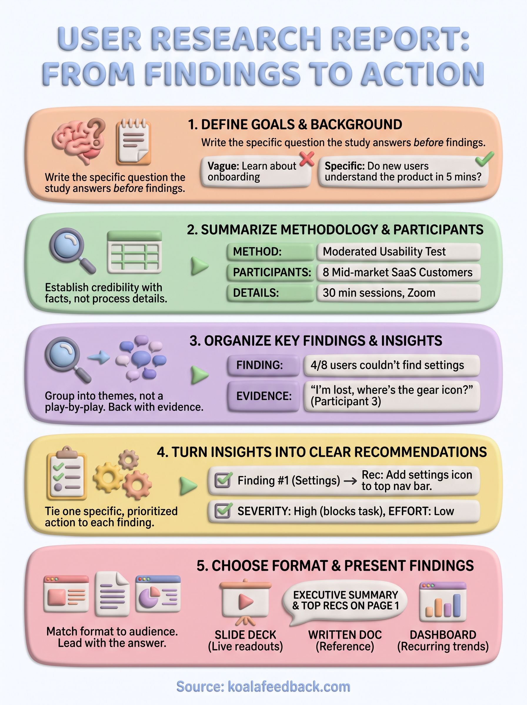
A user research report template only earns its place if it changes what your team builds next. Follow the five steps here, goals, methodology, findings, recommendations, and format, and you'll have a document that stakeholders actually read instead of skim once and forget. The structure does the heavy lifting: clear findings backed by evidence, recommendations tied to real actions, and a format that matches how your audience consumes information.
Next time you wrap a research round, don't start from a blank page. Reuse this skeleton, swap in your new findings, and get the report in front of stakeholders while the insights are still fresh. The real payoff shows up when those recommendations land somewhere your whole team can track them against upcoming work. If you want that connection built in from the start, try Koala Feedback to turn your research findings into a prioritized, shareable product roadmap.

Start today and have your feedback portal up and running in minutes.