You've probably heard someone on your team say a feature
Most product failures don't happen because the engineering was bad. They happen because nobody sat down and asked how a real person would actually use the thing. User experience basics aren't a nice-to-do add-on you sprinkle on after the code ships. They're the difference between a feature people adopt and one that quietly rots in a menu nobody clicks. If you skip this thinking early, you pay for it later in support tickets, churned accounts, and a backlog full of "fix this confusing screen" tasks that should never have existed.
Skipping user experience design basics rarely causes a dramatic, visible failure. Instead, it shows up as slow, quiet erosion. Trial users sign up, poke around for four minutes, and leave without telling you why. Existing customers stop using a feature you spent a quarter building, not because it doesn't work, but because they never understood what it did. Your support team answers the same "how do I..." question fifty times a month, which is really a UX problem wearing a customer service costume. None of this shows up on a single dashboard as "UX failure." It shows up scattered across churn reports, support volume, and low feature adoption, which is exactly why so many teams miss it until it's expensive to fix.
A confusing product doesn't announce its failure. It just loses users one quiet exit at a time.
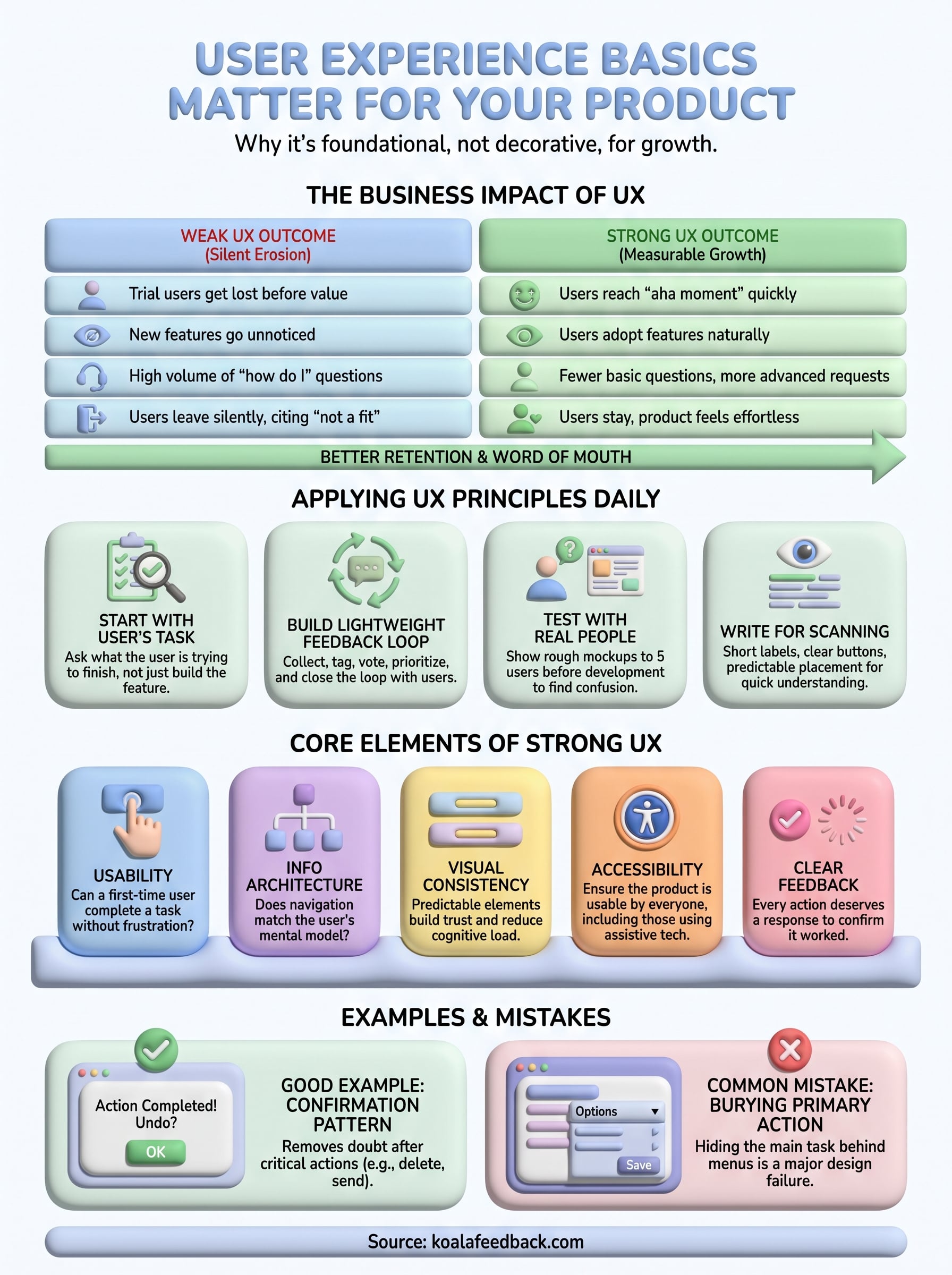
Good UX isn't just a subjective feeling of "this app feels nice." It translates directly into metrics that product managers and founders already track. Onboarding that respects a user's time increases activation rates. Interfaces that reduce guesswork cut support ticket volume. Clear navigation increases the odds someone finds the feature that makes them stick around for another billing cycle. Below is a simple comparison of how weak versus strong UX plays out across common product metrics.

| Metric | Weak UX outcome | Strong UX outcome |
|---|---|---|
| Trial-to-paid conversion | Users get lost before finding value | Users reach the "aha moment" quickly |
| Feature adoption | New features go unnoticed or unused | Users discover and adopt features naturally |
| Support ticket volume | High volume of "how do I" questions | Fewer basic questions, more advanced requests |
| Churn rate | Users leave silently, citing "not a fit" | Users stay because the product feels effortless |
| Word of mouth | Rarely recommended, seen as clunky | Actively recommended to peers |
These aren't abstract ideals. Google's own research into page experience signals shows that how people perceive and interact with an interface has measurable effects on engagement and retention, which is part of why the company built entire ranking systems around page experience for the web (see Google's guidance on understanding page experience). The same logic applies inside your product, not just your marketing site.
Once you treat UX as foundational rather than decorative, it starts acting as connective tissue between departments that usually work in silos. Product managers use it to decide what to build next. Designers use it to shape how something looks and behaves. Developers use it to understand why a seemingly small detail, like a loading spinner or an error message, actually matters. Support teams use it to spot patterns in confusion before those patterns turn into cancellations. When everyone shares a baseline understanding of UX fundamentals, conversations about priorities get shorter because people are arguing from the same set of principles instead of gut feelings.
Support tickets, sales call notes, and churn surveys are packed with UX signals, but only if someone is actually collecting and reading them. This is where a lot of teams fall down. They have the raw material for great UX decisions sitting in scattered spreadsheets, Slack threads, and helpdesk tags, and nobody connects the dots. Centralizing that feedback, tagging it by theme, and letting users vote on what matters most turns vague complaints into a prioritized list you can actually act on. That loop, collect feedback, spot patterns, ship improvements, tell users what changed, is UX in practice, not just UX in theory.
Small teams can sometimes get away with weak UX because founders talk to every user personally and patch problems by hand. That approach stops scaling the moment you have more than a handful of customers. Growth multiplies the cost of every confusing screen, every unclear label, every feature nobody can find. What felt like a minor rough edge at ten users becomes a support bottleneck at ten thousand. Understanding UX basics early means you're building habits and processes that scale with you instead of habits you'll have to unlearn under pressure later.
Knowing that UX matters is one thing. Turning that knowledge into daily habits is where most teams stall out. You don't need a dedicated UX department to start applying user experience basics. You need a handful of repeatable practices that anyone on a product team can run without waiting for permission.
Before you approve a design or ship a change, ask what task the user is actually trying to finish. A settings page isn't a feature, it's a means to "I want to stop getting these emails." Framing decisions around the task instead of the feature keeps you from building something technically correct but practically useless. Product managers who run standups this way often catch confusing flows before a single line of code gets written, because the question "what is the user trying to do here" exposes gaps that a feature checklist never will.
If you can't describe the user's task in one sentence, you're not ready to design the solution.
Applying user experience design basics daily means treating user input as a constant input stream, not a quarterly survey. A simple loop looks like this:
This is exactly the workflow a tool like a feedback portal is built for. Instead of guessing, you're watching real demand accumulate in front of you.
Sketches and clickable prototypes are cheap. Rebuilding a shipped feature because nobody understood it is not. Set a habit of showing rough mockups to five real users before development starts. You're not looking for compliments, you're looking for confusion. If three of five people hesitate on the same button, that's a signal worth fixing now instead of after launch.
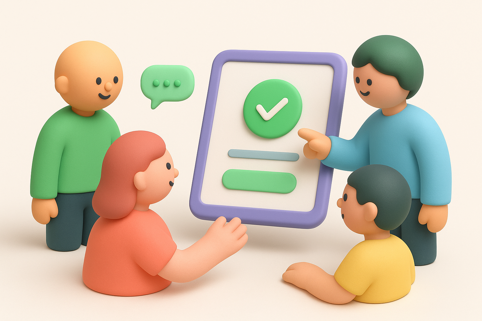
Users skim interfaces the same way they skim articles. Short labels, clear buttons, and predictable placement reduce the mental effort required to use your product. A practical daily checklist looks like this:
Running through this checklist before shipping catches the kind of small friction that quietly adds up into support tickets.
Teams that treat UX review as a separate, optional step tend to skip it under deadline pressure. Weaving a quick UX check into existing code review or sprint review meetings keeps it from becoming an afterthought. Ask one question in every review: would a first-time user understand this without help? Making that question a habit, rather than a special initiative, is what actually embeds UX thinking into daily work instead of leaving it as a slide in a kickoff deck nobody revisits.
When people say a product "has good UX," they usually mean a handful of concrete things are working together quietly in the background. User experience basics break down into a short list of pillars: usability, information architecture, visual consistency, accessibility, and clear feedback. Miss one and the whole experience feels off, even if a user can't name why. Understanding these pieces individually makes it much easier to diagnose what's actually broken when a product feels clunky.
Usability is whether someone can complete a task without frustration, guesswork, or a support ticket. It covers learnability, how fast a first-time user figures things out, and efficiency, how quickly a returning user gets the job done on the tenth visit. A product can look beautiful and still fail on usability if the checkout button hides three screens deep or the settings menu buries the one option everyone needs. Testing usability doesn't require a lab. Watching five real users attempt a task, without prompting them, exposes most usability problems within minutes.
A product only has good UX if a first-time user can succeed without asking anyone for help.
Information architecture is the skeleton underneath every screen: how content and features are grouped, labeled, and connected. Good navigation structure means a user's mental model of "where things live" matches the actual layout. Bad information architecture forces users to hunt through menus that made sense to the team that built them but not to anyone else. A quick test: ask someone unfamiliar with your product to find a specific setting. If they guess wrong twice, your categorization needs work, not your labels.
Visual design isn't decoration, it's a signal of reliability. Consistent color usage, predictable button placement, and readable typography reduce the mental effort required to use a product. Inconsistency, like a save button that's blue on one screen and green on another, makes users second-guess themselves even when nothing is technically broken.
| Element | What it controls | Common failure |
|---|---|---|
| Typography | Readability and hierarchy | Too many font sizes, poor contrast |
| Color | Meaning and emphasis | Inconsistent use of the same color for different actions |
| Spacing | Visual grouping | Cluttered screens with no breathing room |
| Iconography | Quick recognition | Icons with no label, unclear meaning |
Accessibility means people using screen readers, keyboard navigation, or limited vision can still use your product fully. This overlaps directly with user experience design basics because an interface that excludes anyone is, by definition, not well designed. The Web Content Accessibility Guidelines from the W3C give a practical baseline: sufficient color contrast, keyboard-operable controls, and text alternatives for images. Treating these as checklist items during design, not fixes after launch, saves significant rework later.
Every action a user takes deserves a response. Saving a form, submitting a request, or hitting an error should trigger a clear signal, a confirmation message, a loading state, or a specific error explanation. Silence after an action is one of the fastest ways to make users distrust a product, because they're left wondering if it worked at all.
Seeing user experience basics in action makes the abstract principles from the last section click. A few real patterns show up again and again in products that feel effortless, and a shorter list of mistakes shows up again and again in products that feel like a chore. Knowing both helps you spot problems in your own product before a user complains about them.
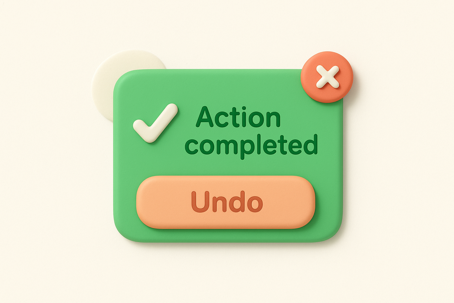
A well-built confirmation pattern shows up the moment someone deletes a project, cancels a subscription, or submits a form. Instead of silently completing the action, the interface shows a brief message confirming what happened and, when the action is risky, a chance to undo it. Slack's message deletion and Gmail's "undo send" are common references people already know from daily use. This small pattern removes doubt, and doubt is what drives a user to click the same button twice or open a support ticket asking "did that actually work?"
Progressive disclosure means showing only what a user needs right now and revealing advanced options later. A signup form that asks for an email and password first, then asks for company details after account creation, respects a new user's limited patience. Dumping every possible field on screen one is a fast way to lose someone who was ready to commit thirty seconds ago. Applying user experience design basics here just means asking which fields actually block someone from getting value today, and pushing the rest to a later step.
The fastest way to lose a new user is to ask them for everything before you've shown them anything.
One of the most frequent mistakes is hiding the one thing most users came to do behind a menu, a tab, or a secondary button. If the main reason someone opens your product requires three clicks to reach, that's not a minor inconvenience, it's a design failure. A related mistake is using vague labels like "Manage" or "Options" for buttons that hide the actual action a user is looking for.
Inconsistent terminology confuses users faster than almost anything else. Calling something a "board" on one screen and a "project" on another forces users to relearn your product every time they switch context. The same applies to layout: moving the save button to a different spot on different pages breaks the muscle memory users build after just a few visits.
| Mistake | Why it hurts | Simple fix |
|---|---|---|
| Hidden primary action | Users can't find the core task | Put the main action above the fold, clearly labeled |
| Inconsistent terminology | Users relearn the product repeatedly | Pick one term per concept and use it everywhere |
| No feedback after actions | Users distrust whether it worked | Add confirmation messages or loading states |
| Overloaded forms | New users abandon signup | Use progressive disclosure, ask less upfront |
| Generic error messages | Users don't know how to recover | Explain what went wrong and what to do next |
Reviewing this table against your own product takes fifteen minutes and usually surfaces at least one fix worth shipping this week. Most of these mistakes aren't expensive to correct once you see them named plainly, which is exactly why naming them matters more than theorizing about UX in the abstract.
Good UX doesn't come from a single redesign or a fancy tool. It comes from repeatable habits: framing decisions around user tasks, watching real people struggle before you ship, and closing the loop once you act on their input. The teams that get this right treat feedback as a constant stream, not a once-a-year survey, and they build products that feel obvious because someone actually checked whether they were.
Start small. Pick one screen this week and run it through the checklists in this guide. Ask if the primary action is obvious, if the labels are consistent, and if a first-time user could succeed without help. That single habit, repeated, is what separates products people recommend from ones they quietly abandon.
If you want an easier way to collect that feedback, spot patterns, and show users what you shipped, try Koala Feedback and turn scattered complaints into a prioritized roadmap.

Start today and have your feedback portal up and running in minutes.