Picking a product analytics tool feels harder than it should be. Every vendor claims to track everything, dashboards look identical in demos, and pricing pages hide the real cost until you're three months into a contract. If you're running this product analytics tools comparison because your current setup can't answer basic questions about user behavior, you're not alone.
This guide breaks down the tools product teams actually use in 2026, including Amplitude, Mixpanel, PostHog, and Heap, along with a handful of alternatives worth your attention. You'll get a straight look at what each tool does well, where it falls short, and who it's built for, whether that's a five-person startup or a product org with dozens of engineers shipping weekly.
We'll walk through event tracking capabilities, pricing tiers, integration options, and the learning curve for each platform, because the
Before you dive into the details, it helps to see how these ten platforms stack up side by side. Pricing models vary wildly across this category, from free open-source options to enterprise contracts that start at five figures a year, and the feature sets overlap less than the marketing pages suggest. Use this table as your starting filter, then jump to the tool profiles below for the specifics that matter to your stack.
| Tool | Best known for | Starting price | Free tier | Setup difficulty |
|---|---|---|---|---|
| Amplitude | Behavioral analytics at scale | Free, paid from ~$49/mo | Yes | Moderate |
| Mixpanel | Event-based funnel analysis | Free, paid from ~$28/mo | Yes | Moderate |
| PostHog | Open-source, all-in-one product suite | Usage-based, free tier included | Yes | Moderate to high (self-host option) |
| Heap | Autocapture, no-code event tracking | Custom pricing | Limited trial | Low |
| FullStory | Session replay and UX debugging | Custom pricing | Limited trial | Low |
| Google Analytics | Web traffic and marketing analytics | Free (GA4) | Yes | Low |
| Pendo | In-app guides plus analytics | Free, paid custom pricing | Yes | Moderate |
| Userpilot | Onboarding flows with analytics | From ~$249/mo | 14-day trial | Low |
| Hotjar | Heatmaps and session recordings | Free, paid from ~$32/mo | Yes | Low |
| Microsoft Clarity | Free heatmaps and recordings | Free | Yes (fully free) | Low |
Glance through this list and you'll notice a pattern: enterprise-grade platforms like Amplitude and Heap lean toward custom pricing and steeper onboarding, while tools like Hotjar and Microsoft Clarity trade depth for simplicity and cost. Neither approach is wrong, but they solve different problems.
The right product analytics tool isn't the one with the most features, it's the one your team will actually use every week.
Keep in mind that several of these tools serve adjacent but distinct purposes. Google Analytics and Hotjar started as marketing and UX tools respectively, and they've expanded into product analytics territory rather than being built for it from day one. Purpose-built platforms like Amplitude, Mixpanel, and PostHog were designed around product usage data from the start, which shows in how they structure events, cohorts, and retention reports. Deciding which category fits your needs is often the fastest way to narrow this list down before you even open a demo.
Lastly, remember that pricing tables like this one shift constantly as vendors adjust tiers and usage limits. Treat the numbers above as a directional guide, and confirm current rates directly with each vendor before budgeting.
Amplitude built its reputation on behavioral analytics at scale, and it's still the tool most enterprise product teams reach for when they need to understand complex user journeys across web and mobile. The platform tracks events, builds cohorts, and surfaces retention curves without forcing you to write SQL, though the underlying data model takes real time to learn. If you've outgrown spreadsheets and basic dashboards, this is usually where teams land next.
Amplitude's core strength is cross-platform event tracking paired with analysis tools that go beyond simple counts:
Amplitude rewards teams willing to invest time in setup with analysis depth few competitors match.
Amplitude suits mid-size to enterprise product teams with dedicated analytics or data resources. Startups with one generalist product manager often find the learning curve steep and the price jump between tiers sharp once usage grows. If you have engineers who can maintain a clean tracking plan and a team that will actually dig into cohort analysis weekly, Amplitude pays off.
Amplitude offers a free Starter plan covering up to 50,000 monthly tracked users, which works for early-stage products testing the waters. Paid plans start around $49 per month and scale based on tracked users and feature access, with enterprise pricing requiring a custom quote. Watch the tracked-user limits closely, since exceeding them mid-cycle can trigger unexpected overage costs or force an abrupt tier upgrade.
Mixpanel earned its place in this product analytics tools comparison by focusing squarely on event-based funnel analysis, and it remains one of the fastest ways to answer "where are users dropping off" without waiting on a data team. The interface leans more intuitive than Amplitude's, which makes it a common pick for product managers who want to self-serve reports without filing a ticket to engineering. Teams that already run lean, cross-functional squads tend to pick up Mixpanel's query builder within a day or two.
Mixpanel's toolkit centers on self-serve funnel and retention reporting built for non-technical users:
Mixpanel's real advantage is speed: a product manager can build a usable funnel report in minutes, not days.
Startups and mid-market SaaS teams get the most out of Mixpanel, especially product managers who want direct access to answers without routing every question through an analyst. If your organization already has a dedicated data science team running custom SQL against a warehouse, Mixpanel's simplicity can feel limiting rather than helpful. Teams shipping frequent product updates and needing quick read on feature adoption fit this tool well.
Mixpanel offers a free plan covering up to 20 million events per month, generous enough for many early-stage products to run entirely on the free tier. Paid plans start around $28 per month and scale with monthly tracked users, with a Growth tier adding advanced permissions and data governance. Enterprise pricing requires a custom quote and typically includes SSO, higher event volumes, and dedicated support.
PostHog stands apart in this product analytics tools comparison because it's open-source and built as an all-in-one product suite rather than a single-purpose analytics tool. Beyond event tracking, it bundles session replay, feature flags, A/B testing, and surveys into one platform, which appeals to engineering-led teams that want fewer vendors to manage. You can self-host it for full data control or run it on PostHog Cloud, and either path gets you the same core toolset.
PostHog's breadth is its calling card, and the all-in-one toolkit covers most of what a product team needs without stitching together separate subscriptions:
PostHog's open-source roots mean you're not locked into one vendor's roadmap or pricing decisions.
Engineering-heavy teams and startups comfortable managing their own infrastructure get the most value from PostHog. Companies with strict data privacy needs, like those in regulated industries, often choose the self-hosted version specifically to keep raw user data off third-party servers. Product teams who want analytics, experimentation, and session replay under one roof, instead of paying for three separate tools, fit this platform well.
Usage-based pricing sets PostHog apart from flat-tier competitors, and a generous free tier covers up to 1 million events per month before charges kick in. Beyond that, you pay per event, per recording, and per feature used, which keeps costs low for lean products but requires monitoring as usage scales. Self-hosting remains free aside from your own server costs, though it demands ongoing maintenance.
Heap takes a different approach to this product analytics tools comparison by capturing every click, pageview, and form submission automatically, without asking you to define events ahead of time. That autocapture model means you can retroactively analyze user behavior you never explicitly tracked, which saves engineering hours upfront but shifts the cleanup work to later in the process. Teams tired of waiting on developers to add tracking code for every new question tend to gravitate toward Heap first.
Heap's pitch centers on removing the instrumentation bottleneck that slows down most analytics rollouts:
Heap's autocapture removes the setup bottleneck, but that convenience comes with its own cleanup cost later.
Non-technical product teams who need answers fast, without submitting tickets to engineering for every new tracking request, fit Heap well. Companies still validating their product and unsure which events matter yet benefit from capturing everything now and deciding what to analyze later. If your team has strong data hygiene discipline and doesn't mind pruning noisy autocaptured events, Heap saves real time compared to manual instrumentation.
Heap keeps pricing behind a sales conversation, offering a limited free trial rather than a permanent free tier like Amplitude or Mixpanel. Custom quotes depend on monthly sessions tracked and which features you need, including session replay and Illuminate. Budget for a longer sales cycle than self-serve competitors, and push vendors for a clear breakdown of overage costs before signing, since session-based pricing can climb quickly as traffic grows.
FullStory built its name on session replay, and it remains the sharpest tool in this product analytics tools comparison for teams that need to watch exactly what a frustrated user did before they rage-clicked and left. Unlike Amplitude or Mixpanel, FullStory leads with qualitative context rather than aggregate charts, pairing every session recording with analytics so you can jump from a metric drop straight to the recordings that explain it. Support and UX teams often adopt it first, then product managers follow once they see how fast it surfaces bugs that never show up in a funnel report.
FullStory centers everything around session-level visibility, which shows up across its core toolset:
FullStory answers "why" a metric moved, not just "that" it moved, which is the gap most dashboards leave open.
UX and support-driven teams get the most value here, especially when debugging reported issues or diagnosing drop-offs that numbers alone can't explain. Product teams running usability research lean on FullStory to watch real sessions instead of relying on assumptions from a survey. Smaller teams without a dedicated UX researcher may find the tool overkill if their main need is funnel or retention reporting.
FullStory doesn't publish flat pricing and instead routes prospects through a sales conversation, with a limited trial for testing the platform before committing. Custom quotes scale with monthly sessions captured and which features you add, such as advanced search or data export. Expect session-volume pricing to grow quickly for high-traffic products, so clarify overage terms before signing anything.
Google Analytics rounds out this product analytics tools comparison as the odd one out, since it was built for marketing attribution and web traffic, not product usage tracking. GA4, the current version, added event-based tracking and cross-platform reporting that inches closer to product analytics territory, but the interface still assumes you care more about acquisition channels than feature adoption. Product teams that already run GA4 for marketing sometimes stretch it to cover basic product questions before realizing they need a purpose-built tool for anything deeper than pageviews.
GA4's event-based data model replaced the old pageview-centric setup, and it now includes:
Google Analytics answers marketing questions well, but it wasn't built to answer product questions.
Small teams and solo founders who need basic behavior data without paying for a dedicated platform get real value from GA4, especially if marketing already owns the account. Companies that need to connect ad spend directly to in-product behavior benefit from the native Google Ads integration. Product teams needing cohort analysis, session replay, or in-depth funnel work should treat GA4 as a supplement, not a replacement, for a purpose-built product analytics tool.
GA4 is completely free for standard use, with no tracked-user caps that force an upgrade. Google Analytics 360, the enterprise tier, adds higher data limits, SLAs, and advanced attribution modeling starting in the tens of thousands of dollars annually. Most product teams never need 360 unless they're processing massive event volumes; details live on Google's official Analytics page.
Pendo blends product analytics with in-app guidance, which sets it apart from purely observational tools like Amplitude or Mixpanel in this product analytics tools comparison. Instead of just showing you where users drop off, Pendo lets you build walkthroughs, tooltips, and announcements that address the friction right where it happens. Product-led growth teams often pick Pendo specifically because it closes the loop between spotting a problem and acting on it inside the product itself.
Pendo pairs usage data with the tools to act on it, and the combination shows up across its feature set:
Pendo's real edge is closing the gap between spotting a problem and fixing it inside the product, not just reporting on it.
Product-led SaaS companies running onboarding flows or feature adoption campaigns get the most out of Pendo, especially teams without dedicated engineering resources for in-app messaging. Customer success and product marketing teams also lean on it heavily, since the guide-building tools require no code. Companies that only need raw event analytics without the guidance layer may find Pendo's price tag hard to justify against leaner competitors.
Pendo offers a free plan limited to a small number of monthly active users, useful for testing the platform before committing budget. Paid plans move to custom pricing based on monthly active users and which modules you need, including guides, feedback, and roadmaps. Expect a sales conversation rather than a self-serve checkout once you outgrow the free tier, and budget for a noticeable jump in cost as your active user count climbs.
Userpilot narrows its focus to onboarding flows, and it earns its spot in this product analytics tools comparison by pairing behavior tracking with no-code UI patterns that guide new users toward their first "aha" moment. Where Pendo spreads across guides, NPS, and roadmaps, Userpilot stays laser-focused on activation and adoption, which makes it faster to set up if onboarding is your only itch to scratch. Growth-stage SaaS teams often adopt it specifically to cut down the manual work behind welcome flows and feature announcements.
Userpilot's toolkit centers on turning usage data into onboarding action without requiring a developer for every change:
Userpilot works best when onboarding, not raw analytics depth, is the problem you're actually trying to solve.
Growth and product-led teams running structured onboarding campaigns get the clearest value from Userpilot, especially SaaS companies with a self-serve signup flow that needs constant tuning. Customer success teams also use it to build in-app announcements without waiting on engineering sprints. Teams needing deep behavioral cohorts or session replay should treat Userpilot as a onboarding layer, not a full analytics replacement.
Userpilot skips a permanent free tier and instead offers a 14-day trial, with paid plans starting around $249 per month for smaller teams. Pricing scales based on monthly active users and which features you need, including advanced analytics and localization. Enterprise plans add custom pricing, dedicated support, and higher usage caps, but expect a sales call once you outgrow the entry tier.
Hotjar rounds out the qualitative side of this product analytics tools comparison with heatmaps and session recordings built for teams who want to see behavior, not just count it. Marketing and UX teams adopted it first, since it answers questions like "why did visitors abandon this signup form" faster than any funnel report could. Product teams have picked it up too, mostly to pair with a quantitative tool like Mixpanel or Amplitude rather than replace one.

Hotjar's toolkit leans visual, and the heatmap-first approach shows up across its main features:
Hotjar shows you the page, not just the numbers, which makes friction points obvious in a way charts rarely do.
Marketing and UX teams running conversion optimization work get immediate value from Hotjar, especially when testing landing pages or signup flows. Product teams without a dedicated analytics platform sometimes use Hotjar as a lightweight starting point before graduating to something like PostHog or Amplitude. Teams needing cohort analysis or retention curves won't find them here, since Hotjar stays firmly qualitative.
Hotjar offers a free plan covering limited daily sessions, enough for small sites to test the waters. Paid plans start around $32 per month and scale with monthly session volume, with higher tiers unlocking more heatmaps, recordings, and survey responses. Enterprise pricing requires a custom quote, but most small to mid-size teams stay comfortably within the published tiers.
Microsoft Clarity closes out this product analytics tools comparison as the simplest option on the list, and it's also the only one that costs nothing at any scale. Built by Microsoft, Clarity focuses entirely on heatmaps and session recordings, skipping the funnels, cohorts, and retention reports you'd find in Amplitude or Mixpanel. Teams already running Google Analytics often bolt on Clarity specifically to see the sessions behind the numbers, since GA4 alone can't show you what a confused user actually clicked.
Clarity keeps its feature set narrow but polished, and the session-level detail rivals paid competitors:
Clarity proves that qualitative insight doesn't require a budget line item, just a willingness to watch real sessions.
Small businesses and solo founders who want session replay without paying for Hotjar or FullStory get full value from Clarity, especially early-stage products still validating basic UX decisions. Marketing teams already inside the Microsoft ecosystem, running Bing Ads or Microsoft Advertising, appreciate the native integration for tying ad clicks to on-site behavior. Teams needing quantitative depth, like cohort analysis or retention curves, will outgrow Clarity fast and should pair it with a purpose-built product analytics tool instead.
Microsoft Clarity is entirely free, with no paid tier, no usage caps, and no sales conversation required to unlock features. That makes it an easy add-on regardless of your primary analytics stack, since there's no cost tradeoff to weigh against another tool's budget line.
Narrowing ten options down to one starts with an honest look at your team, not the feature list. A five-person startup evaluating this product analytics tools comparison needs something different than a 200-person product org with a dedicated data team, even if both are chasing the same retention metric. Start by asking who will actually build reports day to day, because a tool that requires SQL fluency will sit unused if your product managers can't query it themselves.
Budget matters just as much as capability, and it's worth mapping your expected event volume before you commit to any pricing tier. Usage-based platforms like PostHog stay cheap early but can climb fast once you scale, while flat-tier tools like Amplitude or Mixpanel offer more predictable costs at the expense of flexibility.
Choose based on who will use the tool weekly, not on which demo looked the most impressive.
Run through this checklist before signing anything:
Finally, resist picking a tool because a competitor uses it. Your tracking maturity and team structure matter more than industry trends, and the wrong fit here costs months of re-implementation later.
Every tool in this product analytics tools comparison tells you what users did, but none of them tell you why they wanted it in the first place. Amplitude can show a feature's adoption curve dropping off a cliff, and Hotjar can show you the rage clicks around it, but neither explains whether users hate the feature, don't understand it, or just needed it to work differently. That gap is exactly where a dedicated feedback platform earns its place in your stack.
Analytics answers the "what," feedback answers the "why," and product decisions built on only one half of that pair tend to miss the mark. A drop in retention might look like a bug in your dashboard, but a quick scan of your feedback portal could reveal fifty users asking for the same missing integration. Pairing the two turns raw behavioral data into a prioritized roadmap instead of a guessing game.
Behavioral data tells you where users struggle; direct feedback tells you what to build next.
This is where a tool like Koala Feedback fits alongside whichever analytics platform you picked from this list. Instead of just watching session recordings and hoping to infer intent, you give users a public feedback portal to submit ideas, vote on what matters most, and see exactly where their requests land on your roadmap. That transparency closes the loop your analytics tool can't close on its own, because users stop guessing whether their input mattered and start seeing it move through planned, in-progress, and shipped stages.
Teams that run both types of tools together consistently make faster, better-supported product calls than teams relying on usage data alone. The analytics tool flags the problem; the feedback tool tells you what your users actually want done about it.
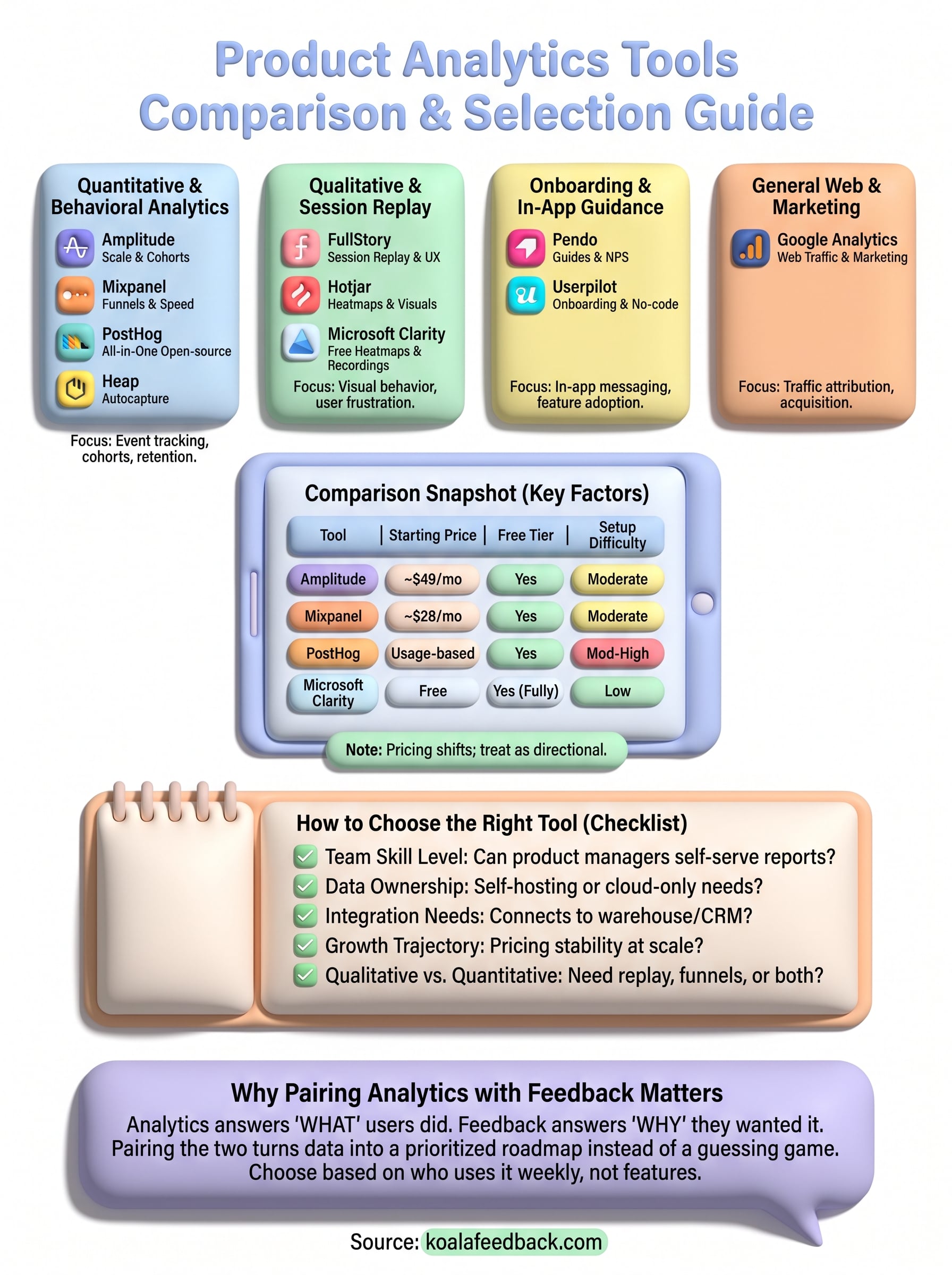
Ten tools, one decision: pick the platform that matches how your team actually works, not the one with the longest feature list. If you're a lean startup, Mixpanel or PostHog get you moving fast without a data team. If you're running an enterprise product org, Amplitude's depth justifies its learning curve. Need to see, not just count, user behavior? Pair a quantitative tool with FullStory, Hotjar, or Clarity for the qualitative side.
But no analytics platform, however sharp, tells you what to build next. It shows you where users struggle, not what they actually want instead. That's the piece worth adding before you finalize your stack.
Pair whichever tool you choose with a system for collecting direct input, and you'll stop guessing at priorities. Try Koala Feedback to turn the behavioral data you gather into a roadmap your users can actually see.

Start today and have your feedback portal up and running in minutes.