Most in-app messages get ignored. They pop up at the wrong time, say nothing useful, and interrupt whatever the user was actually trying to do. The difference between an in-app message that drives action and one that gets swiped away comes down to how well you follow in-app messaging best practices, from timing and targeting to the content itself. Get these right, and you turn a simple notification into a genuine conversation with your users.
That conversation matters more than most teams realize. At Koala Feedback, we help product teams collect user feedback and share roadmaps, and we've seen firsthand how the right message at the right moment can turn passive users into active contributors. In-app messaging isn't just a marketing tool; it's one of the most direct ways to engage users where they already are: inside your product.
This article breaks down eight proven best practices for in-app messaging, each paired with real examples that actually work. Whether you're onboarding new users, announcing features, or gathering feedback, these strategies will help you send messages people want to read, not dismiss.
Every effective in-app message has a single job. When you pack multiple asks into one message, users face a choice paralysis that typically ends with them closing the message without taking any action. One goal means one clear outcome you want the user to achieve; one ask means one specific action you want them to take to get there.
The human brain processes decisions faster when there are fewer options. Research on decision fatigue shows that people make worse choices, or no choices at all, when they face too many competing options at once. Applying this to in-app messaging best practices means your message should leave users with exactly one clear path forward. A focused message reduces cognitive load, and that directly increases the chance users actually follow through.
The simpler the ask, the higher the completion rate.
Before writing a single word of your message, write down the one thing you want the user to do after reading it. This single-action rule applies to every message format, whether it's a tooltip, modal, or banner. Then strip out anything that doesn't directly support that action.
Notion uses a simple tooltip when users first open the database view: "Try filtering your data" with a single "Show me" button. There's no secondary link, no explanation of five other features. Slack does the same thing during onboarding by pointing users to one channel at a time rather than presenting the entire workspace at once. Both examples keep the user moving in one clear direction.
Track your click-through rate on the primary call-to-action alongside your message dismissal rate. If dismissal is high and clicks are low, your message likely has too many competing elements or the ask isn't clear. Compare performance between messages with one CTA and messages with multiple options to see the difference directly.
The most common mistake is adding a secondary "Learn more" link next to your primary button. Secondary links split attention and reduce the number of users who take the primary action. Also avoid writing a message that explains a feature and asks for a review at the same time; those are two separate goals that need two separate messages.
Scheduling messages on a fixed timeline treats every user the same, regardless of what they've actually done in your product. Behavior-based triggers let you send messages precisely when a user is most likely to find them relevant, which is the foundation of solid in-app messaging best practices.
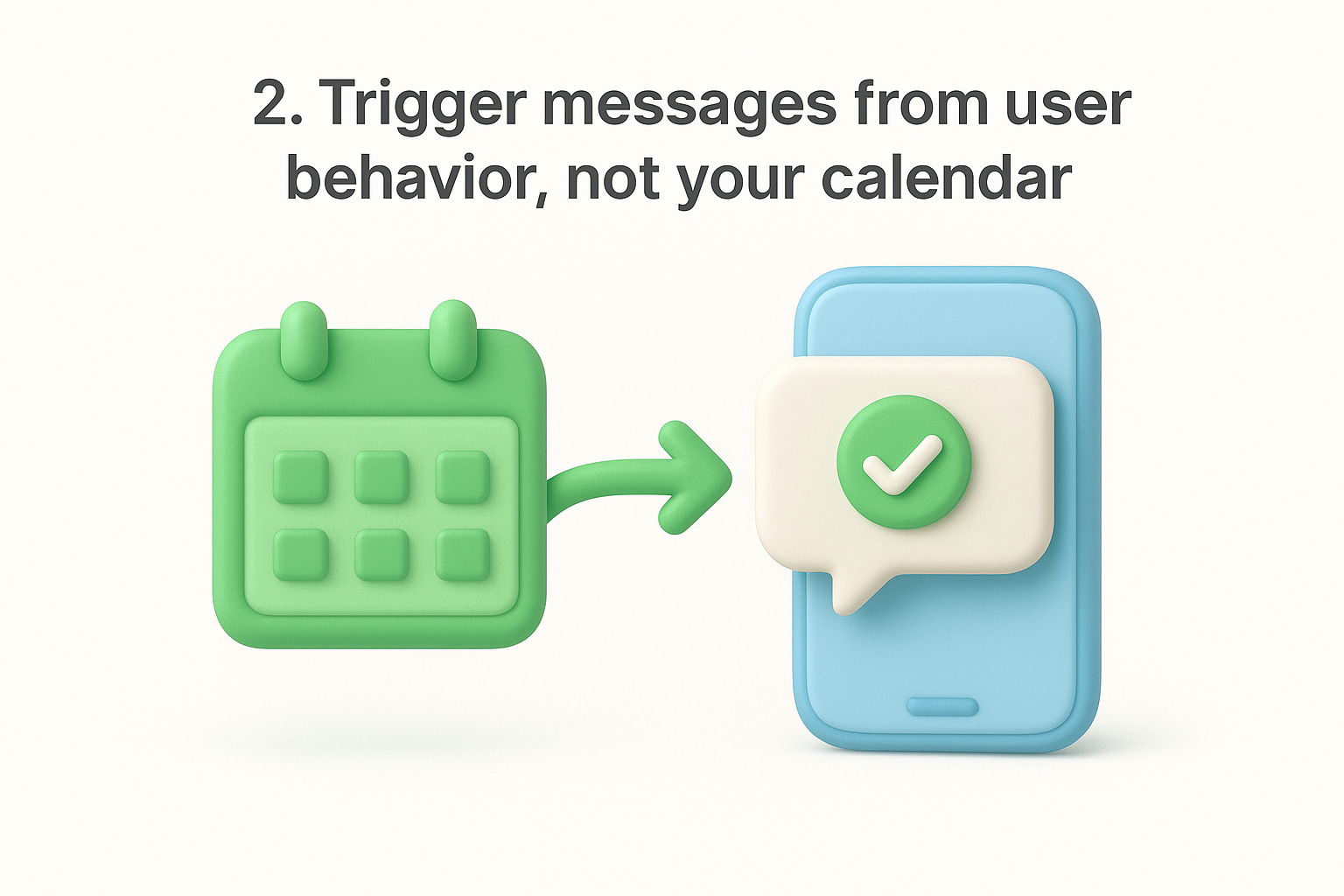
Users respond to messages that feel timely and personal. When a message appears right after a specific action, it connects cause and effect in a way a scheduled message never can. The relevance spike is immediate, and so is the user's motivation to act.
Timing a message to behavior turns a notification into a natural next step.
Map out your key user actions and identify the moments of highest intent, such as completing a setup step or reaching a feature for the first time. Then build triggers around those moments rather than arbitrary date intervals. Most in-app messaging tools let you define event-based conditions without writing custom code.
Figma shows a collaborative editing tip the first time a second team member opens a shared file. Dropbox sends a storage-limit message only after a user uploads a file that brings them close to their cap. Both messages land at the moment of maximum relevance.
Compare conversion rates between behavior-triggered messages and time-based ones. You'll typically see a significant improvement in click-through when the trigger aligns with actual user intent rather than an arbitrary schedule.
Avoid triggering the same message every time a user repeats an action. Set a frequency cap so users who perform an action daily don't see the same prompt on repeat.
Context is what separates a useful message from an interruption. When your in-app messaging best practices include workflow awareness, users read your messages as helpful nudges rather than random noise. A message that fits naturally into what a user is already doing gets far more attention than one that feels pulled from a different part of the product entirely.
Users carry strong mental context when they're in the middle of a task. If your message matches that context, it requires no cognitive shift to process. The moment a user has to stop and ask themselves "why am I seeing this right now?", you've already lost them. Contextual messages feel like the product is paying attention, which builds trust and increases engagement.
A message that makes sense where it appears will always outperform a well-written message that doesn't belong.
Audit every screen or workflow where you plan to show a message, then ask whether the message topic directly relates to what the user is trying to accomplish on that screen. If it doesn't, move the message or delay it until the user reaches the relevant part of your product.
Airtable shows a formula tip only when a user opens a formula field for the first time, not on a general dashboard screen. That placement makes the tip feel like part of the workflow.
Watch your task completion rate before and after adding contextual messages to key workflows. A well-placed message should increase completions, not interrupt them.
Avoid showing promotional messages inside active workflows where users are focused on completing a task. Save those for moments between tasks, like a dashboard landing or a confirmation screen.
Every in-app message format carries a different level of interruption. A full-screen modal demands immediate attention; a tooltip barely registers. Matching the message format to the size of the ask is one of the most overlooked in-app messaging best practices, and getting it wrong costs you user trust fast.
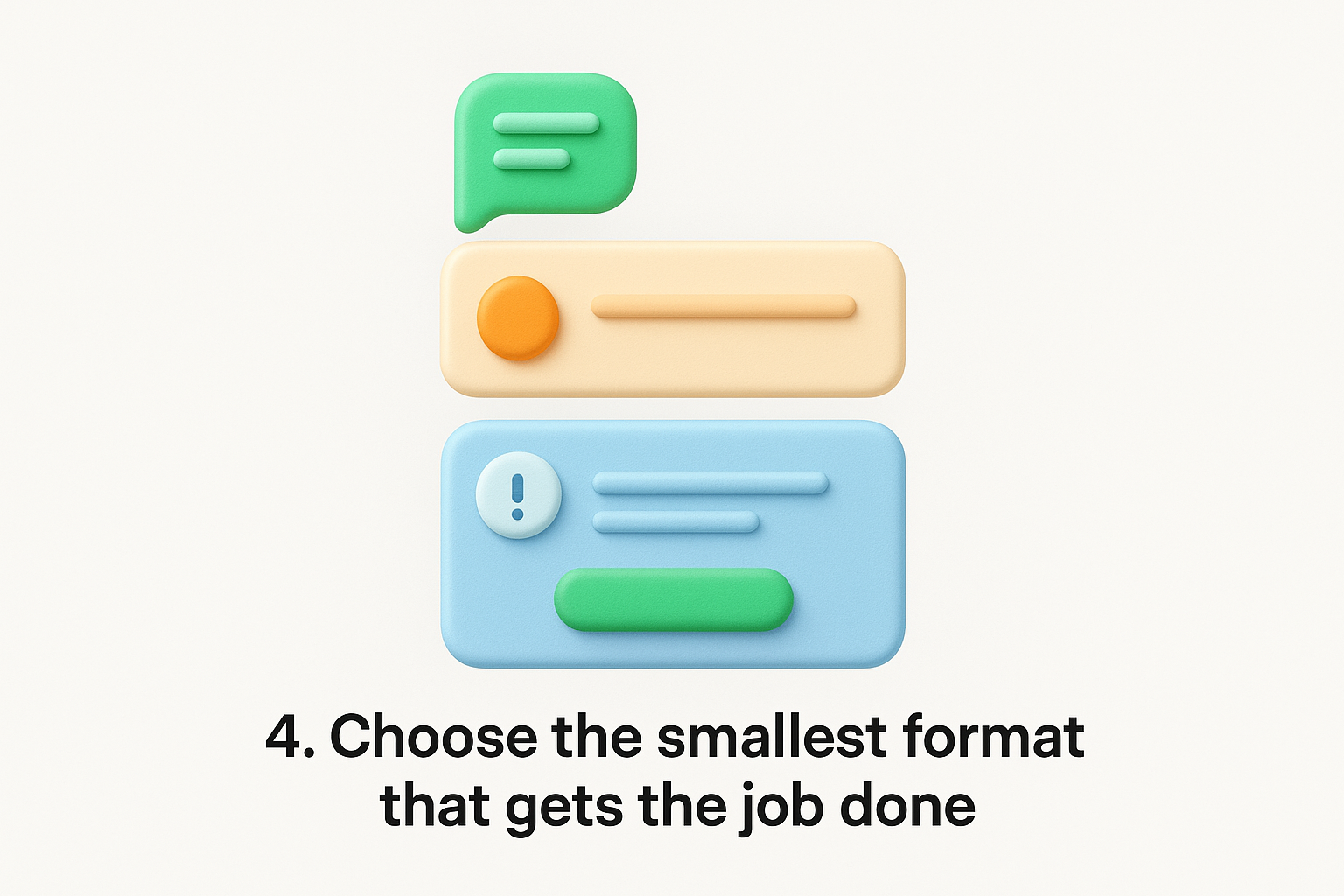
Larger formats signal urgency to users. When you use a modal for a minor tip, users feel tricked into stopping their workflow, and they start dismissing everything out of reflex. Reserve high-interruption formats for genuinely high-stakes moments, and users will actually pay attention when those moments arrive.
The format you choose sets the expectation for how important the message is.
Match the format to the weight of the ask. Use this as your starting guide:
Intercom uses a small chat bubble nudge to prompt users to reply to a conversation rather than a modal that blocks the entire screen. Linear surfaces inline tooltips next to keyboard shortcuts instead of interrupting a sprint board workflow with a larger overlay.
Track your dismissal rate broken down by format type. High dismissals on modals often signal you're using a heavy format for a lightweight message that a banner could handle just as well.
Avoid defaulting to modals for every announcement. Most product updates belong in a banner or changelog, not a screen-blocking overlay that forces users to stop what they're doing.
If a user has to read your message twice to understand what you want them to do, you've already lost them. Clear, plain language is one of the most underrated in-app messaging best practices, and it separates teams that see results from those that wonder why nobody clicks.
Users don't read in-app messages; they scan them. The moment a message requires effort to decode, the brain treats it as a low-priority distraction. Short sentences and familiar words remove that friction instantly, so your message lands before the user's instinct to dismiss it kicks in.
If your copy takes more than two seconds to process, your CTA will go unclicked.
Lead with the user benefit, not the feature name. Write the way you'd explain something to a colleague in a hallway. Use these rules as a quick filter before publishing any message:
Duolingo writes "You're on a 3-day streak. Keep it going?" rather than "Engagement milestone detected. Continue your learning activity." Canva says "Your design is ready to share" instead of "Export process completed successfully." Both examples tell users exactly what's happening and what to do next.
Track time-on-message if your tool supports it, alongside your click-through rate. A low click rate paired with a short time on message usually signals your copy isn't clear enough to motivate action.
Avoid technical jargon that your internal team understands but your users don't. Phrases like "sync your integration endpoint" mean nothing to most users. Replace jargon with plain action verbs that describe what the user will actually experience.
Sending the same message to every user is one of the fastest ways to generate dismissals. Segmentation means grouping users by what they're trying to accomplish and where they are in their journey, so your in-app messaging best practices actually reach the people who need them most.
Users in different lifecycle stages have completely different needs. A new user needs guidance, while a power user wants shortcuts and advanced features. Matching your message to that intent gap means fewer irrelevant interruptions and higher conversion on every message you send.
The more specifically you define who should see a message, the more useful that message becomes.
Build your segments around two axes: where users are in their lifecycle (new, active, at-risk) and what goal they're trying to reach. Define clear criteria for each segment before you write a single word of copy, then map your messages directly to those criteria.
Spotify surfaces playlist collaboration tips only after a user creates their third playlist, not during their first session. That timing matches user readiness rather than an arbitrary milestone, which is exactly what lifecycle-based segmentation looks like in practice.
Track activation rate and feature adoption rate per segment separately. If one segment consistently underperforms, your targeting criteria likely need tightening rather than your message copy.
Avoid building too many overlapping segments that cause a single user to receive messages from multiple rules at once. Conflicting segment rules create the exact message fatigue you're trying to prevent.
Even well-crafted messages lose their effectiveness when users see too many of them. Message fatigue happens when users start dismissing everything reflexively because they've been interrupted too often. Pairing frequency controls with performance data keeps your in-app messaging best practices sharp over time instead of degrading.
Users have a limited tolerance for interruption, and once you exhaust it, they stop engaging with every message, including the important ones. Frequency caps protect that tolerance, while performance data tells you which messages are worth keeping and which need replacing before they do damage.
The goal is a library of messages that improve with every data cycle, not just grow larger.
Set a global frequency cap that limits how many messages any single user sees within a rolling seven-day window. Then review performance data monthly and retire any message with a dismissal rate above 60%. Replace it with a revised version and test against the original before making it permanent.
Asana limits proactive tips to one per session and rotates new ones based on feature usage patterns, which keeps the experience feeling fresh rather than repetitive.
Track opt-out rate and session engagement rate alongside individual message performance. Rising opt-outs signal fatigue before your click rates reflect the problem.
Avoid treating low click-through as the only failure signal. A message can show acceptable clicks while still driving fatigue if users are dismissing it on repeat sessions without acting.
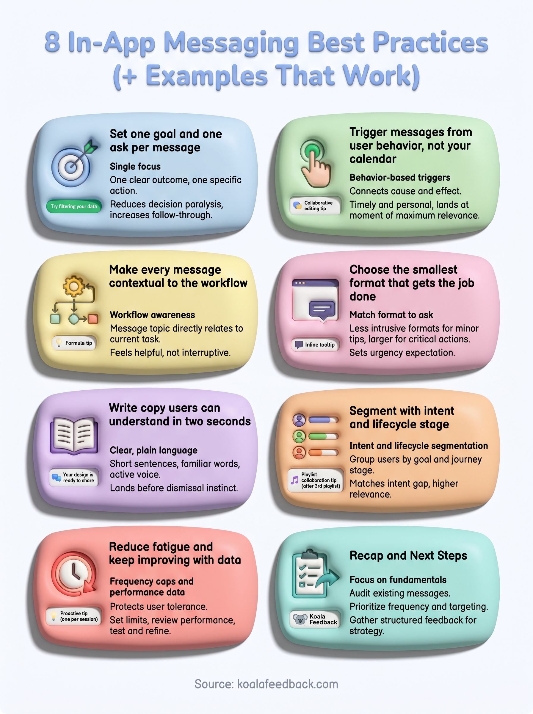
These eight in-app messaging best practices give you a clear framework: focus each message on one goal, trigger from user behavior, match context to the active workflow, pick the smallest format that fits the ask, write copy users process in two seconds, segment by intent and lifecycle stage, and manage fatigue with performance data. Together, these practices protect user attention and turn your messages into something people engage with rather than dismiss on reflex.
Your next step is to audit the messages you're already sending and identify which of these principles you're missing. Start with frequency and targeting since those two factors affect every message in your library immediately. Once your fundamentals are solid, focus on collecting structured feedback so you understand what users actually need before you message them. Koala Feedback helps product teams do exactly that, centralizing user input so your messaging strategy stays grounded in real user intent rather than assumptions.

Start today and have your feedback portal up and running in minutes.