You've got a backlog full of feature requests, bug reports, and "wouldn't it be cool if…" ideas. Your team can't build everything at once, so you need a way to decide what gets worked on first. That's exactly where the value vs effort matrix comes in, a simple four-quadrant framework that helps you weigh the impact of each initiative against the resources it'll take to ship it.
The concept isn't complicated, but applying it well requires some nuance. Placing items in the wrong quadrant can send your team chasing low-impact work for weeks while high-value opportunities sit untouched. Getting it right means your product decisions are grounded in real trade-offs, not gut feelings or whoever speaks loudest in the meeting.
This article breaks down each of the four quadrants, walks through how to score value and effort, and gives you practical steps to build your own matrix. We'll also show how tools like Koala Feedback, which centralizes user feedback and voting data, can feed directly into your prioritization process so the "value" side of your matrix reflects what users actually want, not just internal assumptions.
Most prioritization fails because teams compare initiatives without a common scale. One person argues for a feature that solves a loud customer complaint, while another pushes for infrastructure work that won't be visible for months. Without a shared framework, those conversations cycle through opinions rather than data. The value vs effort matrix solves this by giving every item on your backlog two measurable axes, so you're always comparing like with like instead of debating whose instinct deserves more weight.
The matrix also works because it's fast. You don't need a spreadsheet with 12 weighted criteria or a three-hour workshop to use it effectively. Once your team aligns on what "value" and "effort" mean in your specific context, you can score and place items in minutes. That speed matters because prioritization isn't a one-time event. Your backlog changes every week as new requests come in and business priorities shift, so your framework needs to keep pace without becoming a bottleneck in itself.
Vague priorities create invisible conflicts. When your team says "everything is high priority," nobody knows what to cut when bandwidth runs out and something has to slip. Placing items on the matrix forces you to make those trade-offs visible before any work begins. Once two items land in the same quadrant, you have to decide which one comes first, and that decision becomes a conversation grounded in real business impact rather than personal preference or who spoke up last in the meeting.
Surfacing trade-offs before work starts is one of the most reliable ways to prevent wasted sprint cycles and misaligned team expectations.
When you document those trade-offs on a shared board, you also create accountability. Your team can revisit the matrix in a retrospective and ask whether your original scoring assumptions held up after shipping. That feedback loop sharpens your prioritization instincts over time, making future scoring sessions faster and more accurate.
In most product meetings, the person with the most confidence or seniority tends to drive the roadmap, regardless of whether their ideas deliver the most value. The matrix shifts the conversation from opinion to structured reasoning. Instead of arguing about whose idea is better, your team focuses on two specific questions: how much value does this create, and how much effort does it require?
This structure is especially useful for teams that rely on user feedback to guide their feature decisions. When you have voting data showing that a significant portion of your users want a specific integration or workflow improvement, that signal carries real weight on the value axis. It becomes much harder for a single internal stakeholder to override a prioritization call when aggregated user data is sitting in front of everyone. Centralizing that feedback before you score gives your matrix a factual foundation rather than a speculative one, and the decisions you make from it are far easier to explain and defend across the organization.
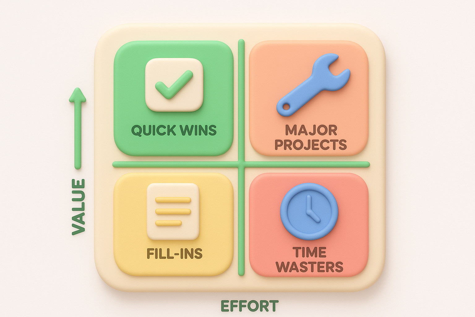
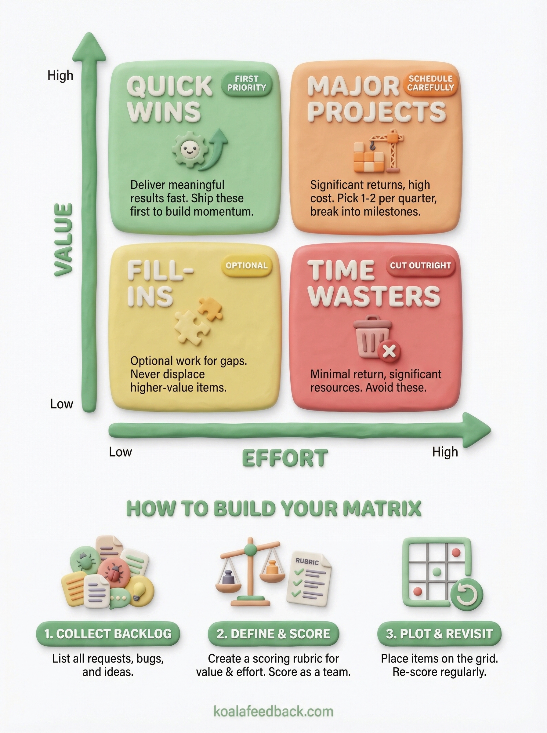
Each zone in the value vs effort matrix carries a specific instruction for your team. The vertical axis tracks value, meaning the measurable impact an initiative delivers to users and the business. The horizontal axis tracks effort, meaning the time, resources, and complexity required to ship it. Where an item lands determines how you treat it, whether you prioritize it immediately, schedule it carefully, deprioritize it, or cut it outright.
Items in this quadrant are your first priority in every planning cycle. They deliver meaningful results without consuming large amounts of engineering or design time, so you can ship them fast and build real momentum. For product teams, these often include small UX improvements that reduce friction, simple integrations a large segment of users has requested, or configuration options that unlock an existing workflow without requiring new infrastructure.
Clear this quadrant first. When you ship genuine quick wins consistently, you build credibility with users and demonstrate that feedback actually influences the roadmap, which encourages more people to share input in the future.
These items deserve a dedicated slot on your quarterly roadmap but require careful scheduling. They promise significant returns, but the resource cost means you can't run three of them simultaneously without diluting execution quality across all of them. Pick one or two per quarter, and break each into smaller deliverable milestones so your team ships incrementally rather than vanishing into a months-long build with no visible output.
Treating a high-effort item like a quick win is one of the fastest ways to blow a sprint and erode team confidence.
Low value, low effort items are optional fill-in work. You might pick them up when your team has a gap between larger initiatives, but they should never displace higher-value items during planning. Low value, high effort items are a harder conversation: they consume significant resources for minimal return, and the right call is usually to cut them from the backlog rather than let them linger and tempt future planning sessions when capacity looks open.
Building your matrix doesn't require any special software. A shared spreadsheet or a physical whiteboard grid works for most teams, and the simplicity is part of what makes the framework durable. The goal is to create a shared visual space where every initiative can be placed relative to the others, so your team sees the full picture before committing time and resources to anything.
Before you place a single item on the grid, you need a complete list of everything competing for your team's attention. Pull in feature requests, bug fixes, technical debt, and any internal initiatives currently under consideration. If you use a feedback platform, export the top-voted requests from your users and add them directly to this list. Skipping this step and scoring items on the fly produces an incomplete matrix that misses whole categories of work.
The completeness of your input list determines how reliable your prioritization output actually is.
Generic axis definitions break down quickly when your team starts scoring. Value should map to specific outcomes your business cares about right now, such as revenue impact, user retention, activation rate, or reduction in support load. Effort should reflect your team's real capacity constraints, including engineering hours, design work, and testing time required to ship.
Write these definitions down and share them before anyone places a single item. When your team starts from a documented, shared understanding of both axes, scoring disagreements shrink because everyone is measuring the same criteria rather than arguing from different mental models.
With your definitions set, go through each backlog item and assign it a rough score on both axes, then plot it on the grid. You don't need decimal-point precision. A simple high, medium, or low rating per axis is enough to position items across the four quadrants of your value vs effort matrix.
Once everything is placed, look at the distribution as a whole before you pull anything into planning. An empty quick wins quadrant usually means your effort estimates are inflated or your value definitions are too narrow. Adjust those inputs and re-score rather than forcing items into quadrants where they don't belong.
Scoring items on the value vs effort matrix feels objective until you realize that two people on the same team often score the same item completely differently. The main cause is rarely disagreement about the feature itself; it's that each person applies a different mental model when they assign a number. Structuring your scoring process removes most of that variance before it derails your prioritization session.
A rubric anchors your scores to concrete criteria rather than general feelings. For the value axis, define what a "high" score looks like in specific terms: an initiative scores high if it reduces churn for a measurable user segment, unlocks a new revenue stream, or resolves a top-ten support request by volume. For effort, a "high" score might mean anything requiring more than two sprint cycles or touching three or more systems simultaneously.

Writing your rubric down before you score ensures your team measures value and effort against the same standard every time.
With a rubric in place, you replace subjective debate with a shared reference point your team can point to when scores diverge. You also make future sessions faster because new team members can calibrate quickly without needing to absorb years of institutional knowledge about what your organization considers high-value work.
When one person scores the entire backlog alone, their individual blind spots become your roadmap. Running a short scoring session with two or three people, including at least one person who works directly with users or reviews support data, catches assumptions that a single scorer would miss entirely.
Keep the session structured by going through each item one axis at a time rather than assigning both scores simultaneously. Score value across the full list first, then loop back and score effort. This prevents anchoring, where your effort estimate for a familiar item quietly inflates your perceived value of it simply because you know how to build it. Separating the two passes keeps your team focused on each axis independently and produces more reliable scores across the board.
Even teams that understand the value vs effort matrix well can drift into habits that undermine its usefulness over time. The most damaging mistakes aren't dramatic errors; they're quiet process failures that accumulate across planning cycles until your prioritization starts producing outputs that don't match what your users or business actually need.
Your backlog is not static, and neither should your matrix be. New feedback arrives every week, business priorities shift, and what looked like a low-effort task last quarter might now require double the work after a platform upgrade. Teams that treat their matrix as a one-time artifact end up building from outdated assumptions that no longer reflect current conditions.
Fix this by scheduling a short re-scoring session at the start of each planning cycle. Treat your matrix as a living document rather than a signed-off deliverable.
Stale scores produce fresh mistakes, and no amount of execution quality recovers the time you spend building the wrong thing.
Not every item in the high-value half of your matrix deserves the same urgency. A feature requested by 40% of your active users carries more practical weight than an improvement that theoretically expands your market but affects no one currently on your platform. Collapsing all high-value items into one undifferentiated group forces your team to make arbitrary sequencing decisions that the matrix should have already clarified.
Fix this by adding a tiebreaker layer to your scoring rubric. When two items land in the same quadrant, compare them on a secondary criterion like user impact volume or alignment with your current growth objective. This keeps your prioritization specific rather than vague.
Internal estimates of value drift toward whatever your loudest internal stakeholders care about most. Aggregated user feedback and voting data give you a factual signal that balances that internal pull. When you skip this input, your value scores reflect opinions rather than evidence, and the decisions you make from the matrix become harder to defend when users push back.
Fix this by pulling voting counts and feedback trends into your scoring session before you assign any value scores.
The value vs effort matrix works best when your value scores come from real user data rather than internal guesses. Start by collecting your backlog, defining your axes with a written rubric, and scoring items as a team. Clear your quick wins first, schedule your major projects in sequence, and revisit your scores at the start of every planning cycle so your matrix stays current.
The part most teams skip is building a reliable data source for the value axis. When you capture structured user feedback and voting data before each scoring session, your prioritization reflects what users actually need, not just what your loudest internal stakeholders pushed for last month. Koala Feedback centralizes that input in one place, so when you sit down to score your backlog, the evidence is already in front of you. Start collecting user feedback before your next planning session and give your matrix a factual foundation.

Start today and have your feedback portal up and running in minutes.