Your backlog has 47 feature requests. Your team can realistically ship 5 this quarter. How do you choose? The impact vs effort matrix is a prioritization framework that helps you make these decisions quickly and objectively. It plots tasks on two axes, the value they deliver versus the resources they require, so you can see at a glance which items deserve your attention first.
Product teams often struggle with prioritization because gut instinct doesn't scale. When you're collecting feedback from hundreds of users (which is exactly what we help you do at Koala Feedback), you need a systematic way to sort through competing requests. The impact vs effort matrix gives you that structure without overcomplicating things.
This guide covers everything you need to start using this framework: the definition, how the four quadrants work, step-by-step instructions for building your own matrix, and practical templates you can apply right away. By the end, you'll have a clear method for turning a chaotic list of ideas into a focused action plan.
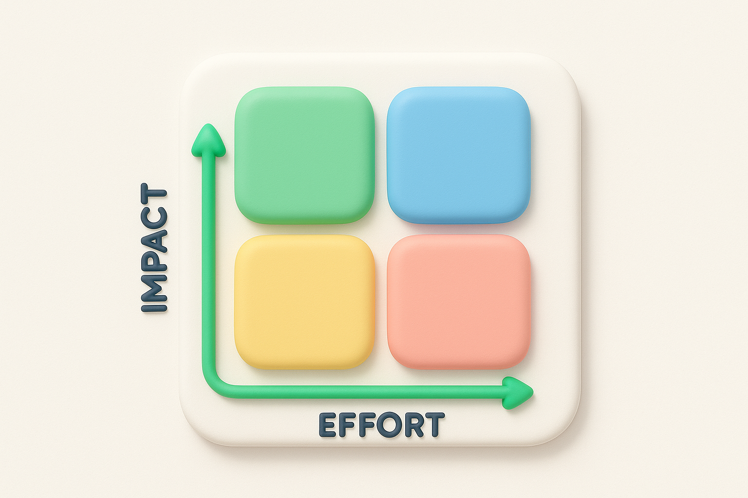
The impact vs effort matrix is a two-dimensional grid that helps you evaluate tasks based on the value they create and the resources they consume. You place each potential project, feature, or task on this grid according to how much impact it will have (the benefit to users, revenue, or your goals) and how much effort it requires (time, money, team capacity, or complexity). The result is a visual map that shows you which items deserve immediate action and which ones you should postpone or skip entirely.
Your matrix uses two axes to create four distinct quadrants. The vertical axis represents impact, ranging from low at the bottom to high at the top. The horizontal axis represents effort, running from low on the left to high on the right. When you plot a task on this grid, you're essentially asking two questions: will this move the needle for our business or users, and how much will it cost us to deliver?
Most teams assign numerical scores (like 1 to 10) or use relative positioning (high, medium, low) to place items on the matrix. You don't need complex formulas or precise calculations. The goal is to create enough separation between tasks so you can see which cluster in the valuable, easy-to-execute zone versus which ones demand massive resources for minimal return.
The power of this framework lies in forcing you to evaluate both dimensions simultaneously instead of jumping on whatever seems urgent or exciting in the moment.
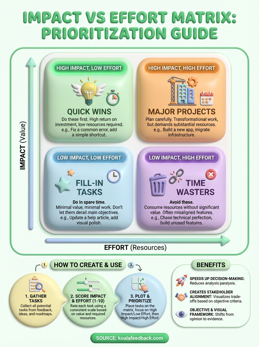
Traditional prioritization often collapses into arguments about which feature users want most or which stakeholder has the loudest voice. The impact vs effort matrix cuts through this noise by introducing objective criteria. When someone pushes for a feature, you can ask them to defend both its impact and its feasibility. This shifts conversations from opinion to evidence, making it easier to reach consensus.
You also gain the ability to compare completely different types of work on the same framework. Should you rebuild your onboarding flow or add a dark mode? Should you fix technical debt or launch a new integration? These questions become answerable when you plot them on the same matrix, because you're evaluating them against the same two universal constraints: value and cost. This standardization is especially useful when you're managing feedback from multiple sources, like the centralized collection we enable at Koala Feedback.
The matrix also prevents two common traps. First, it stops you from ignoring high-impact work just because it feels hard. Second, it helps you say no to easy tasks that don't actually matter. Without this framework, teams often default to completing small, simple items because they feel productive, even when those items contribute nothing to strategic goals. The visual nature of the matrix makes these misaligned priorities immediately obvious.
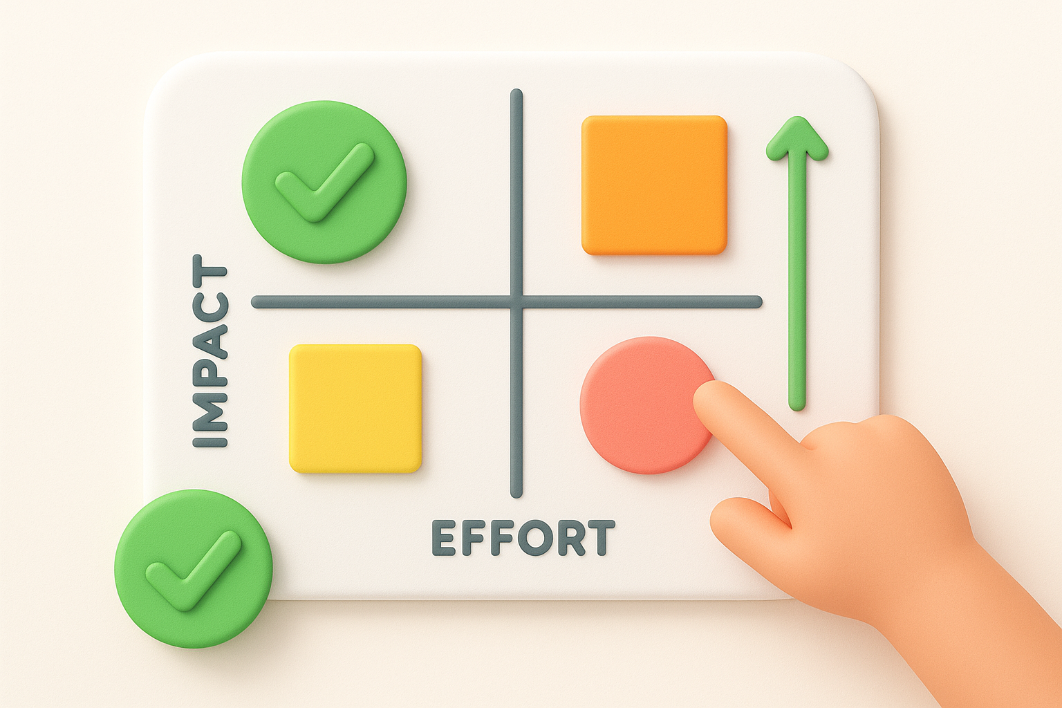
The four quadrants of the impact vs effort matrix each tell you something different about how to handle the items that land there. Understanding what each zone means helps you allocate your team's time and energy effectively. Instead of treating every task as equally urgent, you gain a clear hierarchy that respects both your constraints and your goals.
High impact, low effort items sit in the top-left quadrant. These are your quick wins, the tasks that deliver significant value without demanding major resources. You should prioritize these first because they give you the best return on investment. Examples include fixing a confusing error message that causes support tickets, adding a keyboard shortcut power users keep requesting, or updating outdated pricing information on your website.
High impact, high effort tasks occupy the top-right quadrant. These are your major projects that will transform your product or business but require substantial time, budget, or coordination. You can't ignore these forever, but you need to plan them carefully and commit the necessary resources. Think of building a mobile app when you only have a web product, migrating to a new infrastructure, or redesigning your core user experience.
The impact vs effort matrix helps you distinguish between tasks that deserve immediate action and those that require strategic planning.
Low impact, low effort work falls in the bottom-left quadrant. These fill-in tasks make sense when you have spare capacity or need a quick win for morale, but they shouldn't derail your main objectives. You might add a small visual polish, update a rarely-used help article, or implement a minor request from a single user. Handle these during downtime, not instead of meaningful work.
Low impact, high effort items land in the bottom-right quadrant. These are your time wasters, and you should actively avoid or eliminate them. They consume resources without moving you toward your goals. Examples include building features only one person asked for, chasing technical perfection that users won't notice, or maintaining legacy functionality nobody uses. Learning to say no to this quadrant protects your team from burnout and wasted effort.
Teams adopt the impact vs effort matrix because it solves the prioritization paralysis that slows down product development. When you're juggling feedback from users, stakeholders, and your own roadmap ideas, you need a framework that helps you decide quickly without second-guessing every choice. This matrix gives you a shared language for evaluating trade-offs, which means less time spent in meetings arguing about what to build next and more time actually shipping features that matter.
The matrix cuts through analysis paralysis by forcing you to evaluate just two dimensions instead of ten. You don't need to build elaborate scoring systems, run lengthy workshops, or wait for perfect information. When someone proposes a new feature, you can plot it in minutes by asking how much impact it will have and how much effort it requires. This speed is crucial when you're collecting continuous feedback through tools like Koala Feedback, because you need to process and act on that input regularly, not once a quarter.
The framework's simplicity means anyone on your team can use it, from engineers to marketers, without specialized training.
Your team also gains the ability to revisit decisions as circumstances change. If a high-effort task suddenly becomes easier because of new technology, you can move it to a different quadrant. If market conditions shift and a feature loses relevance, you adjust its impact rating. This flexibility keeps your priorities current without requiring you to rebuild your entire planning process.
The visual nature of the impact vs effort matrix makes disagreements easier to resolve because everyone can see the same information. When your sales team wants one feature and your engineering lead advocates for technical debt, you plot both items and discuss their relative positions. This transparency reduces political maneuvering and helps you reach consensus based on evidence rather than who argues most persuasively. The matrix also helps you explain your choices to users, executives, or investors, because you can point to clear criteria that guided your decisions.
Building an impact vs effort matrix takes less than an hour once you gather the right information. You start by collecting all your potential tasks in one place, score each item on impact and effort, then plot them on a grid to reveal your priorities. The process works whether you're managing three items or three hundred, and you can use simple tools like a spreadsheet, whiteboard, or even sticky notes.
Start by creating a complete list of everything competing for your attention. Pull feature requests from your support tickets, product feedback (the kind we help you centralize at Koala Feedback), stakeholder suggestions, technical debt items, and your own ideas. Write each task as a clear, specific statement rather than vague concepts. "Add single sign-on for enterprise customers" works better than "improve security." Aim for items at a similar level of detail so you're comparing apples to apples when you score them later.
Rate each task on both dimensions using a consistent scale. Many teams use 1 to 10, where 10 represents maximum impact or effort. For impact, ask how much this task will improve user satisfaction, increase revenue, reduce costs, or advance strategic goals. For effort, consider development time, complexity, dependencies, and any resources required beyond engineering, like design work or legal review.
You don't need perfect accuracy in your scores, just enough separation to distinguish high-value work from low-value work.
If you're uncertain about a score, make your best estimate and move forward. You can always adjust later as you learn more. Some teams assign scores individually then average them, while others discuss and agree as a group. Both approaches work as long as everyone understands what the numbers mean.
Draw two perpendicular lines to create your four quadrants, then place each task according to its impact and effort scores. High-impact, low-effort items go in the top left, high-impact and high-effort in the top right, and so on. Once you've plotted everything, step back and examine the distribution. You should see clear clusters that tell you where to focus first. If most items land in one quadrant, revisit your scoring to ensure you're creating enough distinction between tasks.
Real examples and ready-to-use templates help you apply the framework immediately instead of spending days figuring out the details. You also need to know which mistakes trip up most teams so you can avoid wasting time on approaches that don't work. The patterns below come from product teams who use this prioritization method daily to manage their roadmaps and feature requests.
A SaaS company might place "add CSV export" in the high-impact, low-effort quadrant because users request it frequently and implementation takes just two days of development. Their "rebuild payment system" task lands in the high-impact, high-effort zone since it will reduce failed transactions by 30% but requires two months of work. Meanwhile, "add animated loading spinners" sits in low-impact, low-effort, something they'll handle during slack time. The "create custom themes engine" goes straight to low-impact, high-effort because only three users asked for it and building it would take six weeks of engineering time.
The impact vs effort matrix turns subjective arguments about priorities into objective discussions about resources and outcomes.
An e-commerce team working on their mobile app scored "one-click reorder" as high-impact, low-effort after seeing repeat purchase data in their analytics. They moved "AR product preview" to high-impact, high-effort once they estimated the development timeline. Both matter, but one ships this sprint while the other needs budget approval and a dedicated quarter.
Create a simple spreadsheet with four columns: task name, impact score (1 to 10), effort score (1 to 10), and quadrant. Sort by impact score descending to see your highest-value opportunities first. You can also build a visual grid in presentation software with colored dots representing different task categories, making it easy to share with stakeholders who prefer visual formats over raw data.
Teams often score effort too optimistically, forgetting about testing time, code review, and bug fixes that double the initial estimate. They also confuse impact with excitement, rating flashy features as high-impact when boring infrastructure work would actually deliver more value. Another common error is creating too many quadrants or adding extra dimensions, which defeats the purpose of keeping decisions simple and fast.
The impact vs effort matrix gives you a straightforward method for cutting through prioritization confusion. You score each task on two dimensions, plot them on a grid, and immediately see which items deserve your attention first. This clarity transforms decision-making from endless debate into a repeatable process your entire team can follow.
Your biggest challenge isn't building the matrix itself but keeping it updated as new feedback arrives and priorities shift. When you're collecting user requests through multiple channels, you need a system that makes this continuous prioritization manageable. Koala Feedback centralizes your feature requests and user feedback in one place, so you can quickly evaluate and score new items as they come in rather than letting them pile up in scattered spreadsheets and support tickets. The framework works best when you apply it consistently to fresh, organized data about what your users actually need.

Start today and have your feedback portal up and running in minutes.