Teams build better products when they know exactly who they are building for. Most teams say they do, but ask three people on the same team to describe the customer and you will get three different answers. That gap leads to features nobody asked for and debates settled by the loudest opinion. User experience personas exist to close it.
A UX persona is a fictional but research-based profile of a key user group. It captures goals, behaviors, frustrations, and context in one short, shareable document. Good personas come from real data like interviews, surveys, and support tickets. Bad ones come from guesses and stock photos. The difference decides whether a persona guides decisions or collects dust in a shared folder.
This guide explains what personas user experience teams actually use, what belongs in each one, and the main types of personas you will run into. You will see concrete examples and a step-by-step process for building your own. We also show how ongoing user feedback, the kind you collect in a tool like Koala Feedback, keeps your personas grounded in real behavior instead of assumptions.
Design is a long chain of small decisions, and every one of them needs a reference point. User experience personas supply it. They turn a vague audience into specific people with specific needs, so you can judge whether a layout, a feature, or a line of copy actually works for them.
Without a shared reference, teams fall back on personal taste. The designer builds for herself, the engineer builds for the easiest path, and the founder builds for the one customer who emailed last week. A persona gives everyone the same reference point for debate. Instead of arguing about what "users" want, you ask what Maya, the overwhelmed operations lead, would do at this exact step.
Strong user experience design personas also surface people you were not designing for. When you segment research honestly, you often find a group such as admins who rarely open the product but approve the budget. Nobody on the team had them in mind until the data forced the question.
A persona is useful only when it settles a design argument faster than opinion can.
Personas earn their keep when you have to choose. Every product has more ideas than capacity, and a persona gives you a filter. If a feature does not help a defined user reach a defined goal, it drops down the priority list. That is a far easier conversation than debating taste.
The table below shows how the same decisions play out with and without personas.
| Decision | Without personas | With personas |
|---|---|---|
| Feature priority | The loudest voice wins | Ranked by impact on a defined user goal |
| Interface copy | Internal jargon | Words your users actually use |
| Onboarding | One flow for everyone | Flow shaped by the main user's skill and goal |
| Usability testing | Whoever is available | Participants who match a defined profile |
Personas are not just a designer's tool. A short, readable profile travels well, and every function can use it to make better calls in its own work. Here is where it pays off:
One caution. Personas matter only when they rest on evidence. A profile invented in a workshop is fiction, and fiction misleads the team with confidence. Anchor each persona in interviews, survey answers, analytics, and the feedback users send you, and it stays a tool for decisions instead of a poster on the wall.
A persona is short on purpose. Most effective user experience personas fit on a single page and hold six to eight elements, each tied to research. Anything that does not help a design decision is clutter.
Start with the fields below. Together they describe who the person is, what they want, and what stands in their way. Keep each entry to a line or two so the team will actually read and remember it.
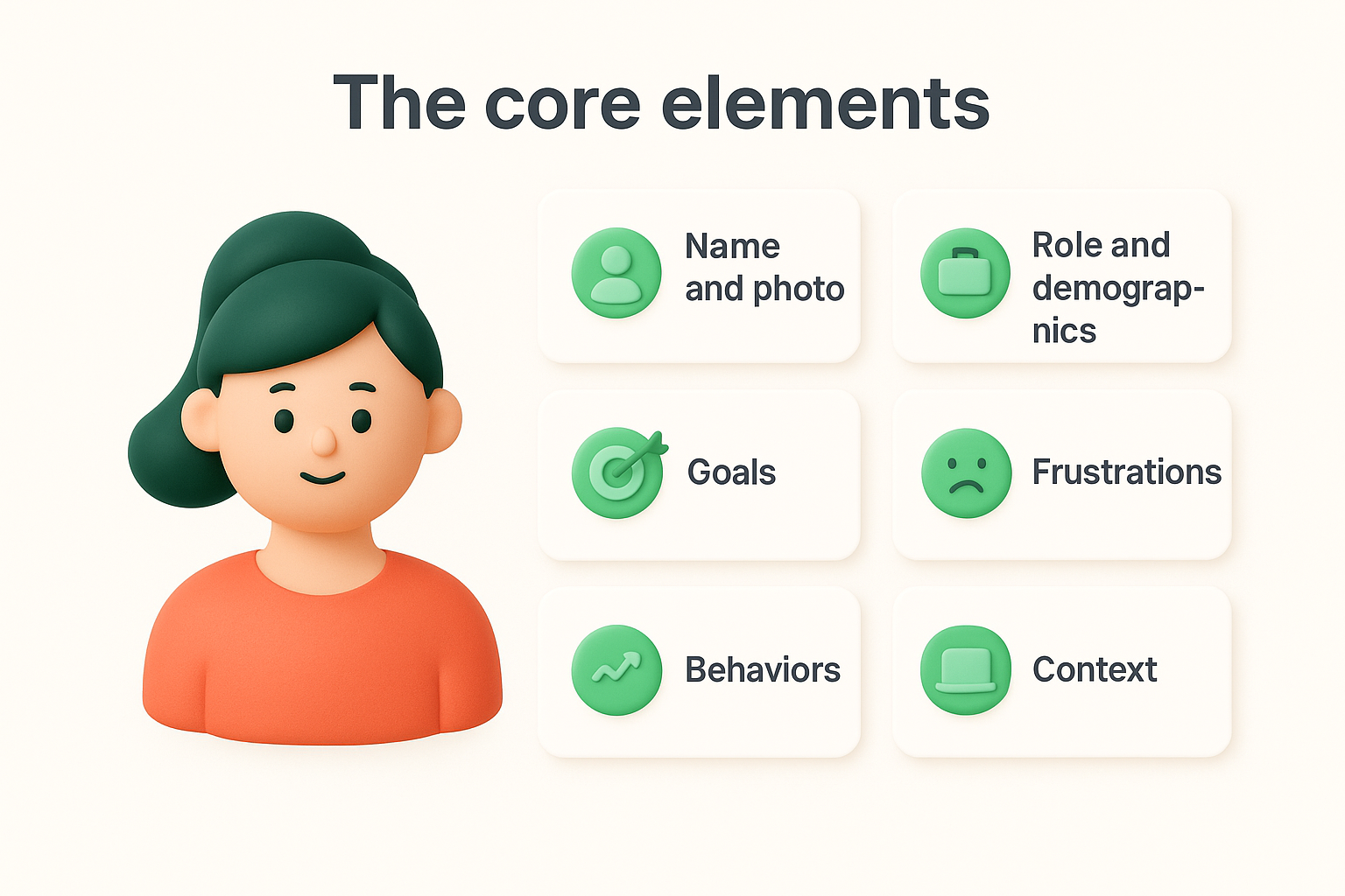
| Element | What to capture | Example |
|---|---|---|
| Name and photo | A memorable label that makes the person feel real | Maya, operations lead |
| Role and demographics | Only details that change behavior | 34, manages a team of 12 |
| Goals | What success looks like | Cut weekly reporting from 3 hours to 30 minutes |
| Frustrations | Pain points in current tools | Exports break and data lives in four places |
| Behaviors | How they work and decide | Checks the dashboard on mobile between meetings |
| Context | Devices, environment, tech skill | Shared laptop, low patience for setup |
| Quote | A line taken from real research | "I just need to see what changed." |
Goals and frustrations do the heavy lifting. Goals tell you what the user is trying to get done, and frustrations show where your product helps or gets in the way. Demographics matter far less. Age and job title rarely explain behavior, so keep them only when they shape how someone uses the product.
The most useful persona fields describe what people do and need, not who they are on paper.
Behaviors and context turn into design constraints. Someone who works on a phone in a warehouse needs large tap targets and short flows. Someone who logs in once a month needs clear labels over clever shortcuts.
Skip invented hobbies, favorite brands, and cute biographies. Those details feel vivid, but they give the team nothing to act on and they invite stereotypes. If a detail would not change a design choice, cut it.
Finally, add a short source note at the bottom, such as "8 interviews, 120 survey responses, 3 months of support tickets." It shows readers the persona is grounded in evidence, and a review date tells them how fresh it is.
Not every persona is built the same way or does the same job. You can sort user experience personas by how they were researched and by the role they play in your product. Knowing both helps you pick the right format for your stage.
Depth of research is the biggest difference between personas. A quick draft and a data-backed profile can look identical on the page, so label which one you have and note how much evidence sits behind it.
| Type | Built from | Best for | Main risk |
|---|---|---|---|
| Proto-persona | Team assumptions and workshops | Early ideas, aligning a new team | Bias, so it needs validation |
| Qualitative | Interviews, observation, support tickets | Understanding motives and frustrations | Small samples |
| Quantitative | Surveys, analytics, usage data | Sizing segments, spotting patterns | Misses the "why" |
| Mixed-method | Interviews plus usage data | Mature products, big decisions | Takes more time |
Another useful split is by the part each persona plays in your decisions. Most teams need only a few of these:
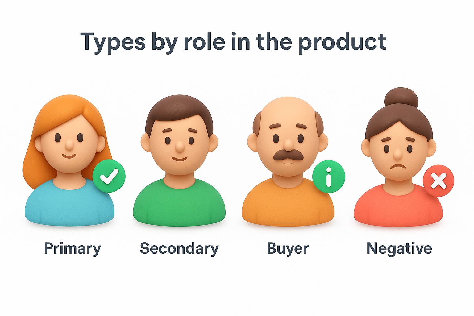
Negative personas are the most underused of the four. Say you run a self-serve tool for small teams. An enterprise buyer who needs custom contracts and months-long procurement is a poor fit. Naming that profile gives you a reason to say no to requests that pull the product off course.
For most teams, the practical path is to start with a proto-persona and then test it. Interview five to eight real users, compare your claims against analytics, and rewrite whatever the evidence contradicts. Over time, ongoing feedback from a portal, with its votes and comments, shows you which segments are growing and what they ask for.
Start with assumptions if you must, but never leave them unchecked.
If you have a small team and little data, a validated qualitative persona is plenty. Save the mixed-method approach for user experience design personas that will steer major roadmap bets.
The process below takes two to three weeks for a small team. You do not need a research department. You need real user data and a willingness to drop your assumptions when the evidence disagrees with them.
Begin with the sources you already have. Support tickets, sales call notes, survey answers, product analytics, and the requests in your feedback portal all hold patterns. Then add five to eight user interviews to learn the "why" behind the numbers. Ask people to walk you through the last time they tried to reach a goal, and listen for workarounds, because those expose needs your product misses.
Once the data is in, look for clusters. Segment by goals and behaviors instead of age or job title, since two people with the same title can use your product in opposite ways. Most products end up with two or three core groups, and that is plenty.
Group people by what they are trying to do, not by who they are on paper.
Test each draft before you publish it. Show it to two or three people who talk to customers daily, such as support or sales, and ask whether it sounds like someone they know. Rewrite whatever they dispute, then compare the persona against your analytics for a final check.
Then put the finished profile where decisions happen. Pin it in the roadmap doc, the design file, and the product wiki, and print a review date at the bottom. Six months is a sensible default. Well-built user experience personas stay useful only if someone owns the update, so name that person before you share the first draft.
Examples make the template from the previous sections concrete. The three user experience personas below belong to a fictional project management tool for small teams. Each one does a different job, and each fits on a single page.
Maya is the person the product is built for first. Her profile comes from eight interviews and three months of support tickets, so every line traces back to something real users said or did.
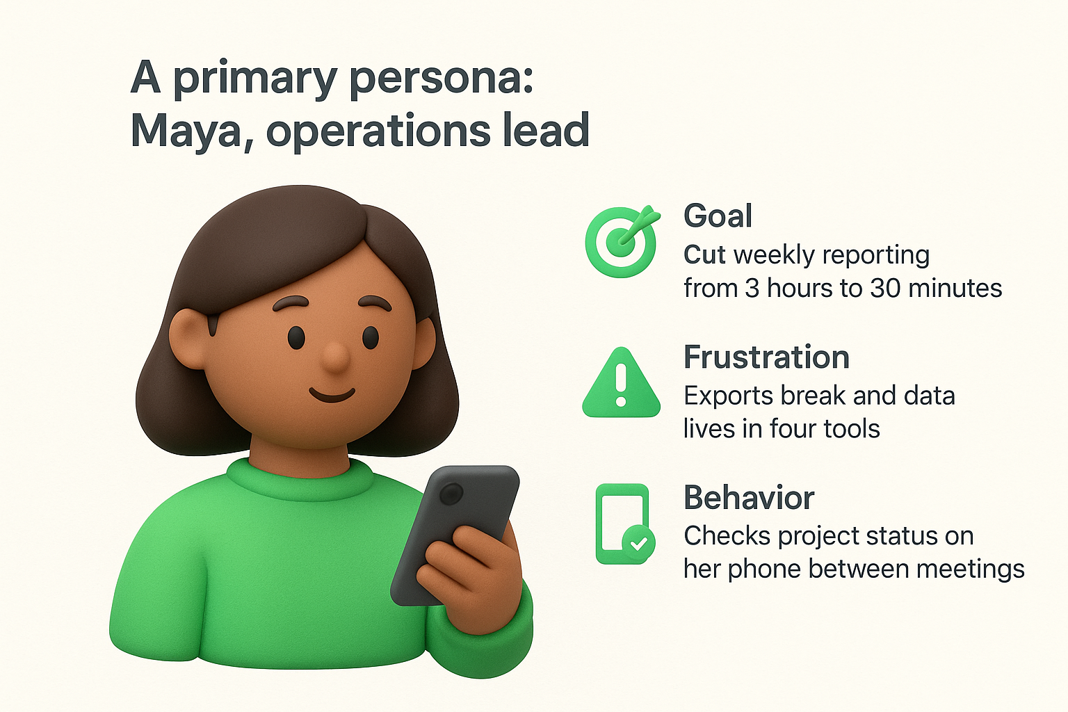
Design choices follow directly from this profile. A mobile-friendly summary view beats a configurable dashboard, and a one-click export ranks above a new charting feature.
Every line on a persona should lead to a design decision you can name.
Daniel never logs in, yet he decides whether the team keeps the subscription. He wants predictable costs, clear answers on security, and proof that the tool saves hours. That tells you to build a clean invoice page, simple admin permissions, and a usage report he can forward in thirty seconds.
Feedback data sharpens this profile. Scan your portal for requests that mention billing, approvals, or seat management. Those come from Daniel's world, and they show which objections surface before renewal, not after.
Victor works at a company of 2,000 people. He wants custom contracts, single sign-on across 40 tools, and a six-month security review. He is a legitimate customer for someone, just not for this product.
Writing him down pays off the first time a request arrives that only serves him. You point to the profile, decline politely, and protect your roadmap focus. In short, the primary persona drives design, the buyer persona drives packaging and pricing, and the negative persona drives scope.
Most failed personas fail for the same few reasons, and each one is easy to spot once you know what to look for. Before you share your user experience personas, check them against the problems below. A quick audit now saves weeks of misdirected work later.
Skipping research is the costliest error. A persona written in a one-hour workshop feels convincing, yet it only repeats what the team already believes. The fix is simple. Attach a source note to every persona and validate each claim against at least one interview, survey result, or analytics pattern.
A persona without a source note is an opinion with a photo attached.
Several other problems creep in while you draft. The table pairs each one with a fix you can apply in an afternoon.
| Mistake | Why it hurts | How to avoid it |
|---|---|---|
| Too many personas | Nobody remembers eight profiles, so none get used | Cap the set at three to five and rank one as primary |
| Demographic trivia | Hobbies and favorite brands invite stereotypes | Keep only details that change a design choice |
| Segmenting by job title | Two people with one title can behave in opposite ways | Group by goals and behaviors |
| Idealized users | Flattering profiles hide real frustrations | Include the blockers and workarounds you heard |
| No owner | The profile ages quietly | Name one owner and print a review date |
Age is the quietest problem. Products change, and so do the people who use them. A persona built two years ago may describe a user who has since switched tools or a segment that has doubled. Review each profile every six months and compare it against fresh feedback, because new votes and comments in your portal show where needs are shifting.
Finally, a persona nobody opens has failed, however good the research behind it. If it lives in a forgotten folder, it cannot influence a single decision. Put it where work happens, in the roadmap doc, the design file, and the sprint planning template. The next section shows how.
A finished persona changes nothing until it shows up in real work. Your goal is to make user experience personas the default reference in every decision meeting, then keep them accurate as your users change.
Start with the rituals you already have. You do not need a new process, only a standing question at each one:
Tagging helps too. Label each request in your feedback portal with the persona behind it. After a month, you can see which group asks for what, and whether your roadmap matches the people you said mattered most.
Votes and comments are a live signal that interviews cannot match. When a new theme gets steady votes from users who do not fit any profile, you have found either a missing persona or a segment that has shifted. Check this signal before every quarterly planning session.
A persona is a hypothesis about your users, and ongoing feedback is how you keep testing it.
Compare, too, what a persona says with what users actually do. If Maya's profile says she values quick exports, but her segment keeps voting for scheduled reports, rewrite the goal instead of defending the original draft.
Mark a review every six months on the calendar, and let the persona's owner run it. Certain events should also trigger an early update:
Each review needs three outcomes. Update details the evidence contradicts, merge profiles that now behave alike, and retire any persona nobody has referenced in months. Record the change and bump the review date only when you actually changed something. A short changelog at the bottom of each profile shows the team that the document is alive, and that its claims can be trusted.
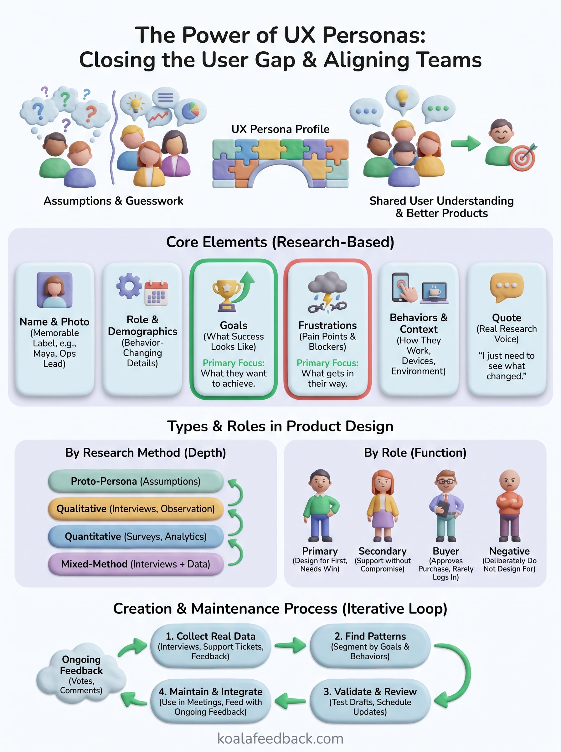
User experience personas work when they rest on evidence, stay short, and appear where decisions happen. Real research gives them credibility, and a named owner with a review date keeps them current. Start with a proto-persona if you must, then test it against what users actually say and do.
Nothing here demands a big budget. Interview five to eight users, group them by goals and behaviors, write one page per group, and pin it in the roadmap doc. Then let ongoing feedback tell you when a profile needs a rewrite.
Ready to keep your personas tied to real behavior? Collect and organize user feedback with Koala Feedback, and see which users are asking for what. Votes and comments show you where your personas hold up and where they have drifted.

Start today and have your feedback portal up and running in minutes.