You have 50 feature requests and capacity for 10. Your team argues about what to build. Sales wants enterprise features. Support wants bug fixes. Users want their pet features. Everyone thinks their priority should come first. Without a clear method, you end up building what screams loudest, not what matters most.
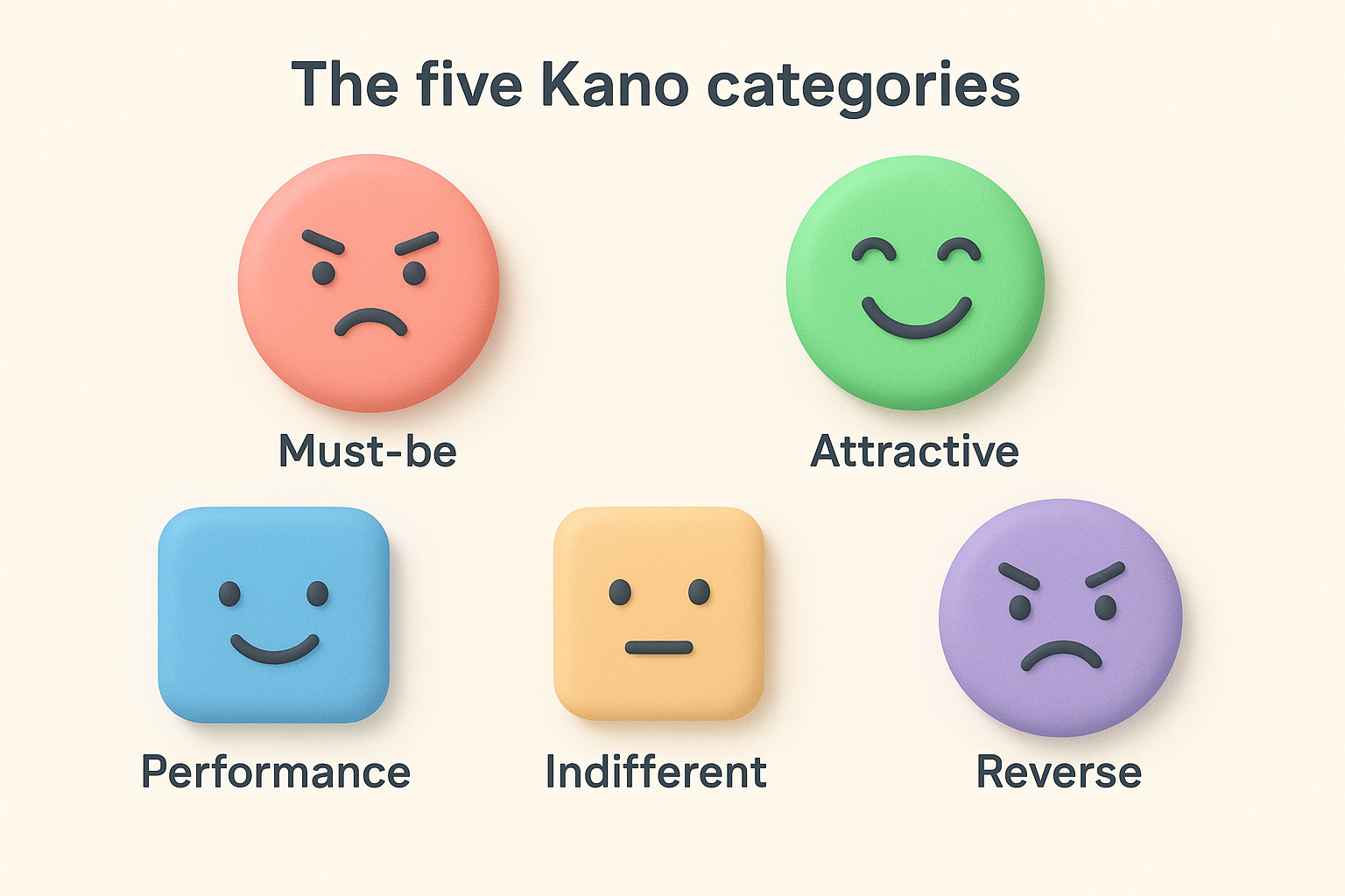
The Kano Model cuts through the noise. It sorts features into categories based on how they affect customer satisfaction. Some features prevent frustration. Others boost satisfaction. A few create genuine delight. When you know which is which, prioritization becomes strategic instead of political.
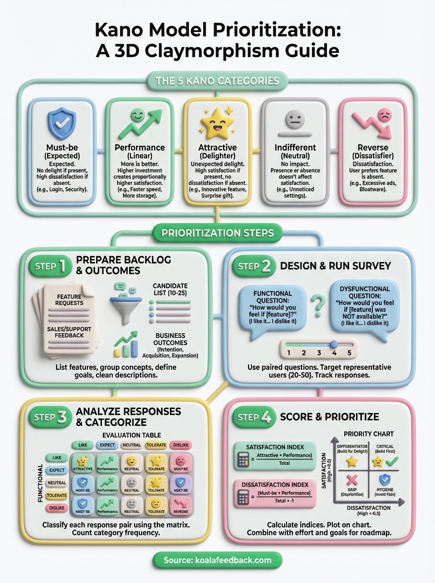
This guide shows you exactly how to run Kano Model prioritization for your product. You'll learn how to prepare your backlog, design the right survey questions, analyze responses to categorize features, and score results to build your roadmap. We include templates you can copy and real examples from product teams. By the end, you'll have a repeatable framework for making better feature decisions.
Kano model prioritization is a customer satisfaction framework that helps you categorize product features based on their impact on user happiness. Professor Noriaki Kano developed this approach in the 1980s after studying why some features delight customers while others barely register. The model reveals that the relationship between investment and satisfaction is not linear. Spending twice as much on a feature does not guarantee twice the satisfaction.
The Kano method sorts features into five distinct categories that describe how users respond when the feature is present or absent. Understanding these categories lets you allocate resources strategically instead of treating every feature request equally.
| Category | User reaction if present | User reaction if absent |
|---|---|---|
| Must-be | Expected, no special satisfaction | High dissatisfaction |
| Performance | Higher satisfaction | Lower satisfaction |
| Attractive | High delight | No dissatisfaction |
| Indifferent | No impact | No impact |
| Reverse | Dissatisfaction | Satisfaction |
The power of Kano model prioritization comes from recognizing that not all features contribute equally to customer happiness.
You avoid the trap of building features that consume time but generate no satisfaction gain. Sales teams often push for features competitors have, which might be must-be items that keep you competitive but never win deals. Users request performance features that steadily improve satisfaction as you invest in them. Product teams discover attractive features that create disproportionate delight with relatively small effort. The Kano model gives you a systematic way to balance these three types while filtering out indifferent and reverse features that waste capacity.
The foundation of successful Kano model prioritization starts with preparation before you survey anyone. You need a clean list of features you want to evaluate and clear outcomes you expect those features to drive. Skip this step and your survey results become impossible to interpret because features overlap, descriptions confuse users, or you lack the business context to make final decisions. Most teams spend 2-3 hours on preparation and save 10+ hours of cleanup later.
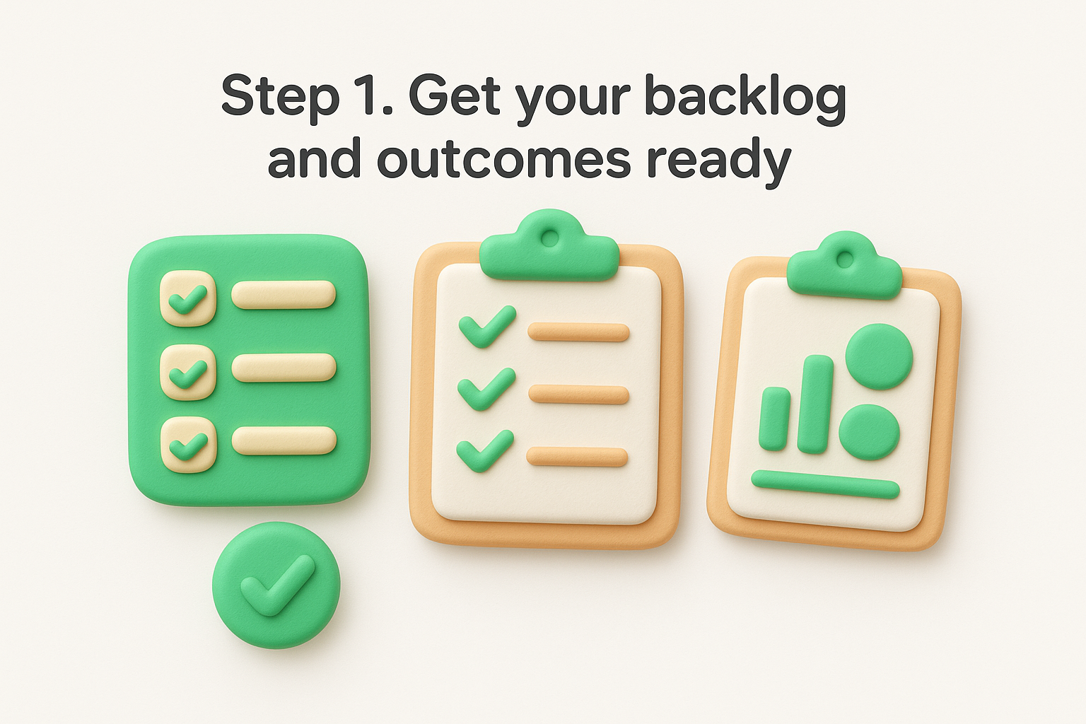
Pull together every feature request you need to evaluate from your backlog, support tickets, sales calls, and user feedback. Focus on features you could realistically build in the next 6-12 months rather than including everything ever mentioned. Your goal is a manageable list of 10-25 features that represent real decisions you need to make. More than 25 features creates survey fatigue. Fewer than 10 wastes the effort of running Kano analysis.
Group similar requests into single feature concepts. If five users asked for "bulk import" and three asked for "CSV upload," combine them into one feature like "Import contacts from CSV file." Here's what your initial list might look like:
Connect each candidate feature to measurable outcomes you care about. This context helps you make the final prioritization decision after Kano analysis categorizes features. A delightful feature that drives no business value still wastes capacity. Write down whether each feature primarily targets user retention, acquisition, expansion revenue, or cost reduction.
For example, two-factor authentication might target retention by reducing account takeovers, while API rate limits target expansion by supporting enterprise customers. Keep this simple with a spreadsheet that maps features to your top 3-5 business goals. You reference this later when deciding between multiple attractive features or when stakeholders question your roadmap choices.
The combination of Kano categories and business outcomes creates a complete prioritization framework that satisfies both users and business needs.
Write feature descriptions that users understand without product jargon. Replace internal terminology with plain language that describes what the feature does and why someone would use it. Keep each description to one clear sentence that focuses on the user benefit rather than technical implementation. Test your descriptions by reading them to someone outside your product team.
Here's how to transform internal feature names into clear survey descriptions:
| Internal name | User-friendly description |
|---|---|
| SSO integration | Sign in using your company's existing login credentials |
| Advanced segmentation | Filter your customer list by multiple criteria at once |
| Webhook notifications | Get instant alerts in Slack when users submit feedback |
The Kano survey uses paired questions for each feature to reveal how users feel when the feature exists and when it does not. You ask respondents two questions about the same feature, collect their answers on a five-point scale, and use those paired responses to categorize each feature. This step requires careful question design because unclear wording produces unreliable results that waste your analysis time. Most teams complete survey design in 1-2 hours and run the survey for 5-7 days.
Create two questions for every feature you listed in Step 1. The functional question asks how users feel if the feature is present. The dysfunctional question asks how they feel if it is absent. Keep both questions neutral and clear without suggesting the "right" answer.
Here's the exact template you copy for each feature on your list:
Functional question format: "How would you feel if [feature description]?"
Dysfunctional question format: "How would you feel if [feature description] was NOT available?"
Apply this template to a real feature example:
Functional: How would you feel if you could export your feedback reports to PDF format?
Dysfunctional: How would you feel if you could NOT export your feedback reports to PDF format?
The power of paired questions reveals whether a feature creates satisfaction, prevents dissatisfaction, or does both.
Provide five response options for every question that capture the range from positive to negative feelings. Use the same scale for both functional and dysfunctional questions so you can compare responses consistently. The standard Kano model prioritization scale gives you enough granularity without overwhelming respondents.
Present these five options in this exact order:
Survey tools like Google Forms, Typeform, or SurveyMonkey work perfectly for this structure. Set up your survey so each feature appears on its own page with both questions visible at once. This prevents confusion and helps respondents understand they are evaluating the same feature from two angles.
Target 20-50 respondents who represent your actual user base rather than internal stakeholders or prospects who have never used your product. Quality matters more than quantity, so focus on users who actively engage with your product and understand its current capabilities. You need their informed perspective on what features would improve their experience.
Segment your survey audience if you serve distinct user types. Enterprise customers might categorize features differently than small business users. Power users have different expectations than occasional users. Send separate surveys to each segment if those groups have meaningfully different needs, then analyze their responses independently.
Distribute your survey through email, in-app notifications, or customer success outreach depending on where you get the best response rates. Explain why you are running the survey and how long it takes to complete. Most respondents finish a 10-feature Kano survey in 5-8 minutes, so communicate this upfront to increase participation.
Track your response rate daily during the collection period. Send one reminder email after 3-4 days to non-respondents. Stop collecting responses once you reach your target number or after 7 days, whichever comes first. You need enough responses to identify clear patterns but not so many that analysis becomes overwhelming.
Once you collect survey responses, the next step transforms raw answer pairs into feature categories. Each respondent gave you two answers per feature (functional and dysfunctional), and you combine those answers using a standard evaluation table to determine the category. This process reveals which features are must-haves, performance drivers, or delighters based on actual user sentiment rather than assumptions. Analysis typically takes 1-3 hours depending on your response volume and number of features evaluated.
Apply the Kano evaluation matrix to classify each response pair into one of the five categories. Find the respondent's functional answer in the left column and their dysfunctional answer in the top row. The cell where they intersect shows you the category for that specific response. You repeat this process for every respondent and every feature to build your complete dataset.
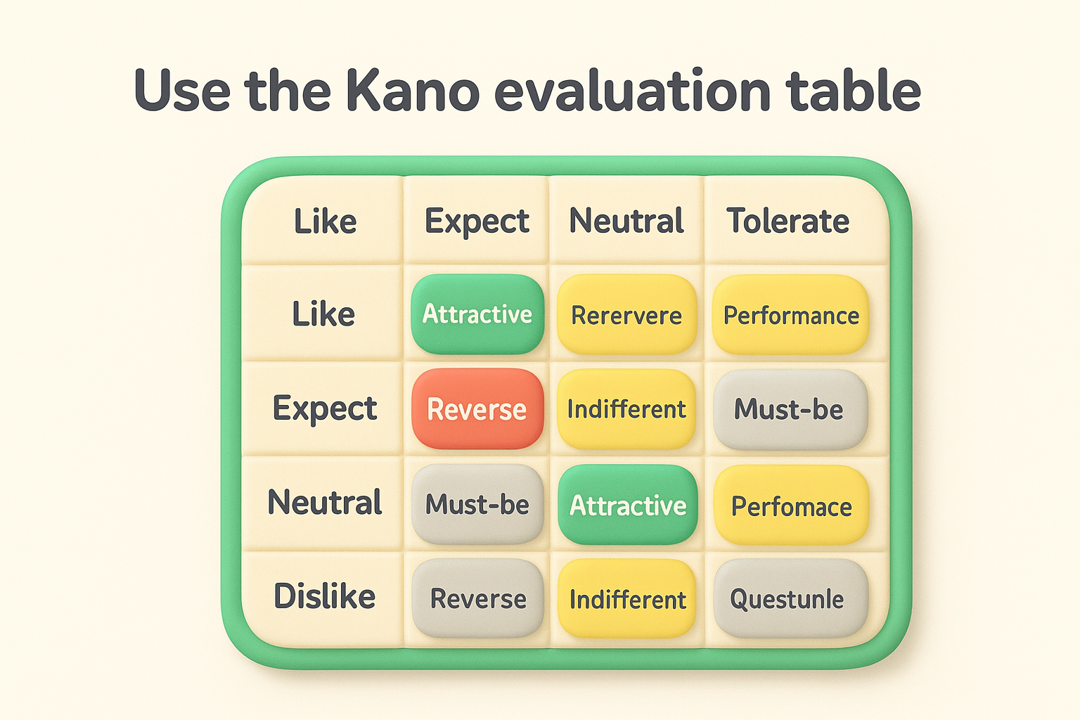
Here's the standard evaluation table you use for classification:
| Functional \ Dysfunctional | Like | Expect | Neutral | Tolerate | Dislike |
|---|---|---|---|---|---|
| Like | Questionable | Attractive | Attractive | Attractive | Performance |
| Expect | Reverse | Indifferent | Indifferent | Indifferent | Must-be |
| Neutral | Reverse | Indifferent | Indifferent | Indifferent | Must-be |
| Tolerate | Reverse | Indifferent | Indifferent | Indifferent | Must-be |
| Dislike | Reverse | Reverse | Reverse | Reverse | Questionable |
Apply this to a real example. If a respondent says they would "like" PDF export when present and "dislike" it when absent, you look at the intersection of "Like" (functional) and "Dislike" (dysfunctional). The result is Performance, meaning the feature drives satisfaction proportionally to how well you implement it.
The evaluation table removes guesswork by providing a consistent method to translate user feelings into actionable categories.
Calculate the category frequency for each feature across all respondents. Count how many times each feature received Must-be, Performance, Attractive, Indifferent, and Reverse classifications. The category with the highest count becomes the dominant classification for that feature. This aggregation reveals the overall pattern of how your user base feels about each feature.
Create a simple tally sheet that shows results like this for PDF export:
Performance wins with 22 responses, so you classify PDF export as a Performance feature. Users expect it to steadily improve their satisfaction as you enhance export quality, speed, and format options.
Some features show no clear dominant category when responses split evenly across multiple types. A feature with 15 Must-be, 14 Performance, and 10 Attractive responses needs additional judgment. Look for patterns by user segment, experience level, or use case to understand why opinions diverge. Enterprise users might view a feature as must-be while small businesses see it as attractive.
When results remain unclear after segmentation, default to the more conservative category in your final kano model prioritization. Treating a Performance feature as Must-be means you invest appropriately rather than under-resourcing something users need. You can always adjust priorities after launch based on actual usage data and continued feedback.
Categories alone do not tell you which Performance feature to build first or which Attractive feature delivers the most delight. You need numerical scores that rank features within each category so you can make data-driven roadmap decisions. This scoring step calculates satisfaction and dissatisfaction indices for every feature, then visualizes results in a chart that shows you where to focus your development capacity. Teams typically complete scoring and visualization in 1-2 hours once they understand the formulas.
Compute two scores for each feature that quantify the emotional upside and downside of building or skipping it. The satisfaction index measures how much happiness you gain by implementing the feature. The dissatisfaction index measures how much frustration you avoid. These indices give you numerical rankings that complement your category classifications from Step 3.
Use these formulas to calculate indices for each feature:
Satisfaction Index = (Attractive + Performance) / (Attractive + Performance + Must-be + Indifferent)
Dissatisfaction Index = (Must-be + Performance) / (Attractive + Performance + Must-be + Indifferent) × -1
Apply the formulas to a real feature example. If your PDF export feature received 5 Attractive, 22 Performance, 8 Must-be, and 3 Indifferent responses:
High satisfaction and high dissatisfaction scores together indicate a feature that significantly impacts user happiness in both directions.
Plot every feature on a two-dimensional chart with satisfaction on the vertical axis and dissatisfaction on the horizontal axis. This visualization reveals which features create the most value and which prevent the most frustration. You spot patterns instantly that spreadsheets alone cannot show.
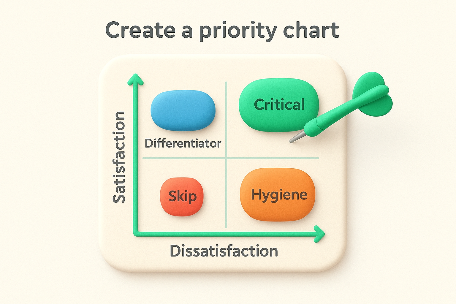
Position each feature using its calculated indices. Features in the upper-right quadrant (high satisfaction, high dissatisfaction in absolute terms) become your top priorities because they drive happiness and prevent frustration simultaneously. Features in the lower-left quadrant (low satisfaction, low dissatisfaction) can wait or skip entirely.
| Quadrant | Satisfaction | Dissatisfaction | Priority | Action |
|---|---|---|---|---|
| Upper-right | High (>0.5) | High (<-0.5) | Critical | Build first |
| Upper-left | High (>0.5) | Low (>-0.5) | Differentiator | Build for delight |
| Lower-right | Low (<0.5) | High (<-0.5) | Hygiene | Build to avoid pain |
| Lower-left | Low (<0.5) | Low (>-0.5) | Skip | Deprioritize |
Combine your Kano model prioritization results with business outcomes, development effort, and strategic goals from Step 1. A feature might score high in satisfaction but require six months of engineering work. Another feature might be quick to build and prevent critical dissatisfaction. Weight these factors together rather than relying solely on indices.
Build your roadmap by allocating capacity across all three valuable categories. Reserve 50-60% for Must-be features that keep you competitive. Invest 30-40% in Performance features that drive measurable improvement. Save 10-20% for Attractive features that create moments of delight. This balance ensures you maintain baseline quality while still innovating and differentiating your product.
You need ready-to-use formats that accelerate your kano model prioritization work instead of building everything from scratch. These templates provide the exact structure and wording that successful product teams use to run Kano analysis. Copy them directly into your survey tools, spreadsheets, or documentation without modification, or adapt the language to match your product and audience.
Start with this complete question format for every feature you evaluate. Replace the bracketed text with your specific feature description while keeping the question structure identical. This template ensures consistency across all features and makes response analysis straightforward.
FEATURE: [Feature name]

Functional Question:
How would you feel if [feature description]?
□ I like it that way
□ I expect it that way
□ I am neutral
□ I can tolerate it
□ I dislike it that way

Dysfunctional Question:
How would you feel if [feature description] was NOT available?
□ I like it that way
□ I expect it that way
□ I am neutral
□ I can tolerate it
□ I dislike it that way
Apply the template to two real examples from a feedback management product:
Example 1: Custom branding
Example 2: Email notifications
Copy this template for every feature in your backlog to maintain survey quality and reduce analysis errors.
Organize your response data in a spreadsheet with these exact columns to calculate indices and make prioritization decisions efficiently. Track one feature per row with aggregated response counts and computed scores.
| Feature | Attractive | Performance | Must-be | Indifferent | Reverse | Category | Satisfaction | Dissatisfaction | Priority |
|---|---|---|---|---|---|---|---|---|---|
| PDF export | 5 | 22 | 8 | 3 | 0 | Performance | 0.71 | -0.79 | High |
| Custom domain | 18 | 9 | 4 | 6 | 0 | Attractive | 0.73 | -0.35 | Medium |
| Two-factor auth | 2 | 8 | 25 | 3 | 0 | Must-be | 0.26 | -0.87 | High |
Use formulas in the Satisfaction and Dissatisfaction columns that reference your response count columns. The Category column shows the highest count among the five types, while Priority combines both index scores with your business judgment.
Kano model prioritization removes guesswork from feature decisions by showing you which features prevent frustration, drive satisfaction, or create delight. You now have the complete process: prepare your backlog with clear feature descriptions, run paired surveys that capture user sentiment, analyze responses to categorize features, and score results to build your roadmap. Apply these templates and examples to your product backlog this week rather than waiting for the perfect moment.
The real power comes from running Kano analysis regularly as your market evolves and user expectations shift. Features that delight users today become performance expectations tomorrow and must-haves next year. Track these changes to stay ahead of your competition.
Ready to collect the feedback you need for your next kano model prioritization session? Koala Feedback centralizes user requests, voting, and comments in one place so you always know what matters most to your users.

Start today and have your feedback portal up and running in minutes.
