You have 50 feature requests in your backlog. Your sales team wants one thing. Users are voting for another. Stakeholders push their favorites. Meanwhile, your dev team asks what's actually next. Sound familiar? Deciding what to build first is one of the hardest parts of product management. Pick wrong and you waste months building features nobody uses.
This guide covers 11 proven frameworks to help you prioritize product features with confidence. You'll learn when to use each method, how to apply it step by step, and what pitfalls to avoid. Whether you're managing a SaaS product, planning your next release, or just trying to make sense of competing priorities, these frameworks give you a systematic way to decide what matters most.
Your users already tell you what they want through support tickets, emails, and feedback forms. Koala Feedback centralizes those requests into a voting board where users can upvote features they need most. This approach lets you see which features have the broadest demand, not just the loudest voices. You get quantifiable data on what users actually want rather than guessing based on a handful of conversations.
Koala Feedback creates a public feedback portal where your users submit and vote on feature requests. The platform automatically deduplicates similar requests and organizes them into boards based on your product areas. Each request shows vote counts, comments, and user segments, giving you clear signals about demand. This method turns qualitative feedback into quantitative priorities you can defend to stakeholders.
Use this framework when you have an active user base that generates regular feedback. It works best for SaaS products where users have ongoing relationships with your product and care about its direction. You should implement this approach before your backlog becomes overwhelming, so you can build prioritization habits early. This method shines when you need to balance requests from different customer segments or pricing tiers.
"When you let users vote on features, you surface the silent majority's needs instead of building for whoever emails the loudest."
Set up your feedback portal with categories that match your product structure. Encourage users to check existing requests before submitting new ones to avoid duplicates. Review your highest-voted items weekly or monthly depending on your release cycle. Look beyond just vote counts by examining which user segments are voting and how those segments align with your business goals. Combine vote data with revenue potential and strategic fit to make final decisions on how to prioritize product features.
High vote counts don't always equal high business value. Free users might dominate voting while enterprise customers stay silent. Some features attract votes but have poor engagement once shipped. Balance democratic voting with strategic direction by weighting votes from your target segments more heavily. Don't let the voting system become a popularity contest that derails your product vision.
RICE scoring gives you a numerical formula to compare features objectively. You calculate a score based on four factors: Reach (how many users affected), Impact (degree of improvement), Confidence (certainty in estimates), and Effort (resources required). This method removes guesswork by forcing you to quantify each dimension, making it easier to defend your priorities to stakeholders who want different features built.
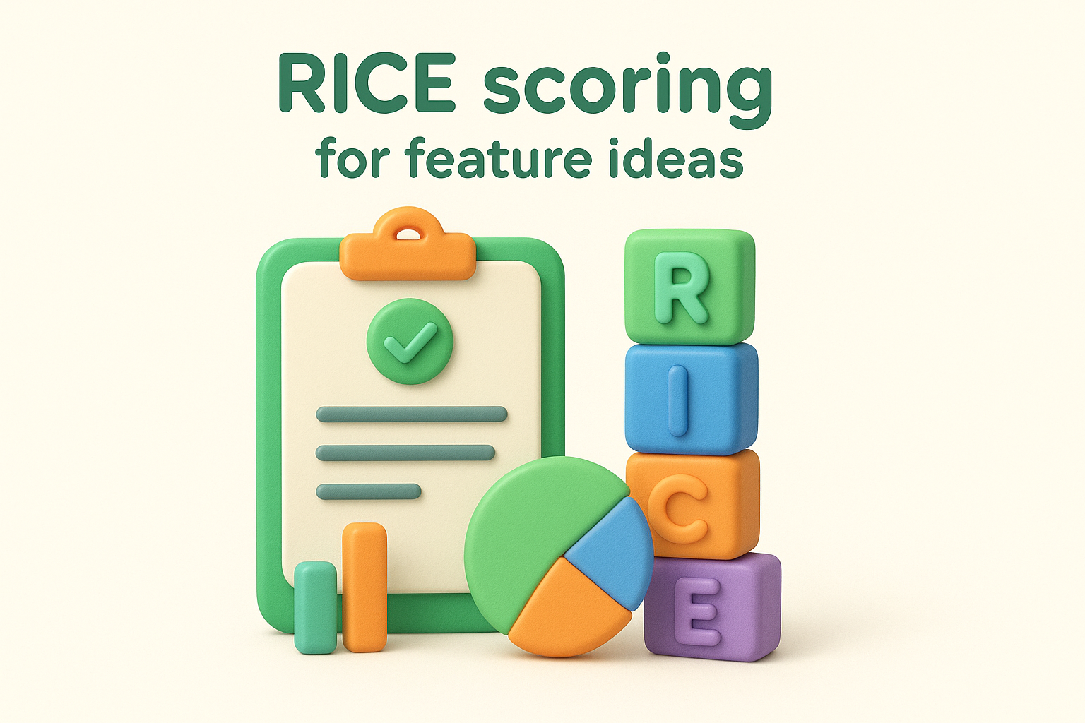
RICE breaks down feature evaluation into four measurable components. Reach measures how many users encounter the feature per time period. Impact uses a scale from 0.25 to 3 (minimal to massive effect). Confidence represents your certainty as a percentage, typically 50% to 100%. Effort estimates the total person-months of work required. You multiply Reach, Impact, and Confidence, then divide by Effort to get your final score.
This framework works best when you're comparing multiple feature ideas with different scopes and complexities. You should use RICE when your team needs an objective scoring system that balances user benefit against development cost. It's particularly valuable when stakeholders disagree on priorities because the numbers create a common language for discussion. This method helps when you're deciding what to build next across different product areas.
"RICE scoring forces you to estimate the hard parts upfront, which prevents features from sneaking onto the roadmap based on gut feel alone."
Create a spreadsheet with columns for each RICE component. Estimate Reach by looking at analytics data for similar features or user segments. Score Impact based on how much the feature moves your key metrics. Set Confidence lower when you're making assumptions without data. Calculate Effort by consulting your engineering team on realistic timelines. Run the formula and sort features by their RICE scores to see your priorities emerge.
Teams often inflate Impact scores to push their favorite features up the list. Your Confidence percentage should reflect honest uncertainty, not wishful thinking. Small features with tiny Effort numbers can score unreasonably high while more strategic initiatives rank lower. Balance RICE scores with qualitative factors like strategic fit and technical dependencies before making final calls on how to prioritize product features.
The MoSCoW method sorts features into four clear categories that help you decide what ships now versus what waits. This acronym stands for Must have, Should have, Could have, and Won't have. You use these buckets to classify every feature request, creating a shared understanding of what's essential versus what's nice to have. This approach gives you a simple vocabulary to communicate priorities across your team and with stakeholders.
MoSCoW creates a four-tier system for categorizing features based on their necessity. Must haves are features your product cannot function without or that would cause complete failure if missing. Should haves add significant value but won't break the product if delayed. Could haves are desirable improvements that enhance the experience when resources allow. Won't haves are features you've explicitly decided not to include in this release cycle.
Use MoSCoW when you're planning a specific release with a fixed deadline or resource constraint. This framework works best when you need to communicate priorities to non-technical stakeholders who want a simple classification system. You should apply this method when cutting scope becomes necessary because the categories make it obvious what can move to the next release. This approach helps when your team needs agreement on how to prioritize product features without complex scoring.
"MoSCoW prevents feature creep by forcing you to admit upfront what's truly essential versus what's just wishful thinking."
List all potential features for your release and categorize each one collaboratively with your team. Aim for roughly 60% Must haves, 20% Should haves, and 20% Could haves to maintain a realistic scope. Review your Must have list critically because teams often inflate this category with features that are actually Should haves. Use the Won't have category to document what you've consciously decided to exclude, preventing those discussions from resurfacing.
Teams struggle with classifying too many items as Must haves, defeating the framework's purpose. Your Should haves might slip into the release anyway because they seem easy, but this creates technical debt and rushed work. The categories feel subjective, so establish clear criteria for each tier before you start classifying. Balance this method with business value by remembering that some Could haves might deliver more impact than certain Must haves.
The impact effort matrix gives you a visual way to plot features on a two-dimensional grid. You map each feature based on its potential business impact versus the development effort required, creating four distinct quadrants that immediately show where to focus. This approach helps you identify quick wins and avoid money pits while making trade-offs visible to everyone on your team. You can complete this exercise in a single workshop session.
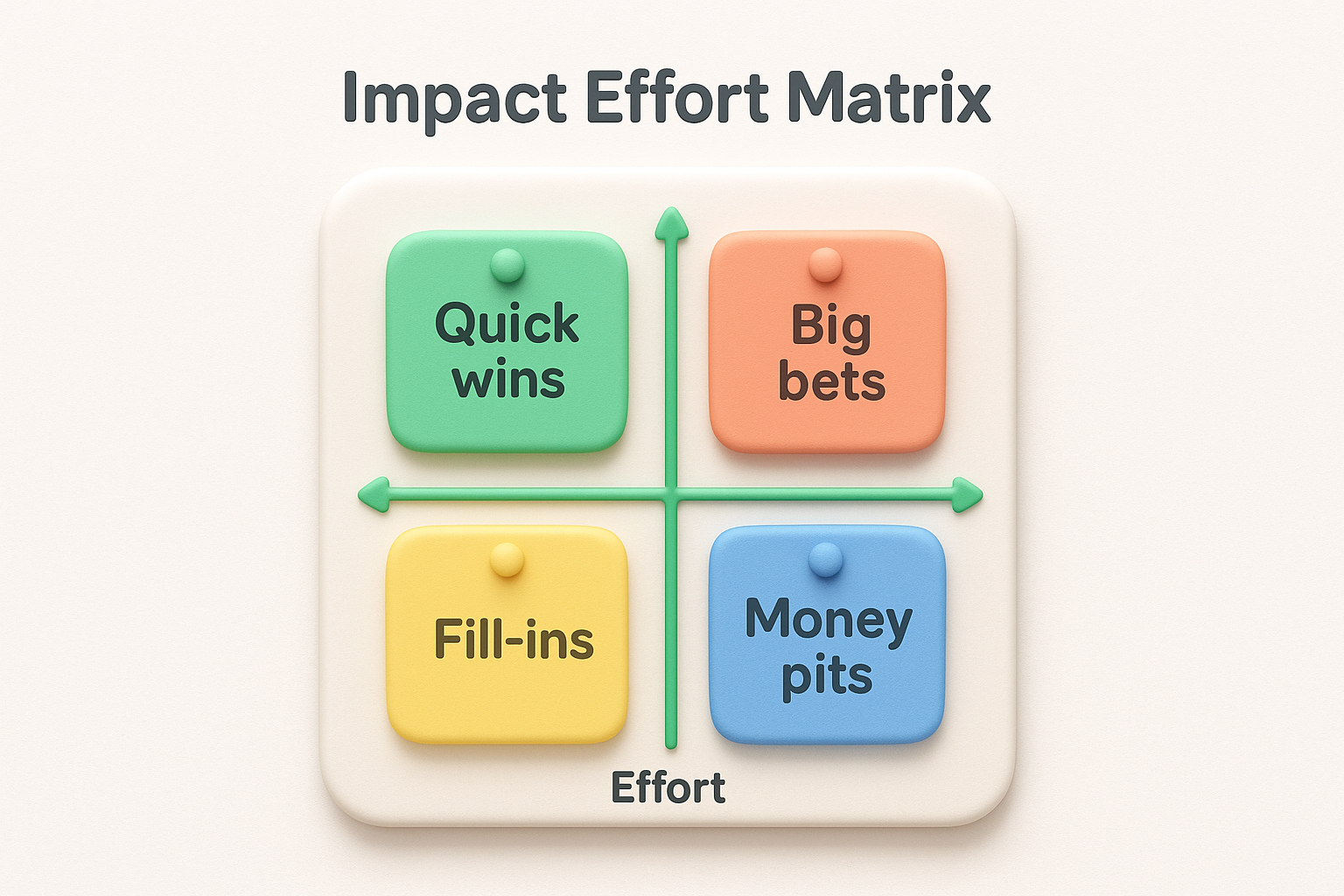
This framework uses a simple 2x2 grid with Impact on the vertical axis and Effort on the horizontal axis. Features land in one of four quadrants: Quick wins (high impact, low effort), Big bets (high impact, high effort), Fill-ins (low impact, low effort), and Money pits (low impact, high effort). Each quadrant tells you exactly what action to take, making prioritization decisions obvious at a glance.
You should use this method when your team needs to visualize priorities quickly without complex calculations. This framework works best during planning sessions where stakeholders need to agree on what ships next. Apply this approach when you're comparing a manageable number of features, typically 10 to 20 items. The visual nature makes it perfect for teams that struggle with spreadsheet-based scoring systems.
"The impact effort matrix turns abstract debates about priorities into concrete decisions by showing everyone where each feature actually sits."
Draw your grid on a whiteboard or digital collaboration tool and write each feature on a sticky note. Have your team vote on where each feature belongs by discussing its expected impact on key metrics and the engineering effort required. Place features in their quadrants and focus first on Quick wins, then evaluate which Big bets align with your strategy. Use Fill-ins as buffer tasks when you're blocked on bigger features, and explicitly avoid Money pits unless you have strategic reasons.
Teams often underestimate effort to push features into the Quick wins quadrant. Your Impact assessment might reflect personal preferences rather than actual user value or business outcomes. Features can migrate between quadrants as you learn more, so revisit your matrix regularly. Balance this visual method with data when deciding how to prioritize product features because the grid oversimplifies complexity.
The Kano model helps you classify features based on how they affect customer satisfaction rather than just business metrics. This framework divides features into five distinct categories that predict whether users will love, expect, or ignore what you build. You use customer surveys to discover which features create delight versus which ones customers simply assume should exist. This approach prevents you from over-investing in basic features while helping you identify opportunities to exceed expectations.
The Kano model categorizes features into five types based on their relationship to customer satisfaction. Must-be features are basic requirements that customers expect without thinking about them. Performance features create proportional satisfaction as you improve them. Attractive features surprise and delight customers because they exceed expectations. Indifferent features don't affect satisfaction either way. Reverse features actually decrease satisfaction for some users even if others want them.
Use this framework when you need to understand which features will differentiate your product in a crowded market. This method works best when you're deciding how to prioritize product features that have unclear ROI but might create emotional connections with users. You should apply Kano analysis when planning major releases where customer retention matters more than quick wins. This approach helps when stakeholders push for features that seem important but might not move satisfaction.
"The Kano model shows you that some features create delight at first but become expected over time, so your delighters need constant evolution."
Create surveys asking customers two questions per feature: how they'd feel if you had it and how they'd feel if you didn't. Map responses to satisfaction categories using Kano analysis rules. Focus your roadmap on Must-be features first, then Performance features that align with your strategy, and finally Attractive features that differentiate your product. Review your classification regularly because features migrate from Attractive to Performance to Must-be as market expectations evolve.
Customer survey responses don't always predict actual behavior once you ship features. Your Attractive features might appeal to a vocal minority while most users remain indifferent. The survey process takes time and effort, so balance this research investment against faster prioritization methods. Features shift categories over time as competitors copy your delighters, turning them into expected Must-be features.
The weighted scoring model lets you customize your prioritization by assigning different importance levels to various criteria. You decide which factors matter most for your product by giving them numerical weights that reflect your strategy, then score each feature against those weighted criteria. This approach ensures your priorities align with company objectives rather than treating all evaluation factors as equally important. You can adjust weights as your business goals evolve.
This framework uses a scoring matrix where you define evaluation criteria like user value, strategic alignment, technical feasibility, and revenue potential. Each criterion gets a percentage weight that adds up to 100%, reflecting how important that factor is to your business. You score every feature on a scale (typically 1 to 10) for each criterion, multiply by the weights, and sum the results to get a final weighted score. Features with the highest totals become your top priorities.
You should use weighted scoring when your organization has clear strategic priorities that need to influence feature decisions. This method works best when you're evaluating features across different product areas that serve various business objectives. Apply this framework when stakeholders need to understand why certain features rank higher despite competing benefits. This approach helps when you're deciding how to prioritize product features that have multifaceted impacts on your business.
"Weighted scoring makes your strategy tangible by translating abstract priorities into numerical weights that directly shape what you build."
Define your evaluation criteria based on what drives success for your product. Assign weights that reflect your strategic focus, giving more weight to criteria that matter most right now. Score each feature consistently using the same scale and definitions. Calculate weighted scores by multiplying each criterion score by its weight and adding them together. Review your criteria and weights quarterly to ensure they still reflect your strategy.
Weights can become subjective debates that reflect office politics rather than strategy. Teams might inflate scores on heavily weighted criteria to push their preferred features forward. Over-complicated scoring systems with too many criteria create analysis paralysis instead of clarity. Balance this method with simpler frameworks to avoid spending more time scoring than building.
Cost of delay puts a dollar amount on waiting to build each feature. You calculate the financial impact of postponing implementation by estimating revenue lost, customers churned, or opportunities missed for every month a feature stays in your backlog. This framework forces you to think beyond subjective importance and translate feature decisions into business language that executives and stakeholders understand. The method works particularly well when competing features all seem equally important but have different time sensitivities.
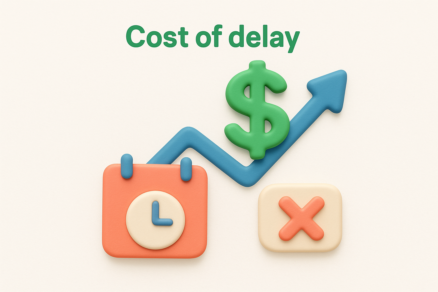
This framework calculates the economic cost of not shipping a feature immediately. You estimate monthly financial impact from lost revenue, competitive disadvantage, or increased support costs, then divide by the development time required. Features with the highest cost of delay per unit of effort become your top priorities. The formula reveals which features are time-sensitive versus which can wait without significant business damage.
Apply cost of delay when you need to justify priorities using financial arguments rather than gut feelings. This method works best when your organization tracks clear revenue metrics and can estimate the business impact of missing features. You should use this approach when deciding how to prioritize product features that compete for the same development resources but have different urgencies. This framework helps when stakeholders push for their preferred features without considering opportunity costs.
"Cost of delay turns vague urgency into concrete numbers that show exactly how much each month of waiting actually costs your business."
Estimate the monthly financial impact of not having each feature by looking at lost deals, churn data, or support costs. Calculate how many months of development each feature requires. Divide the monthly cost by development time to find the cost of delay per month of development. Prioritize features with the highest ratios first because they deliver the most economic value per unit of effort invested.
Revenue estimates often rely on assumptions rather than hard data, making your calculations unreliable. Some features deliver value through customer satisfaction or strategic positioning that's difficult to quantify financially. The framework favors short-term revenue features over longer-term platform investments. Balance this method with qualitative factors that don't easily convert to dollar amounts.
Buy a feature turns prioritization into a hands-on game where stakeholders spend fake money on the features they value most. You assign each feature a price based on development cost, give participants a limited budget, and watch them negotiate over which features deserve funding. This exercise forces stakeholders to make trade-offs rather than insisting everything is equally important. The resulting spending patterns reveal which features have genuine support versus which ones only one person champions.
This framework simulates a marketplace where stakeholders become buyers with a fixed budget to spend on features. Each feature receives a price tag that reflects its development effort, and some features cost more than any single person's budget. Stakeholders must pool resources and build consensus to afford expensive features. The method transforms abstract prioritization discussions into concrete decisions about resource allocation.
Use buy a feature when stakeholders disagree about priorities and need to experience trade-offs firsthand. This approach works best with groups of 5 to 15 participants who understand your product strategy. You should run this exercise when deciding how to prioritize product features across different departments or customer segments. The method helps when political dynamics prevent productive prioritization conversations.
"Buy a feature forces stakeholders to put their money where their mouth is, revealing what they truly value when resources are scarce."
Price each feature based on relative development cost using your team's estimates. Give each stakeholder the same budget, typically 50 to 60 percent of the total feature cost. Let participants negotiate and pool money to buy features collaboratively. Track which features get funded first and which remain unbought, revealing your true priorities through spending behavior.
Dominant personalities can pressure others into pooling money for their preferred features. Some participants try to game the system by splitting budgets to cover more features. The exercise takes significant time to facilitate properly, so balance this investment against simpler methods. Remember that buying patterns reflect stakeholder opinions, not necessarily customer needs.
Opportunity scoring measures the gap between importance and satisfaction to reveal which features will deliver the most value. You survey customers about how important various outcomes are and how satisfied they are with your current solution, then calculate opportunity scores based on the difference. This method identifies features that matter deeply to users but where your product falls short, giving you a data-driven way to decide what will move satisfaction most. The framework works particularly well when you have existing feedback data to analyze.
This framework uses a two-question survey for each potential feature or outcome. You ask customers to rate the importance of achieving a specific goal on a scale of 1 to 5, then ask them to rate their current satisfaction with how your product helps them reach that goal. Features with high importance scores but low satisfaction scores represent your biggest opportunities. The gap reveals where you're underdelivering on things customers care about, making these features strong candidates for how to prioritize product features.
Apply opportunity scoring when you have an established product with active users who can evaluate current functionality. This method works best when you're choosing between incremental improvements rather than building entirely new capabilities. You should use this approach when customer feedback suggests multiple pain points but you need data to determine which ones matter most. The framework helps when stakeholders debate whether to improve existing features or add new ones.
"Opportunity scoring shows you where customers feel the most pain, not just where they complain the loudest."
Create surveys asking about importance and satisfaction for each feature or outcome you're evaluating. Calculate opportunity scores using the formula: Importance + (Importance minus Satisfaction). Features scoring above 15 represent high-opportunity areas worth prioritizing. Focus on features where the importance-satisfaction gap is widest because improving these areas will boost customer satisfaction most significantly.
Survey responses reflect stated preferences rather than actual behavior once you ship improvements. Some features score high on importance but customers never actually use them when available. The method requires customer participation and honest feedback, which can be difficult to obtain consistently. Balance opportunity scores with business value because high-opportunity features might not align with revenue goals.
Story mapping creates a visual representation of your product's user journey and helps you slice features into logical releases. You arrange user stories in a horizontal workflow from left to right, then stack them vertically by priority. This method shows you exactly which features users need to complete core tasks versus which ones enhance the experience. The framework makes it obvious how to prioritize product features by forcing you to think about the minimal path users take through your product.
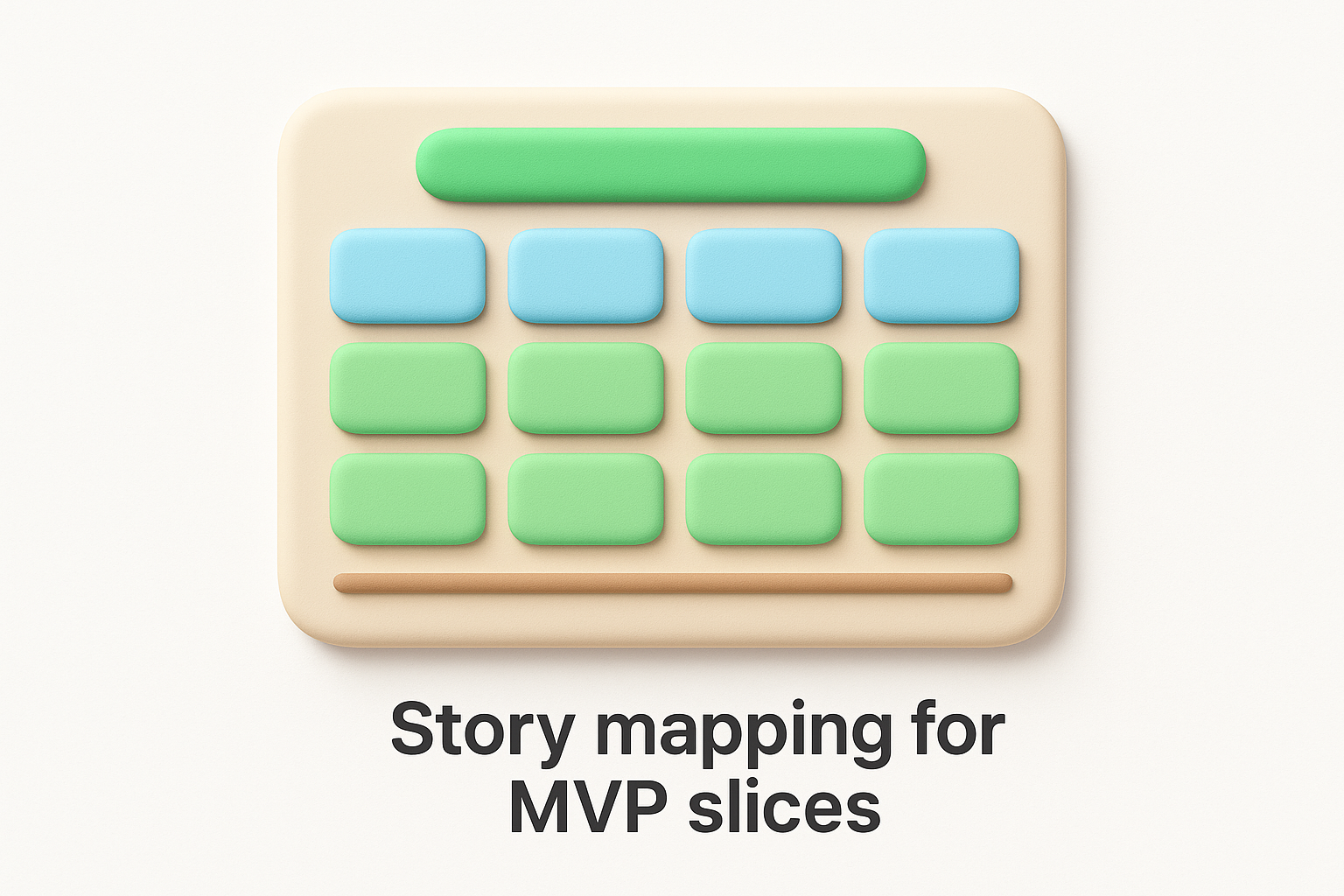
Story mapping builds a two-dimensional grid where the horizontal axis represents the user's journey through your product chronologically. Each major step becomes a column, and within each column you stack user stories vertically from most critical at the top to less essential below. The top row across all columns represents your Minimum Viable Product because it contains the bare minimum features needed for users to complete their core workflow. Lower rows represent enhancement releases that add depth to each step of the journey.
Use story mapping when you're defining your MVP scope and need to separate essential features from nice-to-haves. This approach works best when planning a new product or a major feature where user workflow matters more than individual capabilities. You should apply this method when your team needs to visualize how features connect across the user journey rather than treating them as isolated improvements. The framework helps when stakeholders struggle to understand which features customers need first.
"Story mapping forces you to think about complete user workflows instead of building disconnected features that never form a coherent product."
Map out your user's core workflow as column headers representing major steps like onboarding, creating content, and sharing results. Write user stories on cards and place them in the appropriate workflow columns. Arrange stories vertically by priority within each column, putting must-have stories at the top. Draw a horizontal line across all columns to define your first release, ensuring users can complete the entire workflow. Create additional horizontal slices below for subsequent releases that add depth.
Teams often make the first slice too thick by including enhancement stories that should wait for later releases. Your MVP slice might skip critical steps in the workflow if you're not careful about maintaining end-to-end functionality. The visual format can become unwieldy with complex products that have multiple user types. Balance this method with business value because some low-priority workflow steps might deliver more revenue than others.
Affinity grouping brings your team together to brainstorm and organize feature ideas collaboratively. Everyone writes ideas on sticky notes without filtering, then the group works together to cluster similar concepts and identify patterns that emerge naturally. This method surfaces priorities through collective intelligence rather than top-down decisions, making it valuable when you need team buy-in on how to prioritize product features. The visual, hands-on nature of this exercise breaks down communication barriers and gets everyone aligned.
This framework uses a collaborative workshop where participants generate feature ideas individually, then work together to group them by similarity. Each person writes ideas on separate cards without discussion, creating a large pool of possibilities. The team then silently arranges cards into clusters based on themes that emerge, names each group, and votes on which clusters matter most. The process reveals shared priorities and highlights where team members see connections between seemingly different ideas.
You should run affinity grouping when your team needs to generate ideas and build consensus simultaneously. This approach works best with cross-functional groups where different perspectives on priorities exist. Apply this method when deciding how to prioritize product features for a new initiative where you're starting with a blank slate. The workshop format helps when verbal discussions become unproductive because certain voices dominate.
"Affinity grouping lets quieter team members contribute equally because everyone writes ideas independently before group discussion begins."
Give participants sticky notes and have them write one idea per note for 10 to 15 minutes without talking. Collect all notes and have the team silently arrange them into natural groupings on a wall or board. Once clusters form, discuss and name each group together. Vote on clusters using dots or marks to identify which themed groups represent the highest priorities for your roadmap.
Groups can become too broad or too granular depending on how aggressively participants cluster ideas. Some team members try to force connections between unrelated concepts to create artificial groupings. The exercise generates many ideas but doesn't provide scoring mechanisms to rank individual features within clusters. Balance this creative approach with analytical frameworks that help you evaluate business value.
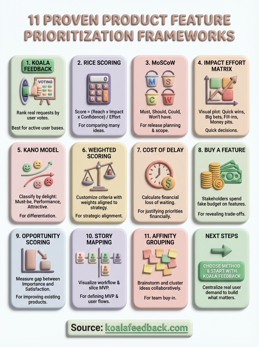
You now have 11 proven frameworks for how to prioritize product features that work across different scenarios. The key is choosing the right method for your specific situation rather than forcing one framework onto every decision. Start by identifying whether you need quick visual prioritization, financial justification, or customer satisfaction data, then pick the framework that matches those needs.
Your next move should be collecting and organizing user feedback before you apply any of these methods. Set up a centralized system where customers can submit requests, vote on features, and see what you're building. Koala Feedback gives you a feedback portal that captures real user demand so you're prioritizing based on data instead of guesswork. Combine that quantitative input with the frameworks you've learned here, and you'll build features that actually move the needle for your business and your users.

Start today and have your feedback portal up and running in minutes.
